For the interior concept it was clear very early on which elements should play the main role:
- The landscape surrounding the house and
- Width / brightness / lightness
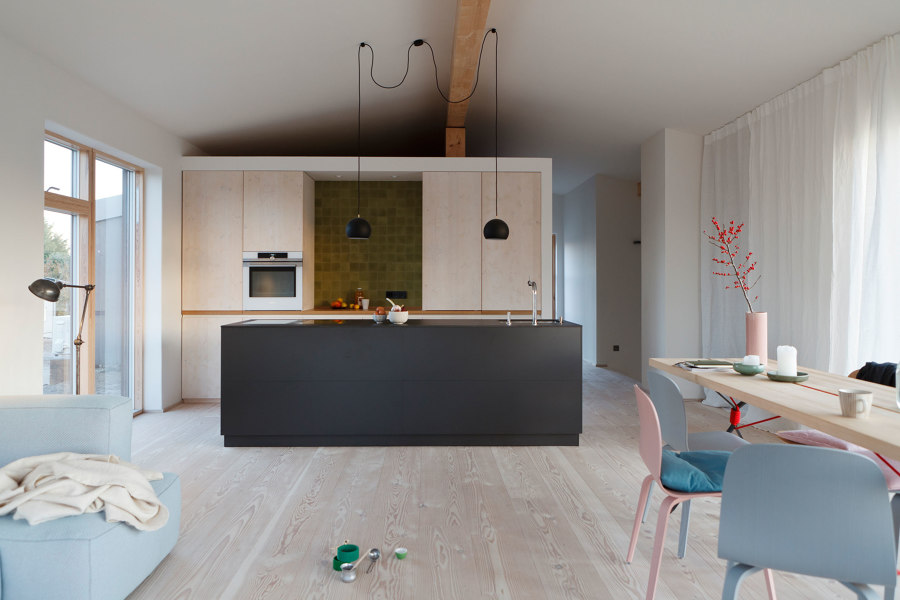
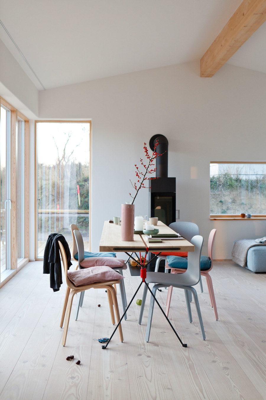
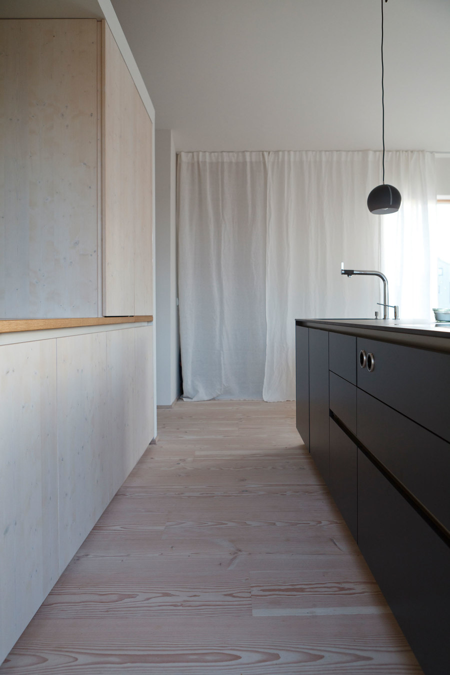
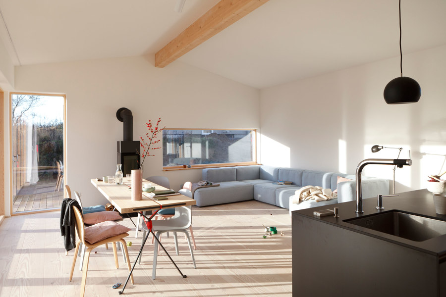
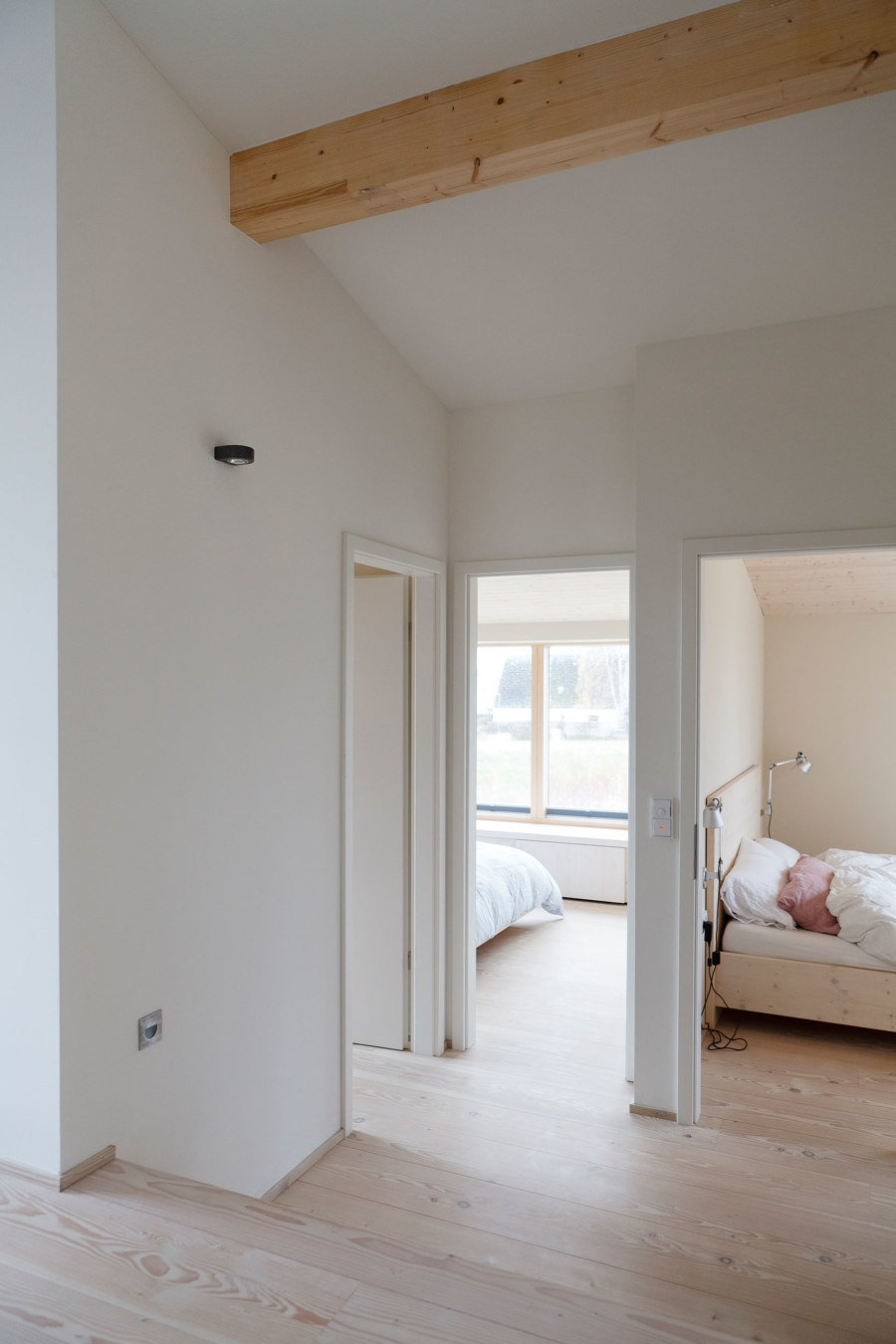
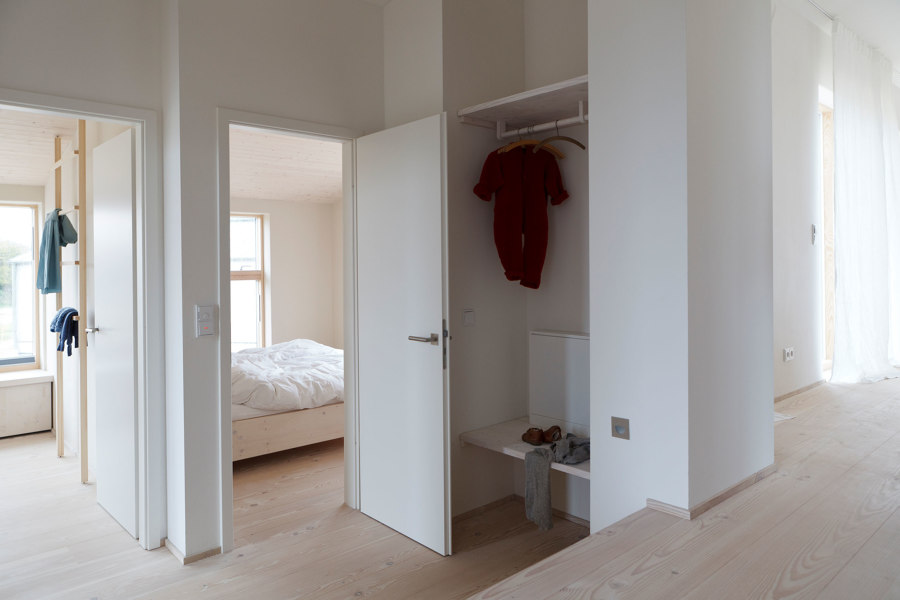
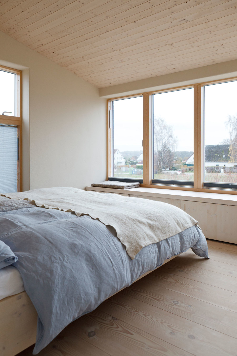
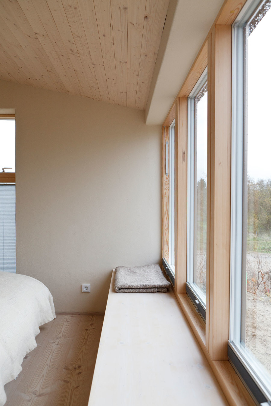
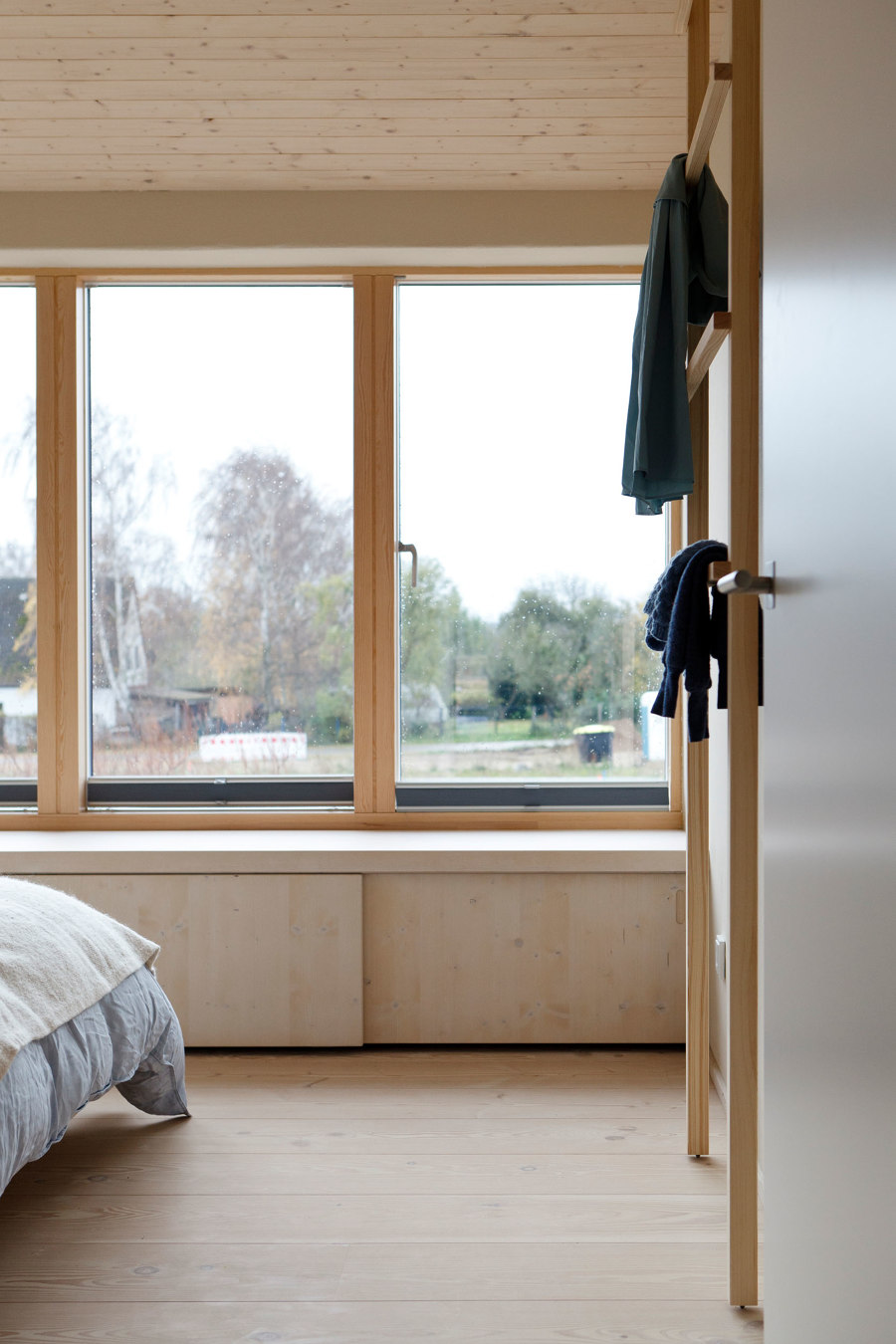
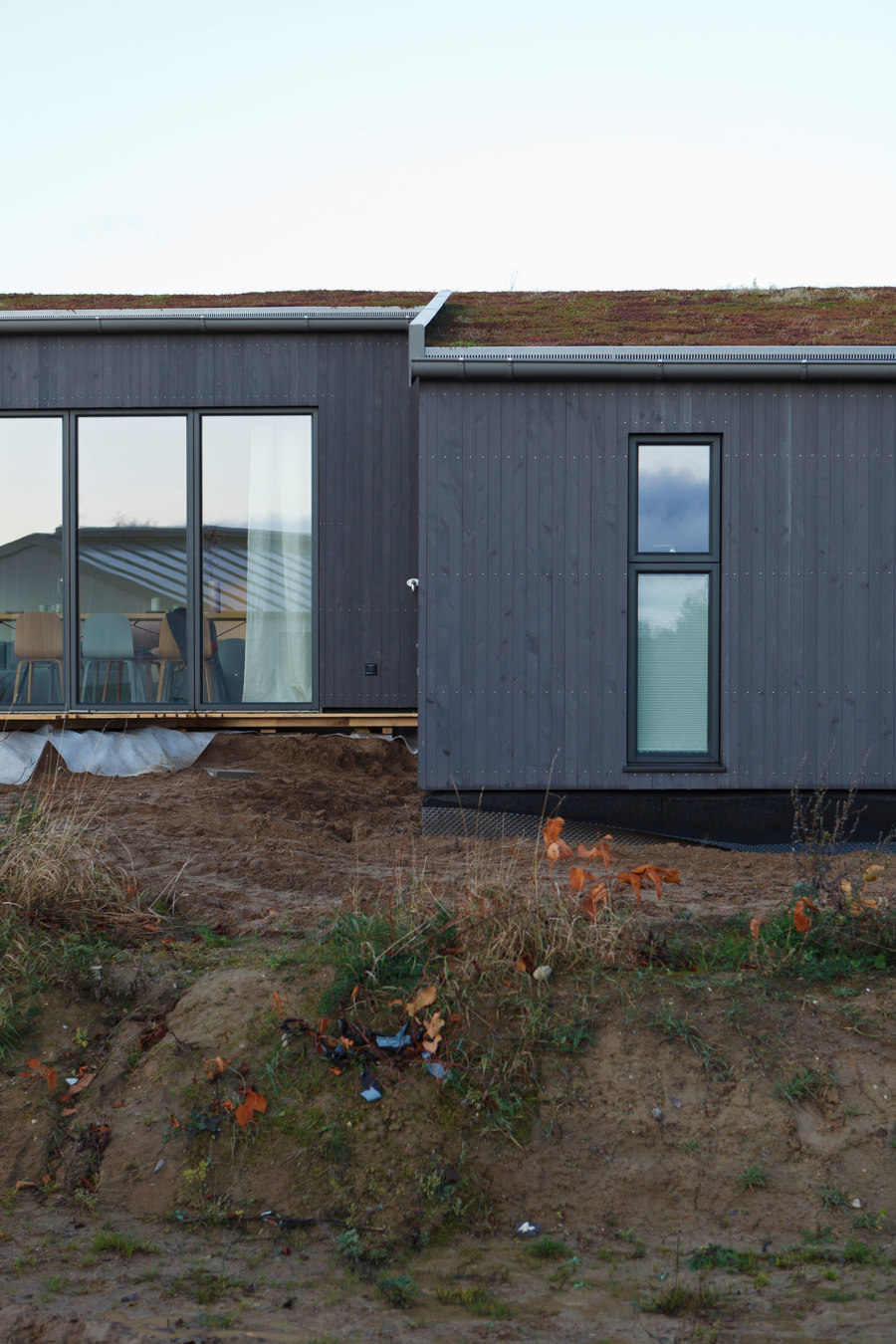
The house should be a place to get together, live together and relax. Inside, it should be open, but also private. After the basic thoughts on the floor plan had been made by the building owner and the architecture firm agmm in Munich and the room layout had been determined, the central coloring elements such as walls and floors should be decided. White Douglas fir and gently plastered walls act as a calm base. The windows, which open to the "outside" like huge picture frames, form a subtle color scheme and playfully capture the surroundings. In the beginning, the builders didn't want much more color.
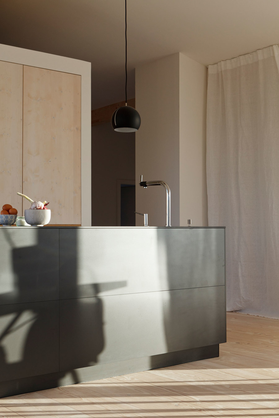
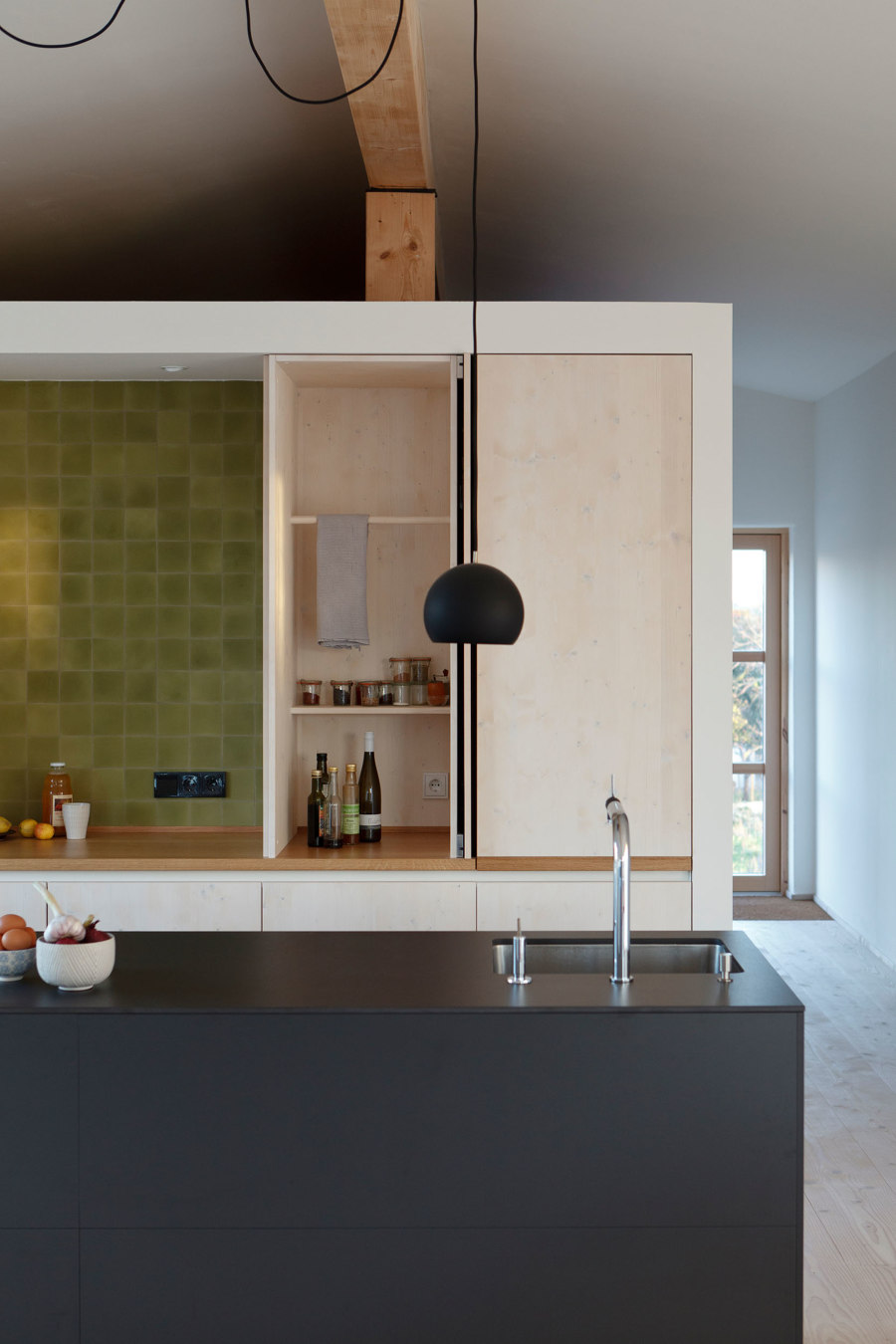
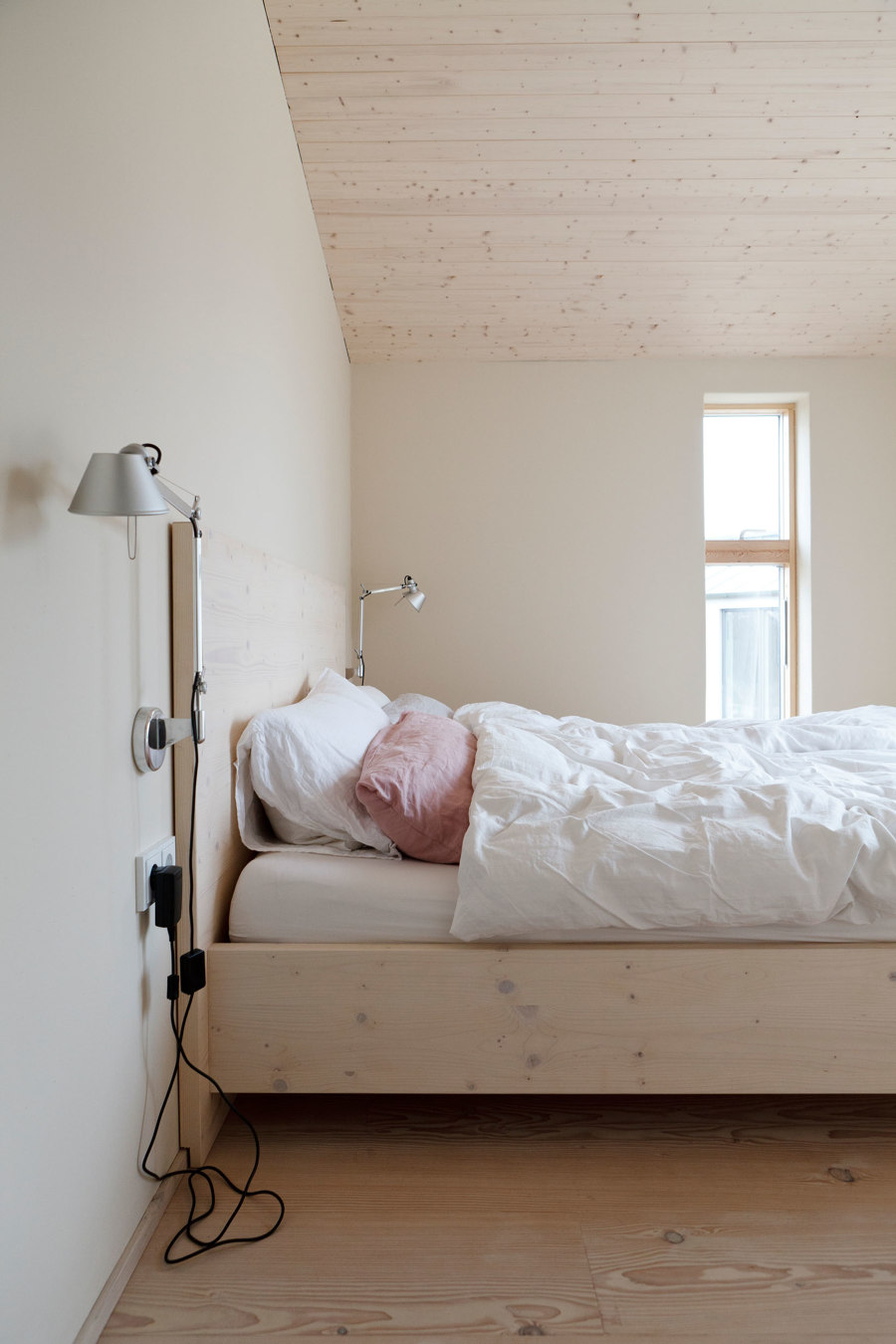
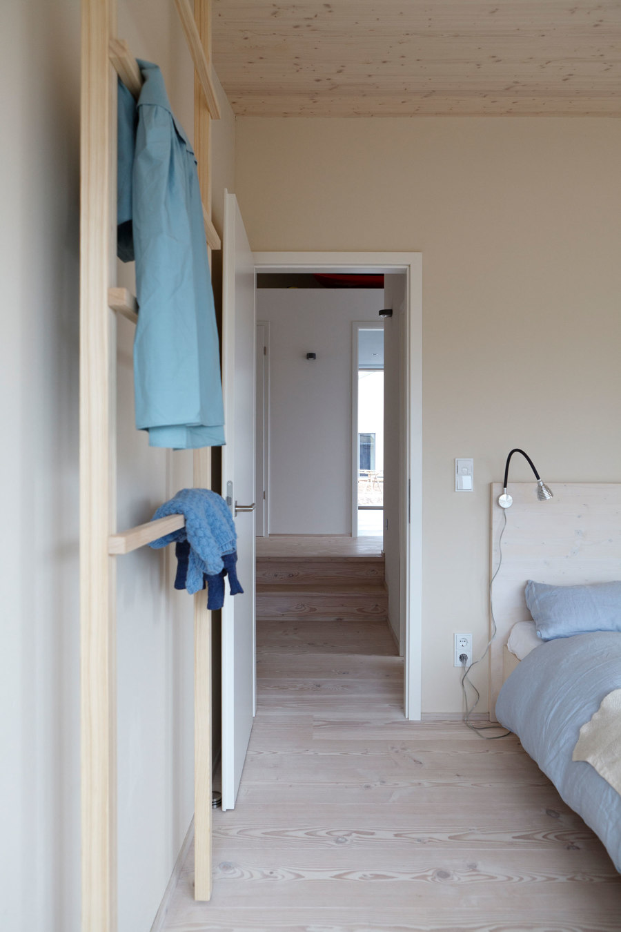
However, it soon became clear that too much "gentleness" and "simplicity" could quickly tip into monotony. Individual elements and furniture should break up and loosen the calm background. For the kitchen, greenish-colored tiles and an anthracite-colored kitchen block were chosen as the monolith. The bedrooms got pastel-colored bed linen and the living and dining area had lively accents in soft blue, pink and green.
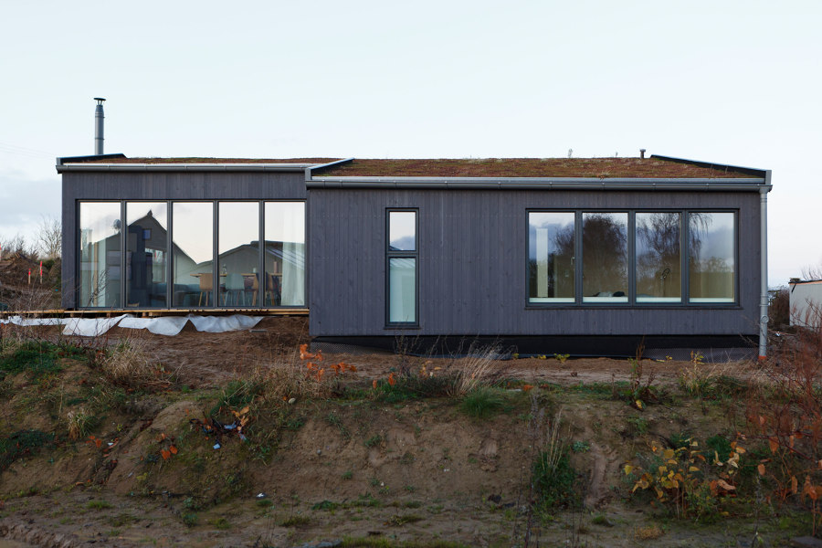
As dark and earthy as the house looks from the outside, the brighter it looks from the inside.
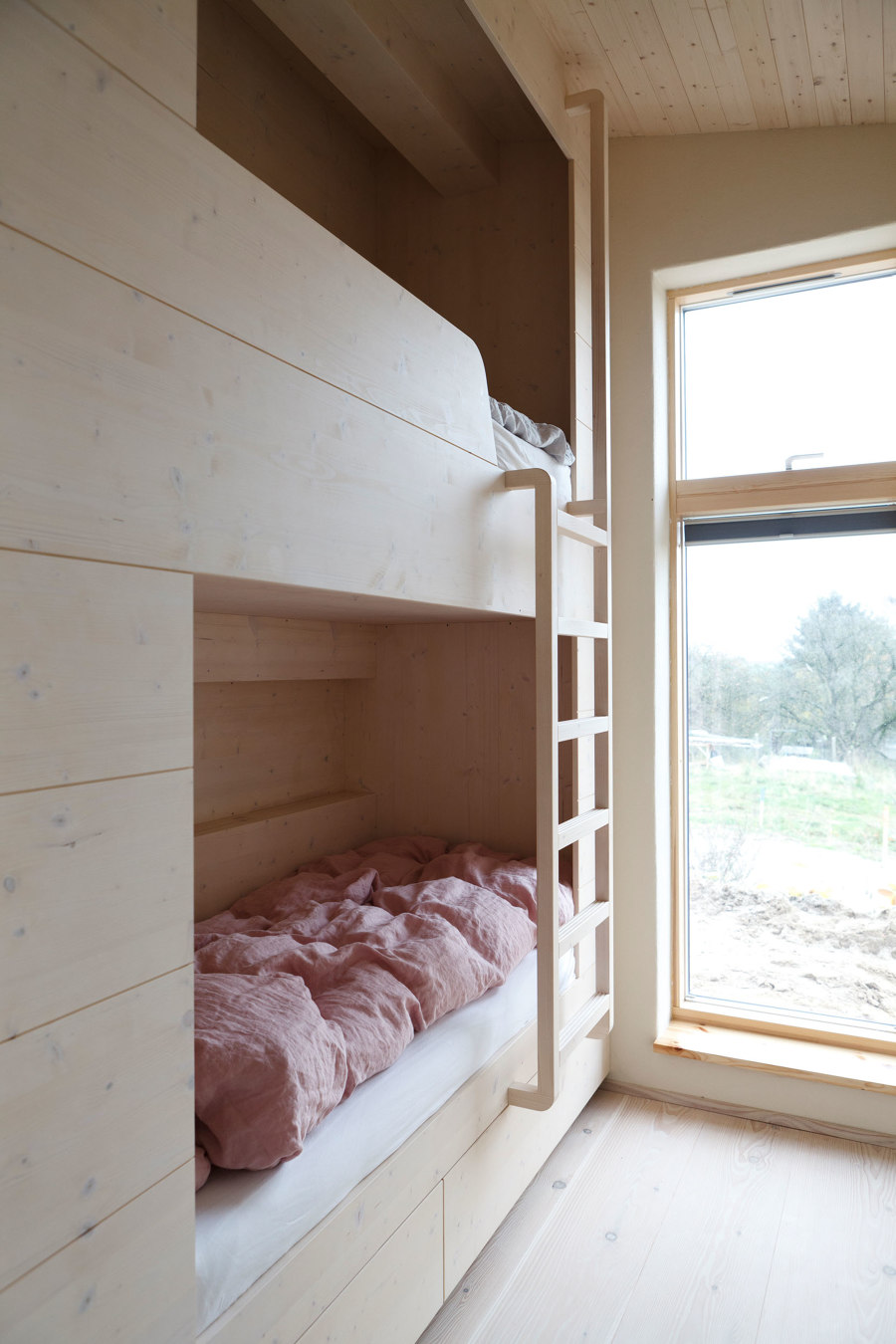
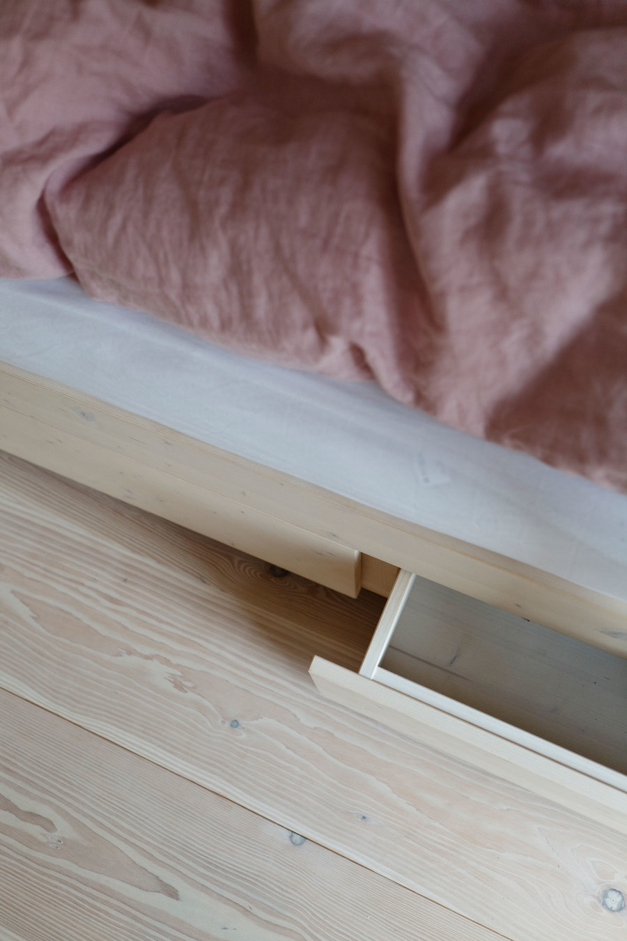
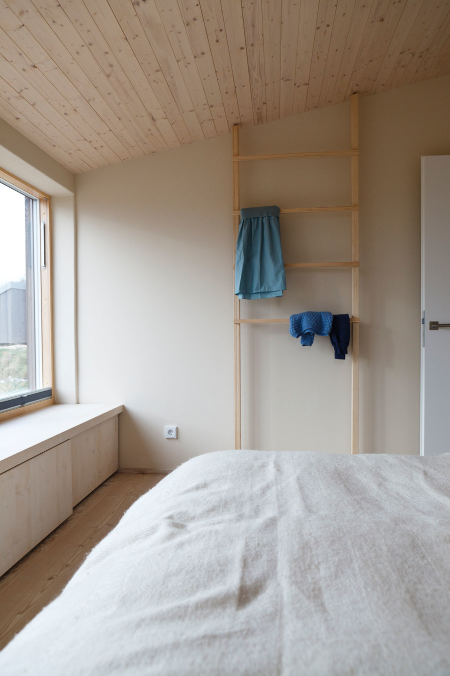
The three bedrooms are designed in a simple and functional way, but the warm and soft wood makes them very cozy and cozy. The berths in particular invite you to snuggle up, especially when it is raining on the coast, and to escape from everyday life.
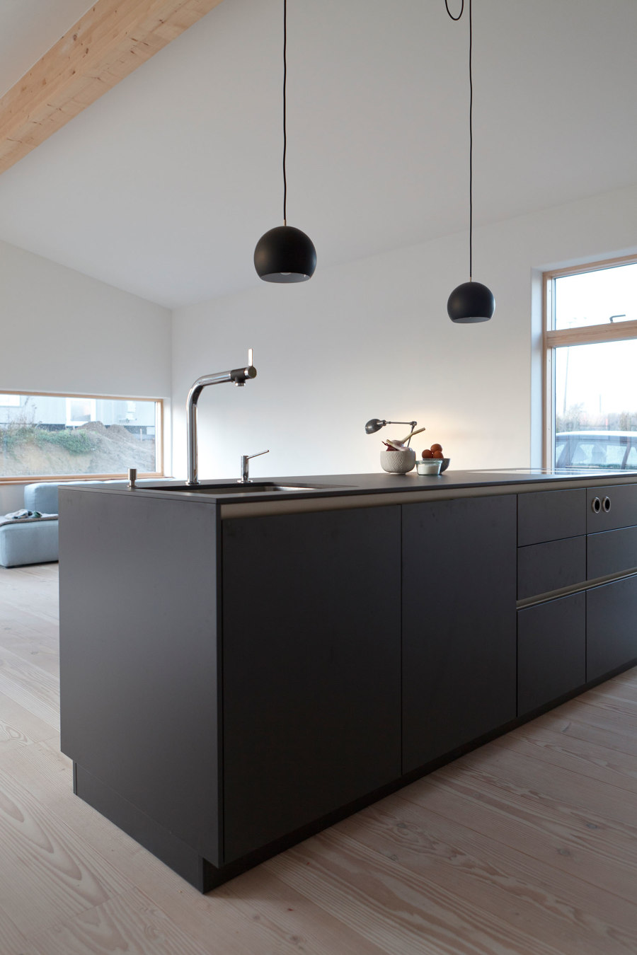
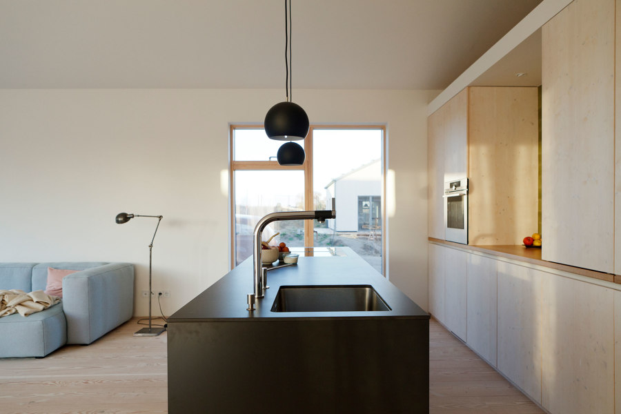
The kitchen is the central element of the house and is designed so that you not only have an eye on the living area, but also the garden and can communicate with the family and guests at any time.
The large dark monolith from Siematic symbolizes the technical and "labor-intensive" process of cooking and preparing. The back front filling the cube picks up the subtle wood tone of the floors and hides enough storage space for dishes, cooking utensils and household accessories. It opens in the middle as a filing, preparation location and graphic element. The tiles capture the warm sunlight and gently filter it into the living room. To the right of the opening is a special storage cabinet. It can be used as a display area or in a closed form as storage space through a door that completely disappears in the central partition. The worktop picks up on the wood tone of the window frame and reflects it discreetly.
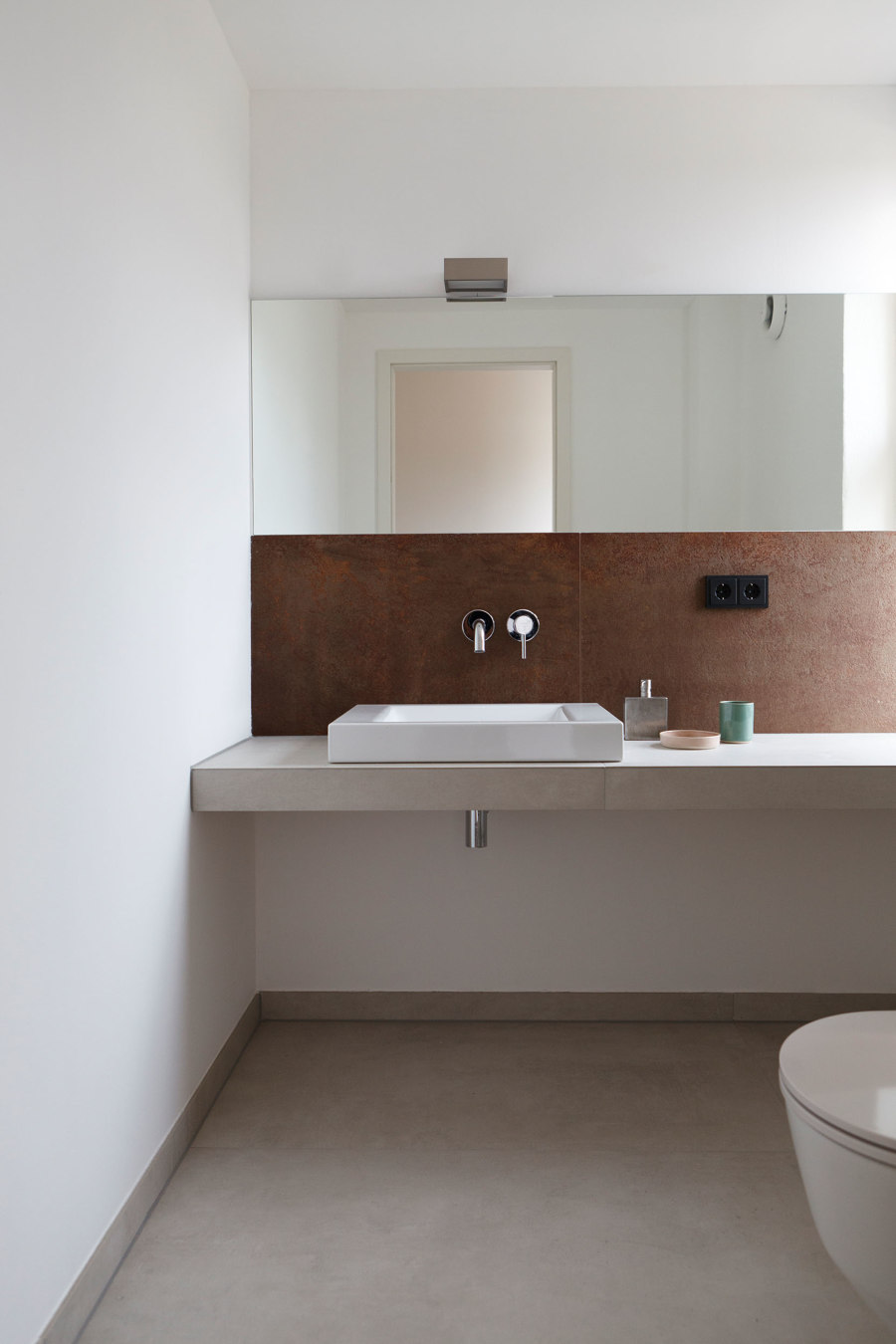
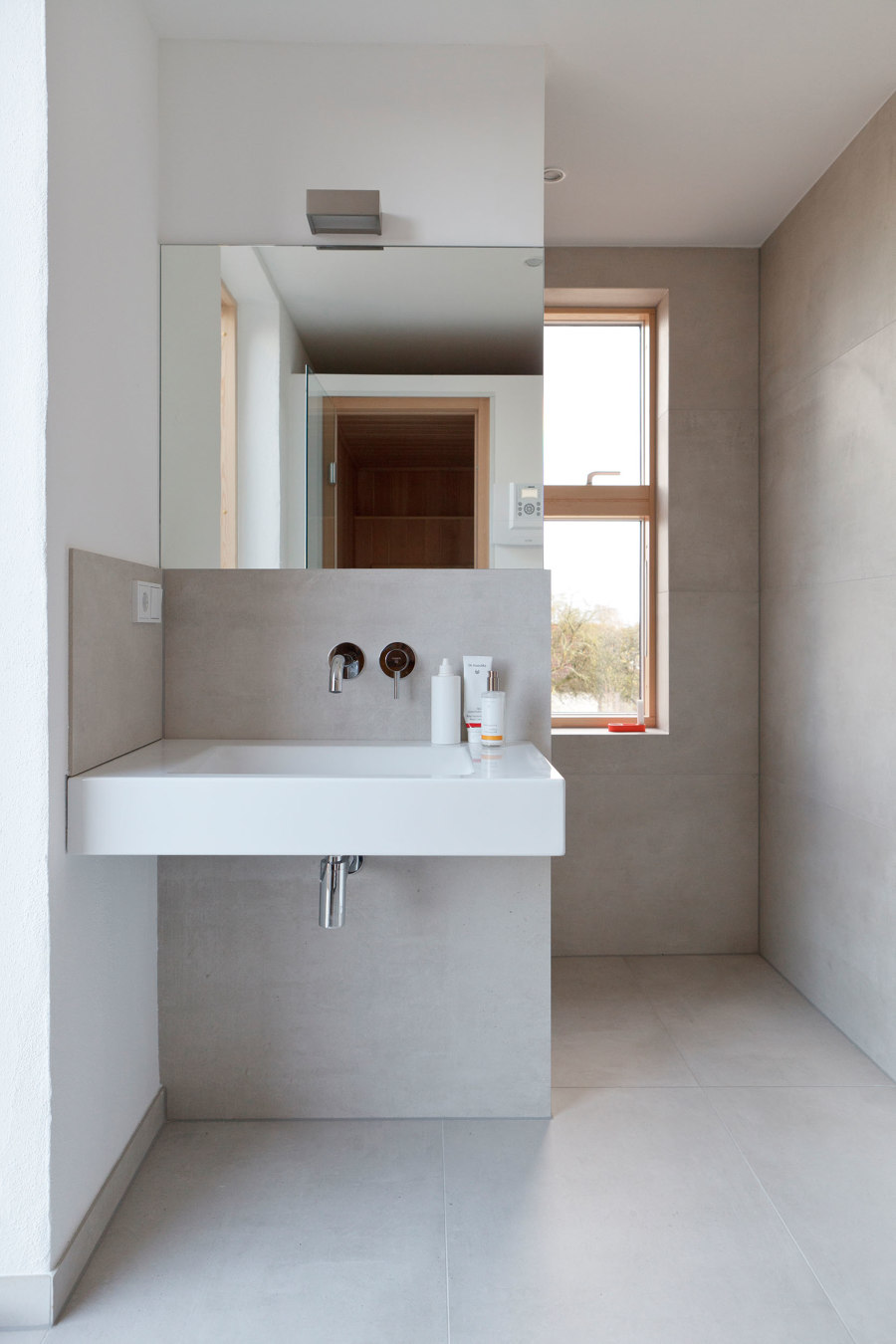
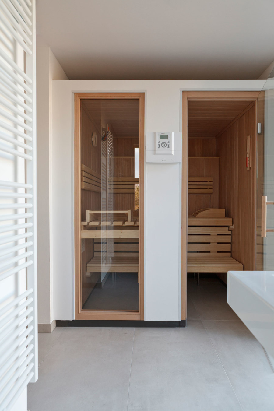
The bathrooms are functional and reserved. Their earthy tones pick up on the outside of the surroundings of stones and beaches and at the same time combine with modern aesthetics. There is even space for a small 2-man sauna that nestles inconspicuously in a niche in the main bathroom. Large mirrors reflect the spatial axes and expand the smaller rooms. Large windows give natural and soft light.
Design team:
Studio Oink
Architects: agmm Architekten + Stadtplaner, Munich
