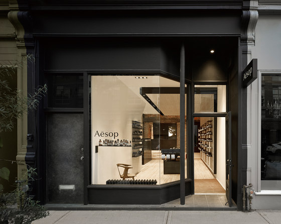
Aesop Queen Street West is the brand’s first Canadian store. A luxury skin and body-care line from Australia, Aesop chose to work with the architectural team to design this retail space based on a shared commitment to highly detailed, site-specific and signature design. All of the Aesop stores strive to capture the intrinsic qualities of their individual locations through the use and engagement of local materials, culture and history. Here on Queen West, the design was inspired by the historic juxtaposition of residential and manufacturing uses along the street, and the natural landscape of the former Garrison Creek ravine in adjacent Trinity Bellwoods Park.
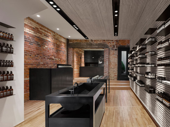
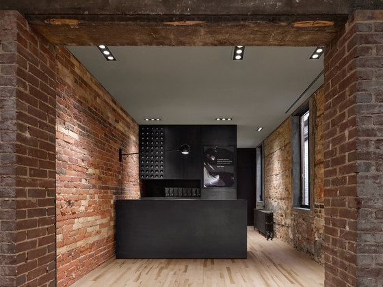
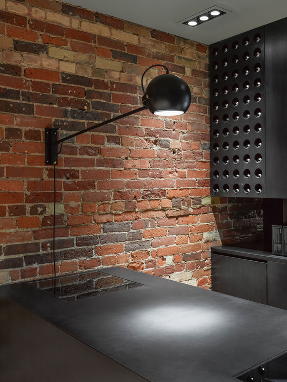
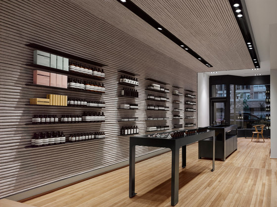
Quintessentially Torontonian, the store is deep and narrow; emphasizing this linearity, the design draws the eye through to a small side courtyard, inviting scrutiny of old and new architecture along the way. The interior was stripped back to the existing maple flooring and original brick, forming a substrate for a clever display system that wraps the east wall and continues along the ceiling plane.
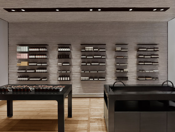
Comprised of layers of industrial felt and steel, this installation was crafted by local artist Kathryn Walter: the felt alludes to Canada’s 17th-century commercial origins in the fur trade and the history of local textile manufacturing. Soft, warm and domestic, it provides a buffer against noise - and in its organic imperfection, an evocation of the greater Canadian landscape. In complement, fins of blackened steel embed themselves in the folds of the pleated felt wall as long, shallow display shelves, referencing local industrial history and the embedded streetcar tracks of the roadway just outside the door.
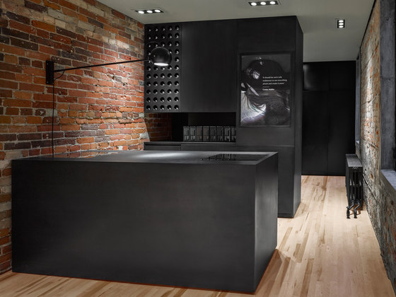
Blackened through immersion in a special solution, a coating of wax not only protects the steel but gives it a soft and glowing lustre. This custom material forms the basis of much of the store’s interior design strategy; the dark patina of the metal offers an appealing contrast to the wood, brick and felt, making the steel an ideal choice from which to fashion the store’s many display tables, counters and sinks. Overhead, troughs of blackened steel are recessed into the ceiling to contain the lighting system.
To encourage flow and progression through the entirety of the space, the display and sampling counters are arranged in a linear fashion, forming islands around which customers can gather to examine and try out the various creams, lotions, cleansers and serums. Here, staff engage visitors in informative discussions about Aesop skin-care products, facilitating the ultimate goal of customer satisfaction and sales transactions, which are concluded at the cash desk at the back of the store.
The Aesop store on Queen West is a sensory journey; bathed in honey-coloured light, the tactile qualities of the brick, steel and felt draw visitors in-away from the noise and frenetic pace of the city - to engage and to touch, enveloped in the distinctive fragrance that fills the space.
superkül
