Photographe : Hampus Berndtson

Photographe : Hampus Berndtson

Photographe : Hampus Berndtson
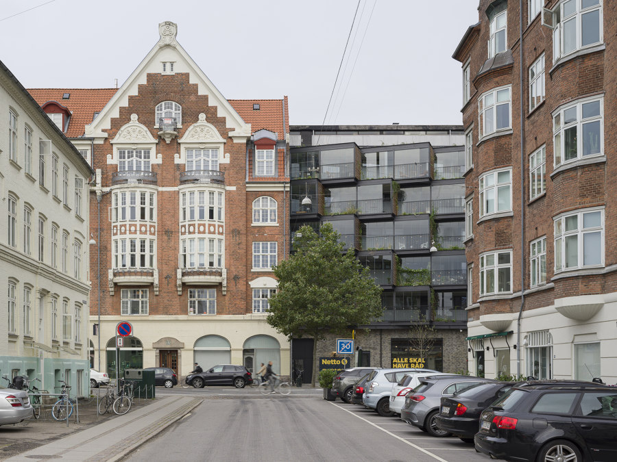
If we want to achieve a sustainable future, we cannot rely on only building sustainable buildings going forward. We need to have a visionary method of transforming and adapting existing buildings to meet our changing needs. Ørsted Gardens is an example of a project that brings a generic renovation to a new level, improving the visual and social environment for residents and visitors alike. Ørsted Gardens transformed a dilapidated building that was often referred to as among the ugliest in its neighborhood. The original building (and many similar to it) was erected in the ’60s at the height of a fascination with rationality, industrial processes, and efficiency in the Danish building industry. The building was sleek and unwelcoming and didn’t age with a modicum of grace.
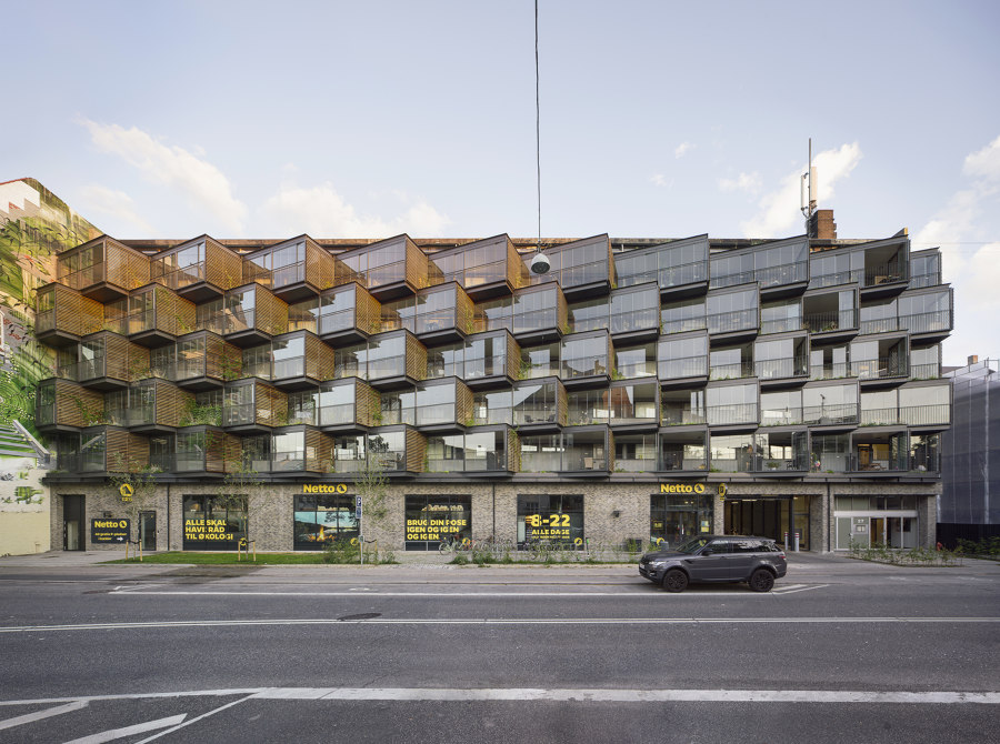
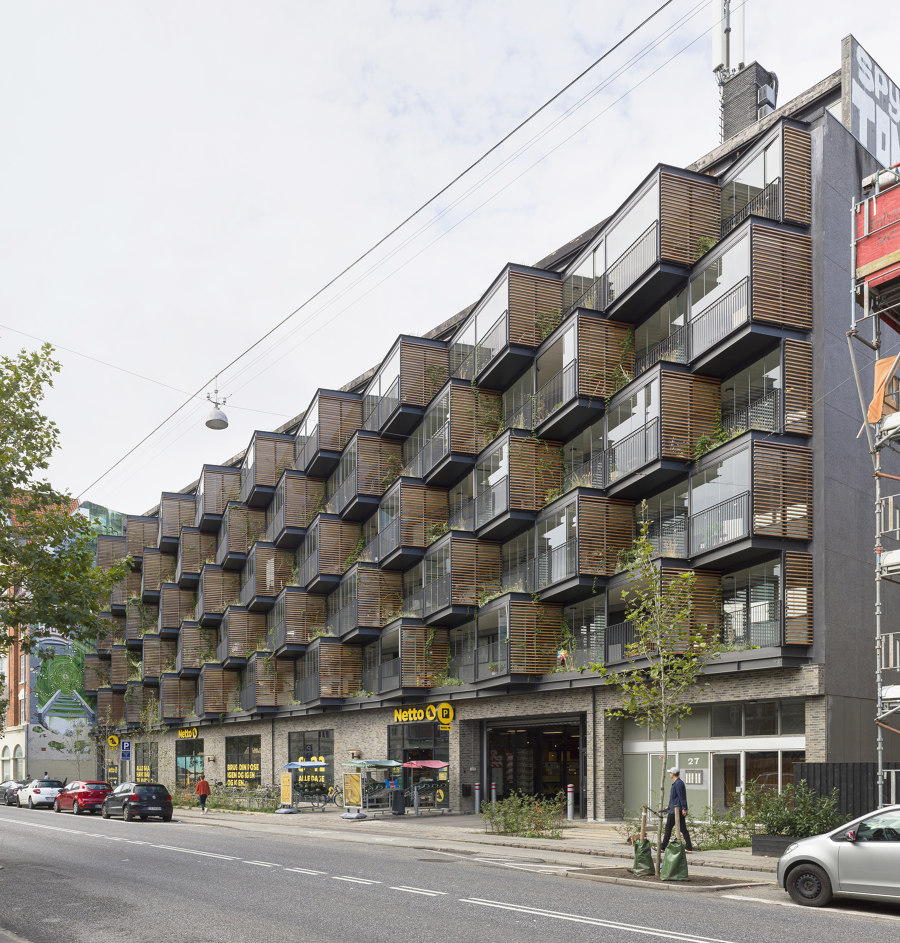
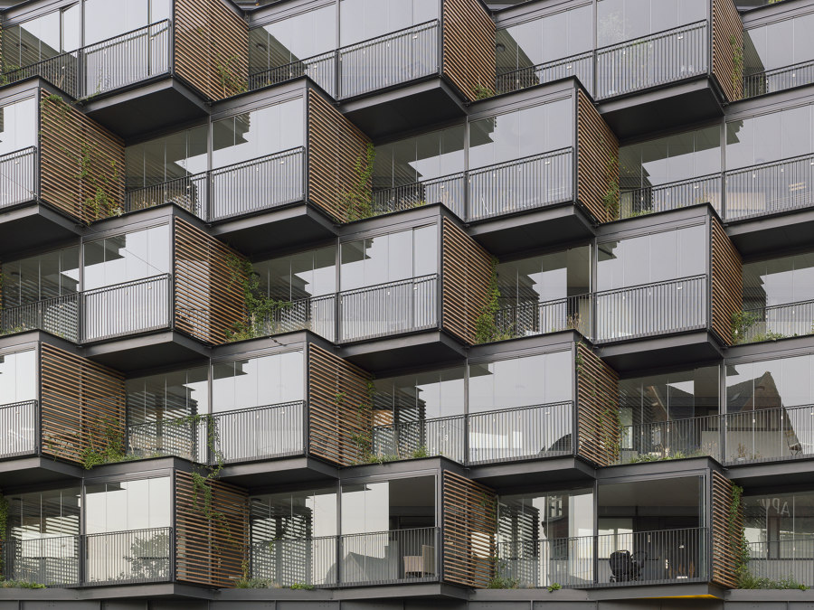
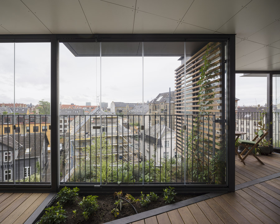
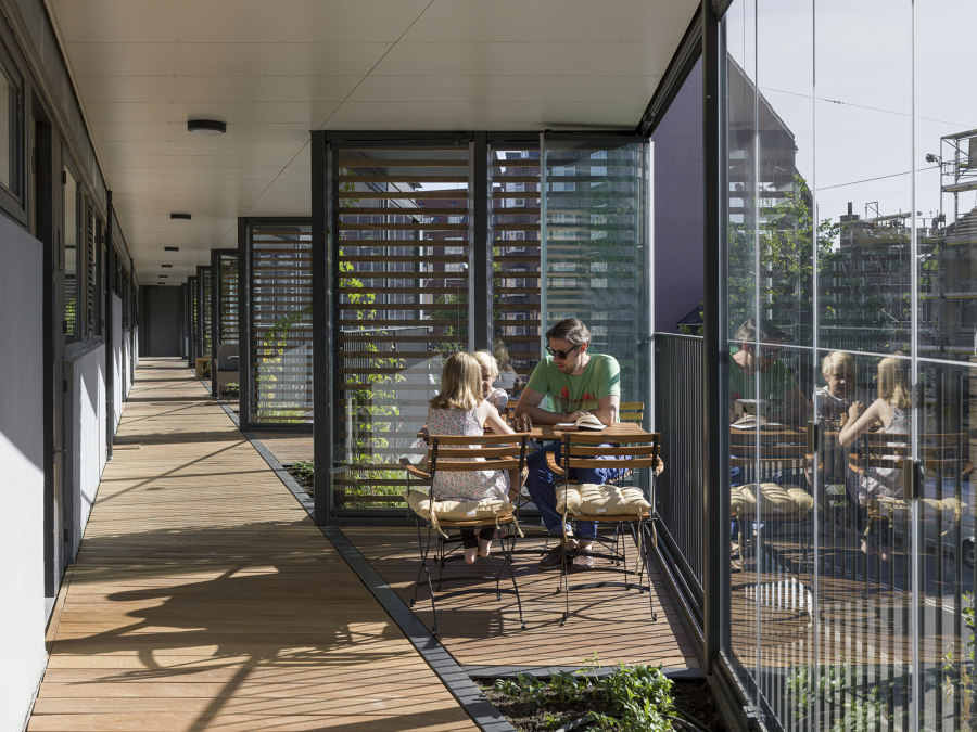
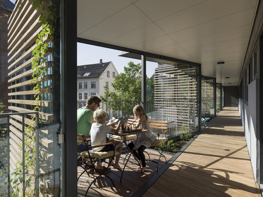
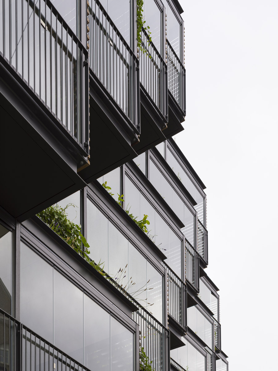
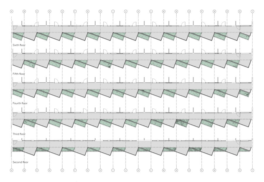
The radical transformation grew out of an ordinary façade renovation, aimed to prevent water from damaging the concrete balconies, into a drastic alteration of the building’s semi-private spaces and a radical reinvention of the façade facing the heavily trafficked street. Instead of just patching up the open balconies with similarly sleek glass panes, Ørsted Gardens aims to create a new social space to bolster the social coherence in the building. To create that social space, a series of triangular glass bays were added to the architecture, creating semi-private decks for the individual residents.
The private balconies are placed on the outside of the access way, which creates a space that is at the same time private and shared, encouraging random meetings between residents. The extension adds a second and more exposed outdoor alternative to the balcony on the opposite façade and operable glass panes can either shield the space or leave it completely open. This extends the usage of the balconies from just the summer months to also include spring and fall. The new façade shelters the apartments from the heavy traffic noise, and it has transformed the way residents live in the building. Front doors are now open and kids roam the new space, visiting neighbors creating a lively urban space on the side of the building rather than the bleak access way that was there before.
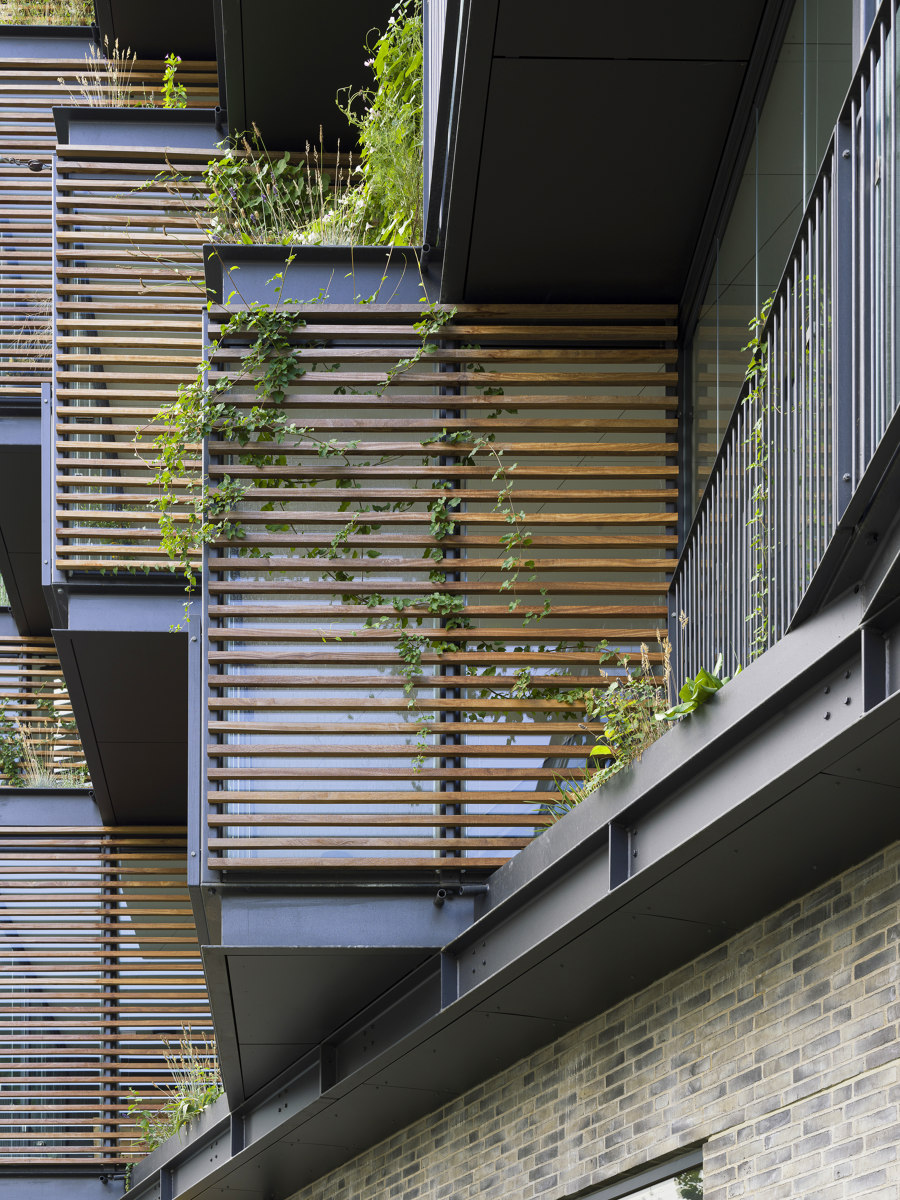
A central aspect of the renovation is the notion that the building should contribute positively to the experience of the street. The monotonous façade of the past is broken up into smaller geometric entities creating a sense of rhythm as you pass the building signaling a residential building, comprised of many families and individuals. The balconies shift story by story further enhancing the sense of rhythm towards the street and effectively creating 50 small gardens. The gardens span from inside to outside blending the interior with the exterior and offering each resident their own small patch of green to grow plants, vegetables, or whatever they feel like. This encourages ownership of the space and combined with the residents’ private furniture it underscores the individuality of the balconies.
Design team:
Tegnestuen Lokal
Consultants: CEJ
Contractor: Amstrup & Baggesen
Engineering: Henneby Nielsen

Photographe : Hampus Berndtson

Photographe : Hampus Berndtson

Photographe : Hampus Berndtson

Photographe : Hampus Berndtson

Photographe : Hampus Berndtson

Photographe : Hampus Berndtson
