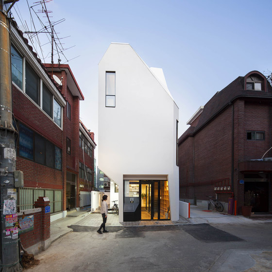
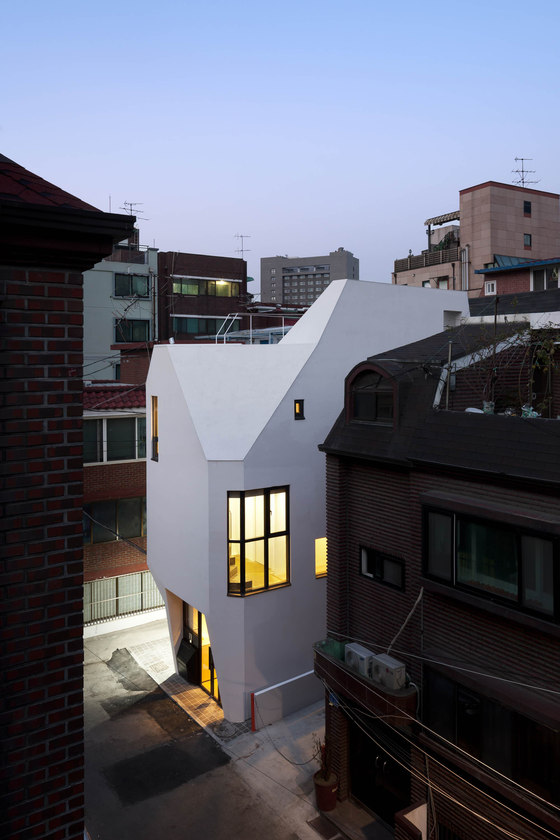
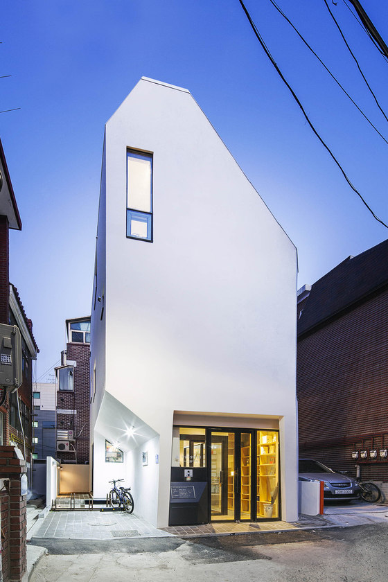
In an alley in the city, on a small piece of land, the [Horn] has risen. The width of the land facing the road is 6 meters, and the depth 10 meters. 60 square meters of land was what I had to work with.
The pre-client, who is the representative of Galmuri Publisher, is also a writer, and political philosopher. He wished to build an independent space for his publisher on this small piece of land, and was looking for an architect who could help him fullfill his wishes. “Galmuri” in Korean means reaping harvested grain or crops for food and to use as seeds. Thus the name “Galmuri” implies that the publisher intends to carefully reap the intellectual and practical achievements of humanity, while sowing the seeds of intelligence proper for our new era.
By chance or destiny, I became in charge of the building design. In spite of the small size of both the site and the building, the process was every bit as difficult and intense as any large building. The entrance alley was as narrow as the size of our site, neighbours surrounding the site were all the more close to the construction site which resulted in frequent complaints from neighbours throughout the process, the site’s soil was soft filled with underground water, and there wasn’t enough space to load materials. It was the harshest environment imaginable for the construction workers.
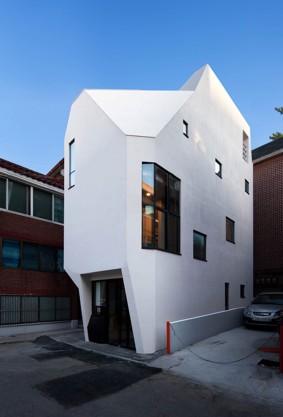
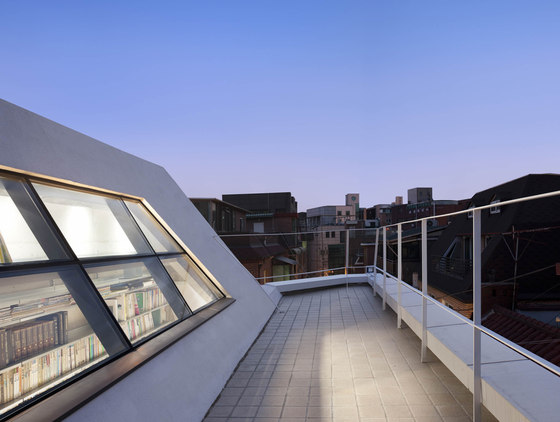
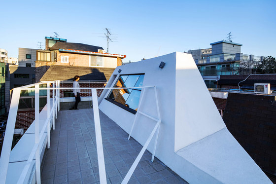
Though small in size, I wanted the building to look bold amidst the high-density surroundings. Somewhat expressionless yet impressive, simple yet refined was what I aimed for. Finally, a white “horn” rose at the end of a small alley that retained the traces of time.
The Horn was very close to the publisher’s previous office space which they had used for a long time. The publisher’s previous office space was filled with traces of their time, and by looking around the office one could easily grasp the attachment my client had for the space. However, the building was sold to a new landlord and it became financially difficult for the publisher to continue renting the space they had been using for so many years. Yet my client did not want to leave the vicinities, and decided to build a new independent space nearby. However with his budget, the land he could afford was very limited. Eventually he was able to buy a very small piece of land 6 meters wide and 10 meters in depth (60 square meters) in the neighbourhood.
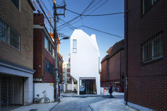
My client began to worry about how to achieve his goal on this small piece of land. My client seemed to be looking for an architect who could successfully build their independent space on this small piece of land, an architect who could show positive energy and passion for this project. When my client and I first visited the site, our perspectives on the situation were a bit different. My client had doubts and was anxious about whether they’d be able to create an environment large enough and sufficiently convenient for their activities on this small land. On the other hand, the architect, as soon as he entered the alley, understood the potential of the site, and believed he could realize the symbolism by creating an object that is small yet confident. The alley that leads to the land is only wide enough for one car at best.
However, as soon as one enters the alley it became a linear axis, and at the very end of that alley was where the new building would be built. I did not want the linear direction to disappear at the end of the alley. What I wanted was to maintain the continuous new axis-direction by constructing a new building on a small ground. I wanted something that stands natural, something that is consistent with the direction of the entrance alley, so that the alley’s direction would naturally slide by the building.
I wanted the building to embody the sense that the horn sprouted out from the land. I thought the first impression of the building should be the feeling of a ‘lump’.
The ‘lumpy’ feeling could be achieved by minimizing decorative elements and using the building’s mass itself as a design feature. As it happened, the front of the building was facing west, so the building’s brightest expression could be read in the late afternoon. Eventually the architect was able to create the expression and impression of the building that he intended, and materialize the small yet bold image.
The architect tried to give the building a variety of expressions that differed depending on the viewing angle, so that the building had an indeterminate quality that in turn arouses curiosity from viewers.
Site area: 63.71㎡
Built area: 35.28㎡
Total floor area: 133.12㎡
Structure: Reinforced Concrete
Exterior specs: STO Finish
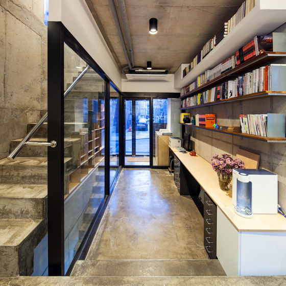
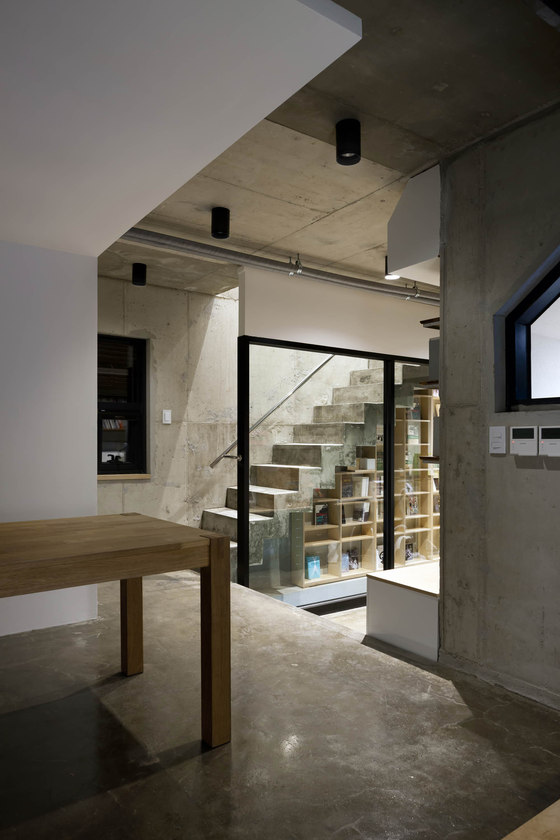
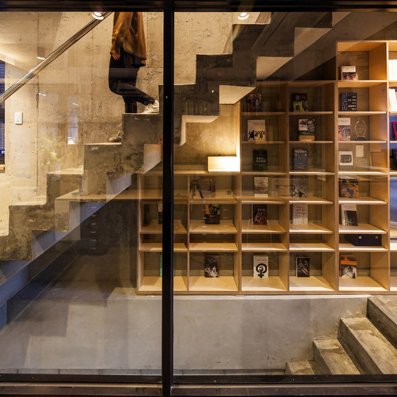
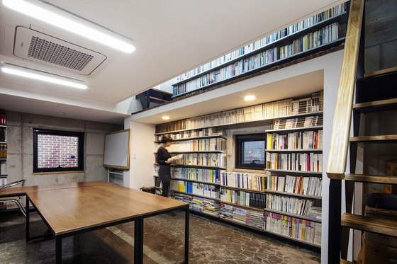
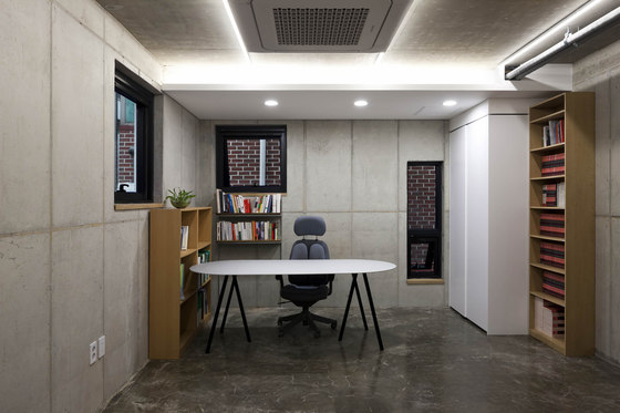
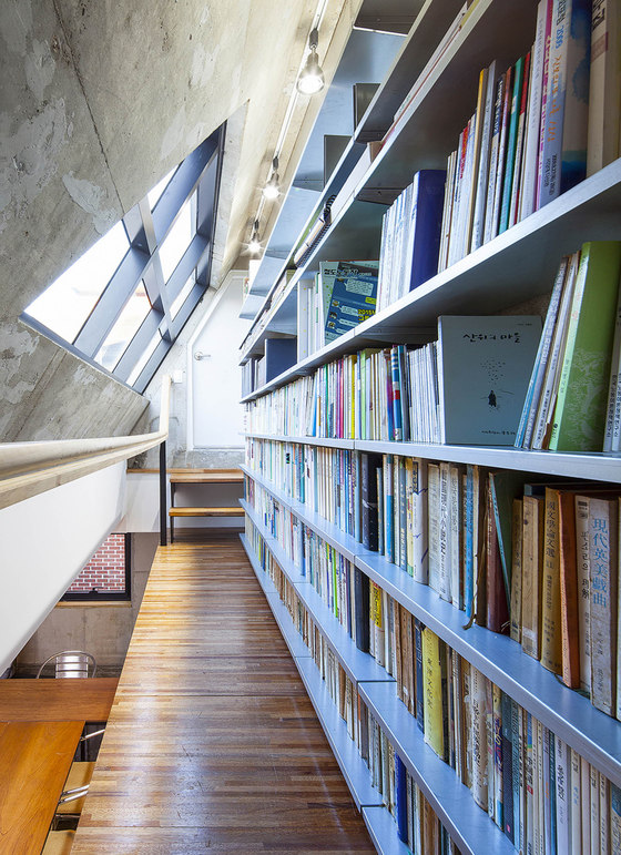
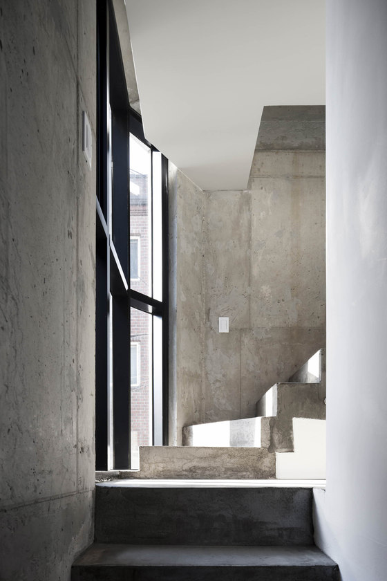
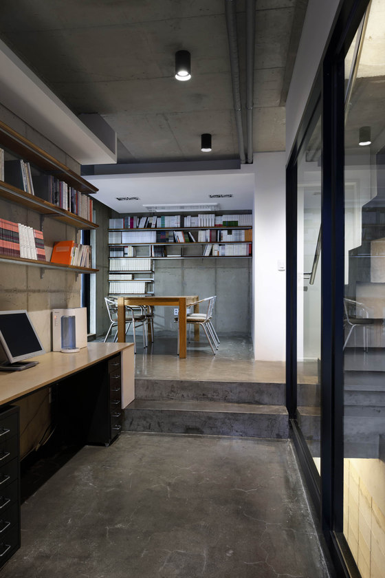
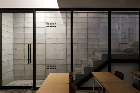
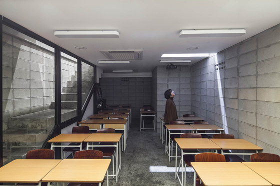
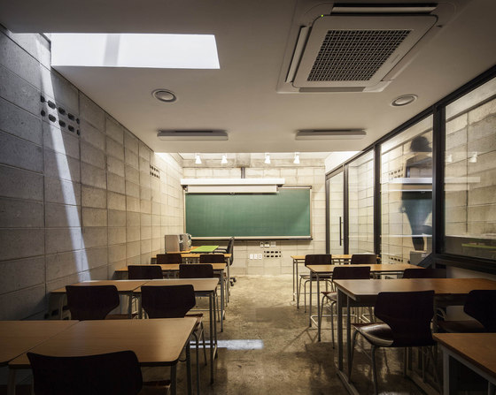
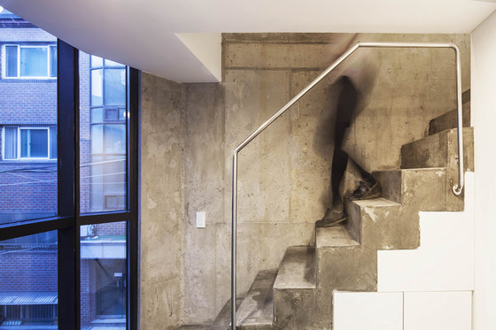
Interior specs: raw concrete wall , floor coated with epoxy, raw concrete ceiling or gypsumboard ceiling.
Furniture specs: wooden shelves, existing furniture.
The Plus Architects
Architect in Charge: Hanjun Cho
Mechanical Engineer: Hanbaek engineering
Structural Engineer: Yongwoo engineering
Construction: Moowon Construction
