Towards a new model for multi-tenant buildings with an appealing philosophy.
As an important building type, multi-tenant projects would seem to present somewhat obvious issues for consideration. In practice, however, most projects end up placing top priority on profit maximization and the optimization of floor area. In addition, these buildings often incorporate elements that lead to superficial architecture. Nevertheless, for this project we attempted to rethink the possibilities of a multi-tenant building that would embody an appealing contemporary philosophy while taking into account such routine considerations.
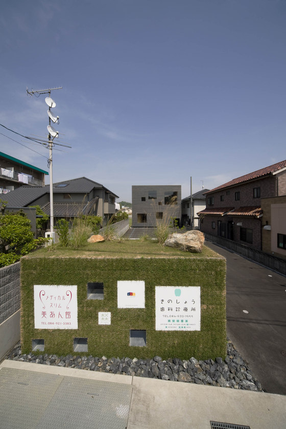
This project is situated in a largely residential area that lies about 1km north of the train station, distinguished by a large number of plots of land that are exceptionally long in relation to their frontage. The site for this project, too, was a narrow, slender plot with a frontage of about 10m and a depth of 50m in relation to the road out front, surrounded on three sides by neighbouring residences. Typically, such a site tends to lead to a situation where the tenant space facing the road out front is blessed with more favourable conditions compared to the other spaces. With this in mind, we tried to work out spatial principles that would allow us to give the inner spaces additional advantages that would equal or surpass the conditions of the front space.
Layered diversity
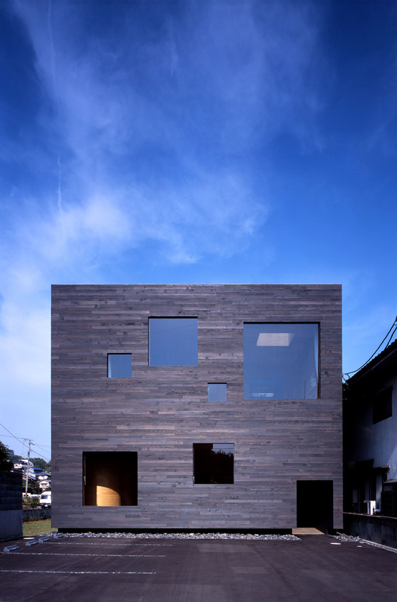
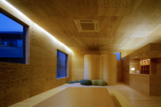
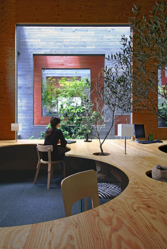
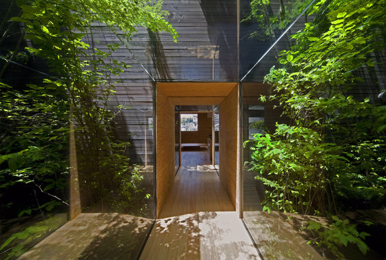
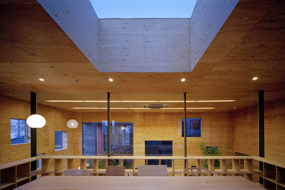
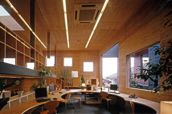
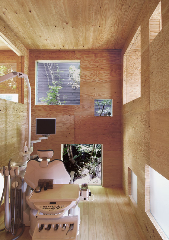
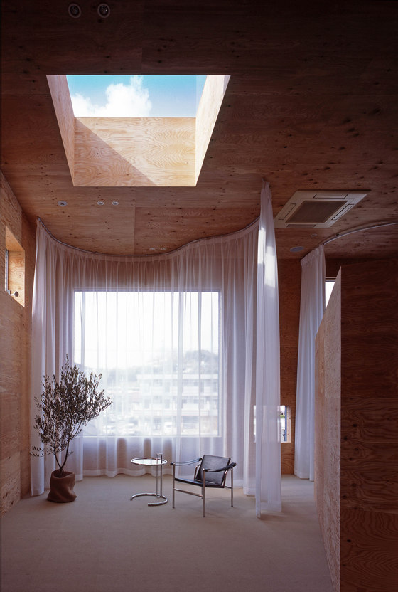
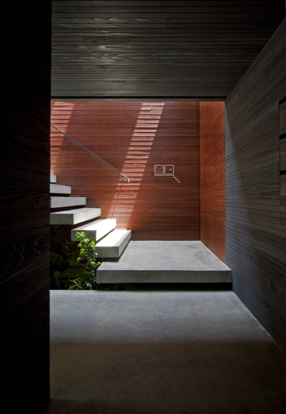
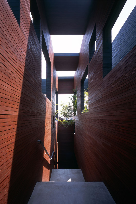
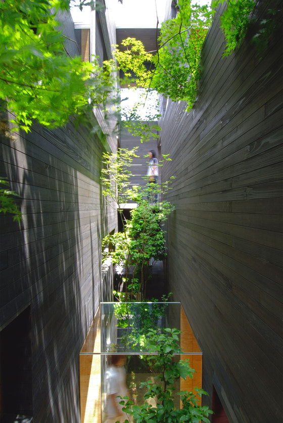
Specifically, this project involved a dental clinic on the first floor and an esthetic salon and office on the second floor. These facilities were housed in two boxes oriented towards the east and west, with a third box in the middle containing a staircase and a forest. The four walls formed by this layout of boxes were designed to create a sense of integrated diversity in the architecture, thanks to the layered openings in between the boxes.
Tenants were also involved in the decision-making process from the planning stage onwards. They took a proactive role in deciding how the interior spaces would be designed, and were able to understand the framework of the building as a whole.
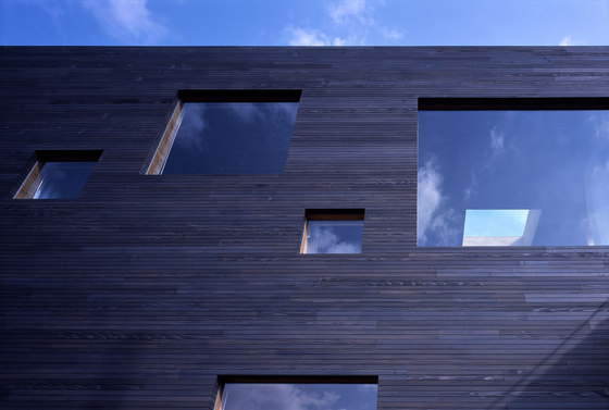
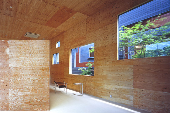
The front and back surfaces of each of the four layers contribute to creating a diverse, interrelated space. The openings ensure the privacy of neighbouring tenants, while the opening and tightening of these openings at regular intervals allows one to be aware not only of vertical connections between floors and horizontal ones between front and back, but also another sort of distance that transcends physical sensations. In addition, we expected that the trees in the forest would cause layers of physical distance to become ambiguous, creating an overall environment that would spread out in an organic manner.
By manipulating the space in this way, the front tenant space would be separated from the inner tenant space, while also remaining visible to it just beyond the various layers. The mountain scenery that lies beyond the front space, in contrast, feels close and familiar. In this way, it was possible to protect the privacy of each tenant while constructing a space that maintained the tangible presence of both these elements, thus providing the inner tenants with an environment that was equally favourable compared with the front space. The function of a single wall led to both a sense of necessity arising from the multiple layers created by the seemingly random openings, as well as a complex, haphazard character resulting from the movement and behaviour of the tenants. This mixture of necessity and contingency led to a new, three-dimensional expanse and a diversely articulated space.
Keisuke Maeda / UID architects
