Photographe : David Schreyer
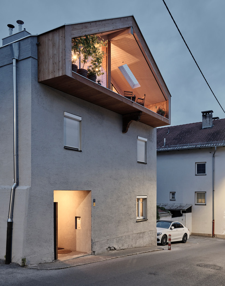
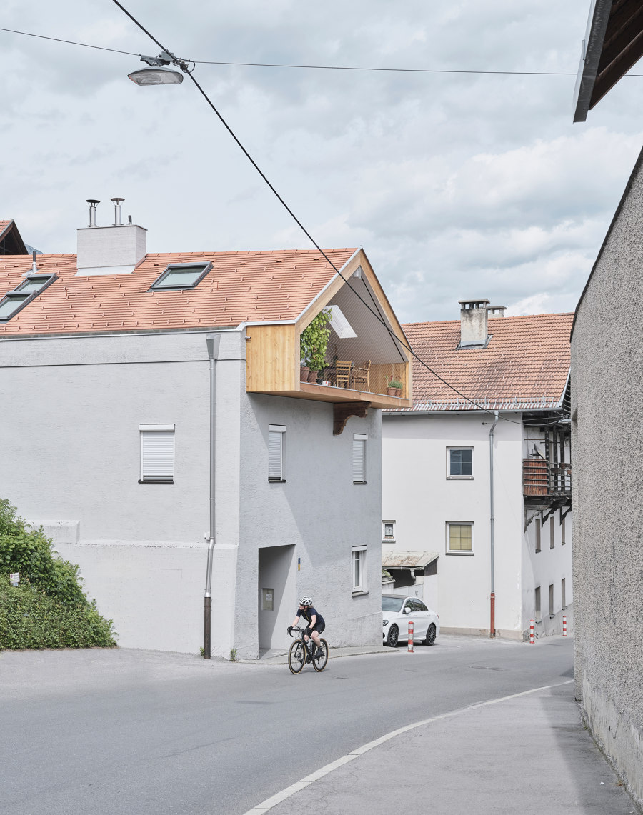
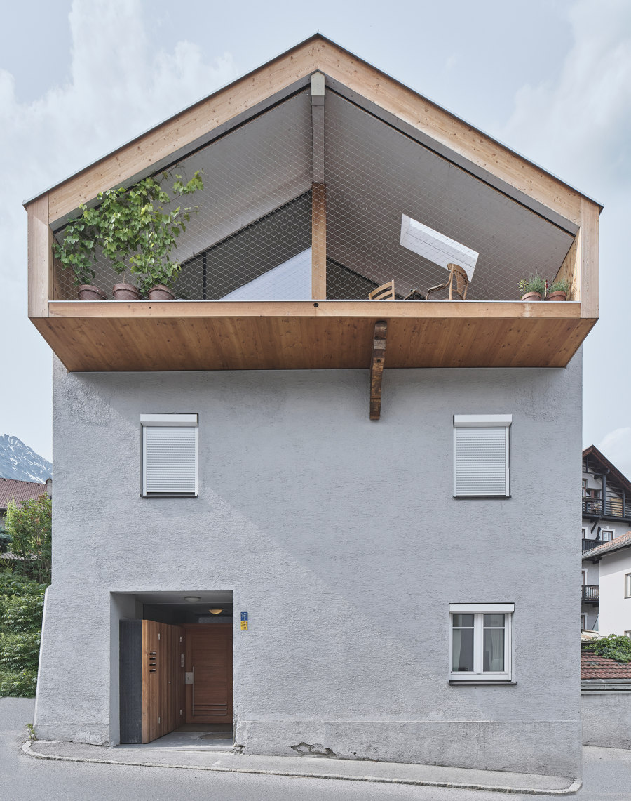
Under He und Du, meaning "hi and you" – a relatively uncommon name for an architecture office – hide Christian Hammerl and Elias Walch, its young owners, whos wit, energy and freshness emanate from their work – projects and their descriptions. The names of the projects are genuinely funny and precise; they named Elias Walch's attic extension "gut drauf", meaning "in a good mood”, but also being a word play in German, referring to something being placed on top.
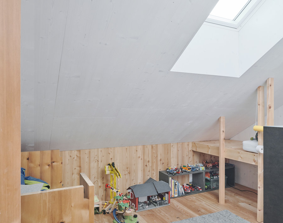
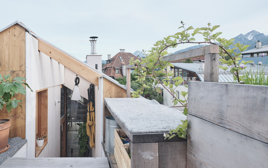
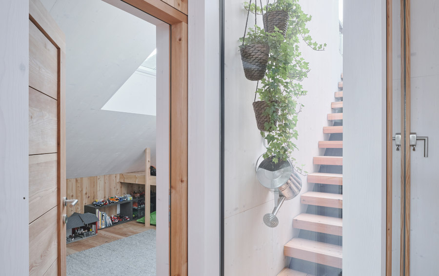
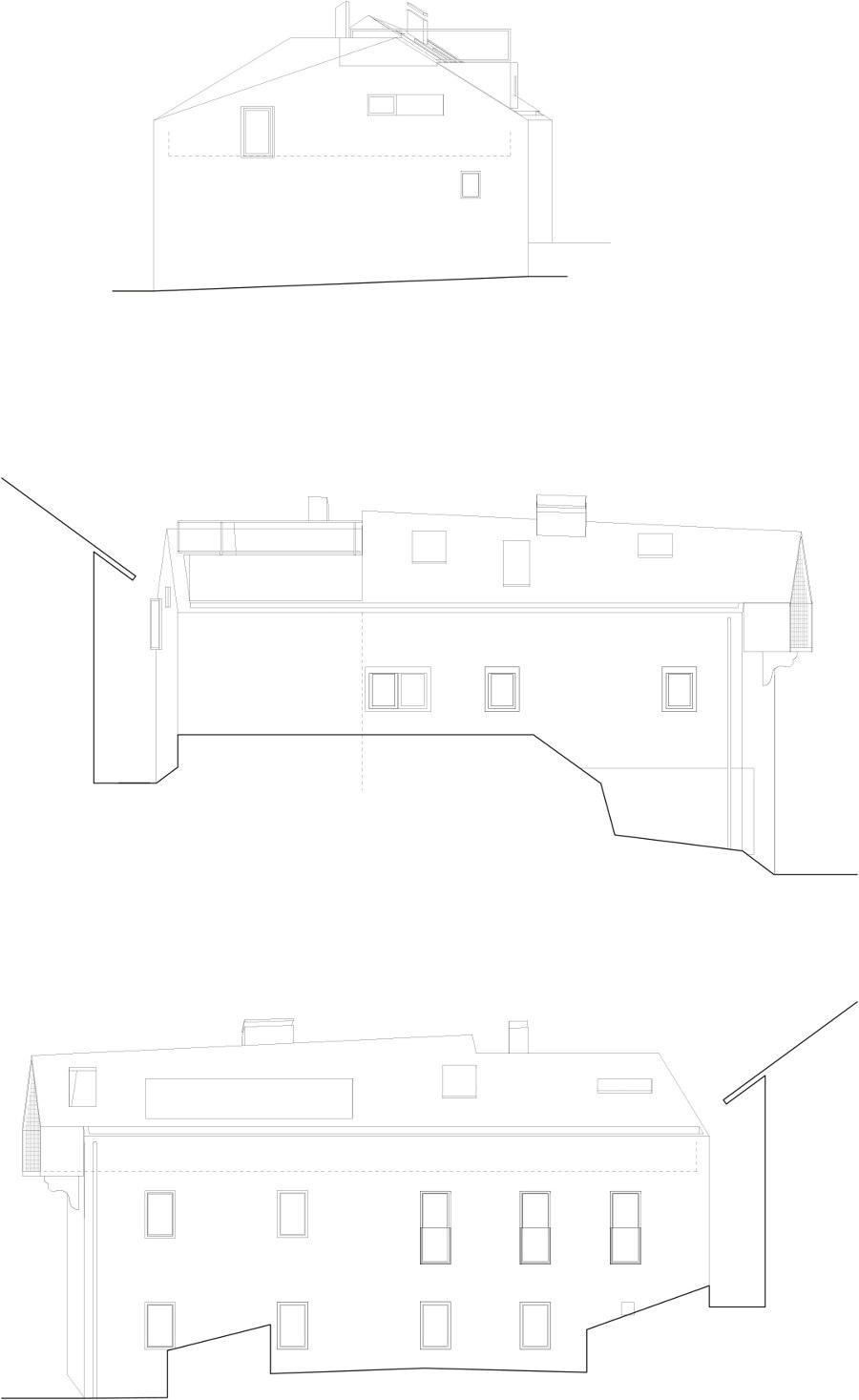
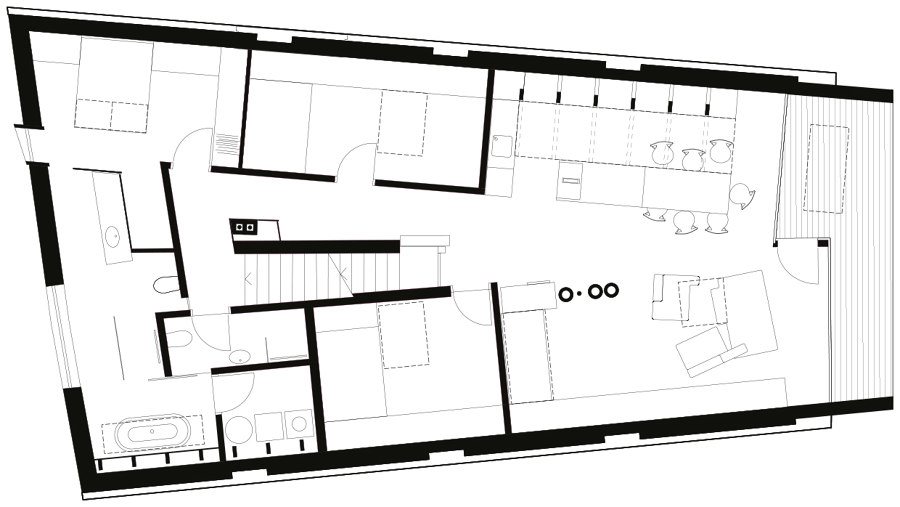
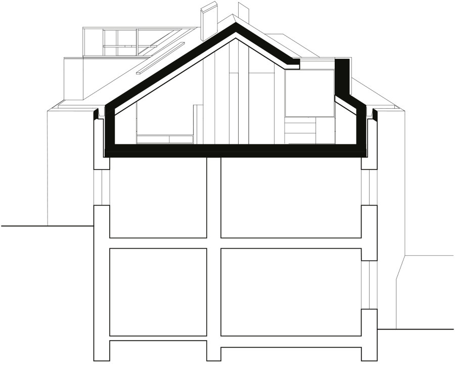
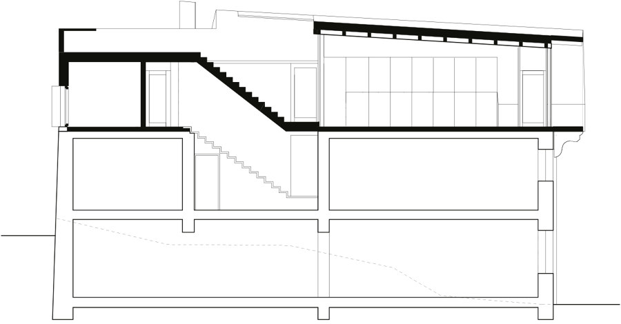
The entrance to the apartment is on the last regular floor of the building; one enters the living space through a bright staircase, which continues up to the roof. An open space – one can see from one side of the building to the other – is divided between a day and a night part. Each bedroom received a large roof window, brightening up space. The openings are located, wherever possible, in corners of the rooms. Such position enhances the quality of daylight thanks to the reflection on the white wall surfaces. In other cases, the location was chosen to enlarge the space beneath – or to enable looking at the stars from bed in the couple's room.
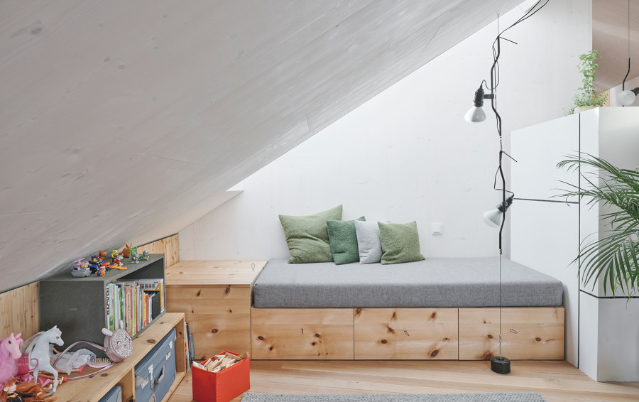
Children's rooms received playful and functional built-in beds and shelves, providing plenty of room to play for the little inhabitants.
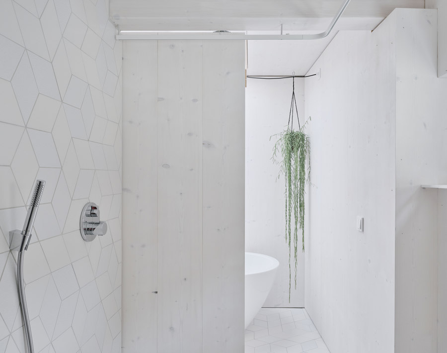
The position of the walls below strongly influenced the layout of the floorplan. Also, ventilation, heating and sewer pipes were set. Still, "Gut Drauf" does not remind of a traditional flat. Not even the bathroom is a closed, dark box, but belongs to the continuous, well-lit space.
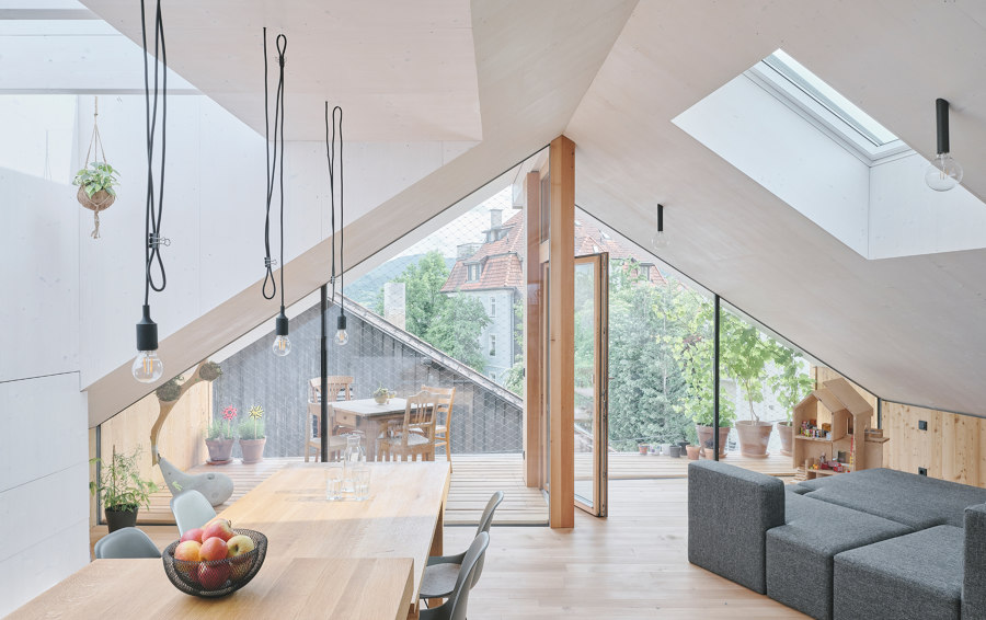
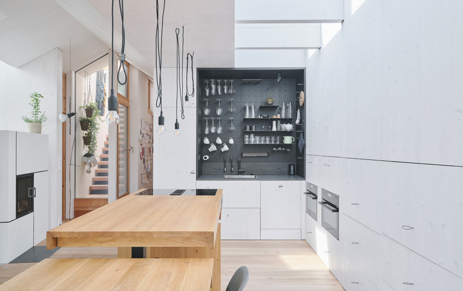
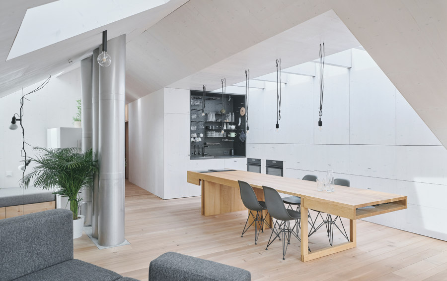
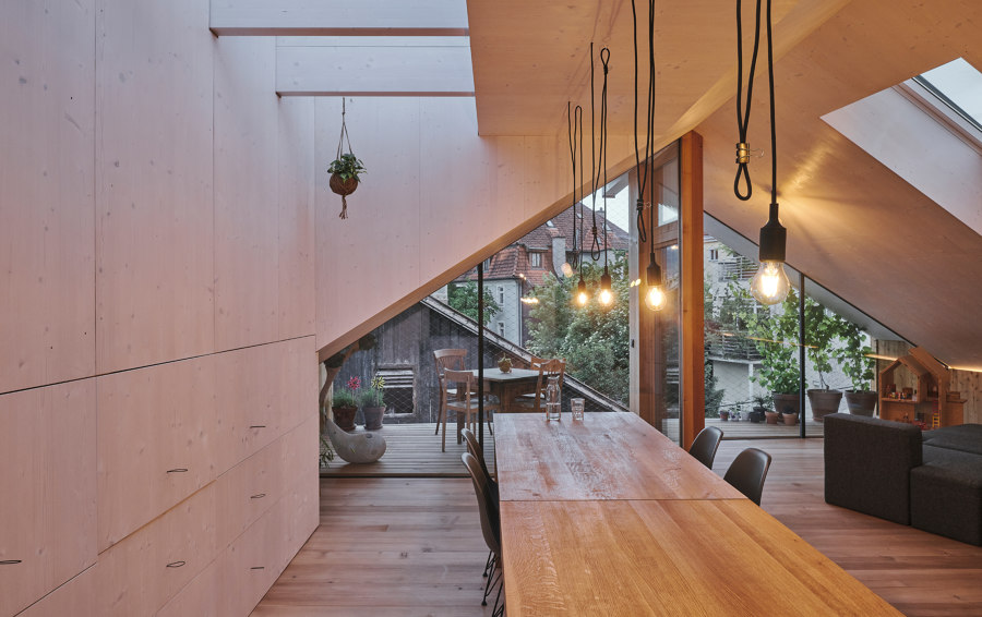
In the day area, space is structured by three pipes coming from below and a fireplace. On the left, looking towards the loggia, under a long dorm window, is the heart of the kitchen: a large, wooden table connected to the stove. An innovative but simple idea to make the stove height-adjustable to match the table allows for celebrating dinners in a big company.
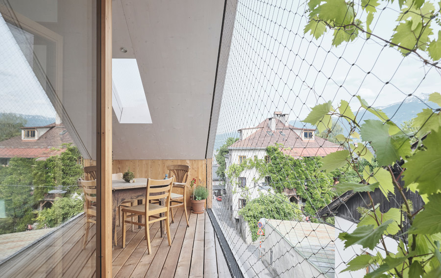
The glass wall to the loggia is divided by a door-wide setback in the middle of the room; this intervention not only enabled to differentiate the size of areas according to their functions but also helped to create the illusion of two rooms being one.
A cosy lounge area on the right side is bathed in sunrays from the window above. In the niche in the back – also just beneath an opening – a day bed, at the same time a guest bed and a quiet spot for reading.
"We definitely have enough roof windows here – including one on the loggia. We placed them along to walls, to reflect even more daylight, in zones, where the room height had to be increased, and in those where we wished for direct sunlight and view towards the stars and clouds. Those placed low enough are manual, the one close to the ridge automated. I can open them from my phone, from the office, and come back to a well-ventilated apartment. It's so easy and comfortable: a little automation gives a lot of advantages.
Architect
he und du, Innsbruck, Austria

Photographe : David Schreyer

Photographe : David Schreyer

Photographe : David Schreyer

Photographe : David Schreyer

Photographe : David Schreyer

Photographe : David Schreyer

Photographe : David Schreyer

Photographe : David Schreyer

Photographe : David Schreyer

Photographe : David Schreyer

Photographe : David Schreyer

Photographe : David Schreyer

Photographe : David Schreyer

Photographe : David Schreyer

Photographe : David Schreyer

Photographe : David Schreyer

Photographe : David Schreyer

