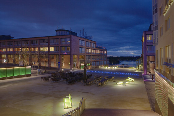
Nacka Strand is located some 10 kilometers out from Stockholm. It was mainly built in 80’s following architect Nyren’s plans. Nacka Strand has some 200000 sqm of offices and housing and it is regarded as one of the good examples of 80’s architecture. The site is great, located to a beautiful slope opening to sea. “I was so happy to have this chance to go there and have a look”, Vesa Honkonen tells. “For me it is important to feel the place, since I believe that where ever there is a problem, the solutions are already there, you just have to be able to feel and see it”.
The view from this place was great, opening to the sea, even the surrounding architecture was fine. But what had happened during these 25 years? So many new details added to this space, to this emptiness. So many light poles, one of them straight in the middle of this great view, mailboxes, signs, bollards. Vesa’s proposal for AP Art Group was following: he wouldn’t have done an art piece since this place had lost its nature and image. He would have done, on the contrary, a sketch showing how it was necessary to work with the whole place. They accepted his proposal and he started to work.
The place had a strong flow, Space was flowing in from the entrance road, through this place and then finding its way to the sea. All these small added urban details were stopping the flow, instead of working with it. Vesa had to get rid of them. One big problem was that this small place was taken over by the cars. A small road divided this place in two and this feeling was strengthened with two different types of bollards. Message was clear, but what was weird, there was not so much traffic on this road. There were much more pedestrians.
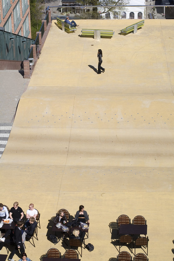
Vesa also felt that the form, the day time exposure has to have the movement of flow through the space. This is why the surface of this place started to wave like a beach sand, it started to see the forms of dynes. These dynes took the role of bollards, telling to cars and pedestrians where to go. But this time the message was different. It is the people who own the place. Cars are visitors and they have to be aware. Cars got a path through the place, driving in a valley. The slopes of the valley will glitter with starry lights. The flow of the space got another exposure as well. Light walls started to flow through the space, guiding the flow of emptiness. This place must not have any light poles. All the light has to be part of the place.
This place now got the following elements:
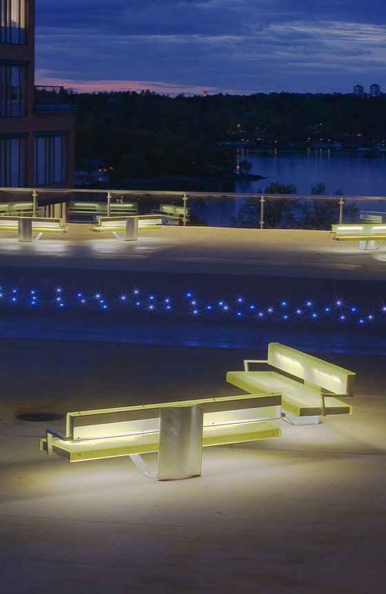
light hills guiding the movement with twinkling led lights;
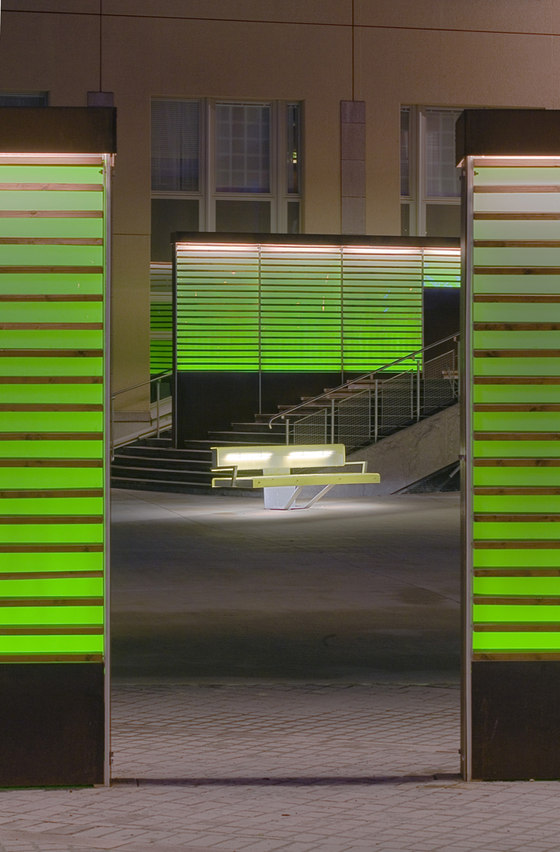
light walls guiding the flow and acting as main light sources - all the information, signage are integrated to these walls;
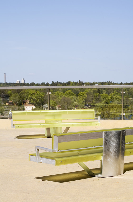
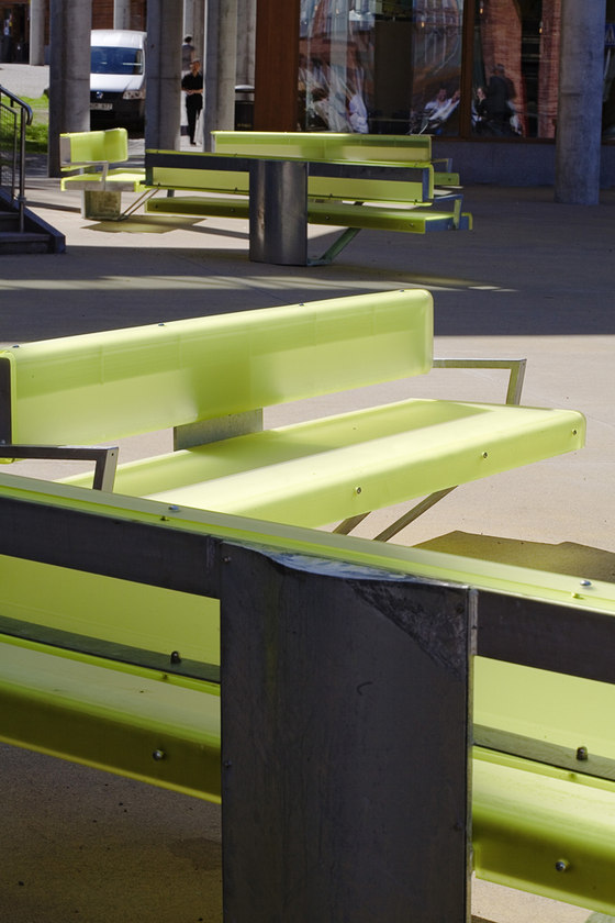
light benches, acting as benches and as lighting fixtures as well.
Square is made out of cast in site concrete. Benches have acrylic seats and steel frame. Light walls are at the same time space dividers and fixtures. Old ramp to garage is also covered with Light Walls. Al the lighting is DMX controlled, which means light can follow music.
AP Fastigheter
