Museum piece: David Chipperfield Architects’ new Zurich Kunsthaus extension
Texte par Alun Lennon
13.01.21
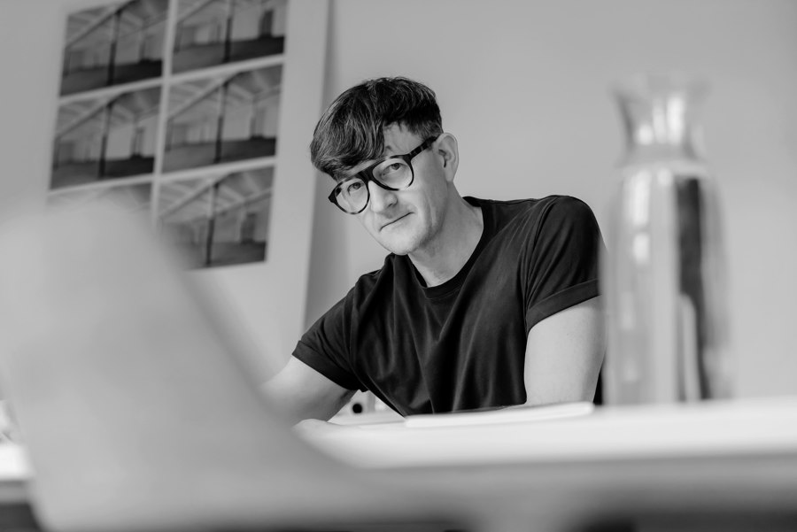
Like what you see? Jan Parth, project architect responsible for delivering David Chipperfield Architects’ latest cultural project, talks about the soft power of hard facades.
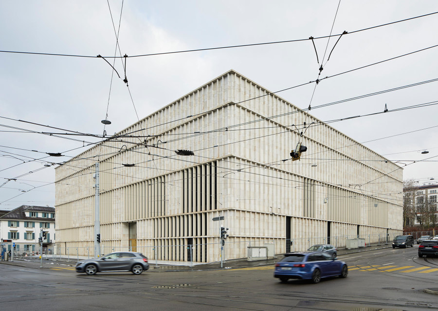
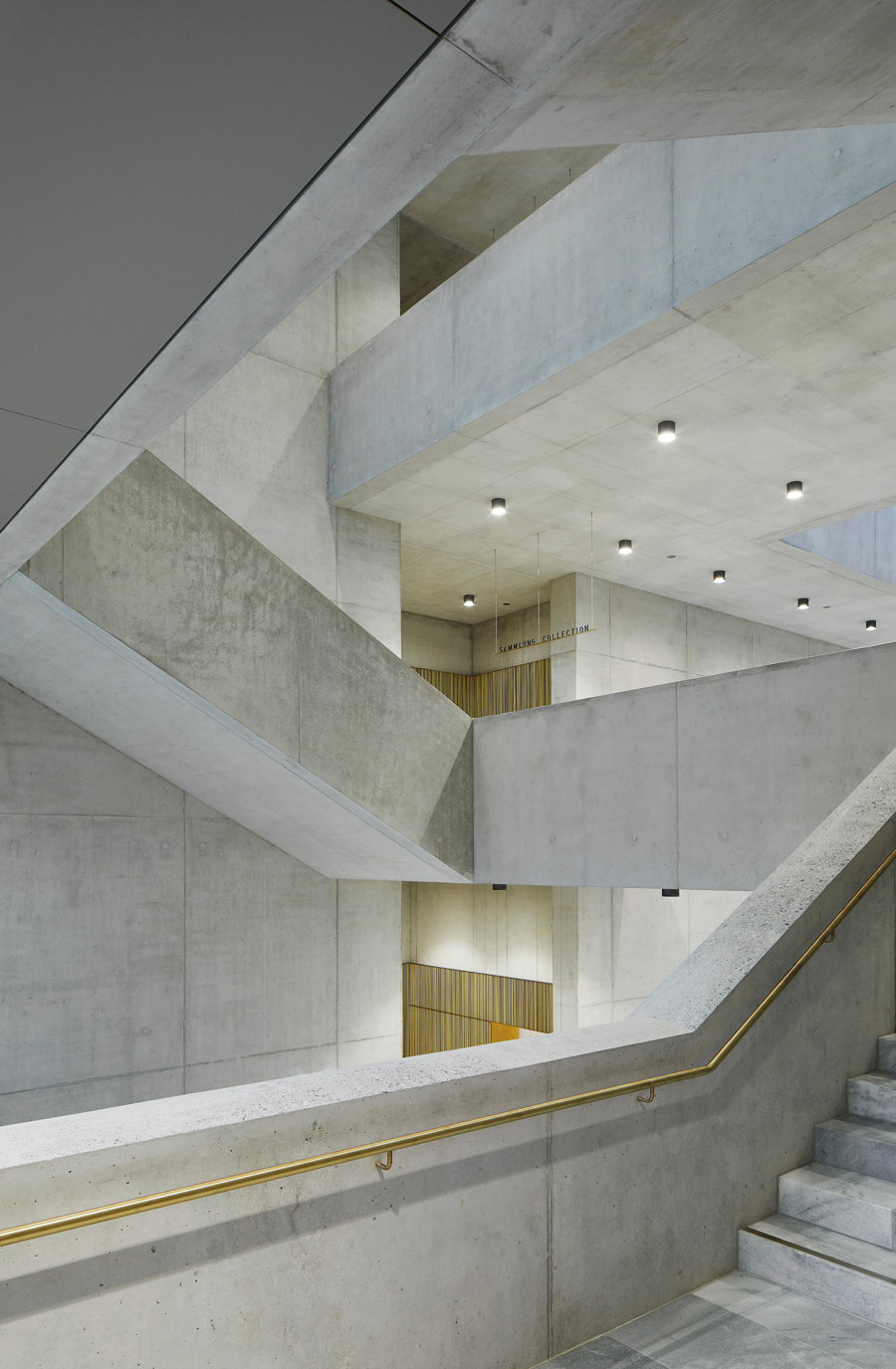
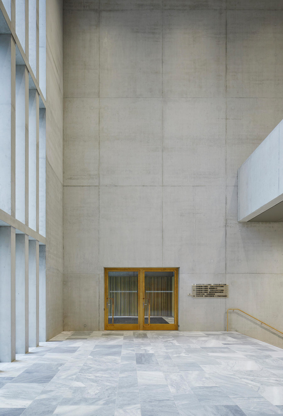
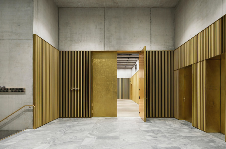
Zurich has a new actor on its cultural stage, in the form of David Chipperfield Architects’ non-contiguous extension to the city’s hallowed Kunsthaus, making it Switzerland’s largest art museum.
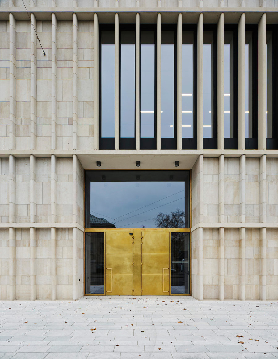
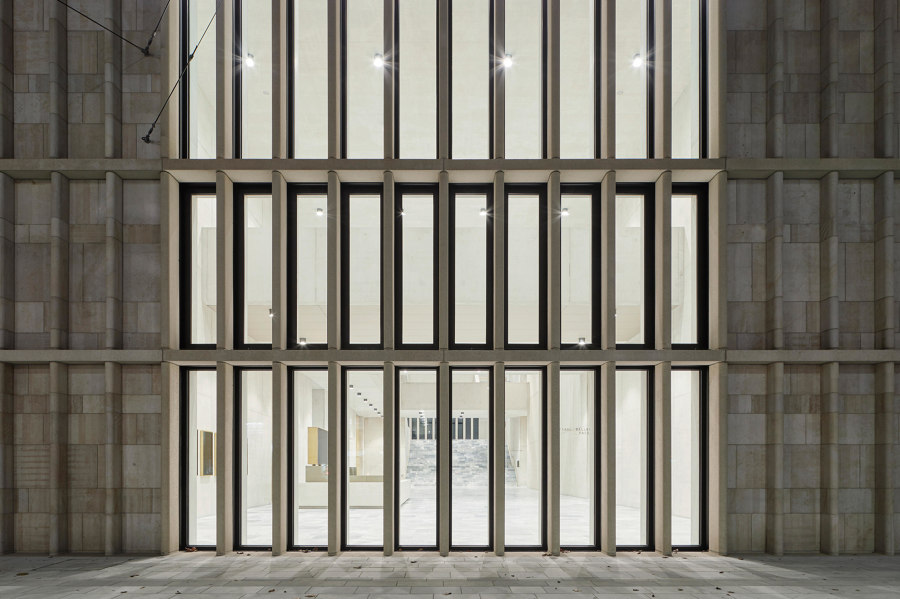
If – as project architect Jan Parth, who oversaw the project’s realisation on the ground, suggests – ‘facades can create distance or extend an invitation,’ then the latter is writ large here. Predominantly constructed of Swiss limestone and with a rib-like expression in terms of its formal articulation, the structure’s outer skin does what Parth says facades do best. Communicate ideas and convey information, yes. But also generate emotions.
Is it fair to say that the new Kunsthaus 'extension' is, before even entering the building, recognisably Chipperfield?
Our motivation in the design process was to develop the best building not only for art, but for the city of Zurich and its residents and visitors. In designing the new building, we started from the place where it was to be built and its urban context. We oriented the architectural form, the facade design and the materiality on the existing building and its surroundings, and by utilising what had previously been a vacant site, we have added to the completion of the city. This approach is certainly characteristic of our office's work.
How exactly does the project's facade dialogue with its context – both physical and cultural?
The museum's facade responds directly to its urban and architectural surroundings. On the one hand, its south facade forms the fourth (and hitherto missing) side of Heimplatz, thus giving it an urban clarity. Secondly, we have used the facade materials found on the neighbouring buildings, especially limestone. This material directly relates the extension to its historical urban context and especially to the existing Kunsthaus building.
Was there any particular innovation or engineering challenge involved when it came to the design and implementation of the new Kunsthaus ‘extension’?
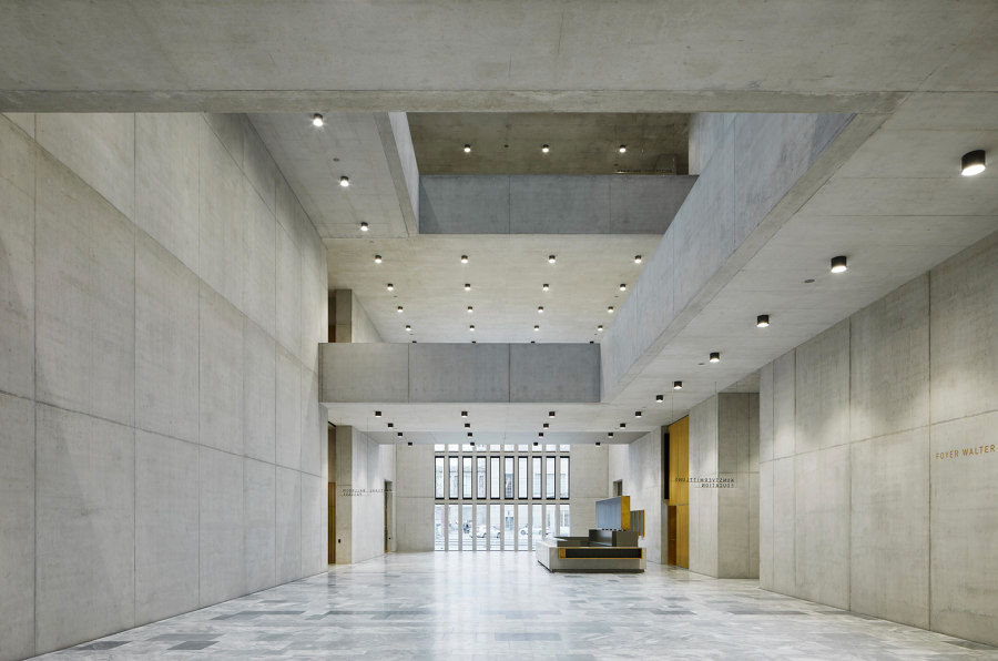
Even when the project started in 2008, it was a requirement of our client to plan according to the guidelines of the 2000-watt society. What that meant for a museum building first had to be clarified – specifications for this type of building category did not exist at that time. This presented us with the challenge of looking for new ways. One example is the recycled concrete used. The building also had to be designed to be earthquake-proof, which was quite complex in some areas.
And does sustainability represent an essential element of the outer shell?
The most sustainable way to build is not to build at all. But in order to make a new building as sustainable as possible, it is our task to use materials that are durable and long-lasting. They should be produced or mined regionally and ideally be able to be returned to the material cycle. For the facade of the Kunsthaus, we opted for traditional construction methods. The Swiss Jura limestone was worked in handcrafted quality and solidly bricked up. We designed and planned the Kunsthaus extension as a long-lasting building, yet almost all the main materials used can be dismantled and recycled.
What is the rhetorical value of facades in general? Beyond their utilitarian function, what do, or should they, say or represent?
A building communicates through its facade: it tells us about what is taking place behind it. It provides information about its use and, in the best case, generates emotions. Facades can create distance or extend an invitation – as in the case of our Kunsthaus extension.
Kunsthaus photos: © Noshe
Portrait photo: © Marion Schönenberger for David Chipperfield Architects
© Architonic
