So materialistic!
Texte par Alun Lennon
06.05.20
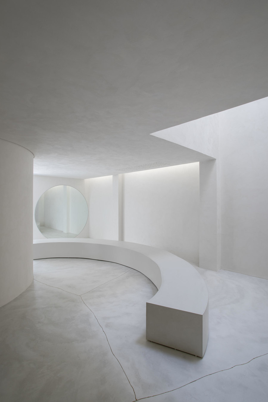
Confident material choices in retail projects have the power to transform shop spaces into ultra-haptic, visually rich environments that no amount of e-commerce trickery can match.
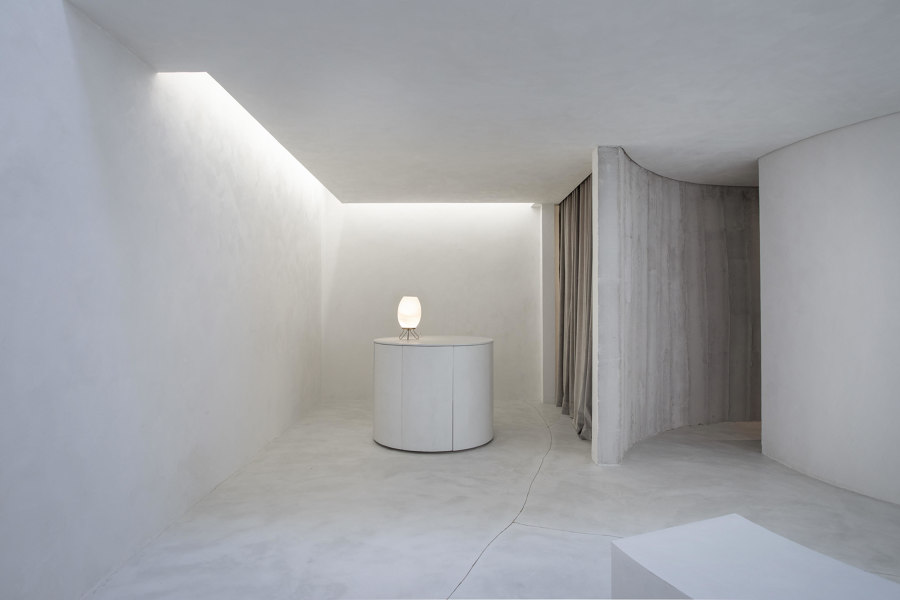
MNMA Studio's project for handmade shoe brand Selo utilises cement slates and frameless glass to reflect São Paulo's urbanity. Photo: André Klotz

MNMA Studio's project for handmade shoe brand Selo utilises cement slates and frameless glass to reflect São Paulo's urbanity. Photo: André Klotz
×Our latest survey of new retail-design projects illustrates how certain interior architects and designers are deploying materials to powerful effect, amplifying their clients’ brand philosophies and values. Let’s go shopping...
01
Ace & Tate, Antwerp
Antwerp, Belgium
2020
Project by Plasticiet
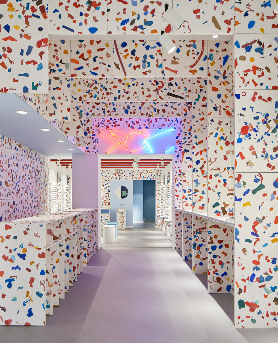
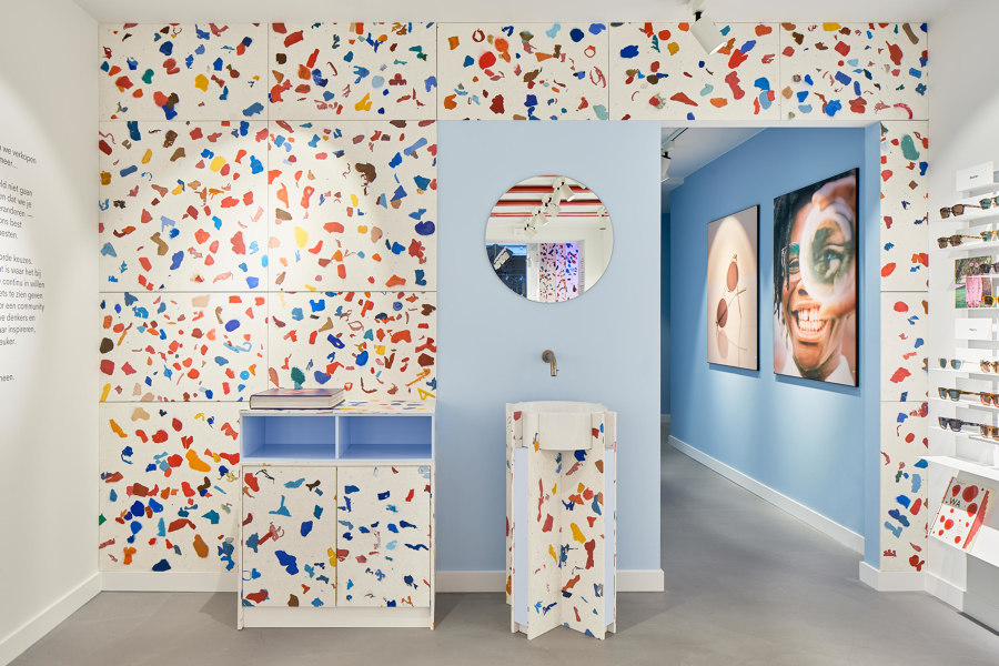
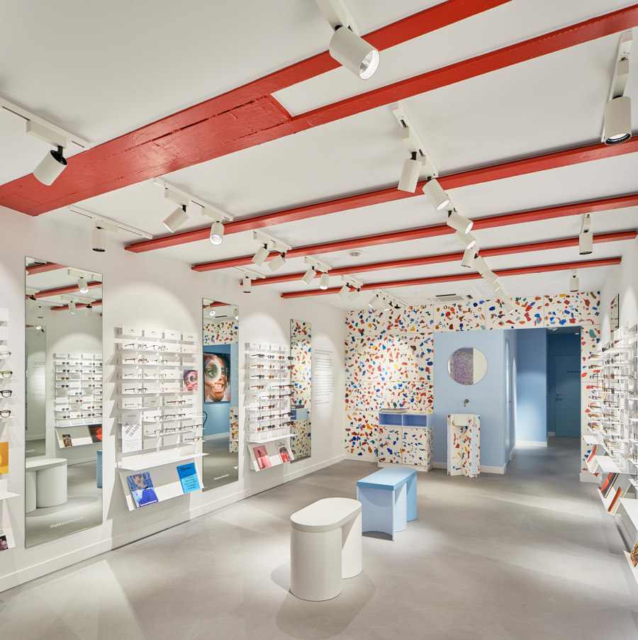
The recycled plastic used for Plasticiet’s Ace & Tate store in Antwerp is polyethylene, a common material that finds many uses in industrial and construction appliances, as well as in domestic products such as food packaging, kitchenware and toys. All the coloured chunks visible in the store were collected from the bulky waste sites around Antwerp and separated from other types of plastic by a machine developed by project partners Suez. The polyethylene was shredded into large pieces that were then hand-sorted into red, blue and orange, colours that are often used in the visual expression of Ace & Tate. Photos: Lennart Wiedemuth
...
02
Selo Shoe Store
São Paulo, Brazil
2019
Project by MNMA Studio
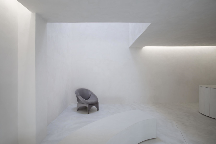
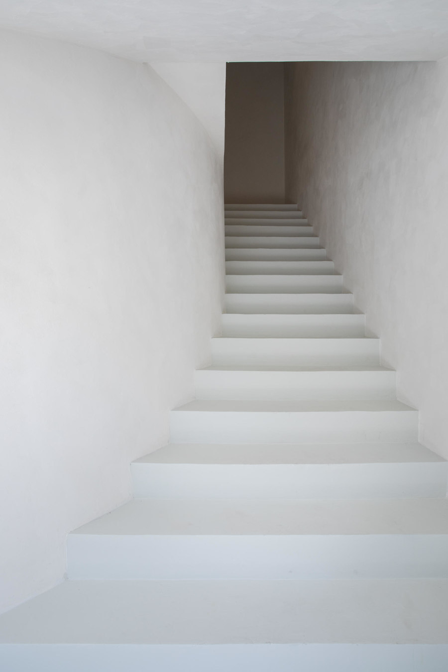
The 100 square-metre retail restoration project for Selo brand of handmade shoes inspired MNMA studio to create a kind of brief escapism atmosphere. MNMA desired to create a visually clear facade as an attitudinal contrast to the chaotic city of São Paulo. The choice of cement slates and frameless glass reflects urbanity but in order to achieve some lightness, it was pigmented to detach it from its surroundings. Photo: André Klotz
...
03
Nanso
Helsinki, Finland
2020
Project by Studio Joanna Laajisto
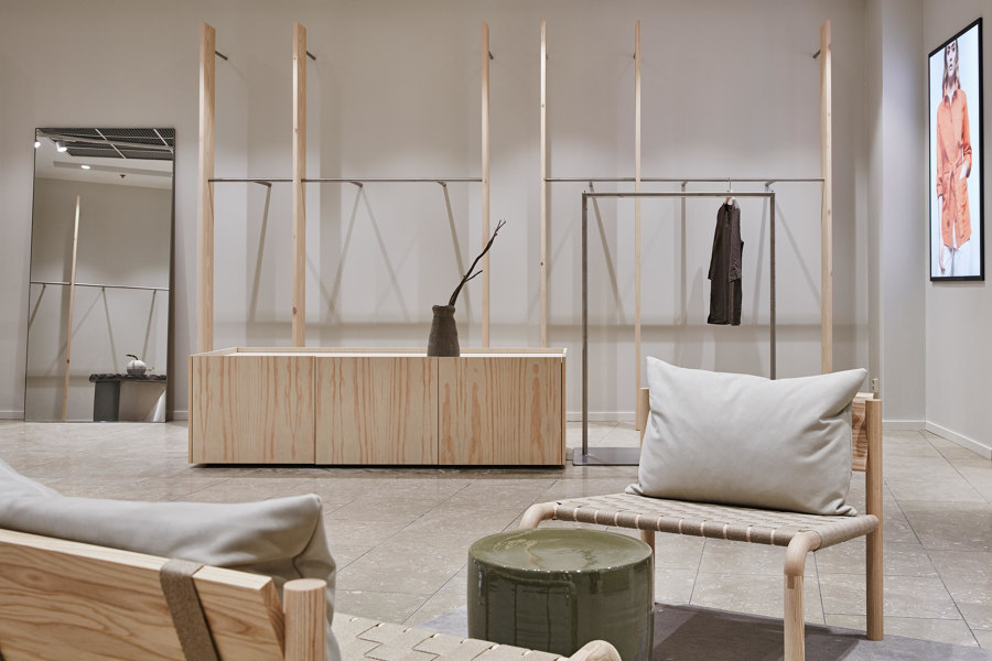
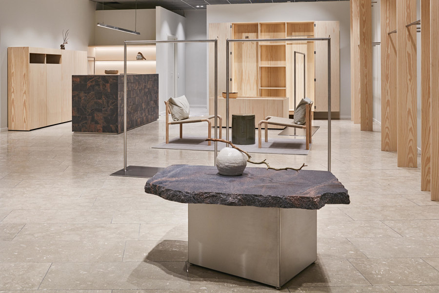
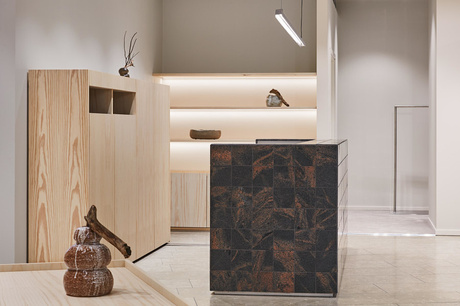
Finnish fashion brand Nanso’s new store concept by Studio Joanna Laajisto was built with simple and honest elements that are custom to Finnish everyday life. Locally sourced pine wood planks, linen and red granite from a small Finnish town called Mäntsälä were natural choices. The interior was designed to stand the test of time, a testament to the values of both the Laajisto and Nanso brands. Photos: Mikko Ryhänen
...
04
The TerraMater Store
Amritsar, India
2019
Project by Renesa Architecture Design Interiors
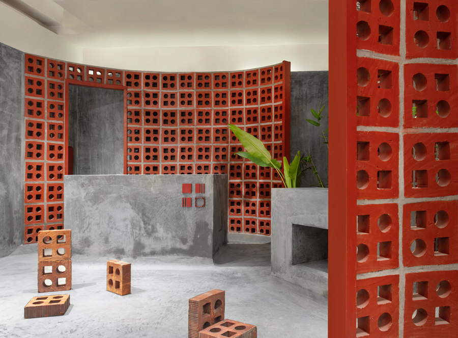
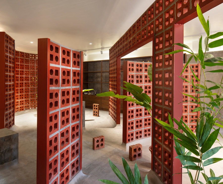
For their project for the TerraMater Store, Renesa steered away from the traditional showroom approach and instead sought to contextualise the space as a gallery that provides the consumer with an experience of viewing the products by presenting them in an engaging setting. The design is such that it allows the customers to interact with the products through the various pockets created and get a sense of their inherent quality. Photos: Niveditaa Gupta
...
05
Geijoeng Concept Store
Shenzhen, China
2019
Project by Studio 10
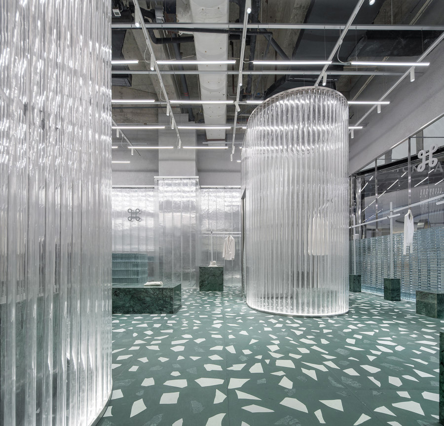
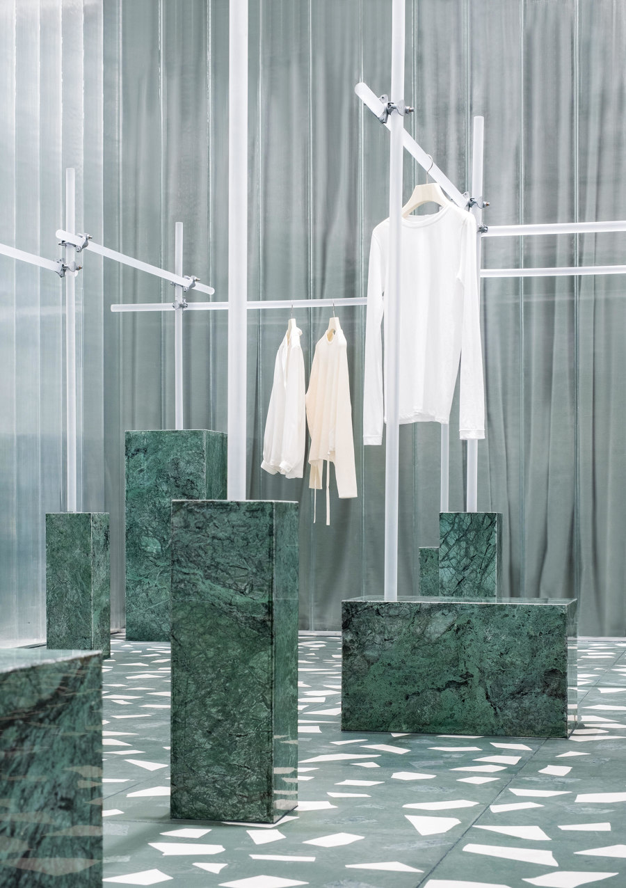
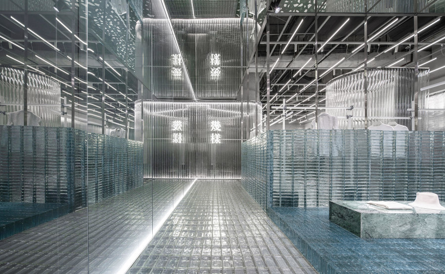
The interior design of the Geijoeng Concept Store by Studio 10 explores the interactivity between materials, light transmission, refraction, reflection, and fabric. Through the use and layering of reflective, translucent and transparent materials combined with a green velour curtain from Kvadrat/Raf Simons and calibrated artificial lighting, Studio 10 have created a rich spatial hierarchy and ghostly spatial dimensions that coincides with Geijoeng’s minimalist and euphoric essence. Photos: Chao Zhang
© Architonic
