GROHE is just going in circles!
Brand story by Barbara Jahn-Rösel
Wien, Autriche
19.03.20
Call it reduced, call it elegant, call it eternal. Find out why GROHE embraced the circle for its Atrio collection.
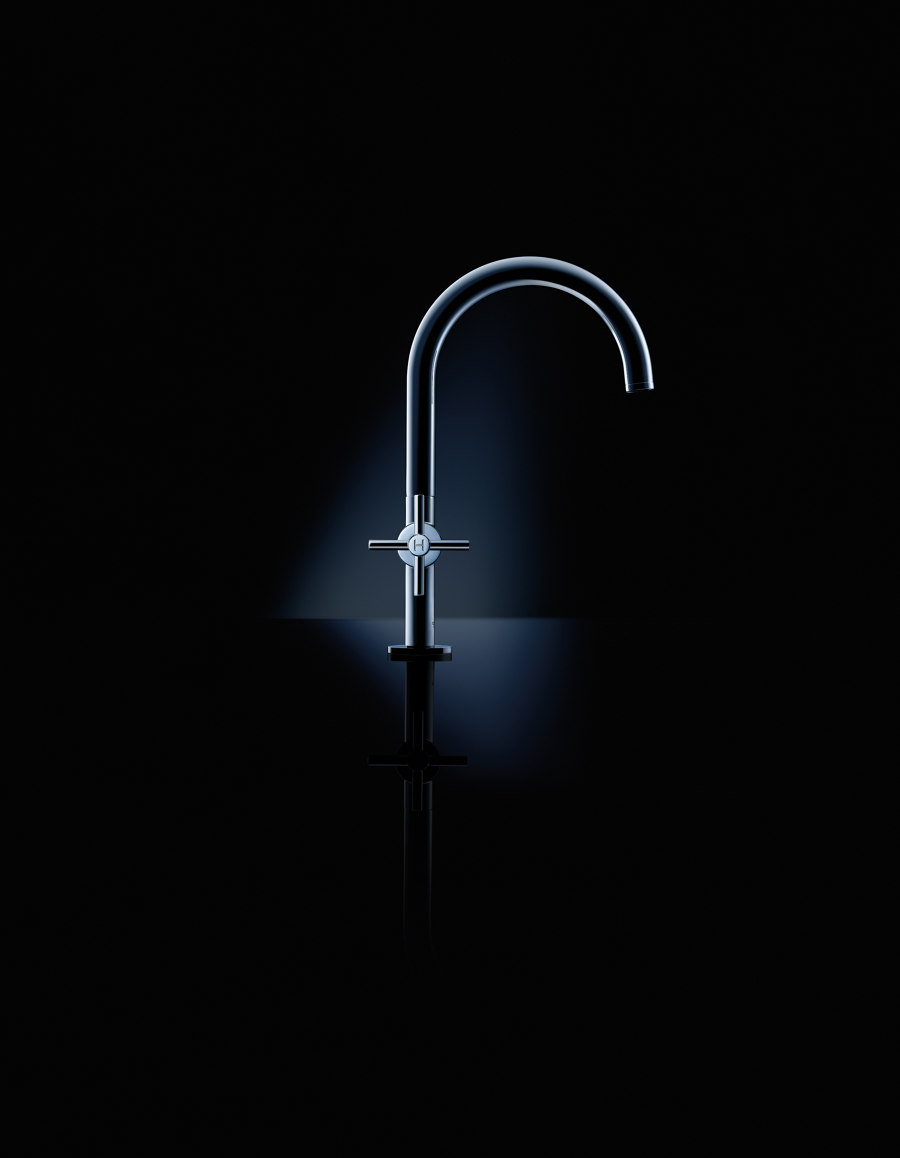
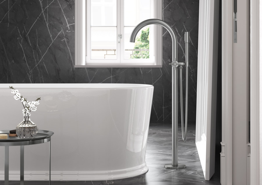
Hard to beat. The GROHE Atrio fitting uses classic geometric shapes with radius and right angles and, despite its formal sobriety, looks sensual, elegant and beautiful. Water doesn’t flow any better than this

Hard to beat. The GROHE Atrio fitting uses classic geometric shapes with radius and right angles and, despite its formal sobriety, looks sensual, elegant and beautiful. Water doesn’t flow any better than this
×Mocking tongues are thought to have once said, ‘If the architect knows nothing, he draws a circle.’ This perhaps expressed more about the person saying it than anything else – a crude attempt to deceive about their own ignorance. For the circle is so perfect in its form that there is almost nothing more inspiring for a designer than to include it in their designs.
And with Atrio, this is indeed what German company GROHE did – and with the knowledge of how to skillfully utilise the perfection of this simple geometric figure. This iconic fitting was reworked as recently as 2018 – a bold, but by no means reckless, step. So, no design experiments, but rather an intensifying and elevation of the already–existing original elegance and aesthetics. Characteristic and yet eclectic, Atrio can be used in all bathroom scenarios. Its familiarity, of course, scores points: the classic and style-defining cross handles, which give the entire fitting a special centre of gravity, and the upwardly stretched barrel, which flows into this perfectly proportioned circular shape, ending there with a precisely seven-degree sloping spout.
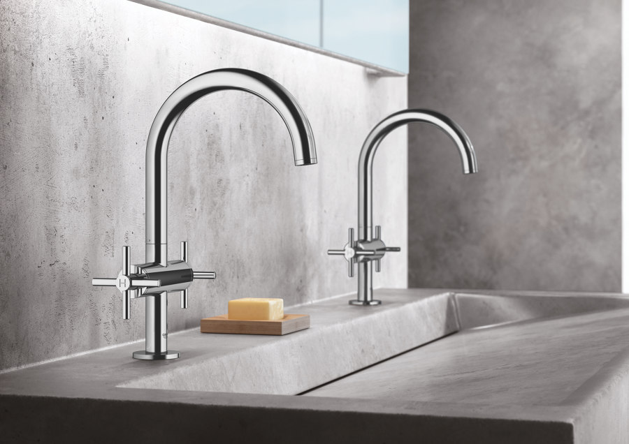
Surprisingly different. Although its shape dictates very clear lines, GROHE Atrio can be adapted to individual situations. It does this with colour, which makes the tap appear completely different depending on the scenario

Surprisingly different. Although its shape dictates very clear lines, GROHE Atrio can be adapted to individual situations. It does this with colour, which makes the tap appear completely different depending on the scenario
×And what is it that could be added to such a meticulously created design without taking away the nobility of its precision? One thing. Colour – which holds the potential to decisively change the appearance without destroying it. SuperSteel and Brushed Hard Graphite, for example, were chosen to give architects more choice for even greater individualisation of the bathroom. Atrio is also one of those designs that you probably never get tired of – simple, minimalist and timeless. And with that, we come full circle – time is, after all, also infinite.
© Architonic
