Retail Detail: 10 outstanding store designs – Part I
Texte par Christian Kuhn
Berlin, Allemagne
13.08.16
When the going gets tough, the tough get shopping. Architonic offers you 10 of the best retail-design projects internationally to have opened their doors recently to customers in search of unique in-store experiences.
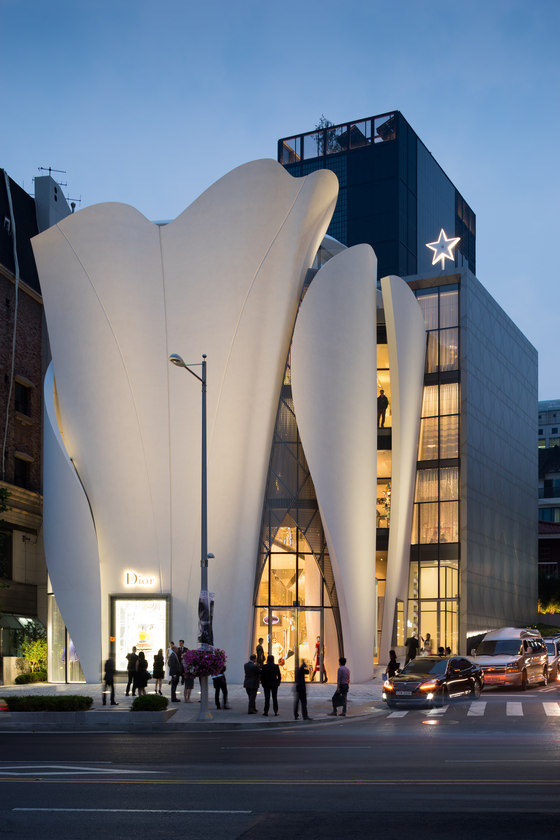
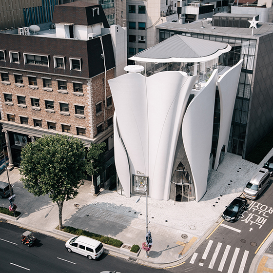
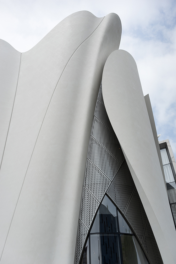
Christian Dior Flagship, Seoul, Korea. Photo: Nicolas Borel
An effective retail-design concept turns a simple shopping experience into a total adventure that addresses the senses at different levels. Touching, smelling, tasting, and testing products in an environment designed to stimulate and inspire imbues the act of consumption with a greater emotional quality. The store also serves as a three-dimensional marketing channel that helps shape and establish a brand identity. Here, the customer is given an opportunity to enter into direct contact with the seller.
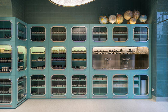
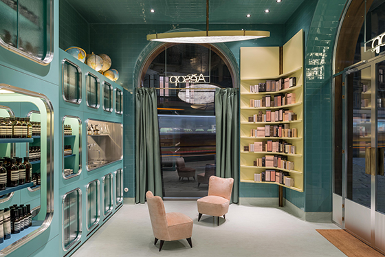
Aesop Corso Magenta, Milan, Italy. Photo: Paola Pansini
With this in mind, we’ve compiled a list of 10 of the world’s most innovative retail projects, by virtue of their underlying concepts, materials, and technical as well as architectural quality. They not only illustrate the possibilities offered by retail design, but also demonstrate the added value of a brand concept, its impact on consumers, and, in turn, its impact on sales revenue.
....
Acne Studios Flagship Store, Seoul, South Korea
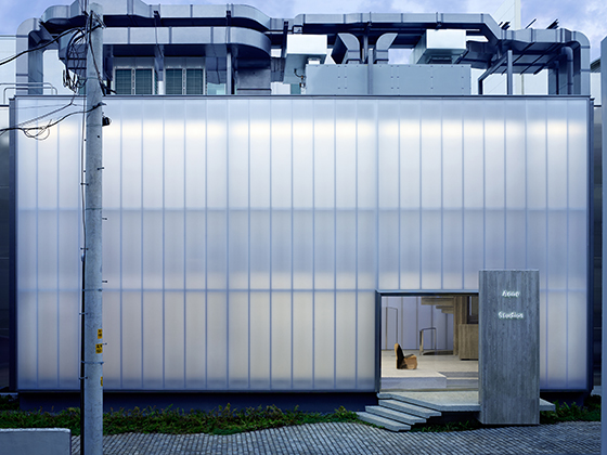
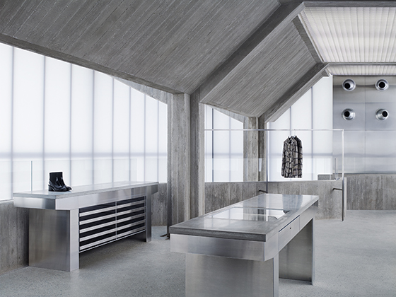
With her design for the Acne Flagship store in Seoul, South Korea, architect Sophie Hicks has created a distinctive project, yet one that is harmoniously integrated within the urban cityscape of Seoul. Typical Swedish discretion and restraint are woven into the overall concept for the store (which opened in 2016), in keeping with the image of the Stockholm fashion label. Hicks emphasised this in her choice of materials: concrete, stainless steel, and glass. The clear lines and planar structures create a relaxed atmosphere.
Acne Studios Cheongdam, Seoul, Korea. Photos: Acne
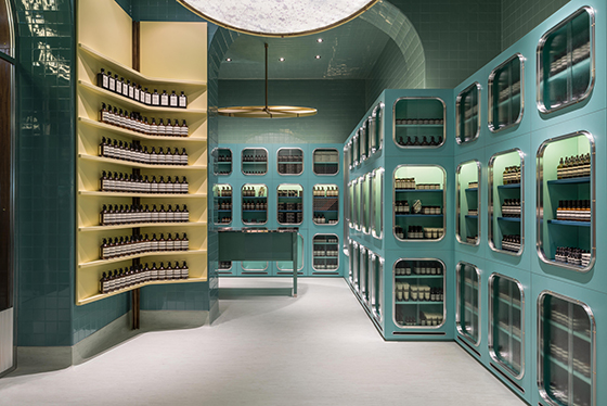
Aesop Corso Magenta, Milan, Italy
Not only has skincare brand Aesop made a name for itself with its high-quality products, it also delights consumers with individual, stylistically expressive shop designs. New stores are emerging all over the world in collaboration with internationally renowned architects and designers. The Aesop Corso Magenta branch in Milan stands out from other shops thanks to its considered use of colour and concept-led interior design. The look of an old apothecary in mint green with a touch of operating-room ambience was realised by Italian office Dimorestudio in 2016.
Aesop Corso Magenta, Milan, Italy. Photos: Paola Pansini
Dior Boutique, Seoul, South Korea
The Dior Boutique building in Seoul, which was designed by Christian de Portzamparc and opened in 2015, calls to mind an oversized flower that reaches imposingly towards the sky or an elegantly flowing fabric. Whatever image it evokes, the Pritzker Prize-winning architect has created an extraordinary building that fits harmoniously into its surroundings despite its dramatic, emotional form.
Christian Dior Flagship, Seoul, Korea. Photos: Nicolas Borel
Maruhiro - Hasami Ceramics Flagship Store, Nagasaki, Japan
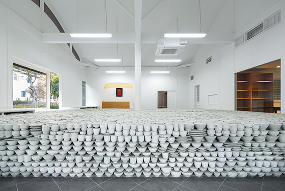
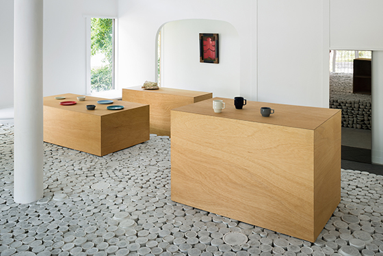
Architect Yusuke Seki has created a new flagship store for the Japanese ceramics manufacturer Maruhiro, which opened in 2015. An expansive installation composed of 25,000 ceramic products (plates, cups, and bowls) cast in concrete lends the space an air of surreality, while making reference, of course, to the company’s products, as well as to the Prefecture of Nagasaki, a region that is famous for the production of ceramics.
Maruhiro - Hasami Ceramics Flagship Store, Nagasaki, Japan. Photos: Takumi Ota
Miu Miu Aoyama Store, Tokyo, Japan
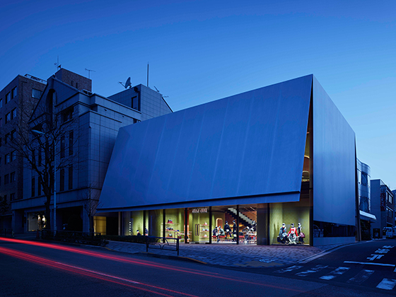
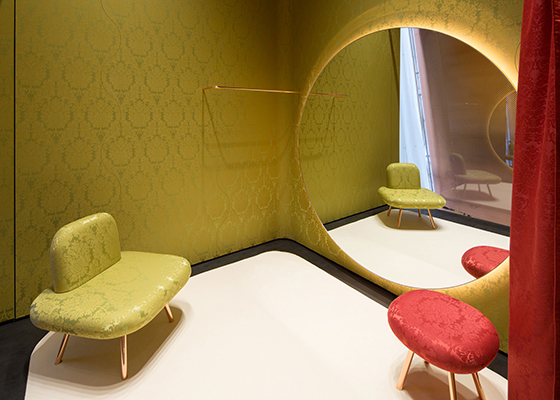
Architects Herzog & de Meuron have realised the Miu Miu Aoyama store across 269 square metres of elaborately designed space in the heart of Tokyo. The impervious outward impression conveyed by the building is mitigated inside by dynamic complementary contrasts of various reds and greens, broadly upholstered furniture, large mirrors, copper-lined walls and a graphic stairway. The scheme as a whole presents a playful, yet charmingly elegant, shopping atmosphere.
Miu Miu Aoyama, Tokyo, Japan. Photos: Nacasa & Partners
© Architonic
