Newly completed market halls that revitalise their urban communities
Texte par Claire Brodka
30.10.23
By bridging not only commercial and cultural functions, but past and present, these four projects from different corners of the world prove that market halls have lost none of their ancient appeal. Featuring: Studio Metamorphosis, RootStudio, Studiolada Architectes and C.M. Chao Architect & Planners.
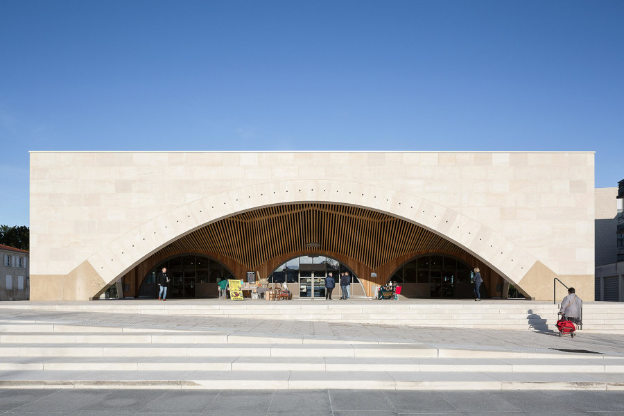
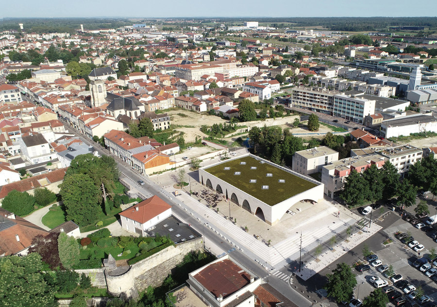
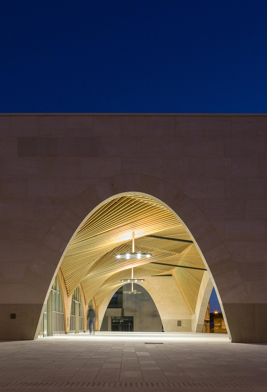
Saint Dizier's Market by Studiolada Architectes is just one 2023 project that revitalises urban communities and anchors its construction in local materials and building craft. Photo: Olivier Mathiotte

Saint Dizier's Market by Studiolada Architectes is just one 2023 project that revitalises urban communities and anchors its construction in local materials and building craft. Photo: Olivier Mathiotte
×Market halls have long held a prominent position in the rich tapestry of architectural history, serving as vibrant hubs for commerce, community and culture. Characterised by their imposing structures and bustling interiors, they have played an integral role in shaping urban landscapes and facilitating the exchange of goods and ideas throughout the centuries.
Market halls stand as a testament to the enduring synergy between architecture, economic activity and the social fabric of society
From ancient agoras and bazaars to the grand marketplaces of the Renaissance and the modern-day food halls that have undergone a renaissance of their own, market halls stand as a testament to the enduring synergy between architecture, economic activity and the social fabric of society. These four newly completed projects from around the globe are proof that the highly specialised structures have lost none of their appeal – and exemplify how they can revitalise communities by bridging commercial and cultural functions as well as the past, present and future.
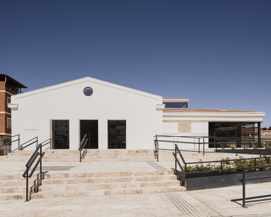
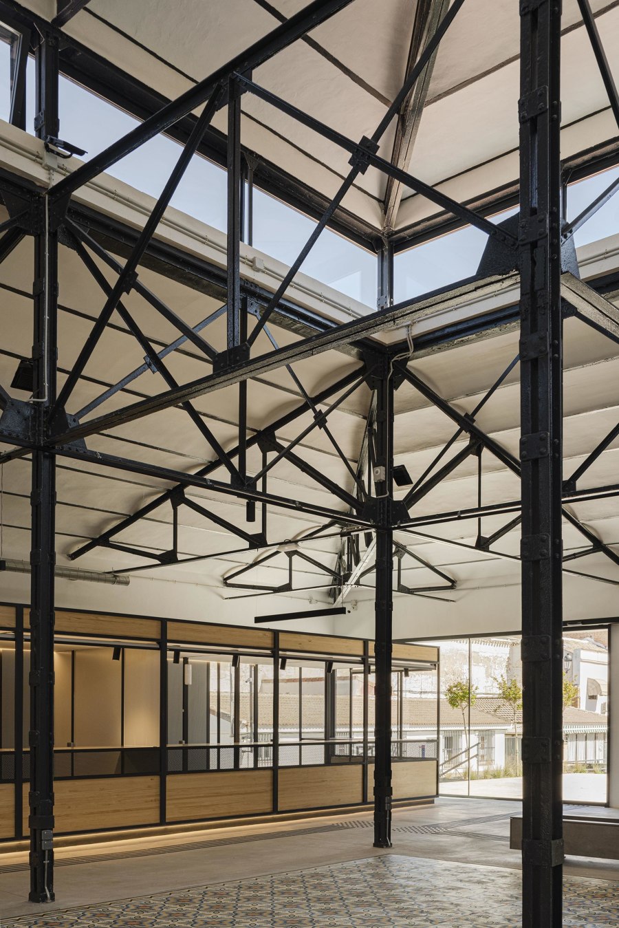
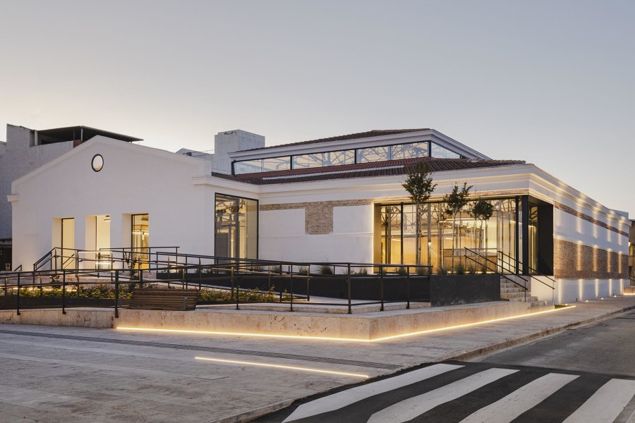
Abastos Market by Studio Metamorphosis uses newly constructed ramps to facilitate building access both during the day and night (bottom). A mosaic hydraulic tile carpet (middle) highlights the center of the new interior. Photos: David Zarzoso

Abastos Market by Studio Metamorphosis uses newly constructed ramps to facilitate building access both during the day and night (bottom). A mosaic hydraulic tile carpet (middle) highlights the center of the new interior. Photos: David Zarzoso
×Abastos Market in Tomelloso, Spain, by Studio Metamorphosis
Located right in the centre of the old Manchegan city, the historic market hall of Abastos was recently restored to its former glory by Studio Metamorphosis. While keeping with the building's legacy as a hub of commerce, the architects also wanted to create 'a more versatile space that was updated to the 21st century, where a multitude of cultural activities could be carried out in addition to being a gastronomic and commercial space.'
Their approach: connecting the exterior market square and indoor hall through a series of new ramps and platforms that showcase the local Almagro stone and increase accessibility and wayfinding. A user-centric mindset also governed the design of the 27 indoor stalls, arranged as flexible modules and surrounded by a metal structure that integrates into the original building to visually connect past and present. Natural pine wood is added as a warmer material, also present in the interior furniture.
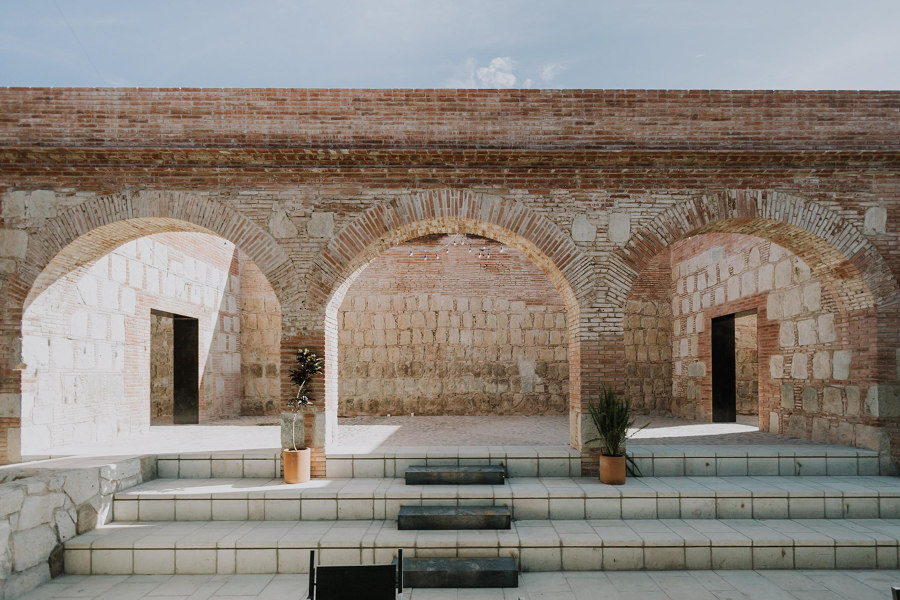
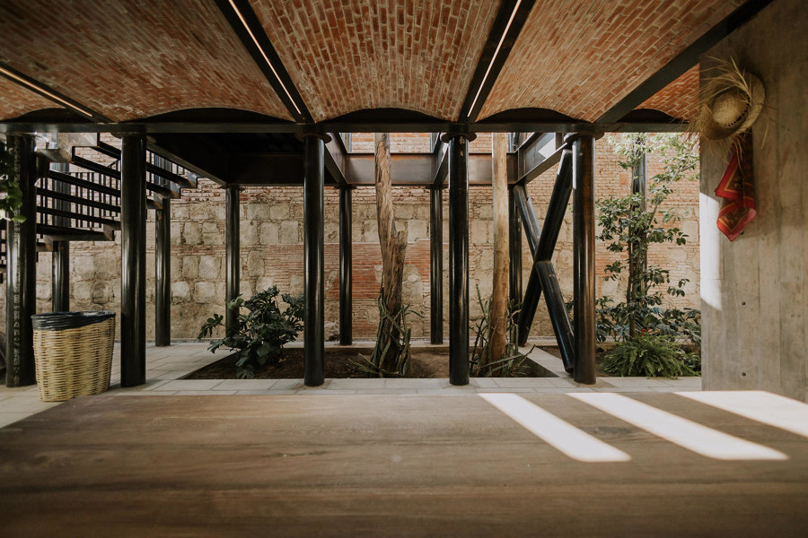
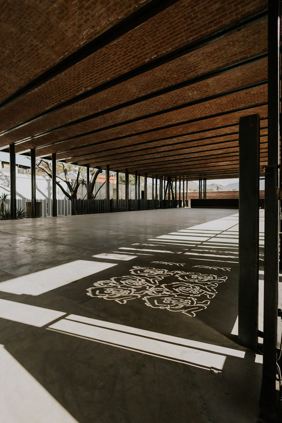
The Gastronomic Center of Oaxaca takes inspiration from the existing conventual architecture, the rich local culinary legacy and endemic materials in one of the largest commissions in Mexico by RootStudio. Photos: Lizet Ortiz

The Gastronomic Center of Oaxaca takes inspiration from the existing conventual architecture, the rich local culinary legacy and endemic materials in one of the largest commissions in Mexico by RootStudio. Photos: Lizet Ortiz
×Oaxaca Gastronomic Center in Oaxaca, Mexico, by RootStudio
Another historic building elevated by a new metal structure is Oaxaca Gastronomic Center by RootStudio. The 16th century convent of Carmen Alto was restored using 'traditional construction techniques and materials such as lime, brick, wood and green quarry stone, respecting the original materiality and recovering the architectural layout', explain the architects.
Accessibility was paramount, along with the elevation of local talent in the structure's interiors
New steel elements and a solar system were added to the property as a way to integrate modernity into the educational and multidisciplinary space. Accessibility was also paramount, along with the elevation of local talent in the structure's interiors, where the production of custom furniture as well as wall art was entrusted to Oaxacan master carpenters and artists. The result is a 'versatile place that stimulates community integration and harmonises with areas for education and an exhibition area.'
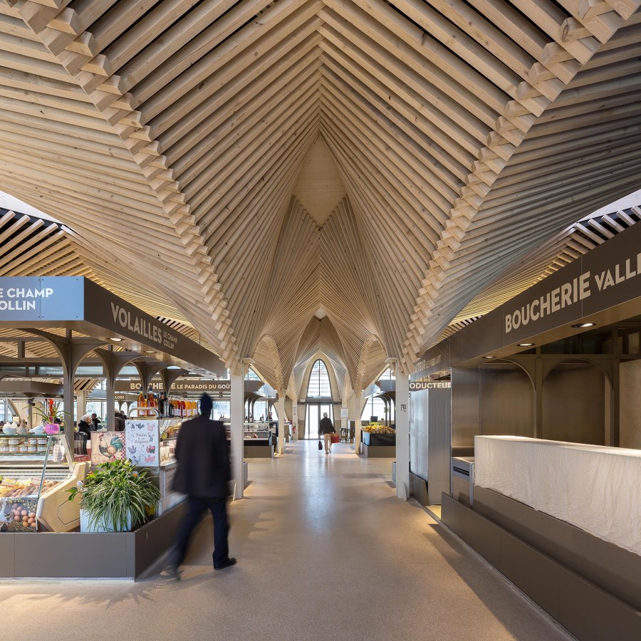
The stone facades (top, middle) of Saint Didier's Market stabilise the metallic grid along the longitudinal axis, while its green roof (top) references surrounding nature. Photos: Olivier Mathiotte

The stone facades (top, middle) of Saint Didier's Market stabilise the metallic grid along the longitudinal axis, while its green roof (top) references surrounding nature. Photos: Olivier Mathiotte
×Saint Dizier's Market in Saint-Dizier, France, by Studiolada Architectes
Though French office Studiolada typically specialises in refurbishment, they were glad at the opportunity to partake in a national government initiative to revitalise medium-sized cities with their market project in Saint-Dizier. Through its location in a formerly abandoned part of town opposite a historic castle, the modern building 'proposes a dialogue between contemporary architecture and the ancient center' and plays a key role in recreating a truly local economy.
The modern building plays a key role in recreating a truly local economy
'The overall constructive principle is a mixed structure composed of stone, wood and steel,' explain the architects, while emphasising that these choices 'bolster the value of crafts, know-how and the art of construction' to return power to local craftspeople and builders. Arches made from stone sourced at a nearby quarry dialogue with wooden framework rib vaults throughout the building that houses local merchants like bakers, butchers, fishmongers and greengrocers.
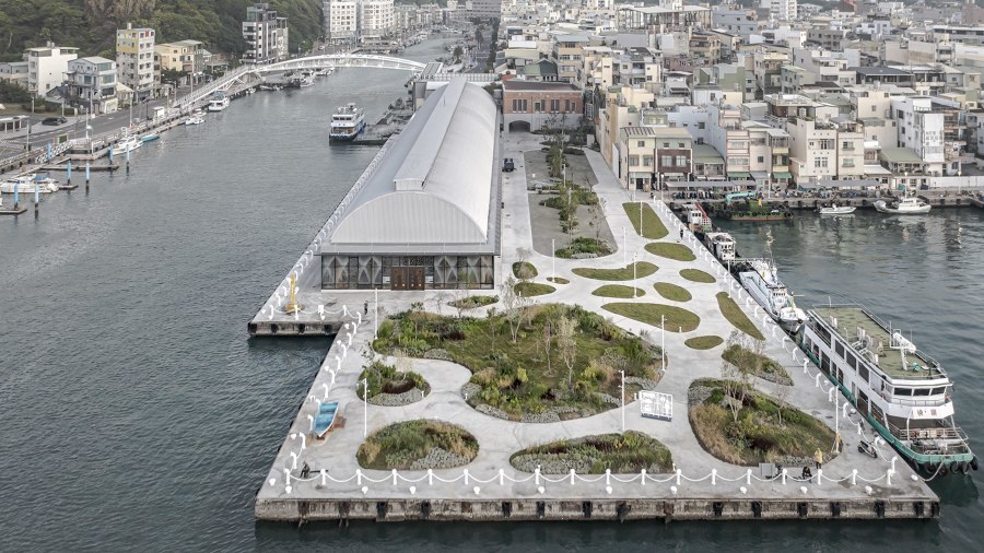
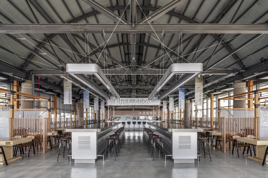
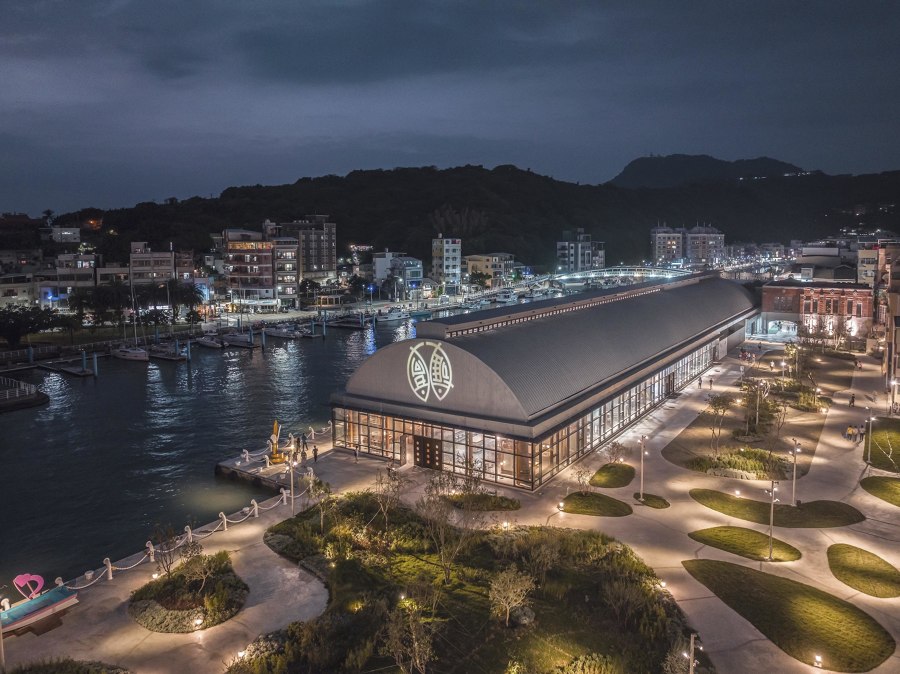
C.M. Chao Architect & Planners incorporated the landscape (top) into their design for Gushan Fish Market. The building serves as a lively food and drink hub (middle) & ferry station – and transforms spectacularly at night (bottom). Photos: Rex Chu

C.M. Chao Architect & Planners incorporated the landscape (top) into their design for Gushan Fish Market. The building serves as a lively food and drink hub (middle) & ferry station – and transforms spectacularly at night (bottom). Photos: Rex Chu
×Gushan Fish Market in Kaohsiung, Taiwan, by C.M. Chao Architect & Planners
Another market project that references the past with new construction is Gushan Fish Market in the southern Taiwanese city of Kaohsiung. Architects C.M. Chao demolished much of the original 1927 building and repurposed its materials in a new structure that acts both as a transport hub and commerce centre. Aiming to 'make the building invisible', the design team blurred the boundaries between landscape, ocean and light with a 330-metre-long transparent glass box concept.
The goal of the renovation was to preserve local history while at the same time exploring new ways to engage the public and revitalise local economy and tourism. The building's highly photogenic aesthetics also serve this goal, with specially processed 'bubble' glass and a detailed lighting concept for nighttime.
© Architonic
Head to the Architonic Magazine for more insights on the latest products, trends and practices in architecture and design.
