Flagship Enterprise
Texte par Dominic Lutyens
London, Royaume-Uni
16.12.14
It may sound paradoxical, but corporate store architecture today strives to be as individualistic as possible. This is partly due to necessity. Like many booksellers, high-end fashion labels are fending off fierce competition from online retailers. They hope that investing in new, ultra-contemporary stores with a unique identity will wow their customers.
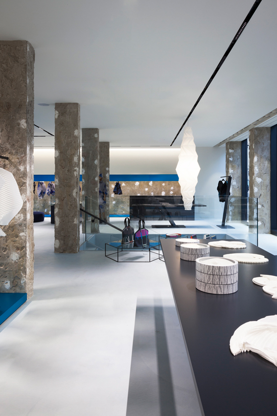
The lower floor of Issey Miyake’s new London flagship store, designed by Tokujin Yoshioka. As evidenced by the store’s raw concrete surfaces, Yoshioka prefers to eschew a traditionally luxurious aesthetic

The lower floor of Issey Miyake’s new London flagship store, designed by Tokujin Yoshioka. As evidenced by the store’s raw concrete surfaces, Yoshioka prefers to eschew a traditionally luxurious aesthetic
בIf the Internet can win the price war, bricks and mortar have to win the excitement factor,’ opines Simon Mitchell, co-founder of London-based Sybarite Architects, which has designed many stores for Marni. ‘Retailers now have to make their stores brand experiences, as customers increasingly buy goods online.’ Meanwhile, Matthew Brown, the managing director of creative retail trade agency Echochamber, says, ‘Shops today are about allowing customers to connect with the brand in deeper ways through hospitality, service, storytelling.’
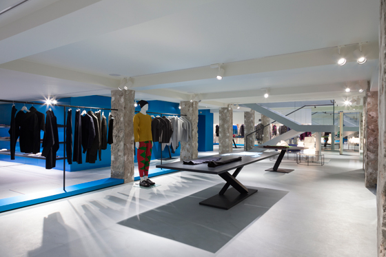
The store’s individuality is enhanced by its furniture, which was also designed by Yoshioka and is manufactured by Desalto and Moroso

The store’s individuality is enhanced by its furniture, which was also designed by Yoshioka and is manufactured by Desalto and Moroso
×Also keeping high-end retailers on their toes is the growing trend known as ‘push to posh’, in which mass market brands invest in high-end interior design. Uniqlo’s flagship store in New York, for example, was designed by the top-end retail architects of Wonderwall.
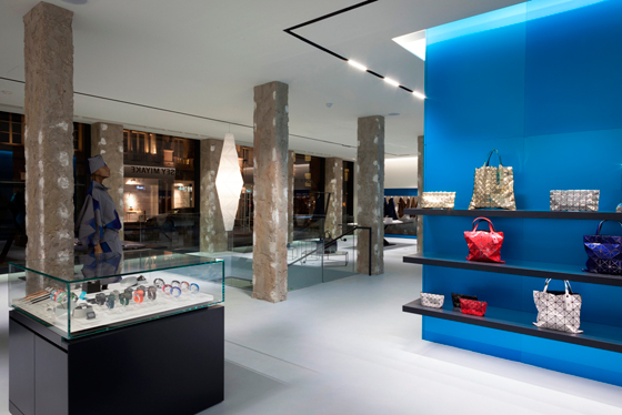
For a unifying effect, blue anodized aluminium panels are used on both the ground and lower floors

For a unifying effect, blue anodized aluminium panels are used on both the ground and lower floors
×One retail designer who strongly advocates individuality is Tokujin Yoshioka, who has created the interior of Issey Miyake’s new London flagship store. He may have designed over 150 Issey Miyake stores but he aims to make each one unique, chiefly by responding to context. ‘There’s a trend now for hotels with the same homogeneous luxury design all over the world,’ he says. ‘We need to go to the next step and create spaces where people can enjoy a place’s locality and nationality.’ His design for the new London store utilizes structural elements of the original 1950s building, formerly a bank. He has stripped back columns and walls to expose roughly textured concrete surfaces, juxtaposing them with aluminium panels in a highly singular shade of copper sulphate blue.
One wall of Neri & Hu’s Camper store in Shanghai, featuring references to the city’s traditional alleyways

One wall of Neri & Hu’s Camper store in Shanghai, featuring references to the city’s traditional alleyways
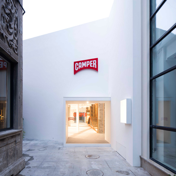
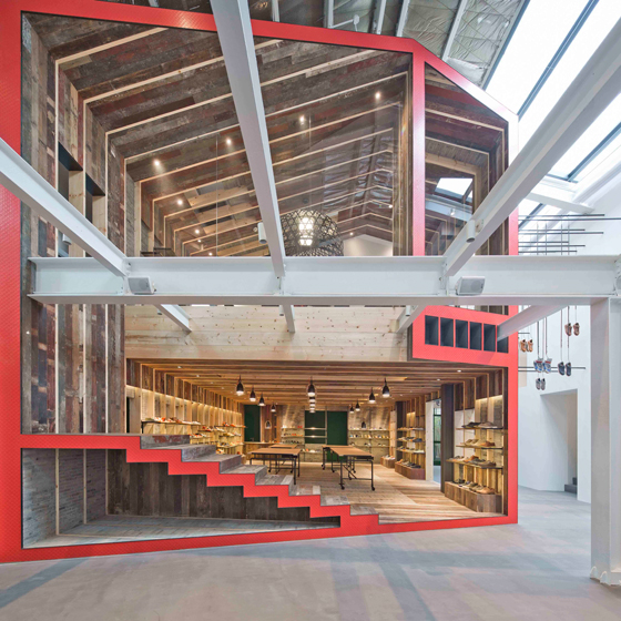
×Shoe brand Camper also sets store by individuality, hiring well-known designers and architects – from Nendo to Shigeru Ban – to dream up its store interiors. In Shanghai, Chinese architects Neri & Hu have created a striking flagship store, a new building inserted into an old industrial warehouse, whose design was a response to its context. Indeed, made of reclaimed, locally sourced timber frames and grey bricks, it’s intended to evoke a typical Shanghai alleyway called a nongtang.
Inserted into an old warehouse, the new Camper shop is designed as a house within a house, viewed in cross section. The sliced-off ends have the same shade of red as Camper’s logo

Inserted into an old warehouse, the new Camper shop is designed as a house within a house, viewed in cross section. The sliced-off ends have the same shade of red as Camper’s logo
×Some of Camper’s shoes are idiosyncratically suspended from steel hooks attached to rods — a nod to the way clothes are hung up to dry in Shanghai’s alleyways

Some of Camper’s shoes are idiosyncratically suspended from steel hooks attached to rods — a nod to the way clothes are hung up to dry in Shanghai’s alleyways
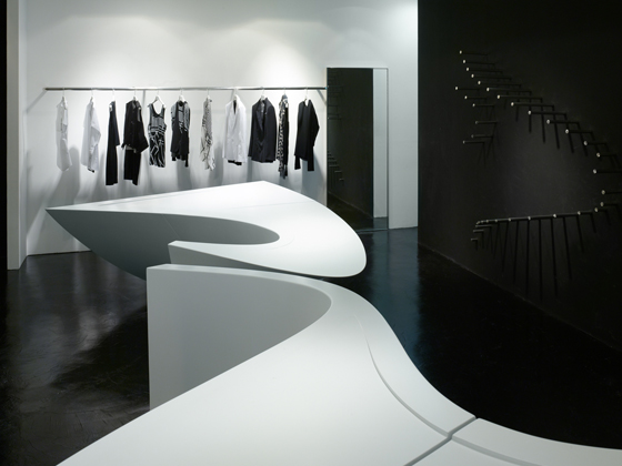
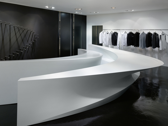
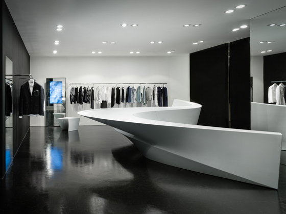
×Conversely, Zaha Hadid’s boutiques for fashion label Neil Barrett – she has designed four in Seoul and one in Hong Kong – pay no heed to context. Yet they do make a bid for individuality. In fact, Hadid’s highly personal design language is responsible for the shops’ unique aesthetic, the key feature being their glacier-like display systems.
Top and above: Barrett’s boutiques offer an experience that is as much about admiring Hadid’s interiors as it is about appreciating the clothing

Top and above: Barrett’s boutiques offer an experience that is as much about admiring Hadid’s interiors as it is about appreciating the clothing
×A sinuous, fragmented display system is the focal point of Neil Barrett’s monochromatic, Zaha Hadid-designed fashion boutiques in Seoul and Hong Kong

A sinuous, fragmented display system is the focal point of Neil Barrett’s monochromatic, Zaha Hadid-designed fashion boutiques in Seoul and Hong Kong
×These originated as a single element, which was chopped into sections and then installed in all the shops, giving this group of boutiques a cohesive and individual identity. Overshadowed by Hadid’s gigantic, striking sculptural display units, the clothing on display almost looks like an afterthought.
Like Yoshioka and Neri & Hu’s shop interiors, Hadid’s fulfills the ultimate aim of every retail designer today: to create a memorable space.
