Gloriously Glossy
Texte par Dominic Lutyens
London, Royaume-Uni
23.09.14
Given the huge vogue for cladding buildings in ceramic tiles, we shouldn’t be surprised to hear that they are now fast infiltrating interiors too. It’s not hard to see why. People find glazed ceramic tiles appealing because of their seductive qualities – their lusciously lustrous surfaces and, if patterned, their potential for being stunningly decorative.
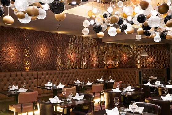
Giles Miller’s highly unusual 3D mural in Leeds eatery Sukhothai features an opulent, shimmering pattern depicting giant lotus flowers

Giles Miller’s highly unusual 3D mural in Leeds eatery Sukhothai features an opulent, shimmering pattern depicting giant lotus flowers
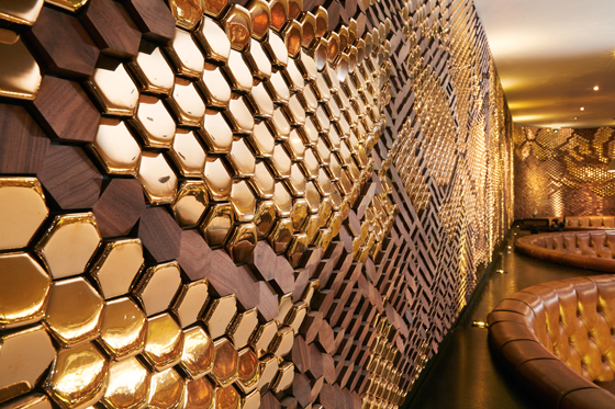
×For his mural at Sukhothai, Miller experimented with combining ceramic tiles with walnut versions in an identical shape and size to create a surface that is at once sumptuously glossy and matt

For his mural at Sukhothai, Miller experimented with combining ceramic tiles with walnut versions in an identical shape and size to create a surface that is at once sumptuously glossy and matt
בThey’re available in so many beautiful colours and finishes and are extremely functional as they’re durable and can be wiped clean,’ says London-based designer Giles Miller, who decorates interiors with tiles in very innovative ways. ‘As such, ceramic tiles are very appealing to both designers and their clients.’ They’re also relatively sustainable since they’re made out of water and biodegradable clay. If in the past they were usually double-fired, today they are often single-fired, a more eco-manufacturing method.
Miller is just one of a growing number of designers who are rediscovering ceramic tiles and celebrating their colourful, graphic qualities. Others include UK-based designers Afroditi Krassa, Ptolemy Mann and David David. The last two have collaborated with the British firm Johnson Tiles: Mann created a tiled mural exhibited at London’s Clerkenwell Design Week last May, and David David designed two murals, inspired by geometric patterns found on Islamic tiles, that were displayed at the Victoria and Albert Museum during the recent London Design Festival. Krassa has just launched her collection of Art Deco-inspired Piano Tiles with black and white stripes in various widths. Although these tiles aren’t ceramic – they’re made using encaustic cement – they’re another sign of the burgeoning vogue for tiles in interiors.
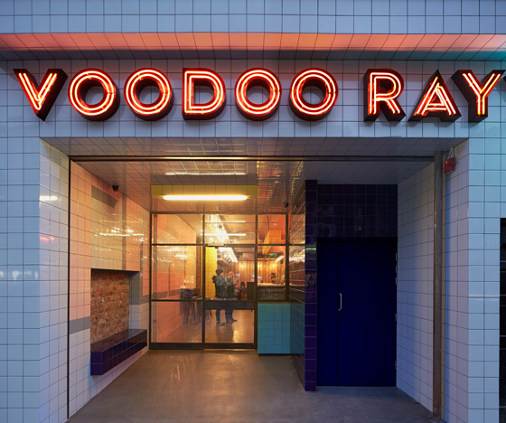
Gundry & Ducker went the whole hog when using tiles for its design for Voodoo Ray’s London pizza bar. Here tiles both front it and line its interior, while their candy-bright hues and graphic shapes pay homage to the 1950s and 80s

Gundry & Ducker went the whole hog when using tiles for its design for Voodoo Ray’s London pizza bar. Here tiles both front it and line its interior, while their candy-bright hues and graphic shapes pay homage to the 1950s and 80s
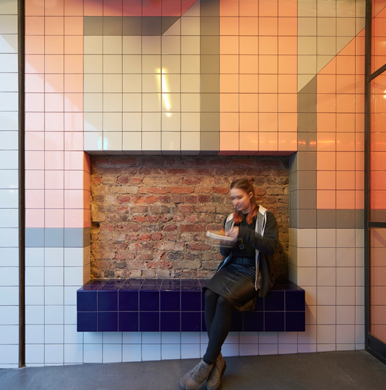
×Top: The geometric blocks of colour formed by the tiles at Voodoo Ray’s recall the 1950s-inspired aesthetic of Italian, 1980s design collective Memphis. Bottom: Tiles also clad a chunky bench for customers

Top: The geometric blocks of colour formed by the tiles at Voodoo Ray’s recall the 1950s-inspired aesthetic of Italian, 1980s design collective Memphis. Bottom: Tiles also clad a chunky bench for customers
×Also on show during the London Design Festival, at the fair 100% Design, was Philippe Starck’s Flexible Architecture collection of ceramic tiles for Capitol Designer Studio, manufactured by Ceramica Sant’Agostino. These can be fixed to floors and walls to create a more homogeneous, all-enveloping surface, and come in punchy hues like sunshine yellow and tangerine and so lend themselves well to bold colour-blocking. The tiles incorporate extended, roughly textured edges (in a matching colour), which resemble grouting and so make a feature of it – a witty touch.
Designers are also drawn to ceramic tiles for their links with the past and with ancient craft traditions, which inevitably endow them with romantic qualities. Arguably, such qualities appeal as an antidote to the technology increasingly dominating our lives. Glazed bricks have existed since circa 575 BC and began to be popular in Persia in the 10th century AD. This was due partly to the fact that, being small and modular, tiles weren’t confined to flat areas and could adorn domes on mosques. During the Baroque era, which began in the 1600s, tiles were widely adopted in Spain and Portugal (where they are known as azulejos). At around the same time, Delftware tiles were becoming popular in the Netherlands; these tiles often depicted mythological beasts, giving them a whimsical quality. So, too, did those of the 19th-century Arts and Crafts movement, which were also inspired by Islamic designs.
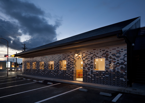
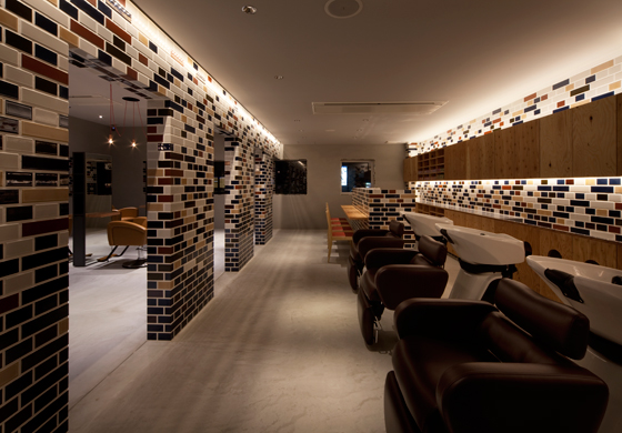
Japanese beauty salon Granny F also uses tiles to clad its exterior and interior. These form a brick pattern, albeit a random-looking one which avoids being repetitive and monotonous

Japanese beauty salon Granny F also uses tiles to clad its exterior and interior. These form a brick pattern, albeit a random-looking one which avoids being repetitive and monotonous
×One contemporary architect who has embraced tiles for their historical associations is Rem Koolhaas of OMA, whose fȇted Casa da Musica concert hall of 2005 in Porto incorporates hand-painted blue tiles that salute Portugal’s craft traditions. The tiles are also used to acknowledge the context of the building.
A more recent project, Voodoo Ray’s pizza bar in London’s hip Dalston area, designed by Gundry & Ducker, is boldly clad, inside and out, in square tiles in primaries and pastels. Tiles also cover ledges, on which plates can be placed, as well as a bench. ‘Our references include graphics from New York and East London of the 1950s and 1980s,’ say the architects. In fact, the pizza bar’s aesthetic channels the current, ultra-fashionable revival of the 1980s Memphis design movement, which took inspiration from 1950s American diners and their kitsch, candy-bright Formica furniture. Voodoo Ray’s demonstrates that today’s tiles have associations not only with age-old cultures, but also with the styles of more recent eras – in this case, 20th-century pop and postmodernism.
Similarly, architect Hiroyuki Miyake has covered both the exterior and interior of the striking Granny F beauty salon in Toyokawa, Japan, with tiles. Yet, compared with Voodoo Ray’s vibrant design, Granny F’s brick-like patterns come in a soothing, neutral palette of chocolate, terracotta and beige, as befits an environment where customers want to feel pampered.
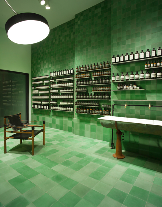
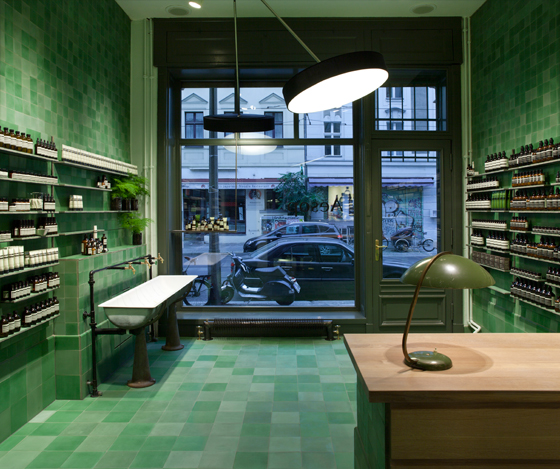
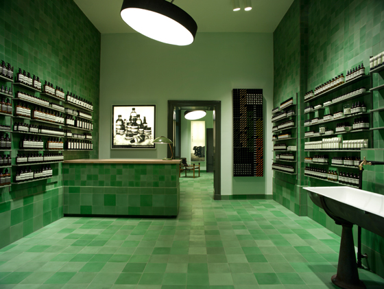
Tiles in a calming green – suggestive of being underwater – were chosen to line the interior of skincare brand Aesop’s Berlin store, designed by Weiss-Heiten

Tiles in a calming green – suggestive of being underwater – were chosen to line the interior of skincare brand Aesop’s Berlin store, designed by Weiss-Heiten
×Top and bottom: The tiles at the Aesop store are also designed to have a retro charm. The same goes for its mid-century furniture, a reclaimed 1950s sink and Edwardian-style potted ferns

Top and bottom: The tiles at the Aesop store are also designed to have a retro charm. The same goes for its mid-century furniture, a reclaimed 1950s sink and Edwardian-style potted ferns
×Tiles in another soothing hue – fern green – grace two shops recently opened by Australian skincare brand Aesop in Berlin and London’s Covent Garden, and designed by German practice Weiss-heiten and French studio Ciguë respectively. In the Berlin store, the tiles clad walls, floors and other areas, creating a surface that looks homogeneous and an environment that feels immersive – almost as if you’ve dived into a lagoon. In both shops, the tiles are intended to have a 20th-century retro charm, reinforced by the addition of 1920s exposed, copper plumbing or reclaimed 1950s sinks. The latter (in the Berlin store) was incorporated as a nod to the building’s former incarnation: a dairy.
At the Sukhothai restaurant in Leeds, Giles Miller has covered three of its walls with tiles to create a similarly immersive setting. His treatment is more flamboyant and unconventional than that of the Aesop shops, however: he has created a 3D, sculptural design that combines hexagonal, high-gloss gold tiles with matt ones made of walnut, arranged at different angles. This results in contrasting areas of light and shade, used here to depict huge lotus flowers.
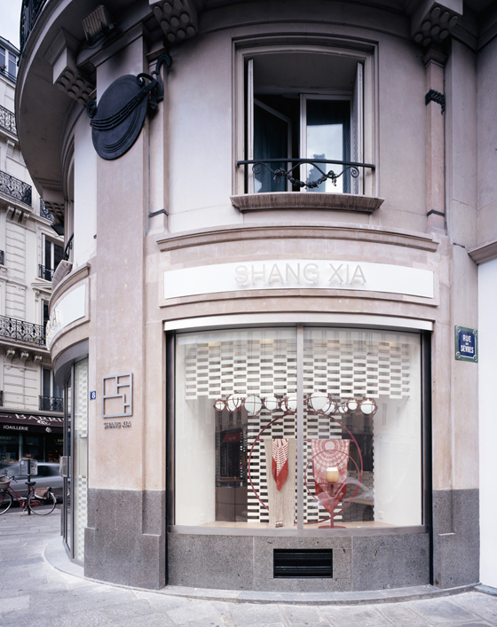
The windows of the Shang Xia boutique in Paris are partly filled with porous screens of white tiles which allow light into the shop, while also hinting at the style of its interior

The windows of the Shang Xia boutique in Paris are partly filled with porous screens of white tiles which allow light into the shop, while also hinting at the style of its interior
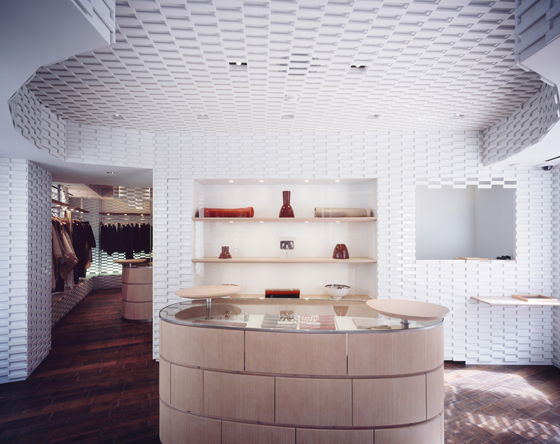
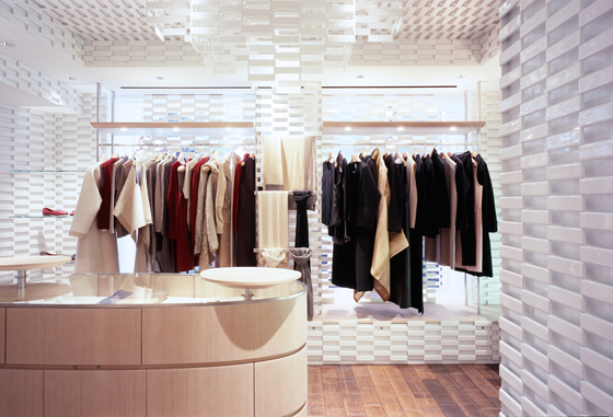
×Top: Here, architects Kengo Kuma & Associates have used all-white tiles in a relatively minimalist way. Bottom: The glossy, reflective surface of the tiles makes this interior all the more luminous

Top: Here, architects Kengo Kuma & Associates have used all-white tiles in a relatively minimalist way. Bottom: The glossy, reflective surface of the tiles makes this interior all the more luminous
×Tiles have been deployed in a completely different way in Kengo Kuma & Associates’ chic Paris boutique for Chinese lifestyle brand Shang Xia. Here, extra-thin, glossy white tiles have been exploited for their translucency. The tiles are arranged in a brickwork, bas-relief pattern. Lining the inside of the shop’s walls and ceiling, they reflect light, creating a luminous, ethereal environment. Meanwhile, tiles form screens in the windows, and gaps between the tiles and their semi-transparent ceramic material draw more light into the shop.
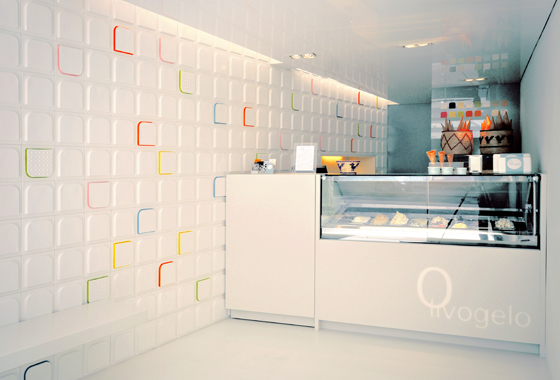
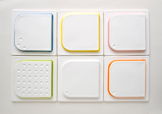
The delicate tones of these tiles, hand-glazed by ceramicist Lubna Chowdhary, cleverly represent London gelateria Olivogelo’s ice-cream flavours

The delicate tones of these tiles, hand-glazed by ceramicist Lubna Chowdhary, cleverly represent London gelateria Olivogelo’s ice-cream flavours
×Chowdhary’s tiles are multi-layered in their references: their shape echoes that of spoons traditionally fixed to the lids of ice-cream tubs

Chowdhary’s tiles are multi-layered in their references: their shape echoes that of spoons traditionally fixed to the lids of ice-cream tubs
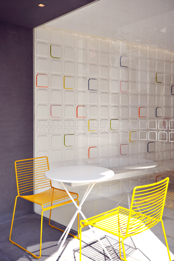
×Bespoke white tiles edged with mouth-watering pastels at London ice-cream parlour Olivogelo also create an airy interior. Andy Martin Architects designed the gelateria, while the tiles were hand-glazed by seasoned ceramicist Lubna Chowdhary. ‘Andy Martin Architects wanted the tiles to complement Olivogelo’s artesan ice creams. I worked closely with the team to develop glazes representing some of their flavours: blueberry, lime, lemon …’ says Chowdhary. ‘The glazes had to simulate melting ice cream, while the tiles’ round edges are based on the spoons fixed to the lids of ice-cream tubs.’
In short, tiles offer designers plenty of opportunities to experiment – as the upcoming Italian tile and bathroom fittings exhibition Cersaie (held in Bologna from 22 to 26 September) is bound to demonstrate. And with the versatile tile now in huge demand, the timing for this fair couldn’t be better.
