13 examples of curved forms circling back into style
Texte par James Wormald
05.04.23
While straight lines and sharp edges often emerge as contemporary alternatives, the curved form is one designers and architects consistently return to. These facade and furniture examples identify why.
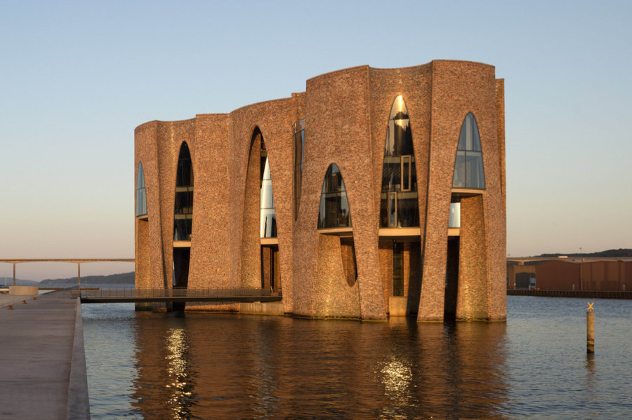
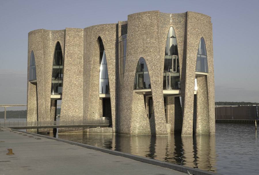
The Fjordenhus, part of a project to revitalise the Vejle harbour in Denmark, seems to rise from the water like naturally-formed coral. Photo: Anders Sune Berg

The Fjordenhus, part of a project to revitalise the Vejle harbour in Denmark, seems to rise from the water like naturally-formed coral. Photo: Anders Sune Berg
×From ancient Palaeolithic fertility sculptures to iconic Marylin-Monroe-era pin-ups, and continuing into modern society’s struggles with perceived vs inner beauty and the difference between wellness and wellbeing, rightly or wrongly, humanity has always had a love/hate relationship with curves.
The popularity of curved forms in architecture and design, meanwhile, has similarly dipped and risen over time – making for an aptly shaped line graph, if there were one, but the shapely form is bouncing back, with reemerging products such as cloud-like furniture, serpentine lighting and ergonomic freestanding bathtubs. Meanwhile, many architectural surfaces are also closing the curved door on one-dimensional movement, too. Here are some examples.
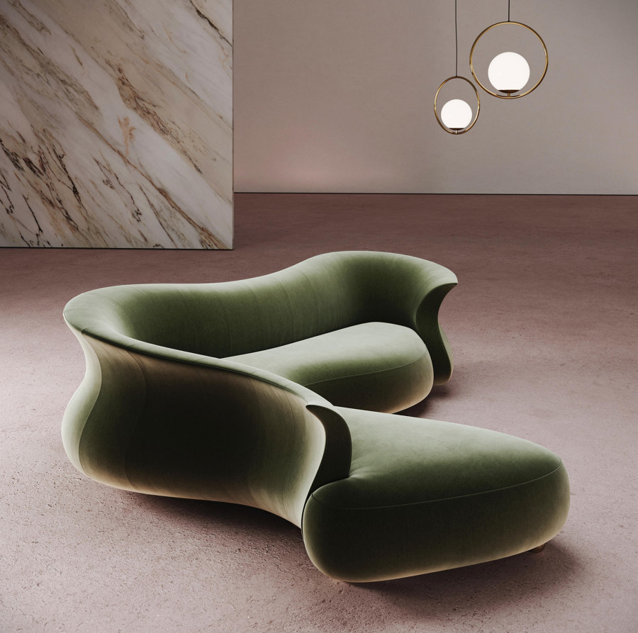
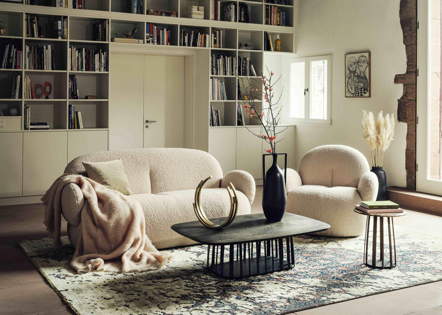
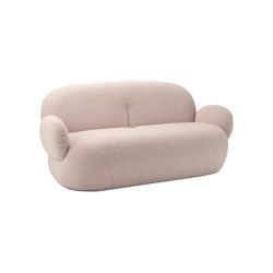
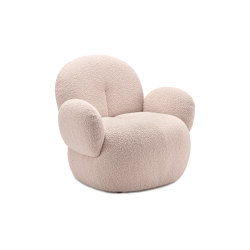
Desforma’s Amphora seating collection is furniture as landscape while the curves of Freifrau’s Nana Loveseat and couch communicate ultimate visual and ergonomic softness

Desforma’s Amphora seating collection is furniture as landscape while the curves of Freifrau’s Nana Loveseat and couch communicate ultimate visual and ergonomic softness
×The shapely form is bouncing back
Freifrau’s seating collections, meanwhile, have always been unapologetic in their focus on comfort. None more so, however, than the young German brand’s cloud-formed Nana series. Like its namesake, the collection of sofas and loveseats embraces users in a warm, comforting hug.
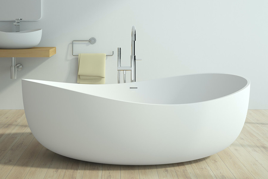
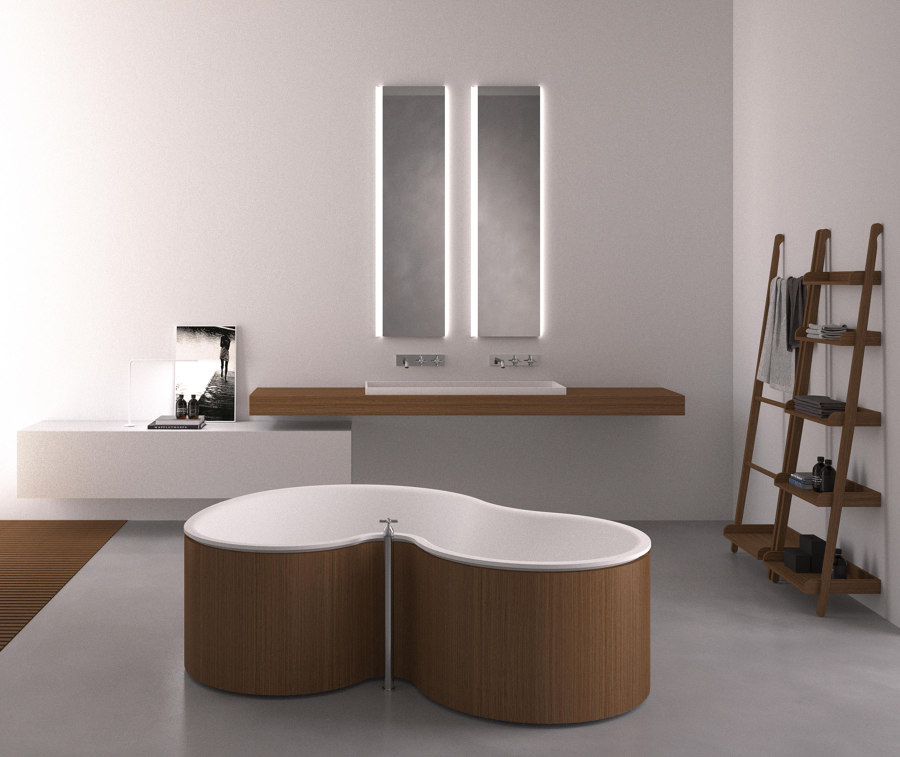
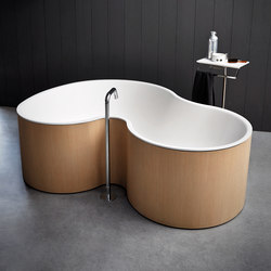
Riluxa’s Genova freestanding bathtub features a curved edge that washes over you like a wave, while Agape’s DR bathtub’s two perpendicular curved ends make it perfect for sharing

Riluxa’s Genova freestanding bathtub features a curved edge that washes over you like a wave, while Agape’s DR bathtub’s two perpendicular curved ends make it perfect for sharing
×Curved freestanding bathtubs
Another luxurious product designed to let the body sink into deep relaxation is a bathtub. And freestanding tubs are the most sumptuous, and most comfortable, option out there. While all bathtubs have body-hugging curves inside, Riluxa’s freestanding Genova bathtub features a curved edge, too, surrounding users with the movement of lapping waves. In contrast, Agape’s contrasting-coloured DR bathtub, designed by Marcio Kogan and Studio MK27, splits and corners the two curved ends of a bathtub, making it easier to share.
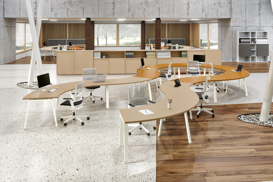
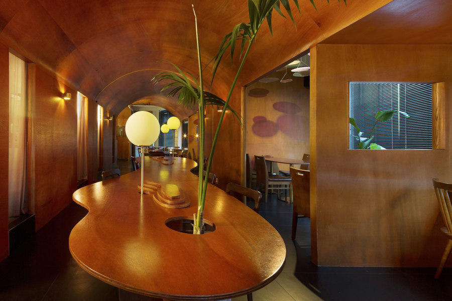
Alea’s Atreo desktop (top) puts more workspace within users’ reach and the curved tabletop at Munhwa Bistro Seong-su (bottom) brings diners together. Photos: Hongkyu Yang (bottom)

Alea’s Atreo desktop (top) puts more workspace within users’ reach and the curved tabletop at Munhwa Bistro Seong-su (bottom) brings diners together. Photos: Hongkyu Yang (bottom)
×Curved tables
The three necessary dimensions of a sofa or armchair allow designers’ hands to loosen when first adding pencil to paper, but even when one dimension is removed – as with a table – a curved edge connects objects or users together. Alea’s Atreo S-shaped Wave desktops and dividers, for example, can combine to cut a meandering route through office spaces, providing users on opposing sides with a workspace more suited to their naturally radial reach. Whereas in the dining space of Munhwa Bistro Seong-su in South Korea, the custom-made streamlined Oasis table ‘plays a role to connect people to people,’ explain architects Indiesalon.
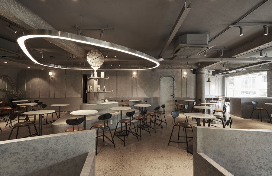
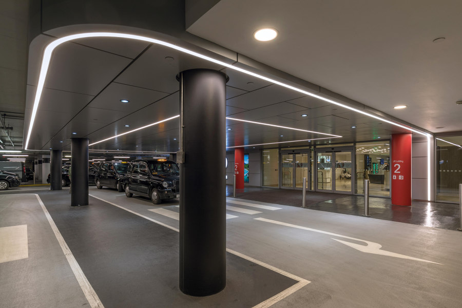
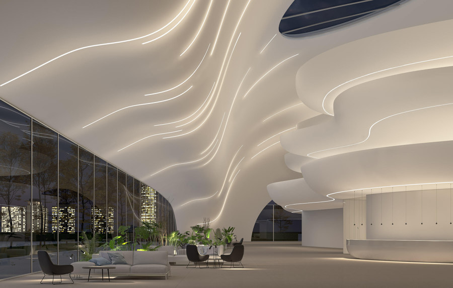
Curved lighting at Katinat Coffee Binh Phu (top), Lightnet’s directional recessed Liquid Line light (middle) and Intra Lighting’s three-dimensional Tracker system (bottom). Photo: Do Sy (top)

Curved lighting at Katinat Coffee Binh Phu (top), Lightnet’s directional recessed Liquid Line light (middle) and Intra Lighting’s three-dimensional Tracker system (bottom). Photo: Do Sy (top)
×Curved lighting
At another hospitality space, meanwhile, curves rule the design behind Vietnamese coffee shop Katinat Coffee Binh Phu in Ho Chi Minh City. Curved seating, counters and staircases ‘create a relaxed vibe and delineate space’ in the café, explain architects Module K, and tie the branded environment together with similarly shaped lighting above.
The only flat surface is the floor
Lighting can be a useful tool to mark out delineated space in any commercial environment. Lightnet’s Liquid Line system of recessed or suspended lighting, for example, can be formed to highlight various functions or layouts underneath, or provide it with an artistic contrast, while Intra Lighting’s recessed Tracker lights go beyond horizontal movement, adhering to multi-dimensional ceilings.
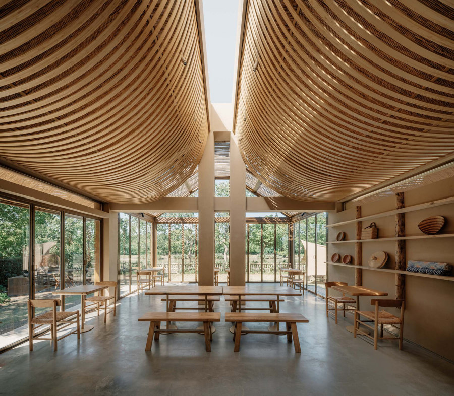
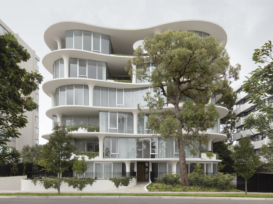
Curved bamboo ceiling at SOM LAND hostel (top) and softened floor plates and fluted columns at No. 6 Sydney Street Apartments (bottom). Photos: Wen Studio (top), Wood Marsh (bottom)

Curved bamboo ceiling at SOM LAND hostel (top) and softened floor plates and fluted columns at No. 6 Sydney Street Apartments (bottom). Photos: Wen Studio (top), Wood Marsh (bottom)
×Curved ceilings
Alongside the SOM LAND hostel in Shanghai, China, sits a very standard-looking accompanying structure, providing multifunctional communal space for visitors. Inside, however, bent bamboo slats curve up to a full-length skylight above, filtering light through a ceiling that’s anything but ordinary. In a converse juxtaposition of interior and exterior form, meanwhile, the No. 6 Sydney Street Apartments in Prahran, Australia, turns the formal composition of the living space’s ceilings into softened floor plates resting on fluted columns, giving the building ‘a sense of visual movement,’ as explained by architects Wood Marsh.
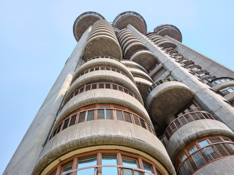
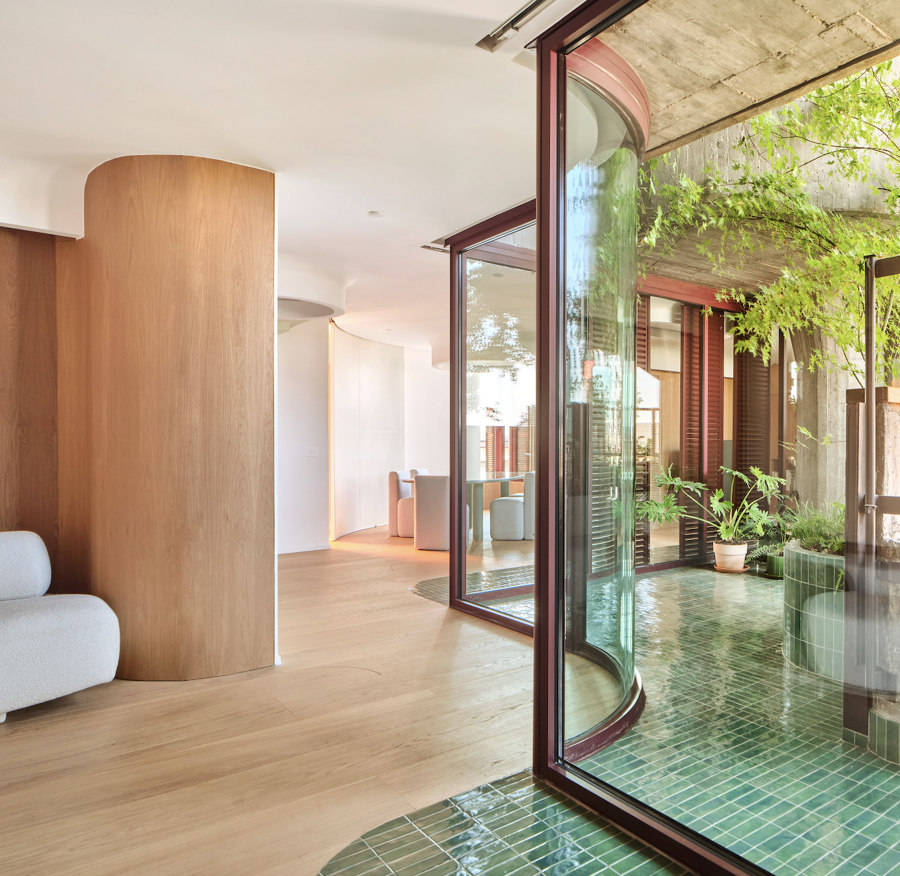
Francisco Javier Sainz de Oiza’s remodelled and rethought White Towers apartments (top) with curved glass, panelled and tiled walls and partitions (bottom). Photos: Jose Hevia

Francisco Javier Sainz de Oiza’s remodelled and rethought White Towers apartments (top) with curved glass, panelled and tiled walls and partitions (bottom). Photos: Jose Hevia
×Curved walls
There’s not a square edge to be found after Studio.NOJU’s Remodelling and Rethinking of the White Towers apartments in Madrid, Spain, however – inside or out. With curves around every rounded corner, every surface from the walls, partitions and doors, to seating and bathroom fixtures reimplement and update the ‘sinuous curves that had been erased’ of original architect Francisco Javier Sainz de Oiza’s iconic building. The only flat surface is the floor.
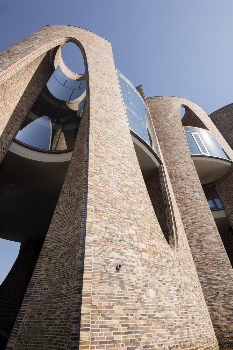
Cylindrical and ellipsoidal negative spaces are cut into the Fjordenhus’ brickwork facade, creating complex curved forms and arched windows. Photos: Anders Sune Berg

Cylindrical and ellipsoidal negative spaces are cut into the Fjordenhus’ brickwork facade, creating complex curved forms and arched windows. Photos: Anders Sune Berg
×Curved facades
Rising up from the surface of the Vejle Fjord like parametrically-formed coral, The Fjordenhus in Vejle, Denmark, is shaped by intersecting four cylinders, then removing circular and ellipsoidal spaces from the building’s harbour-inspired brickwork facade to create complex curves and arched openings. ‘A series of vertical spaces cut into the parameter of the cylinders, connecting the sky and the water,’ states Sebastian Behmann, architect and head of design at the project’s architects Studio Olafur Eliasson. ‘The spaces are deformed by geometrical operation, connecting a circle and an ellipse.’
© Architonic
Head to the Architonic Magazine for more insights on the latest products, trends and practices in architecture and design, or find inspiration in a whole world of projects from around the globe through ArchDaily’s architecture catalogue.
