Architonic's most-viewed projects of 2021: Retail interiors
Texte par James Wormald
15.01.22
These outlandish, luxurious and downright surreal retail spaces were Architonic users' most-seen new shops of 2021.
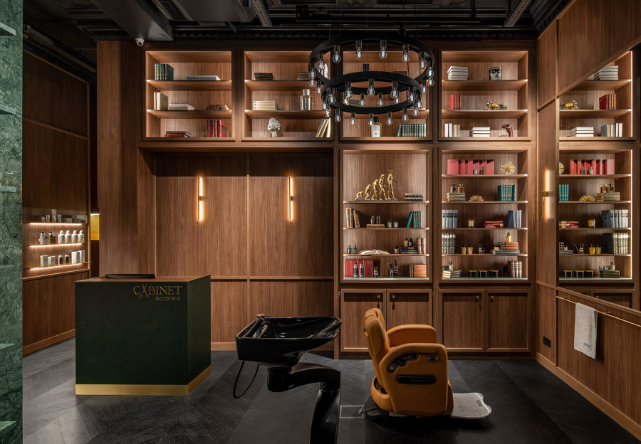
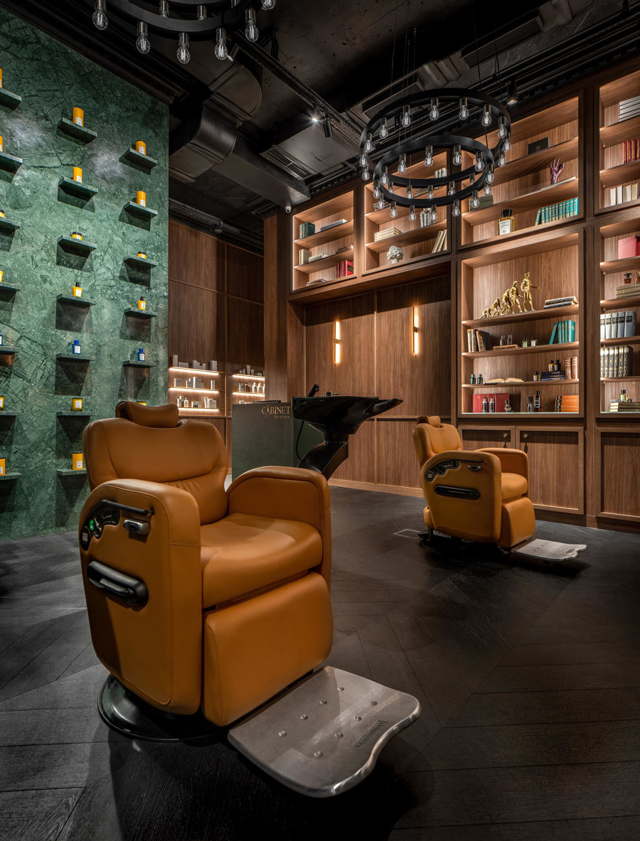
Cabinet Barbiere, by Bogdanova Bureau, provides gentleman's spa and beauty treatments in Kyiv. Photo: Andrey Bezuglov

Cabinet Barbiere, by Bogdanova Bureau, provides gentleman's spa and beauty treatments in Kyiv. Photo: Andrey Bezuglov
×Part of our look back on the most-visited project pages of 2021, the list below reveals the top retail renovations of the year, all bursting with creativity, colour and commercial conception.
1. Toyou Bookstore by Wutopia Lab
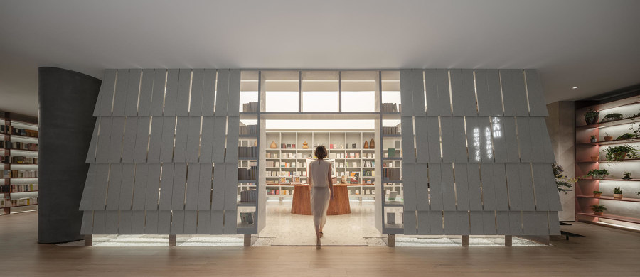
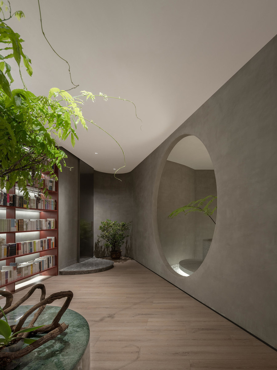
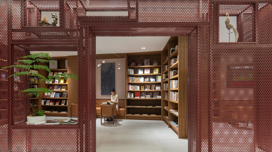
Customers of the Toyou Bookstore by Wutopia Lab find themselves in the middle of literary history, in the architectural representation of Big and Little You mountains. Photos: CreatAR Images

Customers of the Toyou Bookstore by Wutopia Lab find themselves in the middle of literary history, in the architectural representation of Big and Little You mountains. Photos: CreatAR Images
×Based on the Big and Little You mountains – where literary texts were said to have been saved from destruction by the Qin Shi Huang empire, entering customers are immediately met by Little You, protecting the newest, most popular works. While the rest of the literary categories are to be found scattered throughout the store’s remaining snugs and chambers.
2. Cabinet Barbiere by Bogdanova Bureau
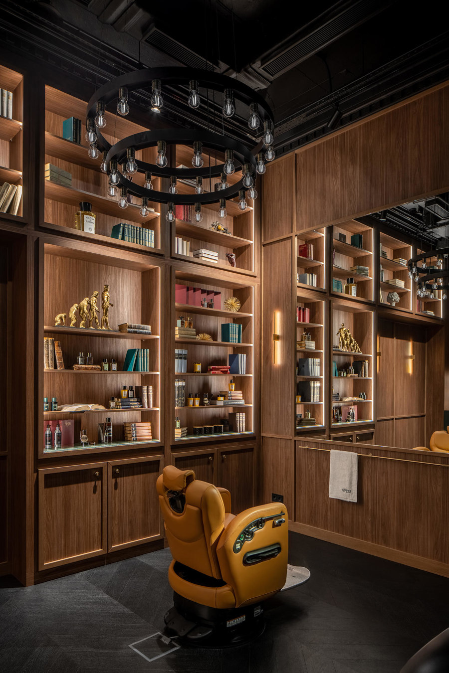
Cabinet Barbiere, by Bogdanova Bureau, creates a rich, luxurious atmosphere with exclusive materials. Photos: Andrey Bezuglov

Cabinet Barbiere, by Bogdanova Bureau, creates a rich, luxurious atmosphere with exclusive materials. Photos: Andrey Bezuglov
×Cabinet Barbiere provides welcome spa and beauty treatments to Kyiv’s most discerning gentleman customers in a location that’s more private members’ club than spa. A rich palette of green marble, leather chairs, brass fittings and dark walnut shelving and cabinetry give the sophisticated feel of an intellectual, highly selective space.
3. Aera Bakery by Gonzalez Haase Architects
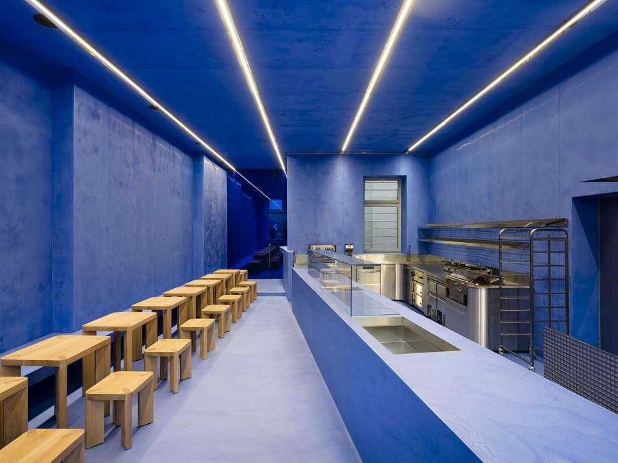
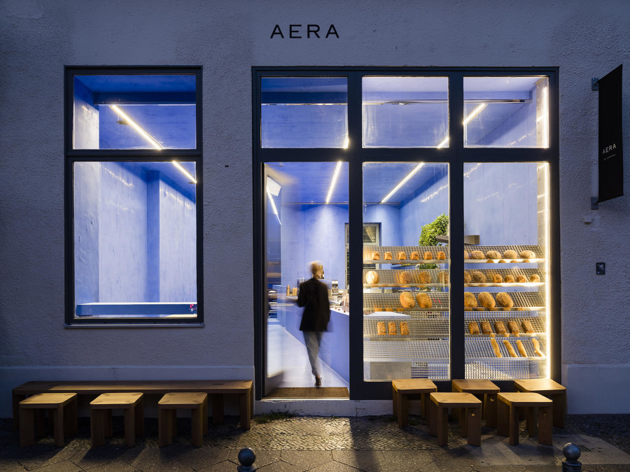
Berlin's Aera Bakery, by Gonzalez Haase Architects uses a vibrant blue palette to bring out the warmth of the fresh bread. Photos: Thomas Meyer / Ostkreuz

Berlin's Aera Bakery, by Gonzalez Haase Architects uses a vibrant blue palette to bring out the warmth of the fresh bread. Photos: Thomas Meyer / Ostkreuz
×The singularity and simplicity of the blue colour scheme and its embedded lights in this GF bakery allow the natural browns of the breads to shine, complemented by the store’s wooden furnishings and stainless steel presentation. With no gingham in sight, the style is as surprising as good quality GF bread, when you find it.
4. Honeyz Concept Store by PUNTOFILIPINO
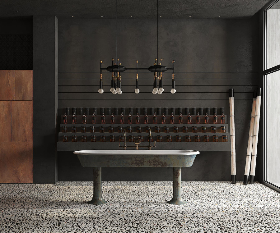
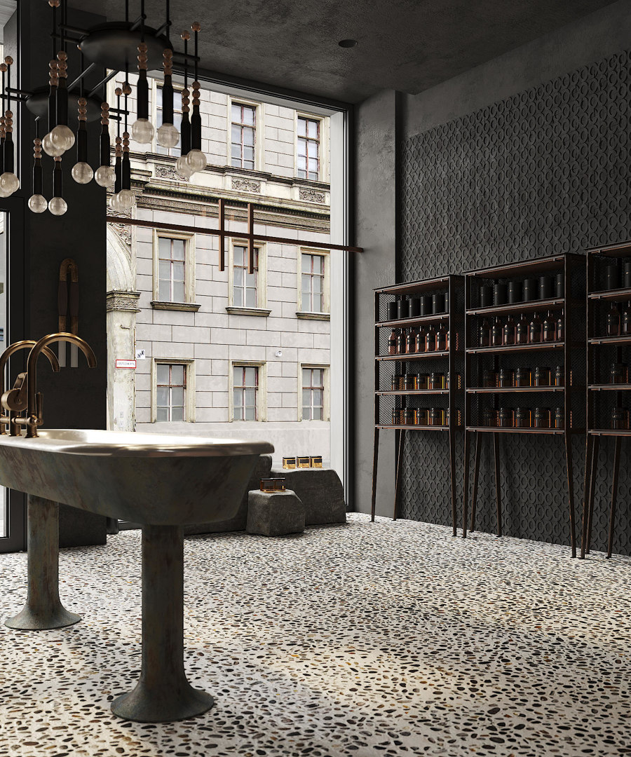
The Honeyz concept honey and beauty product store by PUNTOFILIPINO has a subdued elegance in the shared functionality of both space and product. Photos: Polina Parcevskya

The Honeyz concept honey and beauty product store by PUNTOFILIPINO has a subdued elegance in the shared functionality of both space and product. Photos: Polina Parcevskya
×The interior of this apian-inspired skincare product store in Berlin reflects the brand’s black and golden bronze colours, as well as it’s packaging’s minimal style. Instead of using a light-filled location with plenty of reflective surfaces, as with most beauty and skincare brands, Honeyz is dark and dystopian. The effect helps consumers become more reflective themselves, focusing on the ‘feel’ of the product.
5. Apple Tower Theatre by Foster + Partners
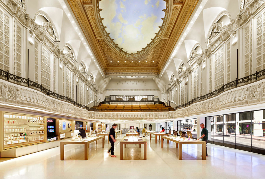
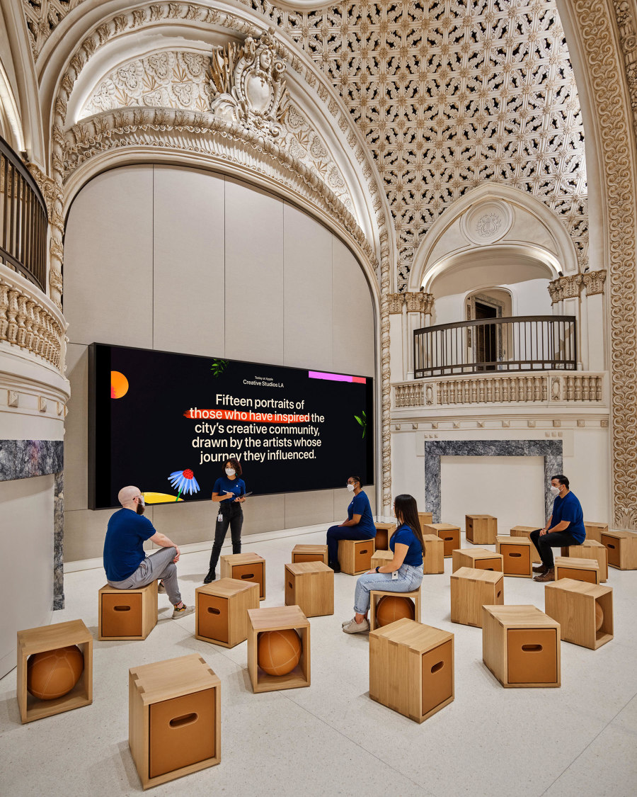
Part of the urban generation of downtown LA, Apple, together with Foster + Partners, renovated and repurposed the city's historic Tower Theatre into a dramatic retail space. Photos: Cesar Rubio

Part of the urban generation of downtown LA, Apple, together with Foster + Partners, renovated and repurposed the city's historic Tower Theatre into a dramatic retail space. Photos: Cesar Rubio
×This adaptive reuse refurbishment saw Apple fill the dramatic and historic interior of the Los Angeles Tower Theatre with a stage of their charismatic product lines. Meanwhile, the actual stage space was utilised for presentations and tech lectures with balcony seating reupholstered and repurposed as a Genius appointment waiting area.
© Architonic
This article is part of Architonic's Annual Review series, reliving our users' most-viewed projects of the past year, while looking ahead to the next.
