Five ways to customise surfaces with single-colour tiling
Texte par James Wormald
27.04.22
Single colour tiles might look simple on the surface, but with a little creative thinking, the full range of possibilities starts to emerge. Here are five original ways to apply them.
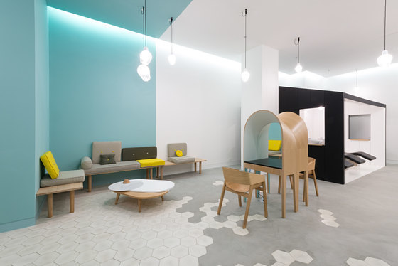
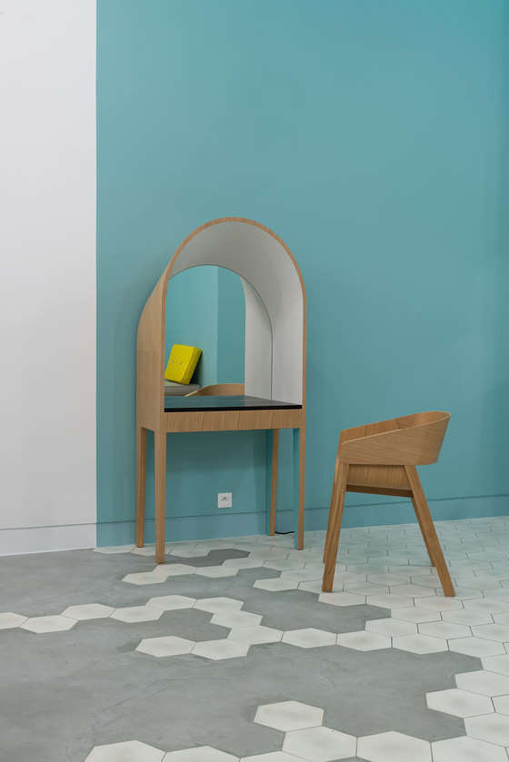
Margaux Keller’s Le Coiffeur hair salon floor combines honeycomb tiles and poured concrete in a mixture of materiality. Photo: Laure Mélone for Margaux Keller

Margaux Keller’s Le Coiffeur hair salon floor combines honeycomb tiles and poured concrete in a mixture of materiality. Photo: Laure Mélone for Margaux Keller
×There’s one element above all others that every specifier, from self-taught own-home designers to professional interiors specialists with years of experience, looks to bring to their projects. Originality.
Bold colours, intricate patterns and more various textures have transformed every type of interior surface product. From the permanent: three-dimensional or light-up wall panels, to the semi-permanent: textured wallpapers and photographic coverings, or even the temporary: re-upholstered furniture, any element you name is susceptible to a little creative tweak.
The best way to ensure you get something truly original, is to do it yourself
But while original and creative in their own right, these all sing to someone else’s tune. The best way to ensure you get something truly original, is to do it yourself. Available in any shape, size, colour and even material, tiles offer the design flexibility to do exactly what you (or your client) can imagine.
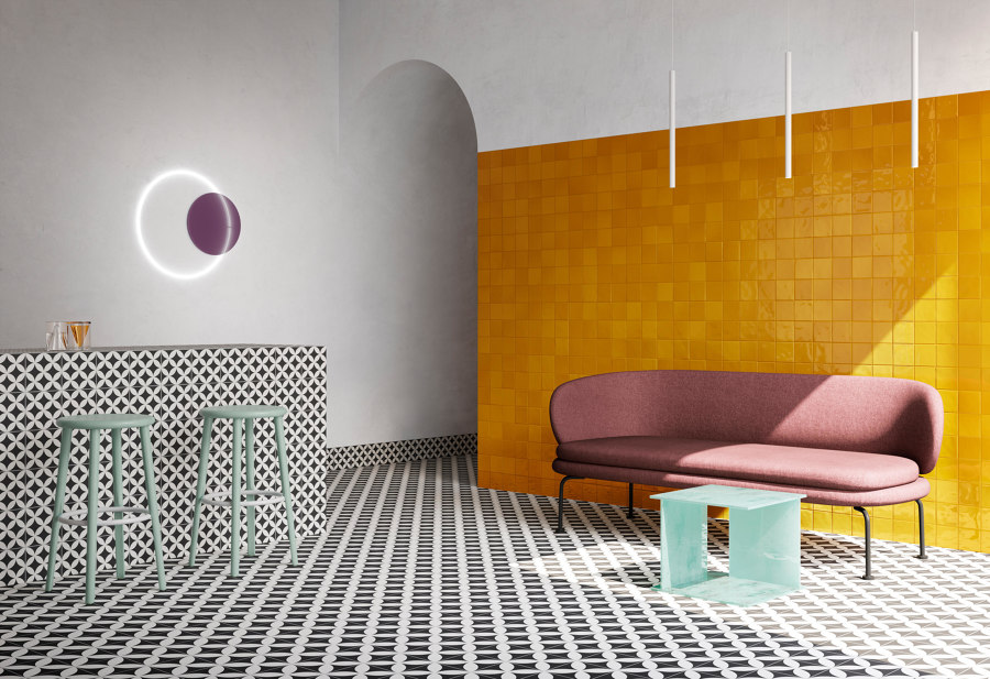
VitrA’s Retromix tile mosaics combine bold colours of similar hues to create sparkling surfaces with artificial depth

VitrA’s Retromix tile mosaics combine bold colours of similar hues to create sparkling surfaces with artificial depth
×Create depth with one colour
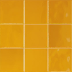
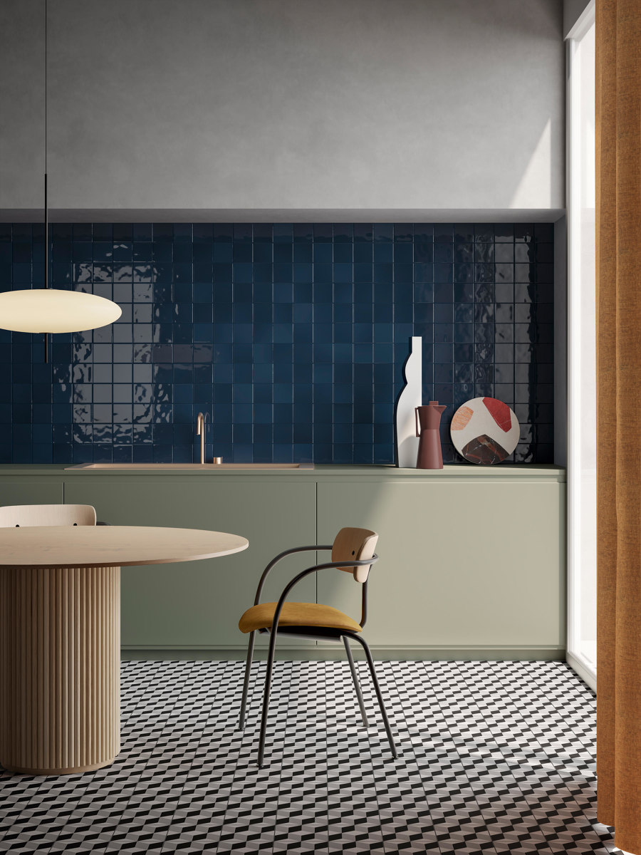
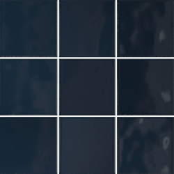
A single block of colour doesn’t sound especially creative or flexible, but the eight available hues of VitrA’s Retromix collection group together tiles with slightly changing shades, creating a textured blend effect. The tiles’ depth and bold colours leave an unforgettable mark on viewers’ retinas, stealing their attention before drawing them in.
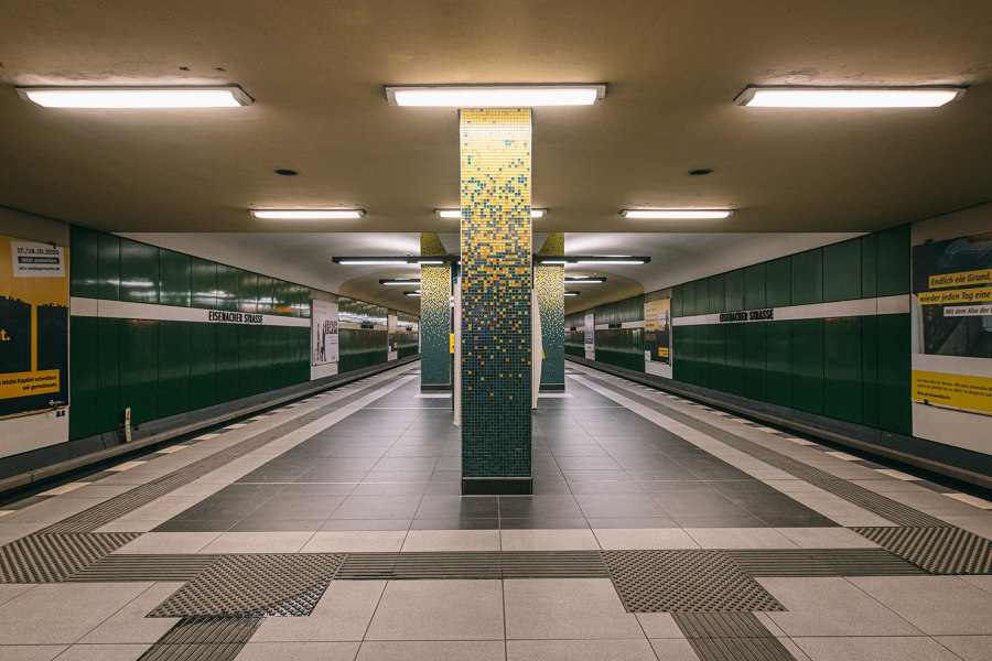
Contrasting mosaic tiles fall in Berlin’s U-Bahn (top) and chaotic herringbone patterns liven up Lotto 16’s easy-to-clean floor (middle, bottom). Photos: Royal Mosa (top), Filippo Poli (middle)

Contrasting mosaic tiles fall in Berlin’s U-Bahn (top) and chaotic herringbone patterns liven up Lotto 16’s easy-to-clean floor (middle, bottom). Photos: Royal Mosa (top), Filippo Poli (middle)
×Strike with contrasting patterns
Although the same effect has been applied to the stair and escalator areas of Berlin’s Eisenacher Strasser U-Bahn station, the platform’s Mosa tiled pillars, also textured with a blended mosaic of green, benefit from additional contrasting yellow and orange segments, sprinkling down from the ceiling like rainfall.
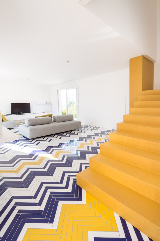
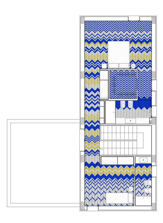
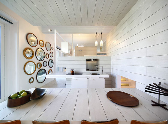
A simpler herringbone pattern, reminiscent of wood flooring, is used to both separate and connect space in the open-plan Lotto 16 home by Guiseppe Gurrieri, in the Sicilian seaside village of Marina di Ragusa. Slim white, blue and yellow tiles come together to fill living spaces with chaotic combinations like a chevron rug, while a simpler linear pattern is applied across kitchen and dining spaces. By limiting the rest of the interior to these three motif colours, the flooring connects the entire home in a relationship with the sand and the sea.
Le Coiffeur’s shared material flooring (top) and the Momentum hotel’s upholstered seat and wall (middle, bottom). Photos: Laure Mélone for Margaux Keller (top), Atlas Concorde (bottom)

Le Coiffeur’s shared material flooring (top) and the Momentum hotel’s upholstered seat and wall (middle, bottom). Photos: Laure Mélone for Margaux Keller (top), Atlas Concorde (bottom)
×Mix up materials
With wall-to-wall ceramics, Lotto 16’s floor is easy to clean – useful given its sandy location – and the bright colour-fast lava stone tiles will hold on to their vibrancy. But it’s not the only tile material available. Alternative options including wood, metal, stone, glass, cork and various fabrics can mingle together to tell stories of tactility as well as colour and pattern.
Tile materials including wood, metal, stone, glass, cork and various fabrics can mingle together to tell stories of tactility
The polished concrete floor of Le Coiffeur hairdressing salon in Marseille, for example, is as hardwearing as the ceramic tiles it joins, with equal aesthetic depth and cleaning simplicity, too. Designer Margaux Keller combined the two subdued cream and grey floorings, to create a striking feature through the centre of the salon.
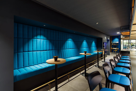
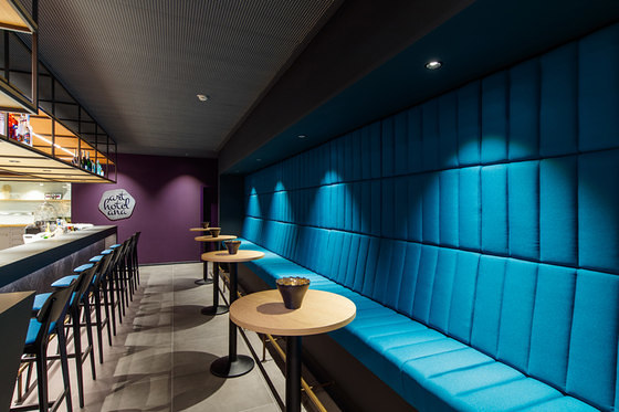
The Momentum hotel in Göppingen, Germany, meanwhile, takes the bright turquoise upholstered seat of its bar’s long bench, and reimagines it as wall tiles. By extending the seat back up the height of the wall, the bench is transformed into one of the bar’s biggest decorative features.
Milton’s cornering tabletops, concrete tiles (top) and wooden panels (middle), and Héctor Ruiz-Velázquez’s liberally-applied tiling (bottom). Photos: Ari Hatzis (top, middle) and Pedro Martinez (bottom)

Milton’s cornering tabletops, concrete tiles (top) and wooden panels (middle), and Héctor Ruiz-Velázquez’s liberally-applied tiling (bottom). Photos: Ari Hatzis (top, middle) and Pedro Martinez (bottom)
×Reorientate
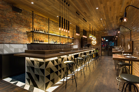
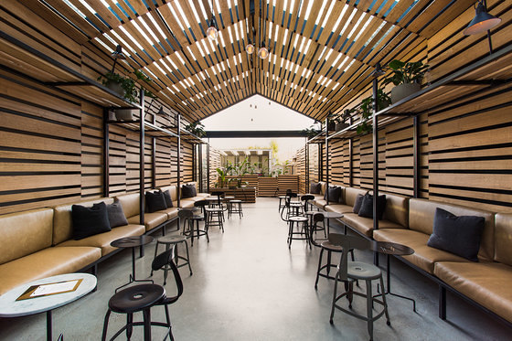
With many ceramic tiles suitable for both wall and floor application, the same colourful or patterned section can spread like viral creativity, jumping from one orientation to the next. The Milton bar in Melbourne, Australia, for example, achieves the effect in multiple instances and materials. A linear pattern of wooden wall panels extends to form an arched ceiling along with camouflaged shelving above, reclaimed wood tables are bent up to attach menu hooks, while a customised triangular pattern of charcoal, white and grey concrete tiles pour onto the floor from the bar’s front.
Another example of spreading tiles across multiple surfaces can be found in this multi-level home in Madrid by architect Héctor Ruiz-Velázquez. As the ‘indisputable protagonist of the space’ opines Ruiz-Velázquez, ceramic tiles are applied liberally across floors, walls, ceilings and tabletops.
Mambo Unlimited Ideas’ tiled Caldas tabletop (top) and the Perfect Darkness concept space with tiled furniture (middle, bottom). Photos: Giorgio Possenti (middle, bottom)

Mambo Unlimited Ideas’ tiled Caldas tabletop (top) and the Perfect Darkness concept space with tiled furniture (middle, bottom). Photos: Giorgio Possenti (middle, bottom)
×Tile unexpected places
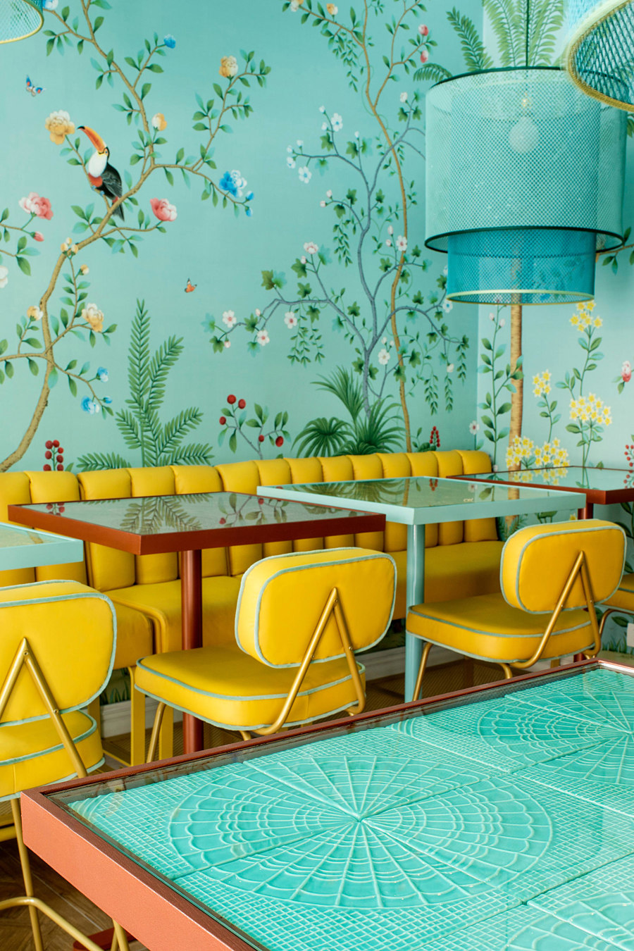
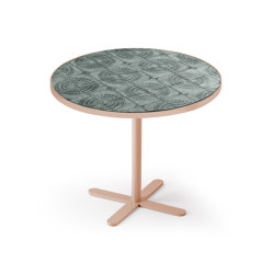
By tiling furniture and other non-traditional areas, a new focus and decorative element can be brought to previously mundane interior elements. Either to complement furniture surfaces with the same colour, pattern and even material as the walls and floors, or to provide an intriguing contrast, tiled furniture presents an opportunity to personalise functionality. Mambo Unlimited Ideas produce a series of tables and sideboards, such as the Caldas range, that incorporate relief tiles to complement any interior style, but a similar effect can be achieved with designers’ own choice of tile, too.
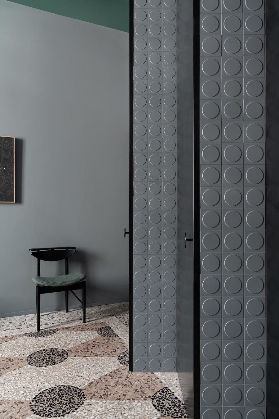
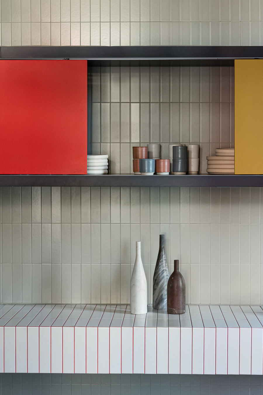
The ceramic-centred concept space, Perfect Darkness, by interior architects H+O Design during Milan Design Week 2019, for example, gave numerous imaginative examples of creatively tiled surfaces including custom-tiled furniture and storage interiors.
© Architonic
