High-ambience restaurants illuminated with subtle lighting effects
Texte par James Wormald
13.11.23
These gentle but intelligent lighting arrangements bring comfort and relaxation to hospitality spaces, shutting away the outside world and helping guests focus on themselves and each other.
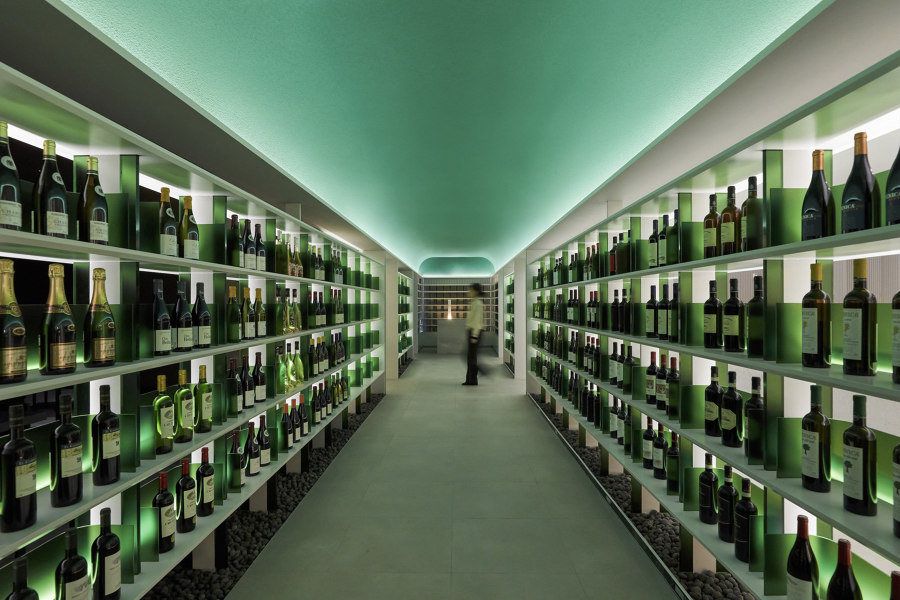
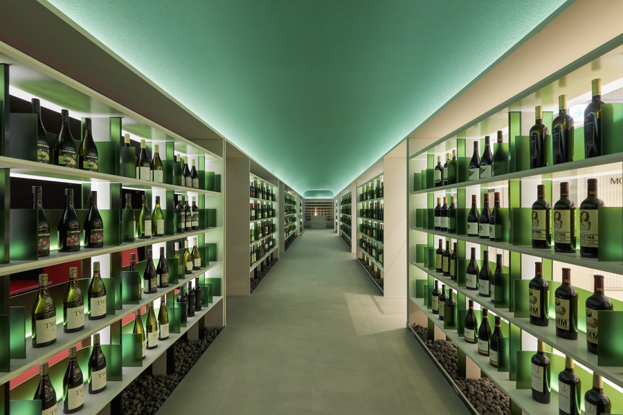
With a green ceiling lit from below and walls of green frosted glass panels behind each bottle, MOWa’s central wine library passageway is like being inside the bottle itself. Photos: SOULGRAPH

With a green ceiling lit from below and walls of green frosted glass panels behind each bottle, MOWa’s central wine library passageway is like being inside the bottle itself. Photos: SOULGRAPH
×Hospitality settings are often asked to walk a tightrope between light and dark. Too dark and the aiming of one’s fork towards plate becomes a haphazard operation – and a full-blown hazard when targeting the mouth. If bleached in too much light, however, the food itself loses its lustre and, when faced with the reality of an environment in close proximity to 30-100 noisy others, it can be hard to feel relaxed.
By using various lighting techniques, materials and arrangements, these hospitality spaces craft the perfect Goldilockian light settings that allow guests to concentrate on what matters most, be that the food, the peace of being with oneself or the comfort of the person on the opposite side of the table.
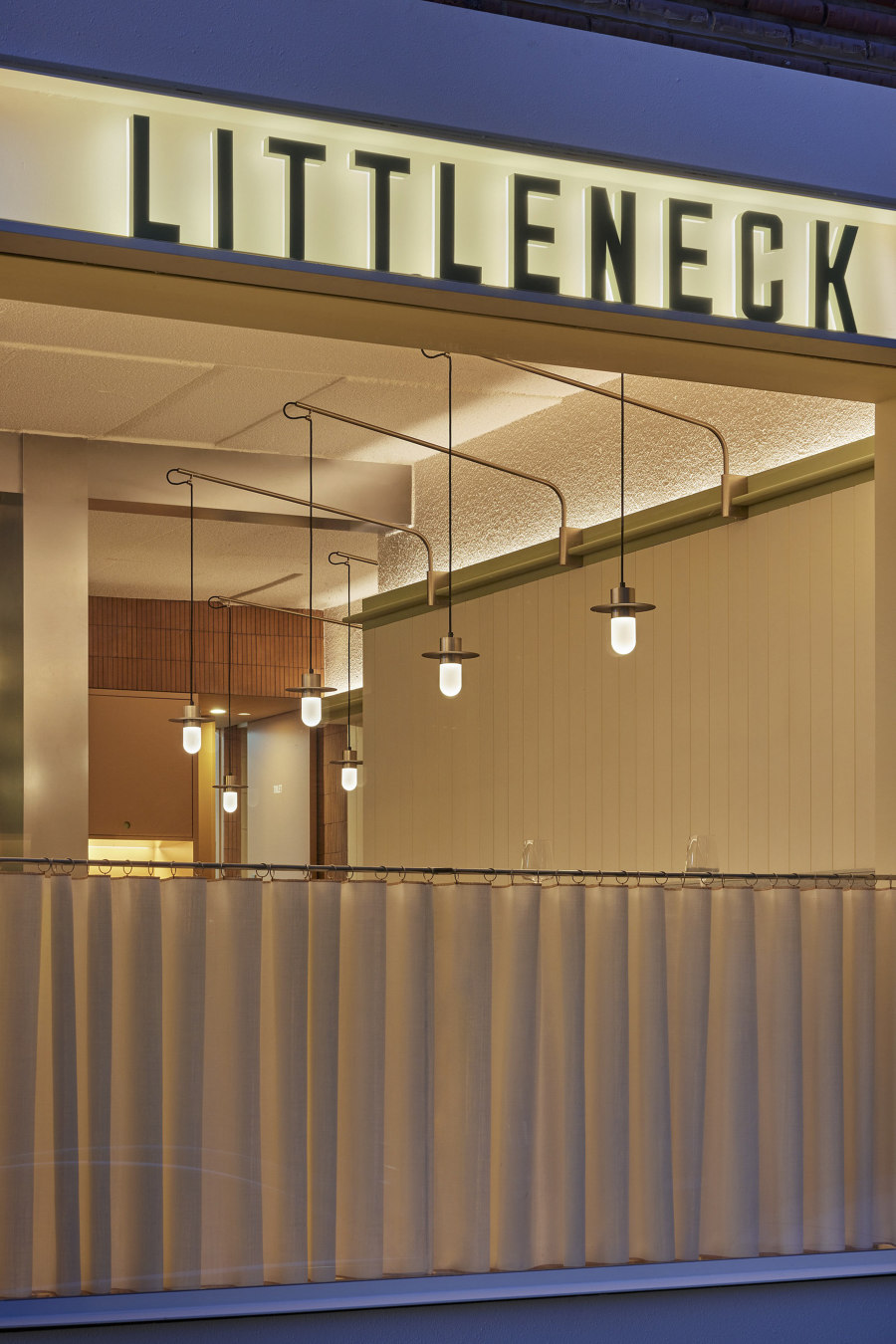
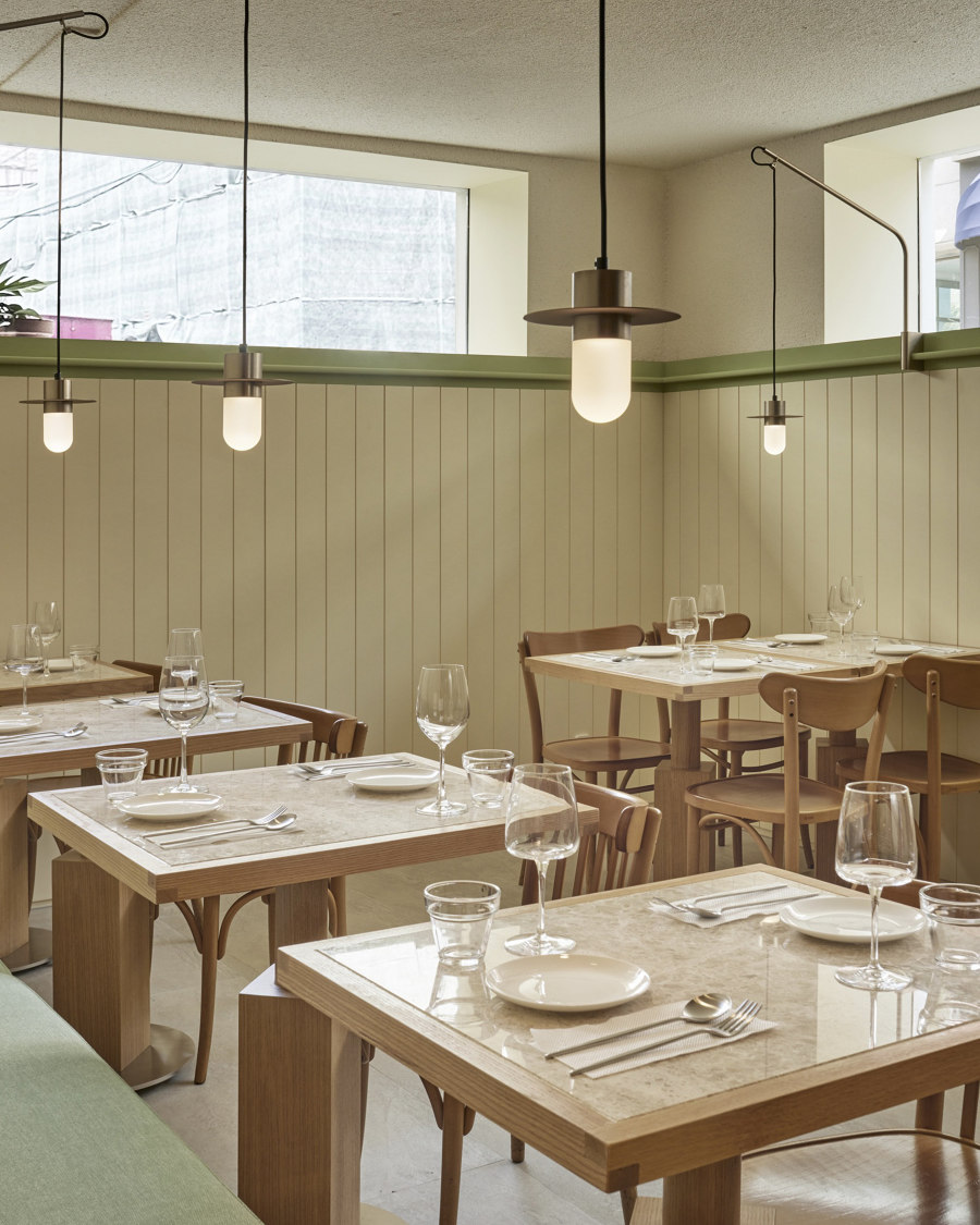
Custom-made fishing-rod-like pendant lights fixed to the mouldings are able to position orbs of soft, glowing light anywhere in three dimensions for flexible, intimate lighting. Photos: Roh Kyung

Custom-made fishing-rod-like pendant lights fixed to the mouldings are able to position orbs of soft, glowing light anywhere in three dimensions for flexible, intimate lighting. Photos: Roh Kyung
×Littleneck Restaurant in Gangnum-Gu, South Korea, by SLA South Korea
‘Intimate’ is a word often used to describe something that’s a bit on the small side, in a more positive light. When a small restaurant boasts of its intimacy, however, this can mean sharing a romantic meal elbow-to-elbow with a complete stranger. In order to separate tight-knit tables, restaurants use clever acoustics and lighting arrangements to create islands of enclosed light and sound.
It can mean sharing a romantic meal elbow-to-elbow with a complete stranger
While installing low-hanging pendants keeps the tables’ surfaces clear of obstruction, restaurant seating plans that are dependent on occupancy and booking size mean permanent lighting solutions are often lacking in flexibility. At the Littleneck Restaurant in Gangnam-Gu, South Korea, ‘a sense of intimacy’ is revealed, explain the architects SLA, in part with ‘custom lighting fixtures that hang on the moulding, creating a dynamic perspective of the space.’ The fishing-rod fixtures are able to position a sphere of light at any height and position.
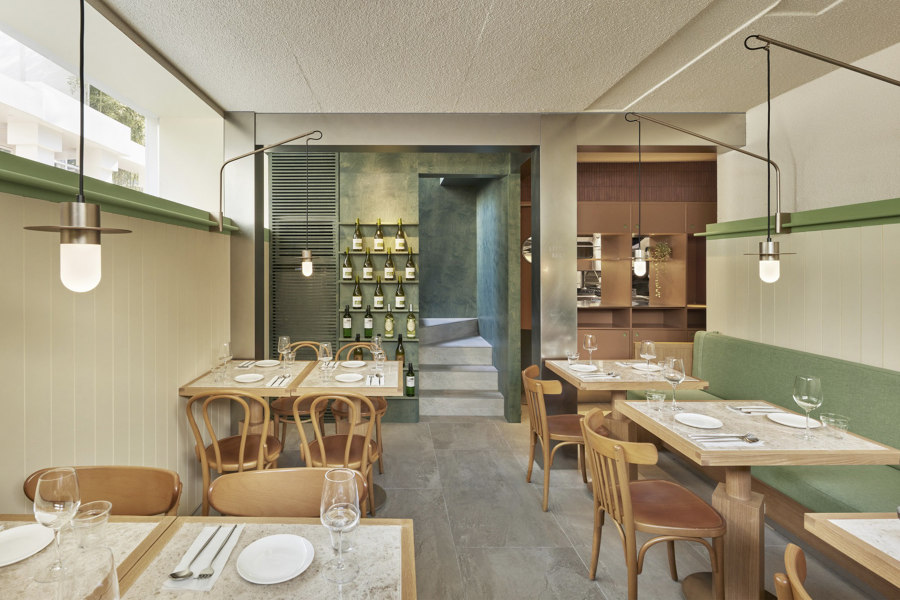
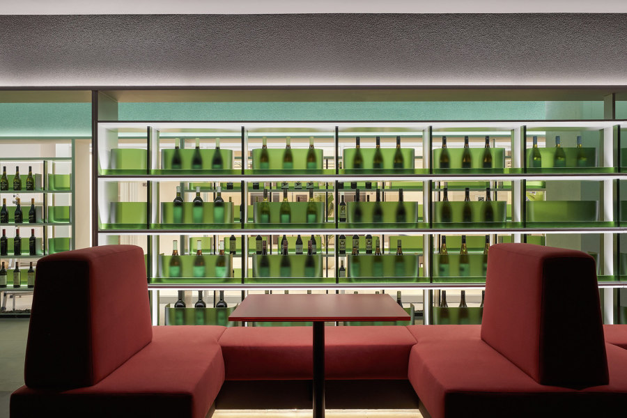
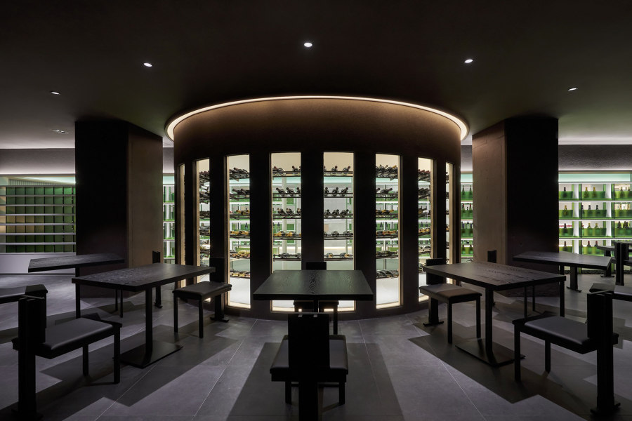
Sandwiching its green-hued central wine library (top) with rich red upholstered (middle) and darker grey seating areas (bottom), the MOWa restaurant takes guests on a journey through the margins of the bottle. Photos: SOULGRAPH

Sandwiching its green-hued central wine library (top) with rich red upholstered (middle) and darker grey seating areas (bottom), the MOWa restaurant takes guests on a journey through the margins of the bottle. Photos: SOULGRAPH
×MOWa Restaurant in Jung-Gu, South Korea, by 134, Design Studio Maoom
Green is a colour that’s synonymous with wine. With the familiar rich hue bringing a mysterious look to each bottle, the dark green glass is also useful to hide the amount that remains. The bottle, therefore, consistently seems half full, rather than half empty. The MOWa restaurant in Jung-Gu, also South Korea, is a space inspired by the margins found within the wine bottle. ‘Just like the empty spaces in glass have a purpose,’ explain the restaurant’s architects, 134, Design Studio Maoom, ‘margins can mean emptying, and sometimes they can mean filling.’
MOWa is a space inspired by the margins found within the wine bottle
The restaurant, which pairs its wines with Korean cuisine, runs a green-hued corridor straight down its centre, serving as a library of wine. Deep red upholstery sits to one side of the central passageway, representing the remaining tipple, while a starker grey area shares the opposite wall to reference a third space that waits to be filled. Using up-lighting against a green ceiling and diffused lighting through green frosted glass panels in the wine shelves, being inside the passageway feels like being inside the bottle itself.
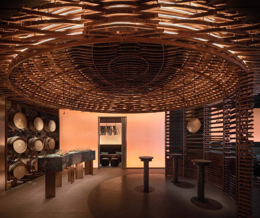
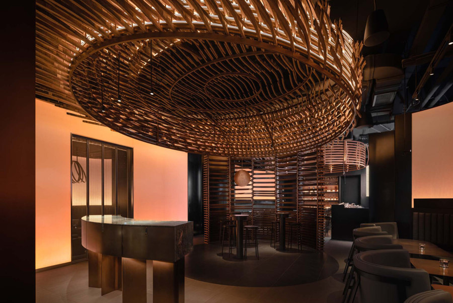
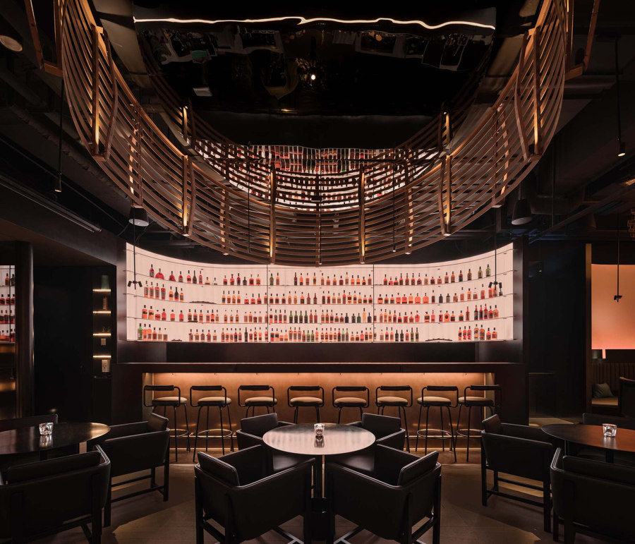
The near-blackout Laizhou Bar, barely lit by diffused panels and large ‘nest’ lighting features made from remnants of used whisky barrels, enhances the relaxation provided by the drink. Photos: Wen Studio

The near-blackout Laizhou Bar, barely lit by diffused panels and large ‘nest’ lighting features made from remnants of used whisky barrels, enhances the relaxation provided by the drink. Photos: Wen Studio
×Laizhou Bar in Shanghai, China, by RooMoo Design Studio
The concept of blackout dining is that, with visual senses removed, other senses such as taste and smell – those more imperative to dining – are enhanced, leading to increased gastronomic pleasure. The activity, as well as the number of blackout restaurants, is growing in popularity. But while darkness may increase gastronomic pleasure, fumbling around in the dark for a whisky glass likely does little to improve comfort and relaxation.
Guests can take a dram without the burden of light clouding their senses
Instead of complete darkness, architects RooMoo Design Studio has created a dark, but not entirely without light space for the Laizhou whisky distillery where guests can take a dram without the burden of light clouding their senses. panels of heavily diffused amber light and growing ‘nest’ lighting fixtures made from the remnants of used whisky barrels, RooMoo has added the cosiness of a flickering fire and birds’ nest to the bar’s tasting area. As more barrels reach the end of their life, in part due to the popularity of the bar, a second nest above the bar area will thicken.
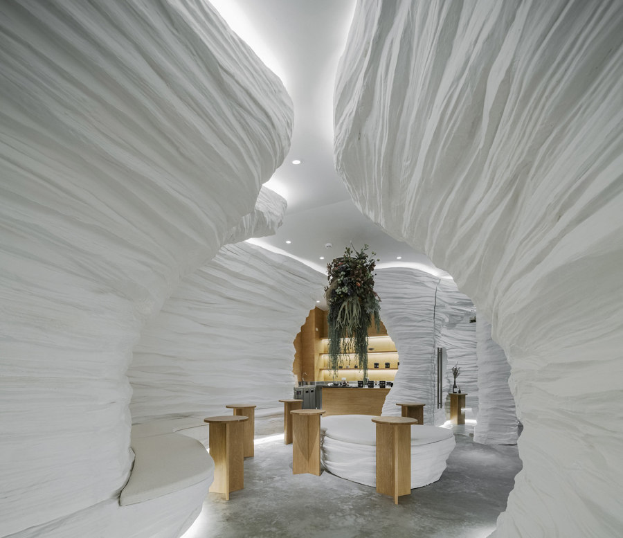
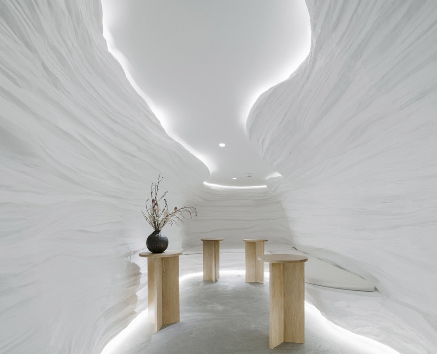
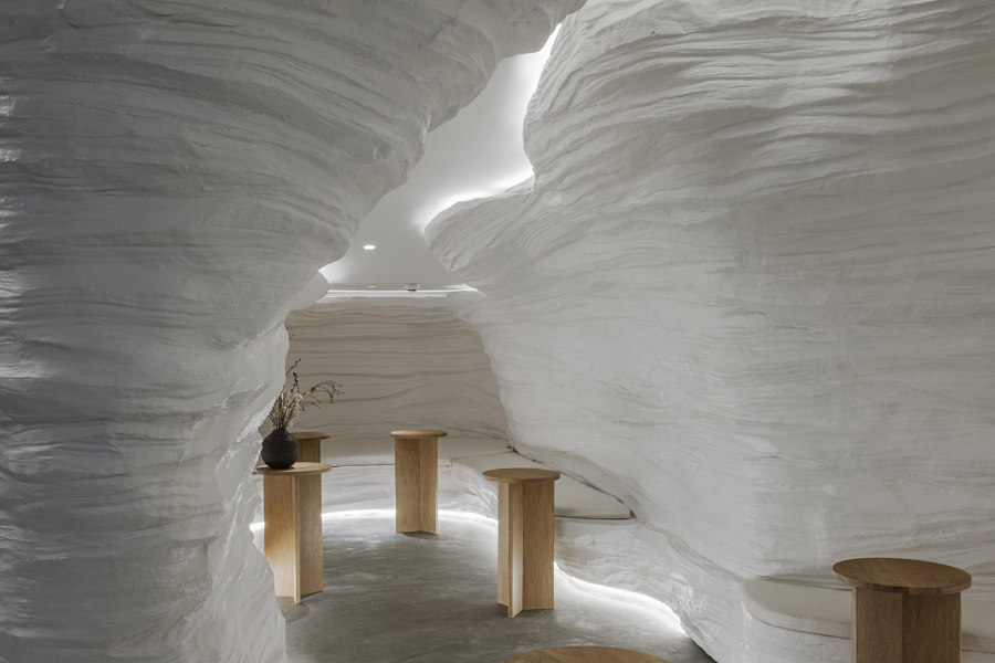
Soft lighting navigates a line around the form of the KSANA Tea House’s cave-like walls, helping to bring their texture into sharper focus. Photos: Peerapat Wimolrungkarat

Soft lighting navigates a line around the form of the KSANA Tea House’s cave-like walls, helping to bring their texture into sharper focus. Photos: Peerapat Wimolrungkarat
×KSANA Tea House in Bangkok, Thailand, by Juti architects
The depths of an underground cave system is one of the darkest natural spaces humans can find themselves, but also one of the most peaceful. As well as light, sound is also blocked out and only the gentle, echoing trickle of underground geology remains. With walls of moulded fibreglass sculptured with cave-like textures, combined with the stark purity of white, the KSANA Tea House in Bangkok ‘was designed to be a place where you escape from the city to drink tea in a gorge or cave’ explain Juti architects.
‘A place where you escape from the city to drink tea in a cave’
Although both the cave walls and the more clearly man-made flatness of the floor and ceiling are white, lighting set at the edges of the walls draws noticeable lines around the shape of the cave, bringing the edges themselves closer into focus, while helping the texture of the surfaces form realistic highlights. ‘This kind of experience,’ explain the architects, ‘will make us feel relaxed and reach true peace and balance.’
© Architonic
Head to the Architonic Magazine for more insights on the latest products, trends and practices in architecture and design.
