How to choose children’s bedroom furniture
Texte par James Wormald
12.09.22
Children first, society says. But this often isn’t the case when it comes to interior design choices. Adaptable, child-centred design makes a supportive, creative world, built just for them.
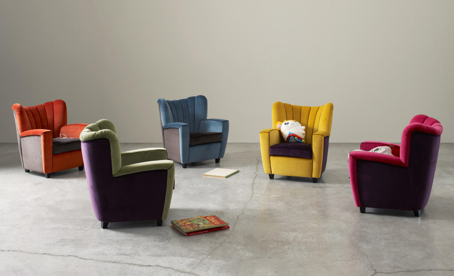
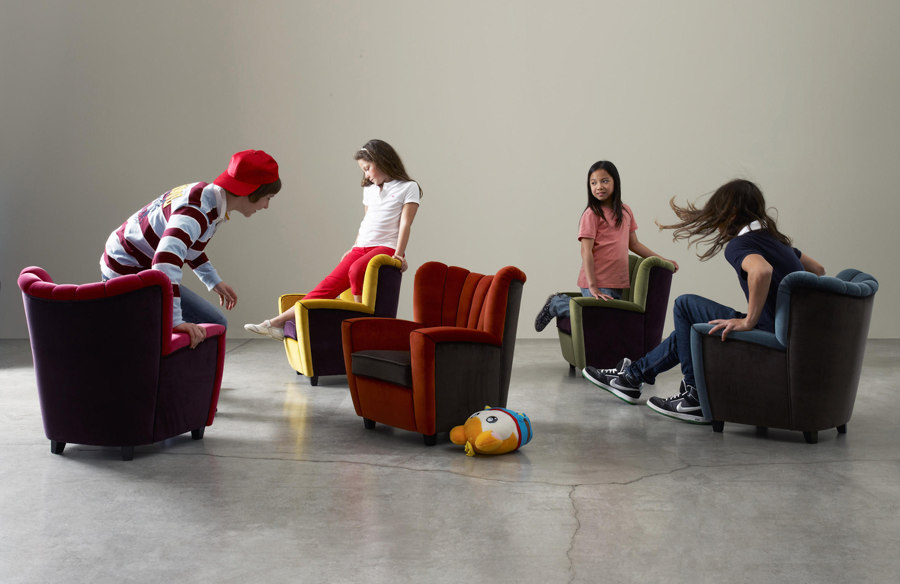
Adele–C’s Zarina Baby armchair, a miniature version of the adult version, inspired by the chair originally handmade as a gift by Adele Cassina’s father, in 1944

Adele–C’s Zarina Baby armchair, a miniature version of the adult version, inspired by the chair originally handmade as a gift by Adele Cassina’s father, in 1944
×In the majority of family homes, it’s common for children to be given the smallest rooms. They are, after all, the smallest people. But where grown-ups have the rest of the house to fill with their accrued material wealth, children’s only freedom to decide what they do and where things go, is in that one small room.
Learning about the world can be frustrating, and quickly lead to misdiagnosed ‘bad’ behaviour. So creating a safe, welcoming, comfortable space where children can feel calm, loved and protected, while enjoying their independence and individuality, is essential for a happy, healthy childhood. Children’s bedroom design, therefore, has more in common with open-plan living than simple sleeping quarters.
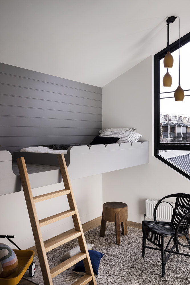
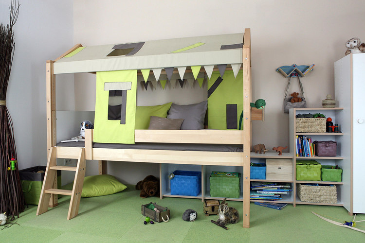
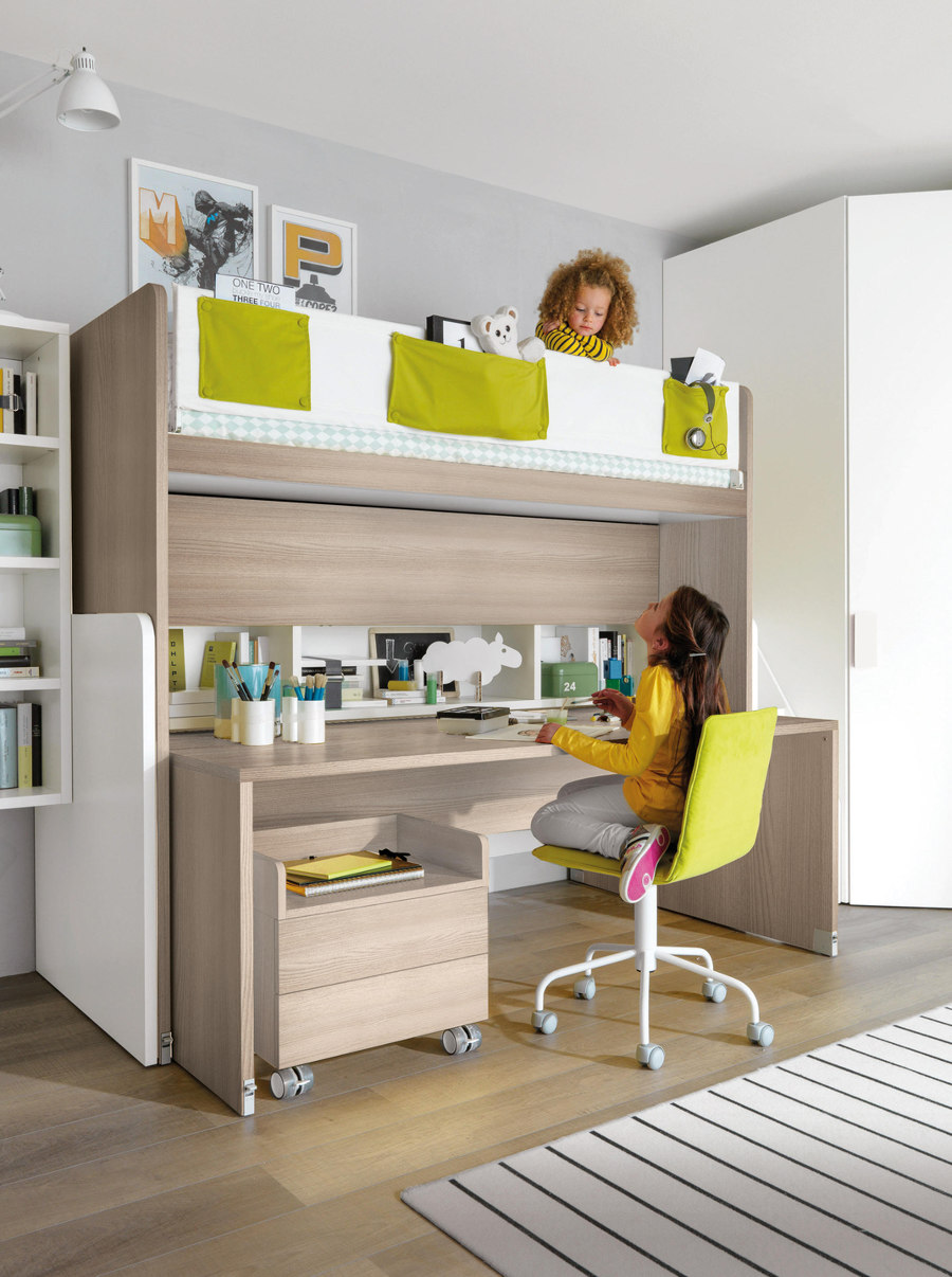
The raised bed at Nido II (top) and loft beds from De Breuyn (middle) with play space, and Letti A Castello from Zalf (bottom) with workspace, underneath. Photo: Dylan James (top)

The raised bed at Nido II (top) and loft beds from De Breuyn (middle) with play space, and Letti A Castello from Zalf (bottom) with workspace, underneath. Photo: Dylan James (top)
×Work, rest and play: the many faces of a child’s bedroom
Literally designed for a growing family – the brief changing from young couple to family of six during the project – Nido II House’s architects, Angelucci Architects, raised the children’s beds off the floor, opening the space underneath for more activity. And children’s loft beds such as the City high play bed from De Breuyn create similar split-level environments for children to play during the day and sleep soundly at night.
Growing children, of course, have drastically changing interests and requirements. Letti A Castello is another loft bed example from Zalf, this time allocating its under-space for a generous desk, shelves and storage, perfect for school projects, writing, artwork and much more besides. With more children to squeeze into a small space, however, mihadesign’s nr1977 house takes the loft bed concept, and flips it on its bed. Two ‘boxes’ sleep the entire six-person family on their lower level, while upper levels feature low-height areas for the children to sit, write, read, draw and play together.
True Home’s children’s rooms’ twice-functional storage (top, middle) and De Breuyn’s Cabinets with multiple options to show or hide the goods (bottom). Photos: Yevhenii Avramenko (top, middle)

True Home’s children’s rooms’ twice-functional storage (top, middle) and De Breuyn’s Cabinets with multiple options to show or hide the goods (bottom). Photos: Yevhenii Avramenko (top, middle)
×Storage: put everything in its place
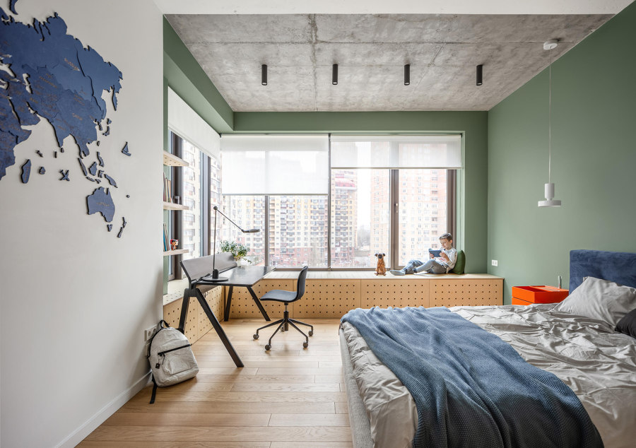
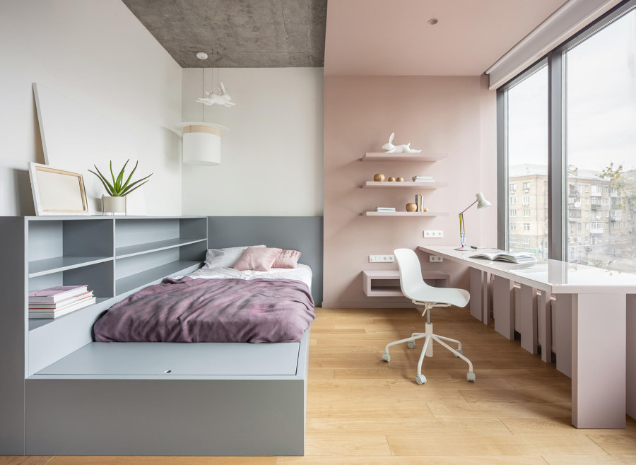
With piles of books, clothes, toys and equipment all needing storage and organisation in children’s rooms, it’s no wonder they’re hard to keep tidy. Minimal but functional storage solutions are applied in the Bogdanova Bureau-designed True Home in Kyiv, where storage chests camp underneath windows, forming comfortable reading spaces in one room. While in another, a wide focussed desk space is coloured in wakeful dusty pink and filled with natural light, separated from the calming grey of a sleep and storage area opposite.
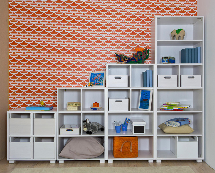
Systems like this, which combine open and closed storage in chests, cupboards and shelves, along with sliding drawers and various-sized trays and containers like De Breuyn’s Cabinet Combinations, enable children to keep their private objects hidden from view, messy items ordered and to position their most prized possessions, creations and other memorable objects for all to see.
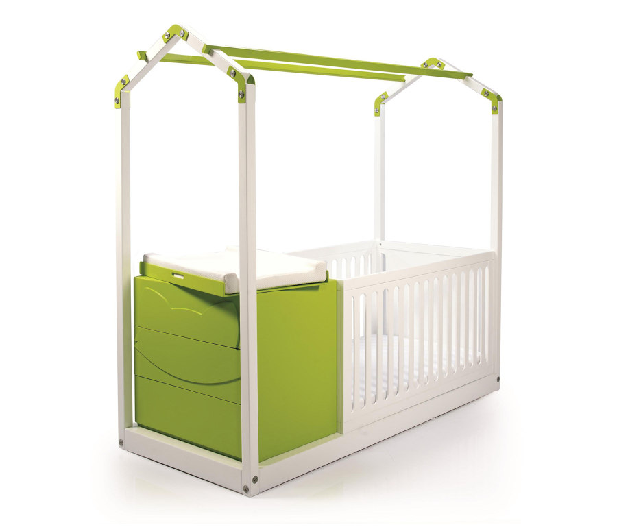
Magis’ Little Big table and chair (top) and GAEAforms’ Casa e Crib (middle) both change for fast-growing people, while timkid’s SILA (bottom) gives kids a space to call their own. No grown-ups allowed

Magis’ Little Big table and chair (top) and GAEAforms’ Casa e Crib (middle) both change for fast-growing people, while timkid’s SILA (bottom) gives kids a space to call their own. No grown-ups allowed
×Personal and physical growth
Children grow at an alarming rate, so functional furniture that remains functional as they expand is a modern imperative. As babies transform from immobile bundles through into young adults, adaptable beds like GAEAforms’ Casa e Crib are able to change with them. The bed’s house-like frame is home to a bassinet or cot and changing table, suitable from 0-3 years, before becoming a standard single.
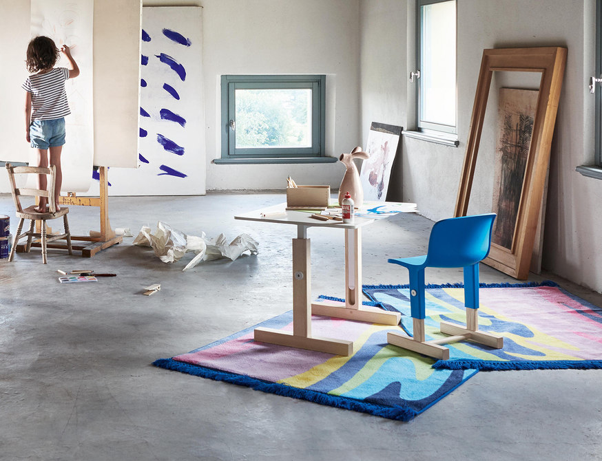
Keeping the correct seating position is an important aspect of workplace health. So why do children – who spend most of their day sitting at a desk and are constantly growing – have desks that stay the same? Recognising the injustice, Magis’ Little Big series are height-adjustable desks and chairs for small, then suddenly not-so-small, bodies.
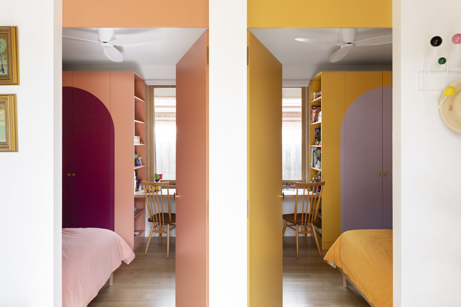
Rooms of equal size and individual colour (top) and the shared corridor (middle) of PONY House’s children’s wing, and the personal-size Zarina Baby (bottom). Photos: Martina Gemmola (top, middle)

Rooms of equal size and individual colour (top) and the shared corridor (middle) of PONY House’s children’s wing, and the personal-size Zarina Baby (bottom). Photos: Martina Gemmola (top, middle)
×Individualism: alone but together
Childhood is all about learning and accepting who you are, but also about fitting in with others. Understanding this paradoxical desire – to become an individual but not to do it alone, is crucial to a child’s mental health.
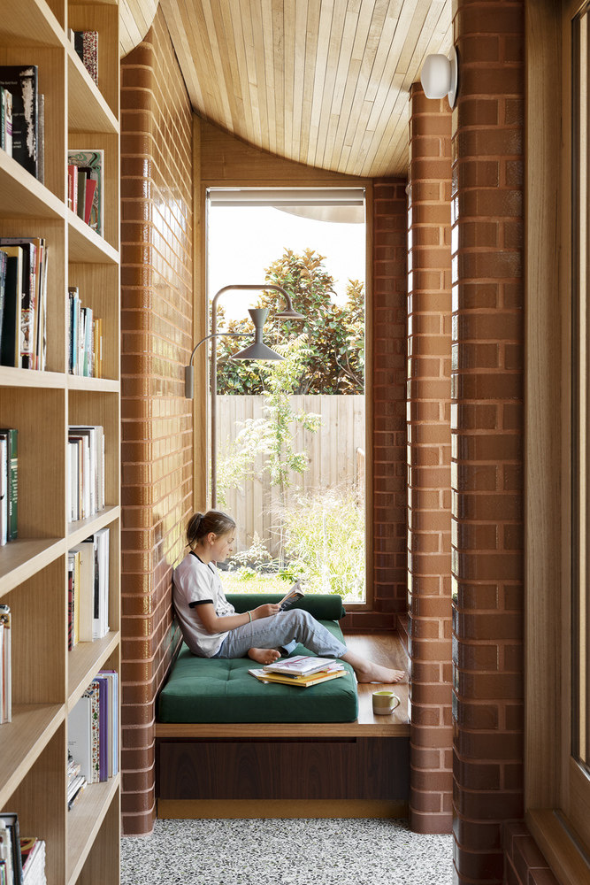
Giving children this space to be alone, together, the PONY House in Brighton East, Australia, by WOWOWA Architects, features a dedicated ‘children’s wing’ in its redesign. To increase the feeling of togetherness and independence from adults, the rooms – with the same measurements and layout but individual colour schemes – share a connecting corridor with an inviting reading nook that opens out onto the family pool and outdoor seating.
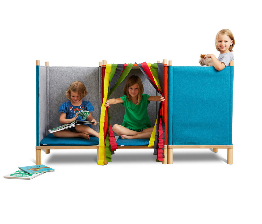
Alternatively, timkid’s acoustic children’s furniture SILA very simply separates square-cushioned seats with felt partitions, letting single or groups of children get away from the (adult) world for a while, and Adele–C’s Zarina Baby chair gives children a taste of the personal pleasure of a seat that’s just for them. So even if there isn’t space for a dedicated children’s wing, perhaps there’s room for a children’s wing chair instead.
© Architonic
Head to the Architonic Magazine for more insights on the latest products, trends and practices in architecture and design.
