Open call: when architecture uses open facades to make friends
Texte par James Wormald
17.04.23
These multi-purpose, residential, retail and cultural buildings use open and approachable facades to stay on speaking terms with the neighbours.
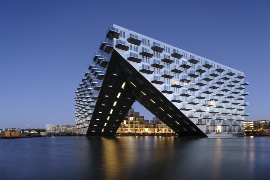
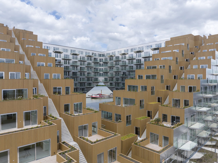
Built on the IJburg harbour in Amsterdam, the Sluishuis connects the water and the city, projecting its sloped facade into the sea at a cantilevered front corner. Photo: Ossip van Duivenbode

Built on the IJburg harbour in Amsterdam, the Sluishuis connects the water and the city, projecting its sloped facade into the sea at a cantilevered front corner. Photo: Ossip van Duivenbode
×Let’s talk. Good communication is key to building and maintaining working relationships, be they personal, romantic, business or geopolitical. The importance of communication with and respect for one’s neighbours is a lesson that has featured heavily in many texts and teachings from all religions and cultures for millennia, possibly sparking civilisation itself.
Some of the fastest growing economies are keen to shout from their garden rooftops about their growing environmentalism, infrastructure, attractive investment opportunities and rising architectural scene, but also to keep alive the history and culture of their past, and build socially active environments. These four building projects from across East Asia and Europe both visually and symbolically invite guests inside to see how they operate, building positive relationships with residents of the building and the city, and visitors from beyond.
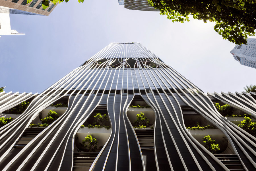
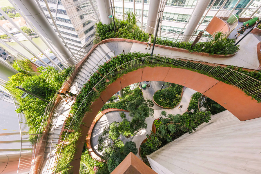
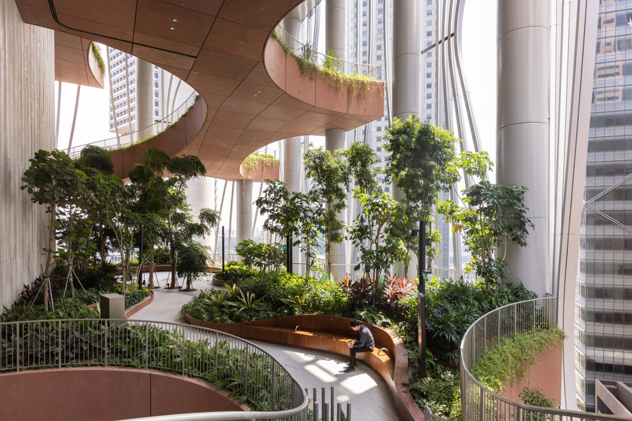
The mixed-use Capita Spring building in Singapore draws back its facade curtains to reveal environmental insides underneath, with tall public-use gardens set at intervals. Photos: Finbarr Fallon

The mixed-use Capita Spring building in Singapore draws back its facade curtains to reveal environmental insides underneath, with tall public-use gardens set at intervals. Photos: Finbarr Fallon
×Capita Spring in Singapore by Carlo Ratti Associati and BIG
Singapore is a city-state well known for blending environmentalism with its architectural scene, with decades worth of green building projects, such as the Gardens by the Bay’s 18 super trees, sprouting up from the once-concreted urban floor. Capita Spring is another urban construction that not only seems to bleed green, but actually pulls apart its skin to prove it. ‘At multiple elevations, the vertical elements comprising the building’s exterior are pulled apart,’ explain the architects, Carlo Ratti Associati, ‘to allow glimpses into the green oases.’
The facade is stretched and pinched to reveal an 18m-high ground-floor cavity
The building communicates with the public by adding accessible green public environments, without sacrificing commercial floorspace. The facade is stretched and pinched to reveal an 18m-high ground floor cavity forming public walkways and cycle routes, for example, while at the facade-defining heart of the building, ‘four connected levels of organic softscape’ are added. The resulting 35m-tall open-air garden ensures the tower becomes another icon of architectural environmentalism for the city.
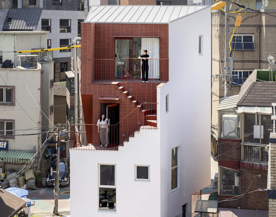
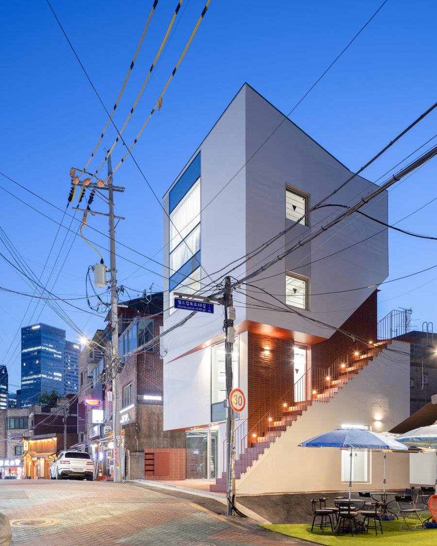
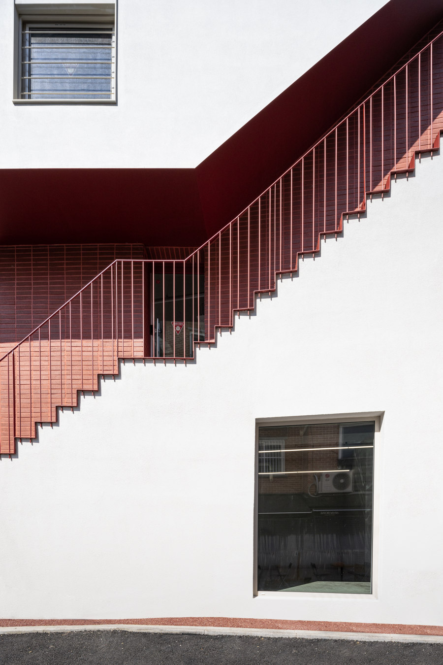
By cutting away a section of its exterior wall and exchanging an interior staircase for an exterior one, OHOO architects have brought movement to the city landscape: Photos: Bae Jihun

By cutting away a section of its exterior wall and exchanging an interior staircase for an exterior one, OHOO architects have brought movement to the city landscape: Photos: Bae Jihun
×Red Hole Commercial Building in Mapo-Gu, South Korea, by OHOO architects
Instead of cutting away part of its facade to reveal an unexpected space underneath, when the Red Hole Commercial Building in South Korea removed a chunk of its exterior wall, it instead presented a rather common one. A staircase. By animating the facade with the action of moving visitors, the form adds liveliness to the local landscape, becoming ‘one of the street’s most gazed at and visited buildings,’ as OHOO architects put it.
By combining white render and red brick, the interior and exterior elements of the building facade meet to form a contrast that diverges the two, ‘making the building resemble a piece of bitten-off red velvet cake,’ according to OHOO architects, who added red ‘in between gaps in the twisted form of the facade to give it character.’
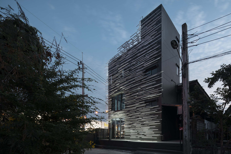
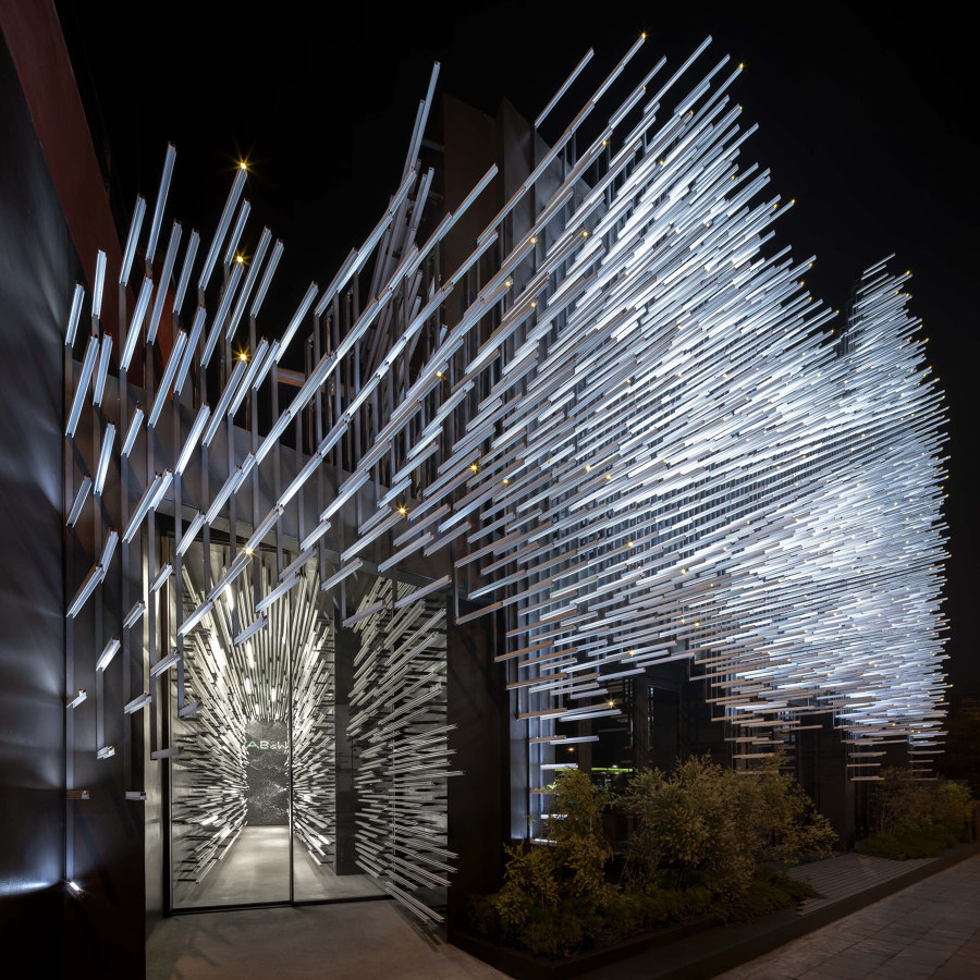
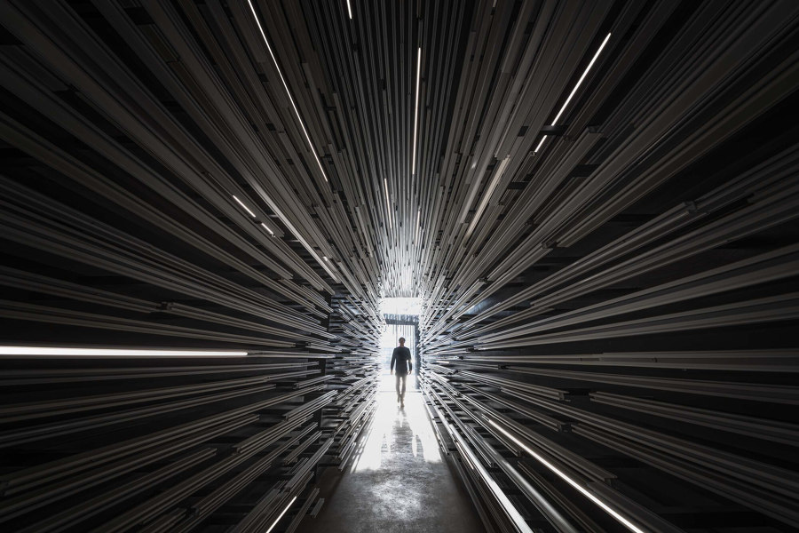
With thousands of aluminium strips, HAS design and research added a new dimension to the MoMA’s (Museum of Modern Aluminium) facade in Bangkok, then continued the journey inside. Photos: W Workspace

With thousands of aluminium strips, HAS design and research added a new dimension to the MoMA’s (Museum of Modern Aluminium) facade in Bangkok, then continued the journey inside. Photos: W Workspace
×Museum of Modern Aluminium Thailand in Nonthaburi, Bangkok, Thailand by HAS Design and Research
As a building that narrates Thailand’s history with aluminium and its relationship with the country’s economy, the MoMA (Museum of Modern Aluminium) in Bangkok places its exhibitions behind a suitably futuristic facade. Thousands of simple suspended aluminium profiles combine with LED lighting to dance on the museum’s front and side facades, inspired both by swaying dandelion puffs and the fireflies of nearby Ko Kret island.
The carefully arranged facade gives approaching visitors a sense of faster-than-light inertia as they’re transported through the wormhole entrance into the space. Once inside, however, the facade itself follows them in. ‘The aluminium strips,’ explains project architects HAS Design and Research, ‘extend straight through the tunnel space, filtering and dampening the noise of the external environment and guiding visitors.’
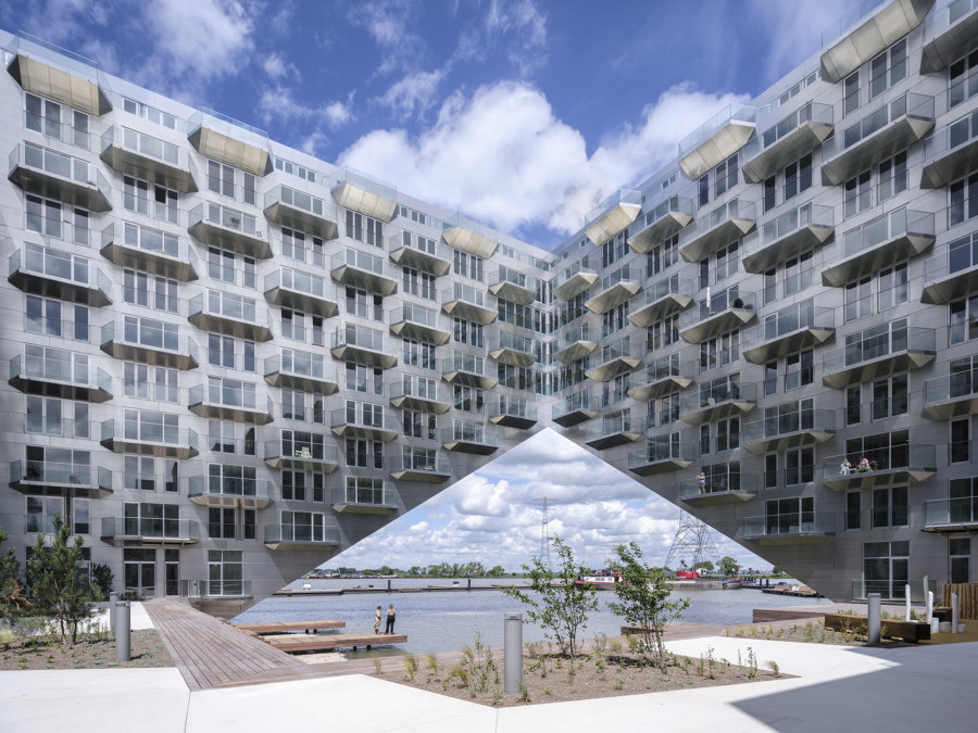
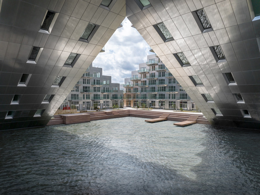
Sluishuis’ cut-away corner (top) invites seafarers towards a jetty promenade inside (middle), while stepped terraces (bottom) communicate with the city on the other side. Photos: Ossip van Duivenbode

Sluishuis’ cut-away corner (top) invites seafarers towards a jetty promenade inside (middle), while stepped terraces (bottom) communicate with the city on the other side. Photos: Ossip van Duivenbode
×Sluishuis Residential Building in IJburg, Amsterdam, The Netherlands by BIG and Barcode Architects
Sluishuis cuts an imposing figure, sitting above Amsterdam’s IJmeer like a tactical rampart. But the residential building invitingly opens up at both ends, communicating and welcoming viewers and visitors from both land and sea. Where the structure meets the water, for example, the lower corner of the Sluishuis seems to simply disappear, welcoming travelling mariners to its floating jetty promenade like a pirate’s cove. Thanks to the resulting sloped facade, ‘the apartments at the bottom of the cantilever,’ explain architects BIG, Sluishuis boasts a unique feature ‘with stunning views over the IJ and directly on to the water.’
The lower corner of the Sluishuis seems to simply disappear, welcoming travelling mariners to its floating jetty promenade like a pirate’s cove
At the opposite corner of the structure, meanwhile, a facade of stepped apartment terraces – cut in half with a public-access staircase, leading to a rooftop pathway – ‘creates surprising sightlines and exchanges with the city and beyond. ‘Stimulating contact with the water by introducing various mooring places, sitting decks and floating gardens,’ suggest the architects, Sluishuis’s many-angled facade ensures the water of the IJmeer becomes a prominent aspect of its architecture.
© Architonic
Head to the Architonic Magazine for more insights on the latest products, trends and practices in architecture and design.
