When changes in flooring alter our spatial experience
Texte par James Wormald
19.06.23
The floors we stand, walk and arrange furniture on are a constant presence. By contrasting colour, texture and material we can improve the comfort, navigation and usability of our most in-contact surface.
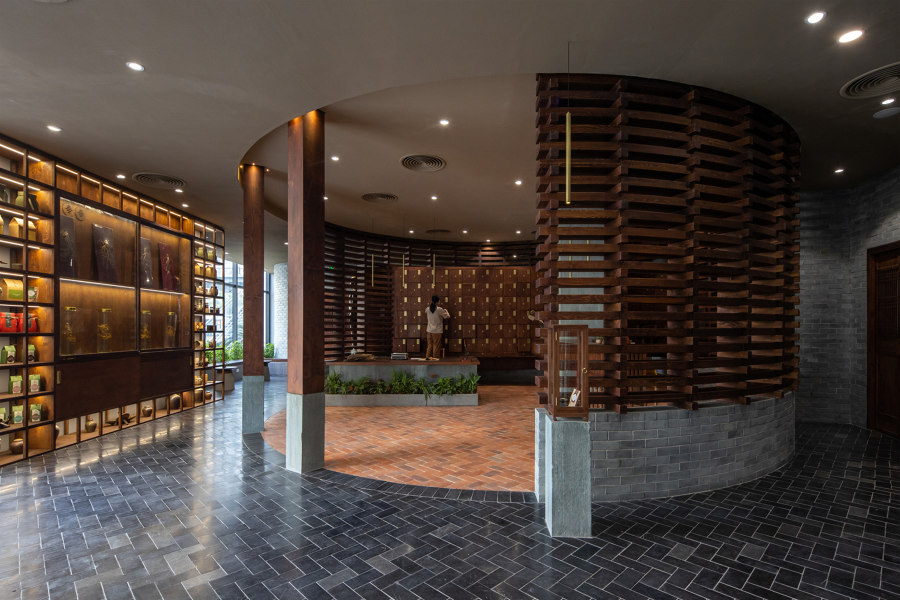
By contrasting terracotta and natural stone tiles in its flooring, the Phong Kham Yacht Traditional Clinic has a trustworthy and authoritative presence within its transparent architecture. Photo: Hoang Le

By contrasting terracotta and natural stone tiles in its flooring, the Phong Kham Yacht Traditional Clinic has a trustworthy and authoritative presence within its transparent architecture. Photo: Hoang Le
×Designers and architects have a mountain of modern, high-performance flooring options at their disposal. From standard choices like wood, carpet, ceramic tiles or natural stone; to heavy-duty commercial favourites like terrazzo, concrete or poured epoxy. Add less well-tread options like cork and leather and then multiply them all with imitation solutions like laminate and luxury vinyl, and it’s easy for decision-makers to get lost in indecision.
Despite the size of the marketplace, however, we tend to just make our choices and stick with them, using just one type of floor for each room. Not so in the case of the following four projects, which select and arrange various flooring types together in the same room, adding functionality to the floor and helping to improve how we interact with the spaces above.
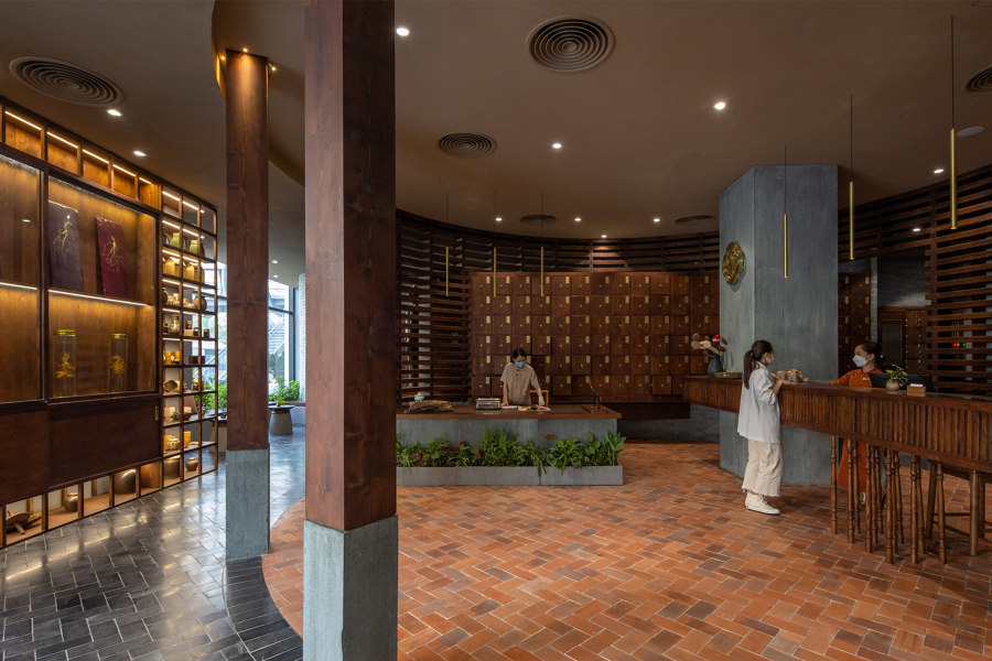
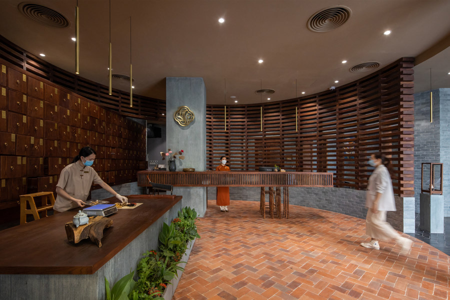
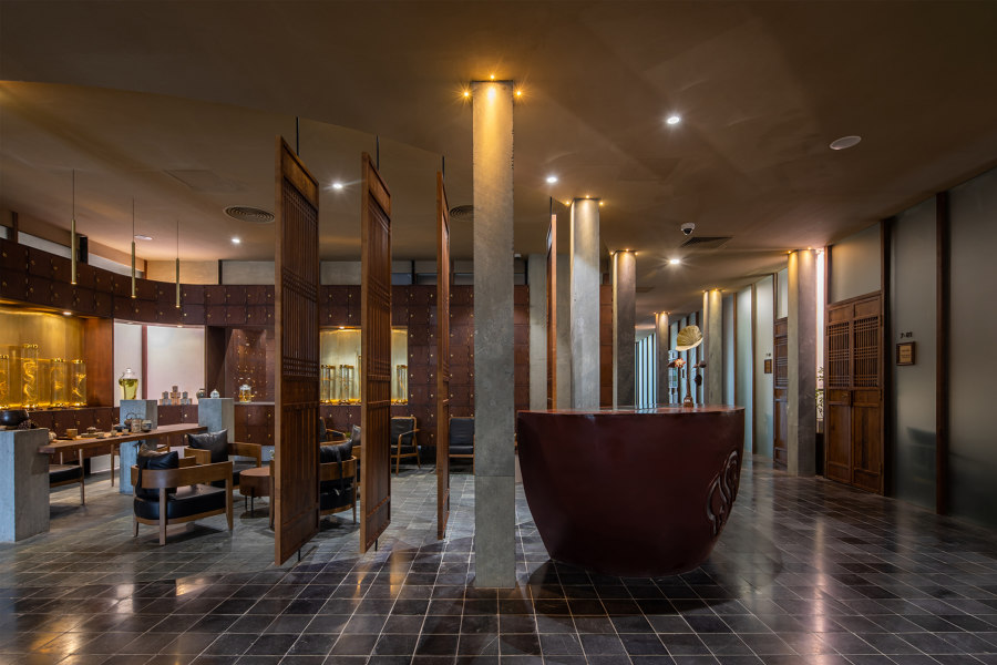
The Traditional Clinic segregates itself as an informative space, yet remains open to the wider public looking to explore traditional natural medicines. Photos: Hoang Le

The Traditional Clinic segregates itself as an informative space, yet remains open to the wider public looking to explore traditional natural medicines. Photos: Hoang Le
×Phong Kham Yhct Traditional Clinic in Hanoi, Vietnam, by ODDO architect
As a unique aspect of Vietnamese medicine, ailments are often treated with traditional medicines that include natural ingredients. In a mixed-use residential complex in a rapidly developing area of Hanoi, the Traditional Clinic brings an informative and educational pharmacy space to the building’s street-level reception area, as well as treatment spaces up on the seventh.
Using two contrasting materials on the floor allows the clinic to create an elegant curve
‘The design is oriented around the utilisation of natural and traditional materials,’ explains ODDO architects, on the connection between the terracotta tiles and natural stone tiles of its flooring, and the natural properties of its prescribed medicines. Using both these two contrasting natural materials on the floor, however, allows the clinic to create an elegant curve that ‘not only decides each function, but also highlights the image of the traditional pharmacist, carefully and precisely concocting each dose,’ as ODDO architects describe, ‘helping patients to better understand, be reassured and trust in the methods of traditional medicine.’
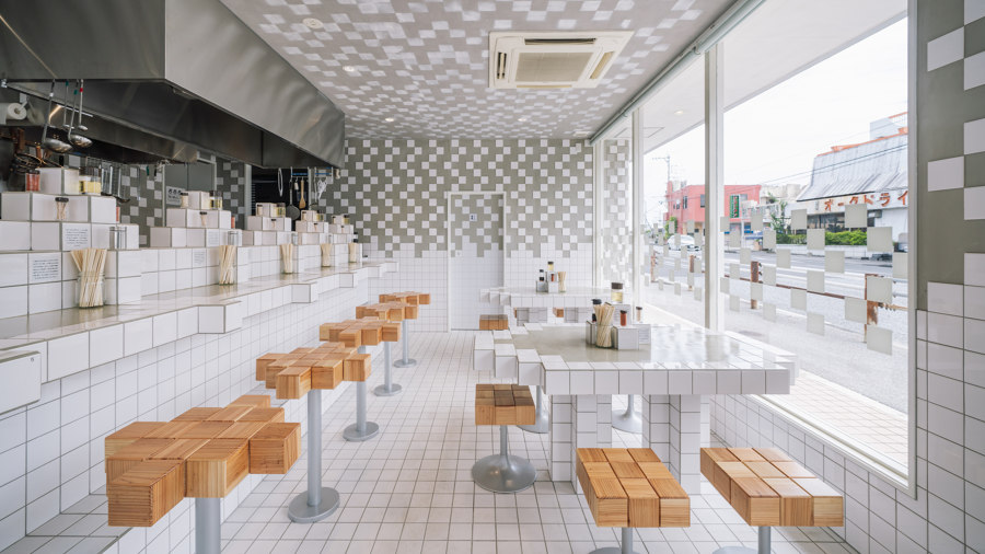
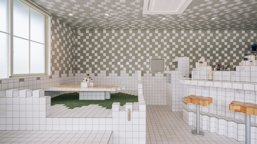
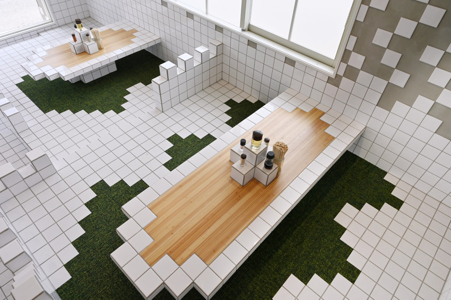
Ceramic white tiles bring suitable pixellated surfaces to the video-game-themed Kaishin No Ichigeki noodle bar, while green carpet tiles encourage diners to sit or kneel in comfort. Photos: Yoshiaki Ida

Ceramic white tiles bring suitable pixellated surfaces to the video-game-themed Kaishin No Ichigeki noodle bar, while green carpet tiles encourage diners to sit or kneel in comfort. Photos: Yoshiaki Ida
×Ramen in the video game world in Okinawa, Japan, by 07BEACH
After the concept for this dipping noodle bar was decided – early-format pixelated 8-bit video games of the retro-popular past – the flooring choice of square, white ceramic tiles was simple, and the surface could easily stretch up to cover the restaurant’s decorative walls, furniture and even condiment architecture, too.
By cutting away the tiles around tables, the exposed spaces direct patrons on where to sit
Keeping tables in the raised group seating section low to the ground allows customers to casually kneel or sit cross-legged should they prefer, but in this instance, the use of ceramic tiles represents a restriction on comfort. By cutting the tiles away in seating spots around the table, the exposed spaces direct patrons on where to sit. ‘The ceramic tiles and carpet tile materials on the floor are ordinary, but look unique with the combination and forms,’ as architects 07BEACH explain, with the comfortable green carpet tiles reminding users of close-cropped video game grass, enhancing the three-dimensional in-game experience.
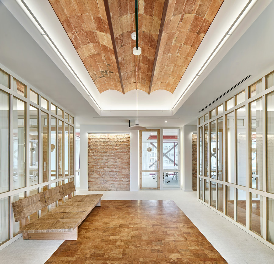
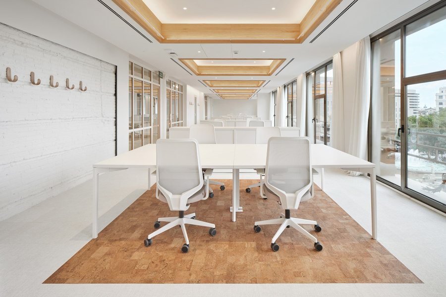
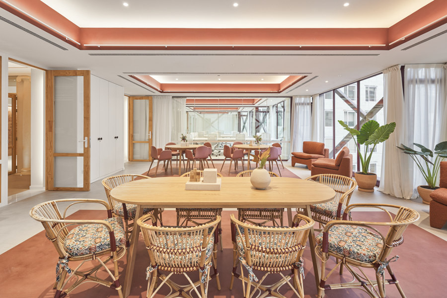
‘Interior windows’ frame exhibitions of natural materials at the LOOM offices’ culturally significant and historically sensitive renovation. Photos: José Hevia

‘Interior windows’ frame exhibitions of natural materials at the LOOM offices’ culturally significant and historically sensitive renovation. Photos: José Hevia
×Casa Pich i Pon. LOOM Plaza Catalunya in Barcelona, Spain, by SCOB and Sergi Carulla Altadill and Oscar Blasco Lárazo
‘Inspired by the Noucentisme aesthetic, both in composition, colour, texture and materials,’ explain project architects SCOB, of the flooring installed in the LOOM offices at Plaza Catalunya in central Barcelona, the renovation project ‘reinterprets them as resources in the reorganisation of spaces.’ This strategy is used to rediscover the original structures and materials through ‘interior windows’, as Scob describes them, framing the natural, earth-toned wood floors, brick walls and vaulted Catalan ceilings.
These geometric drawings on the surrounding surfaces serve not only to direct users to the history of local architecture and its relationship with the materials, but also help to direct users around the layouts themselves, establishing shared work points and reinforcing natural interactions.
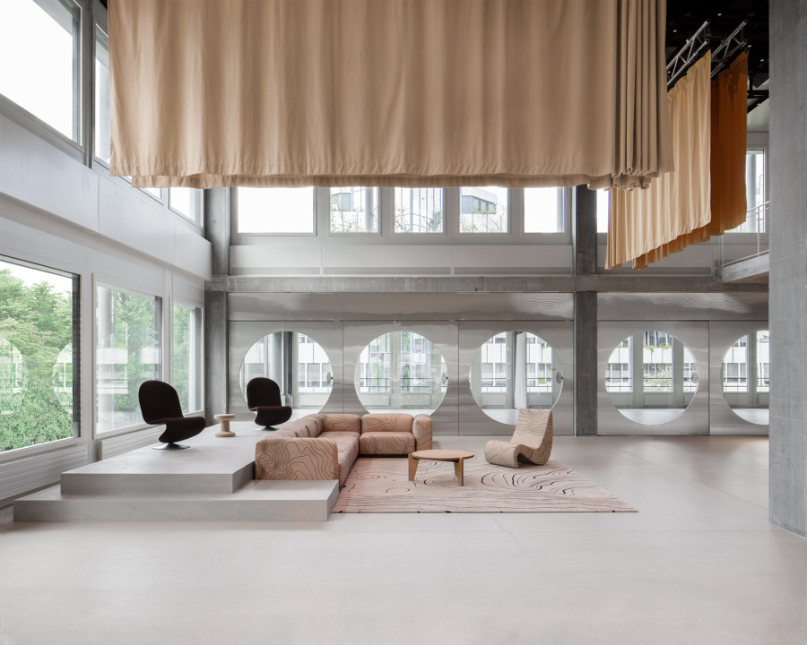
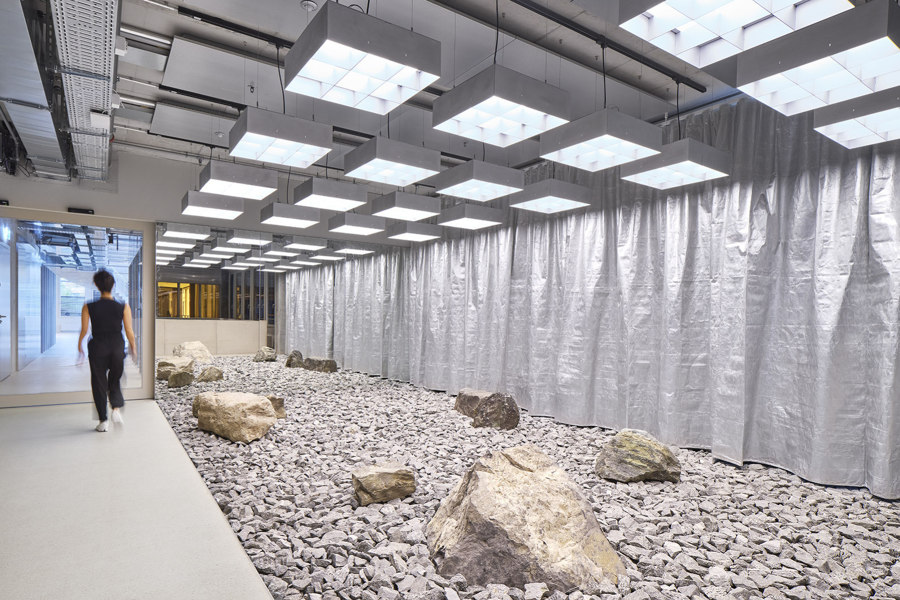
Earth-toned carpets (top), a locally-sourced rock garden (middle) and plush blue carpet (bottom) all help On running to plot a course up their mountainous office building. Photos: Mikael Olsson

Earth-toned carpets (top), a locally-sourced rock garden (middle) and plush blue carpet (bottom) all help On running to plot a course up their mountainous office building. Photos: Mikael Olsson
×On Labs – New Global Headquarters for On running in Zürich, Switzerland, by Specific Generic and Spillmann Echsle Architekten
As a brand of performance running footwear, On has an affinity with health, well-being and nature. Because of this, project architects Specific Generic and Spillmann Echsle Architekten laid out the company’s 17-storey building’s functions as ‘experiences along a mountain trail, running up the building, as they explain, ‘with steps getting narrower and steeper with each floor, just like climbing a mountain.’
‘Rocks literally lifted from nature’ are positioned to form inspiring meeting spaces
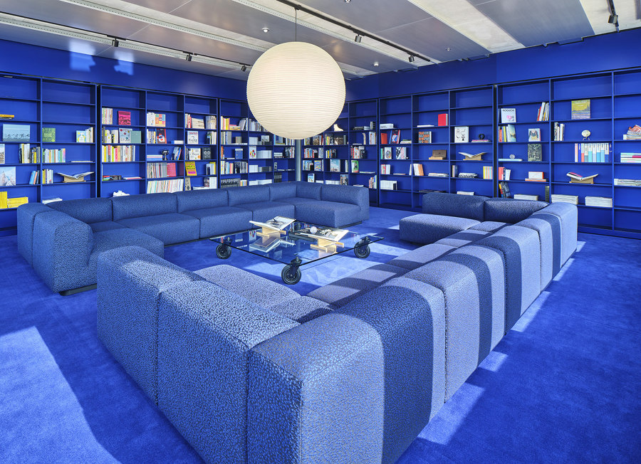
Separated into different ‘neighbourhoods’ where each represents various stages of the mountain path, the lower floors feature earthy tones with topographic maps of surrounding mountains translated into carpets and upholstered furniture. Central floors were inspired by forests and lakes with ‘rocks literally lifted from nature’ positioned in inspiring meeting spaces. And among the clouds of the uppermost floors that seem to touch the sky, an all-encompassing blue library is softened by a thick, deep blue carpet.
© Architonic
Head to the Architonic Magazine for more insights on the latest products, trends and practices in architecture and design.
