Letting it all hang out: textiles in wellness spaces
Texte par Katharina Schwarze
18.08.23
The thoughtful application of textiles allows interior designers to create relaxed, haptically pleasant atmospheres. Their ability to immediately lend rooms a calming character also makes them the material of choice in these wellness and health projects.
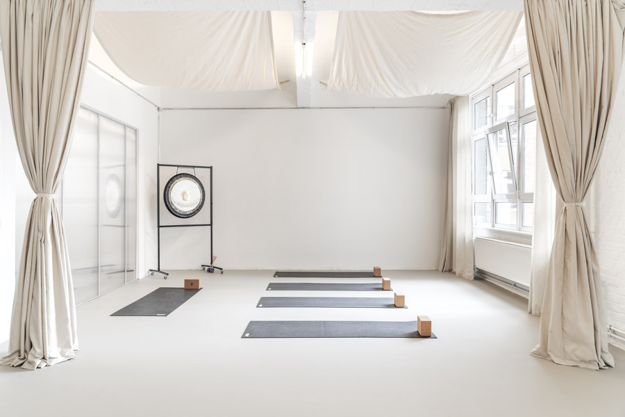
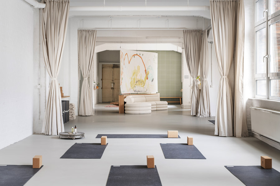
Textile elements in interior design are an unbeatably uncomplicated instrument for setting up or changing the spatial situation. Original Feelings Yoga Studio in Berlin. Photos: Linus Muellerschoen

Textile elements in interior design are an unbeatably uncomplicated instrument for setting up or changing the spatial situation. Original Feelings Yoga Studio in Berlin. Photos: Linus Muellerschoen
×Stone, steel, concrete – fabric. From a purely structural point of view, textiles represent a secondary medium in architecture, as they are neither load-bearing nor especially durable. They are dependent on suspension and therefore react to the structural elements that have already created the space. As far as atmosphere is concerned, however, textiles certainly contribute to setting the tone. Few things can affect a room as uncomplicatedly and impressively as fabric.
Textiles help to remove the hardness within a space and allow completely new contours to be drawn, while curtains also have something theatrical and performative about them – playing the game of showing and concealing. In places where one reveals oneself and one's vulnerability, such as health centres, yoga studios or wellness temples, it is particularly important to create friendly, welcoming spaces where people feel comfortable letting it all hang out – a fitting phrase for our selection of textile- and relaxation-related projects below.
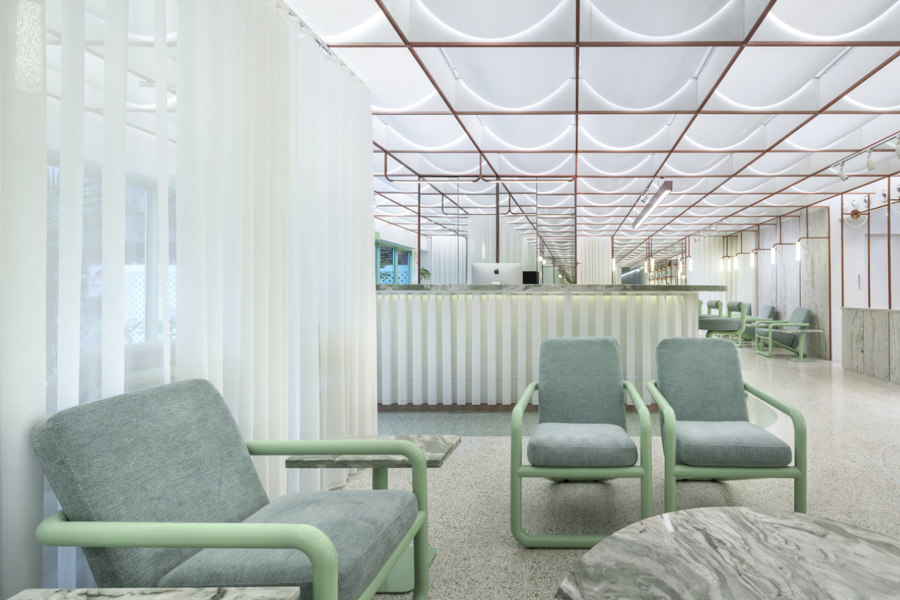
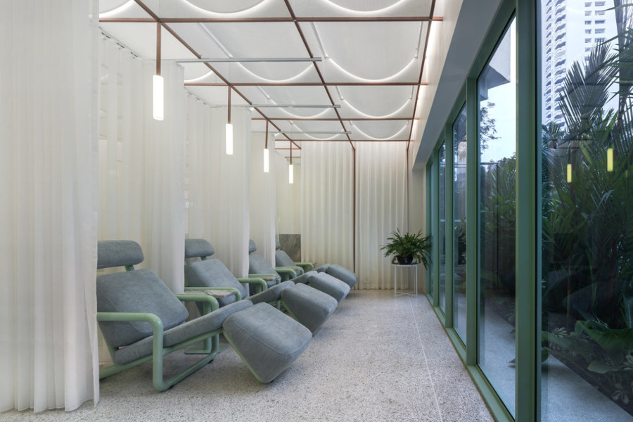
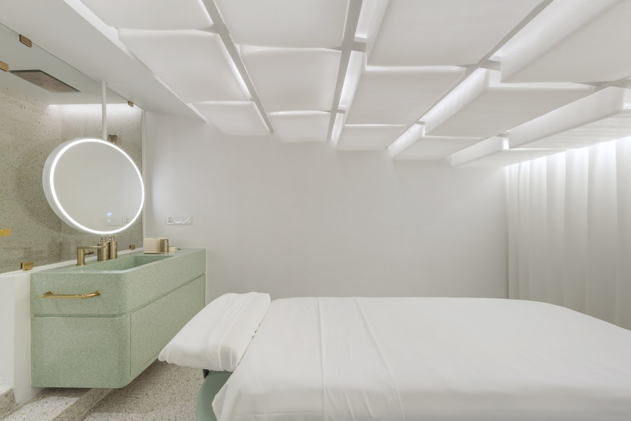
Semi-transparent and backlit fabrics make small spaces look big, as here in Bankok's Infinity Wellbeing Spa by Space Popular. Photos: Wison Tungthunya

Semi-transparent and backlit fabrics make small spaces look big, as here in Bankok's Infinity Wellbeing Spa by Space Popular. Photos: Wison Tungthunya
×Infinity Wellbeing Spa Bangkok by Space Popular
The ethereal, curtain-wrapped Infinity Wellbeing Spa by Space Popular may be located directly on the busy Sukhumvit Road in Bangkok's modern business centre, but as soon as you step through its spacious tropical garden into the lobby, you quickly forget the chaos of the city, outside. The interior design relies on a soothing colour palette and semi-transparent fabrics that refract the light and allow the space to become a stage for eclectic furnishings.
Bespoke materials and objects are combined with affordable, off-the-shelf ones such as packing foam. Luxury meets modesty here – a contrast often seen in Bangkok. The treatment of the single rooms is also inventive. Fitted with backlit foam ceilings and curtains, they appear brighter and cleverly conceal their small size.
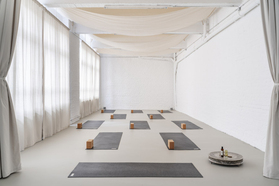
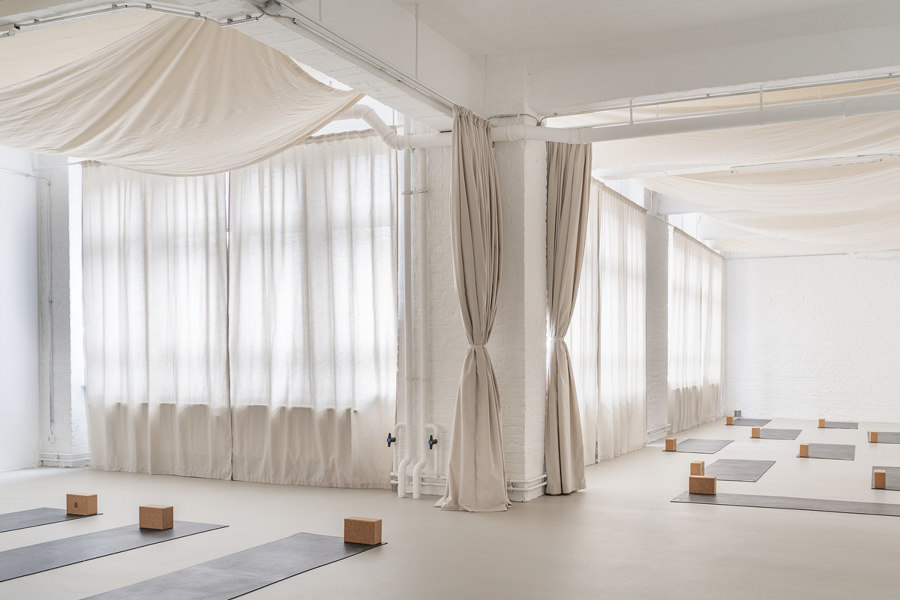
Everything is in flow at the Original Feelings Yoga Studio in Berlin. Some Place Studio's spatial concept with malleable materials and lots of fabric allows visitors to take a deep visual breath. Photos: Linus Muellerschoen

Everything is in flow at the Original Feelings Yoga Studio in Berlin. Some Place Studio's spatial concept with malleable materials and lots of fabric allows visitors to take a deep visual breath. Photos: Linus Muellerschoen
×Original Feelings Yoga Studio by Some Place Studio
It's not only the visitors to the Original Feelings Yoga Studio in Berlin that are in good shape, the design of the space is, too. The interior concept by Some Place Studio relies entirely on malleable materials. Visitors are welcomed by an organically shaped fountain made of hemp concrete, specially created by designer Yasmin Bawa. Another commissioned work is the large-scale textile privacy screen by Viennese artist Denise Rudolf Frank, which subtly separates the lounge area from the changing rooms.
Symmetrically arranged curtains structure the space and divide it when needed. The ceiling can also be suspended with large, horizontally stretched fabric panels, creating pleasant acoustics and an almost yurt-like atmosphere.
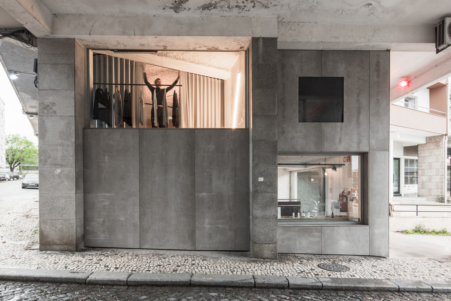
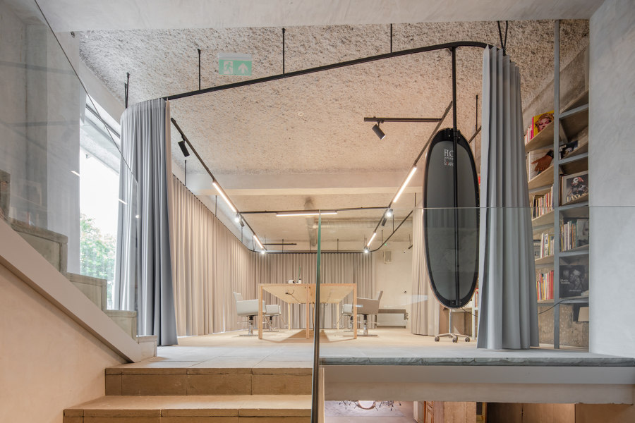
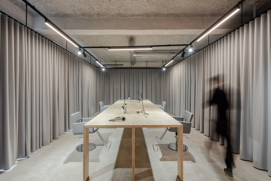
Grey in grey: Nuno Ferreira Capa arquitectura e design is responsible for the design of the four-storey retail space of Masion862 in Portugal. Opaque curtains define the areas. Photos: João Morgado

Grey in grey: Nuno Ferreira Capa arquitectura e design is responsible for the design of the four-storey retail space of Masion862 in Portugal. Opaque curtains define the areas. Photos: João Morgado
×Maison826 by Nuno Ferreira Capa arquitectura e design
Concrete meets textile. In the centre of Braga, Portugal, Nuno Ferreira Capa arquitectura e design focuses on materiality, texture and surface for the 250-sqm retail space of Masion862. The sober grey concrete building provides a view through its large window fronts of the location, which extends over four floors and comprises a hairdressing salon, a culture and music room as well as a concept store. The 'rooms' are defined here only by curtain rails and concrete grey curtains.
The sparse use of materials, the exposed columns, bare concrete beams and unfinished walls all act as stylistic devices, here. A simple but impressive concept that gives new meaning to the term 'grey area'.
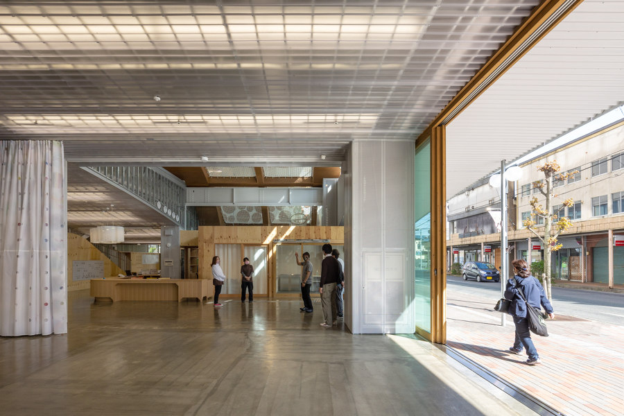
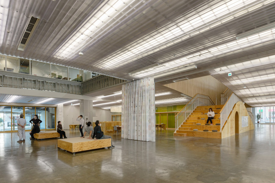
The public meeting space of the Children Health & Support Centre in Kitakami, Japan, manifests its connection to the city through its large windows. For some privacy, individual zones can be separated by curtains. Photos: Kai Nakamura

The public meeting space of the Children Health & Support Centre in Kitakami, Japan, manifests its connection to the city through its large windows. For some privacy, individual zones can be separated by curtains. Photos: Kai Nakamura
×Kitakami Children Health & Support Centre by UtA/Unemori teco Associates
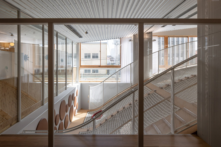
Going to the doctor with children is usually not such a big deal, but spaces like those at the Kitakami Children Health & Support Centre in Japan changes that. Gently undulating, net-covered floors turn the building, which has both a health and a childcare complex, into an indoor playground. On the ground floor, the architectural firm responsible, UtA/Unemori teco Associates, has created a public meeting space whose large area can be divided into smaller zones by curtains. The large windows and sliding glass doors, meanwhile, manifest the open character and connection of the building to the city.
© Architonic
Head to the Architonic Magazine for more insights on the latest products, trends and practices in architecture and design, or find inspiration in a whole world of projects from around the globe through ArchDaily's architecture catalogue.
