Wearable Architecture
Texte par NoéMie Schwaller
Zürich, Suisse
10.11.08
Architecture succeeds again and again in taking our breath away with its spectacular forms, making us wish that we could take these works of art with us in our everyday lives instead of just admiring them where they stand. This wish will be fulfilled this season by several collections.
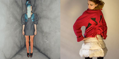
Architecture succeeds again and again in taking our breath away with its spectacular forms, making us wish that we could take these works of art with us in our everyday lives instead of just admiring them where they stand. This wish will be fulfilled this season by several collections. Nicholas Kirkwood and Scott Ramsay Kyle, two up-and-coming designers are showing fantastic collections in the idiom of architectural form. Mashallah Design and Linda Kostowski present sewing patterns from 3D-Bodyscans, Pedderzine shows accessories surrounded by urban architecture; Architect Zaha Hadid designs shoes for the first time and Maison Martin Margiela celebrates his jubilee with the expected conceptual boldness.
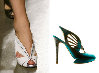
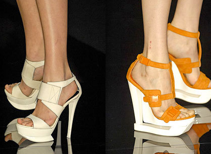
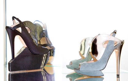
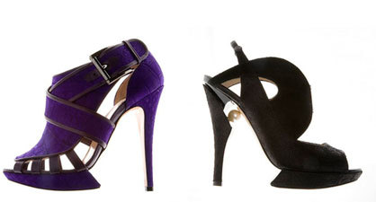
A courageous play with shapes and materials: Nicholas Kirkwood - SS 2008
Nicholas Kirkwood
The London-based shoe designer Nicholas Kirkwood made his debut in the spring of 2005 and has since developed a unique signature. He boldly combines provocation and aggression with a sexy and feminine touch, skilfully uniting clean lines and forms with exciting material mixes. “I've always been interested in structure, in very linear shapes,” he says. “Whether it's furniture or accessories or whatever, I love things that have a practicality to them.”
Kirkwood studied art at Central Saint Martins in London and shoe making at Cordwainers College before launching his own collections. The focus on design makes his shoes easy to identify, even if the process of creating them isn't an entirely democratic one. He admits with confidence that you have to be a committed fashion fan to wear his shoes: “They aren't for everybody.”
Sculptural construction and the dizzyingly high heel are Kirkwood's trademarks - SS 2008
The structure, architectural details and attention to form also appeal to major designers, and accordingly names like Belstaff, Doo Ri, Basso & Broke, 3.1 Philip Lim, Chloé, Gareth Pugh and Zac Posen had their models parading down the catwalk in shoes by Kirkwood – all during the first season in which he was on the scene. “In some cases I had two weeks to design, build, and ship a shoe halfway across the world,” Kirkwood said. “I am definitely not doing that again next season!”
«It’s about silhouettes… It’s about the shape of the last and about the shape of the actual pattern that’s drawn onto the last, and color or material combinations. I don’t use anything that’s stuck onto the shoe. In certain ways it’s architectural, I suppose. Old-fashioned buildings like to be very decorative on the outside, but the basic shape is still a block, whereas modern buildings are more concerned about the actual shape of the building itself, rather than what’s put on as ornamentation. That’s sort of the way I try to think of my shoes in a sense, especially when it comes to the heels.»
Scott Ramsay Kyle
Scott Ramsay Kyle studied at the Glasgow School of Art and at Central Saint Martin's in London and after working together with Emma Cook and Boudicca, Jane How and Sarah Richardson, launched his own label at the age of only 26.
On show as part of the Super Super Collective last season, Kyle made his individual off-schedule debut with a collection which was inspired by Alice In Wonderland's Queen of Hearts and the icon Grace Jones.
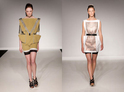
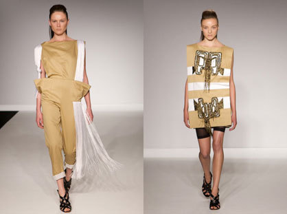
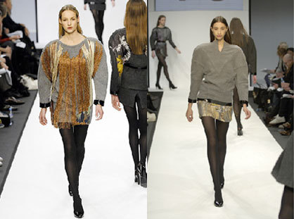
The style of this avant-garde designer combines daring and simple designs made of luxury wool and woven textiles as well as denim. Complex embroidery work and an entirely new way of handling traditional appliqué techniques are typical of his work, which he himself describes by stating: «Everything has quite big shoulders, and I like to use a lot of volume.»
The main focus in his collection is on the surcoat. With spreading folds of material to both sides and oversized pockets Kyle uses them as a canvas for his embroidery and decorative craftsmanship. Metal-coloured tassels decorate the skirts, creating movement and a contrast with their angular form. Next to the military look of the surcoats with their decoration of gold cord Kyle displayed playful overalls combined with stay-ups.
Bold colours, extravagant fringes and accentuated shoulders are the key elements of Kyle's creations - SS 2008

Bold colours, extravagant fringes and accentuated shoulders are the key elements of Kyle's creations - SS 2008
׫BECAUSE I am an embroiderer there’s always quite an element of craft in my work. Then, when it comes to putting it into fashion, it’s all about strong girls.»
Maison Martin Margiela
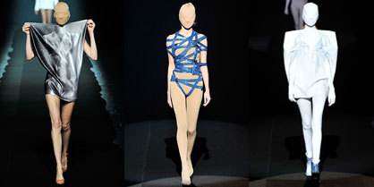
In October 2008 the Paris fashion house Maison Martin Margiela celebrated its 20th anniversary. It was founded by the Belgian fashion designer Martin Margiela, who trained at the Academy of Fashion in Antwerp.
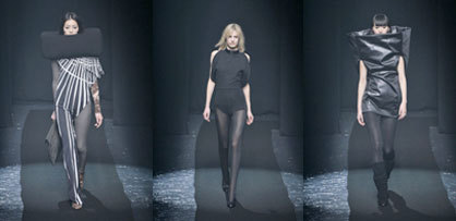
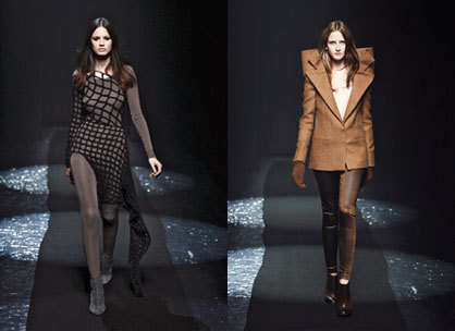
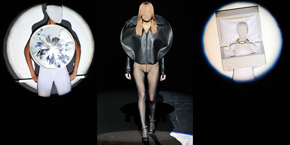
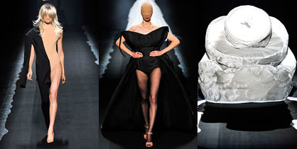
Whatever the season the conceptualist Martin Margiela is always good for a surprise. For the winter he started with an unusually slim silhouette, emphasised by a net-like fabric and skintight bodysuits from head to toe.
Each outfit has an asymmetrical detail, either on the sleeve or the seams. To round off the design the deconstructivist plays with controlled volume, especially on the collar which is as a result transformed into a sculpture.
On the occasion of his 20th anniversary Margiela provided a retrospective of his creative output in the course of 20 years and 40 collections. Margiela thought up leather cut into circular forms as early as 2005, and now this geometry is a constant feature of the catwalk everywhere.
The conceptual strictness of the show was interrupted when a white birthday cake walked past, followed by a brass band and a procession of Margiela's assistants dressed in the kind of white smock which is familiar from his stores.
Melissa + Zaha Hadid
The Brazilian firm of Melissa transforms plastic into objects of desire - plastic as a medium for authentic sculptures which communicate both technology and renewal. Their first concept store in São Paulo's fashion district unites art and design as an ecological manifesto, whose facade is redesigned every six months by up-and-coming new artists.
Melissa has now developed MELFLEX , a material which moulds itself to the foot and provides a comfortable fit. The formula contains natural and neutral products which can be fully recycled and are characterised by elasticity, impermeability and robustness.
Since completing his training as an architect Edon Matsuo, the creative director at Melissa, has worked as an illustrator, cartoonist and graphic designer. «I believe plastic is only limited by a designer's creativity» is his comment on the material of the shoes.
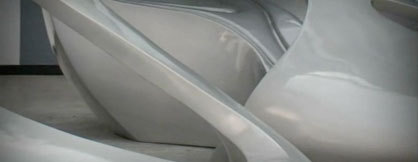
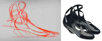
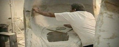
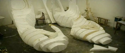
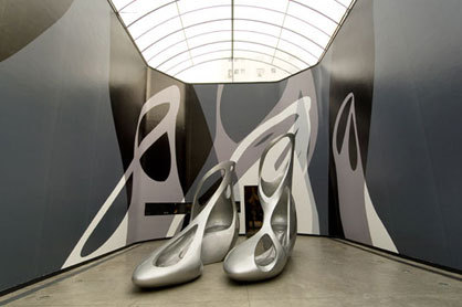
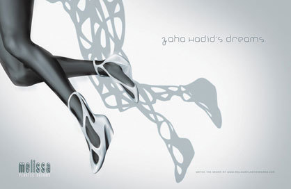
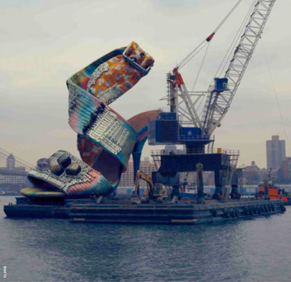
Melissa entered into partnerships in 2004 with prestigious names such as the Campana brothers and the designer Alexandre Herchcovitch, with art director, fashion and jewellery designer Judy Blame, with the Egyption designer Karim Rashid in 2005 and Vivienne Westwood in 2008. Now a product has been launched which originated in a new cooperation. For the summer 09 collection the Iraqi architect Zaha Hadid has created a shoe in structural form, inspired by the fluent movements of the body.
"The fluidity of our design combined perfectly with the technology of the plastic of Melissa, injecting pieces without closures or seals", Zaha completes, "The asymmetry conducts to an inherent sense of movement to the design, evoking continuous transformations", explains Zaha.
With rounded forms, strategic sections and avant-garde design the shoe combines Hadid's architectural know-how and the Melissa style. It's the architect's first shoe and she herself selected the range of eight colours in which it is produced. Melissa + Zaha Hadid were presented at the London Fashion Week in September.
Digital T-Shirt Issue
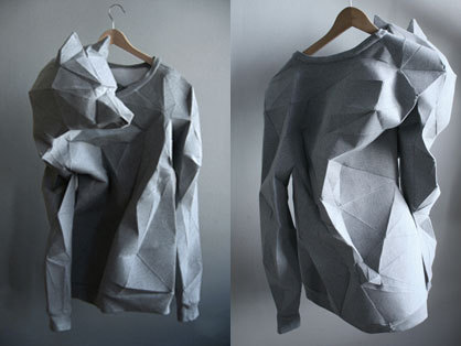
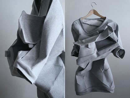
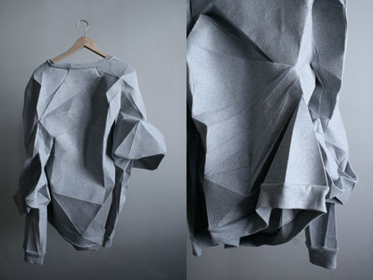
At "Create Berlin" Mashallah Design and Linda Kostowski presented sewing patterns from 3D-Bodyscans, enmeshed with personal experiences and sewn to t-shirt portraits. Making a clothes pattern in this way changes the aesthetics of the garment fundamentally, because in contrary to ordinary patternconstruction methods unfolding does not matter about orientations like center front or the shape of an armhole, which frees the designers imagination in a way that feels fresh and liberate.
As material fabric sweatshirt jersey was used as a reference to the common clichee that Berlin is the cuty which fashionable output lies in making and painting on t-shirts.
Pedderzine Pictures
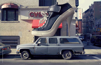
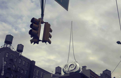
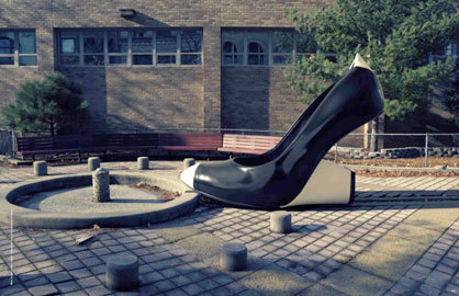
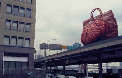
As a matching illustration alongside, the images showing accessories surrounded by urban architecture from the latest issue of Pedderzine - "On Pedder"-boutiques' house media.
