In good company: office architecture works it
Texte par Peter Smisek
05.02.18
Bold, geometric forms and compelling facades characterise a new cohort of office buildings internationally, whose cool, professional dress signals the fact that they definitely mean business.
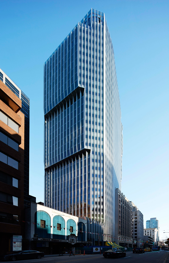
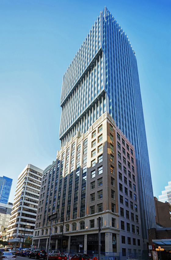
Harry Guger Studio's The Exchange successfully marries Vancouver's Old Stock Exchange and a modern, 31-storey glass tower soaring above it

Harry Guger Studio's The Exchange successfully marries Vancouver's Old Stock Exchange and a modern, 31-storey glass tower soaring above it
×Gone are the days of drab business parks and soulless cubicles. Today's offices are all about creating an attractive and uplifting work environment, inside and out.
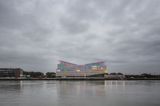
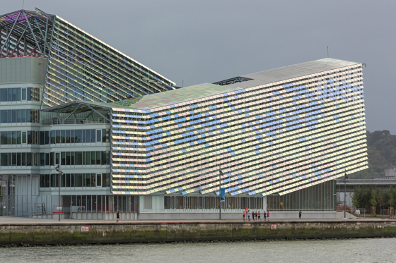
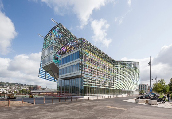
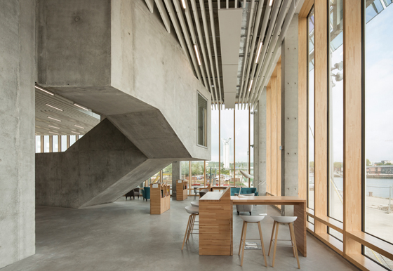
A great example is the newly-opened Headquarters of Metropole Rouen Normandie in Amfreville-La-Mi-Voie, France, by Jacques Ferrier Architecture. Here, two inclined prisms create a strong silhouette against the flat landscape of the building's port location. To counteract the often demure weather, the building is wrapped in a shimmering coat of coloured glass fins, recalling Claude Monet's paintings of Rouen Cathedral. The pale wood and light grey concrete interiors work together to create a bright and calm working environment.
The building's multi-hued cloak also acts as a shading device, whilst the roof features solar panels contributing to the office's energy self-sufficiency

The building's multi-hued cloak also acts as a shading device, whilst the roof features solar panels contributing to the office's energy self-sufficiency
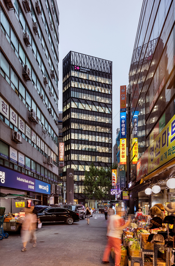
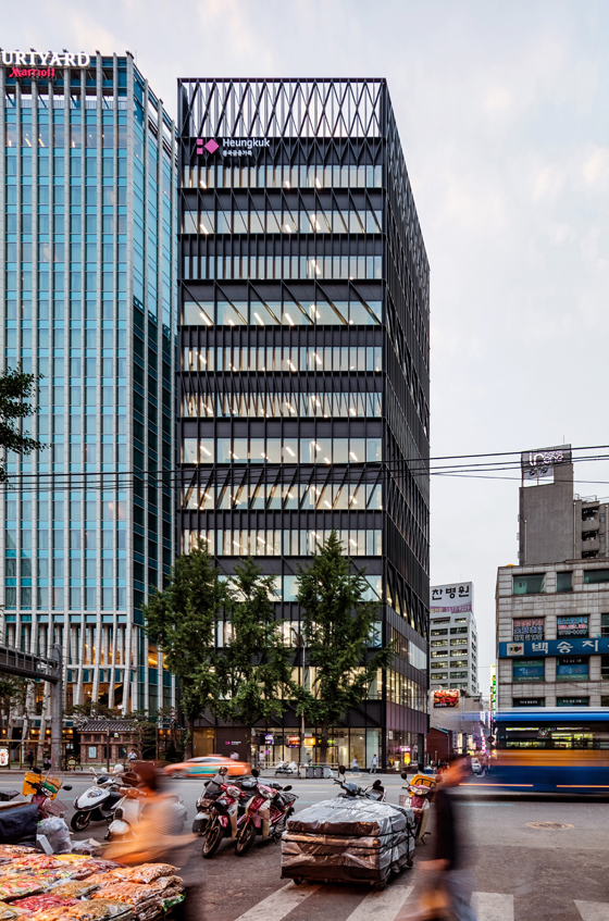
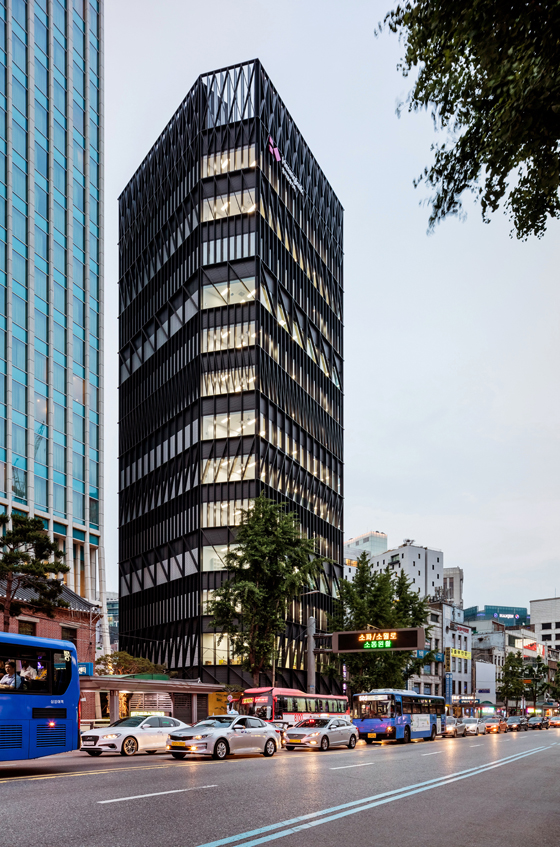
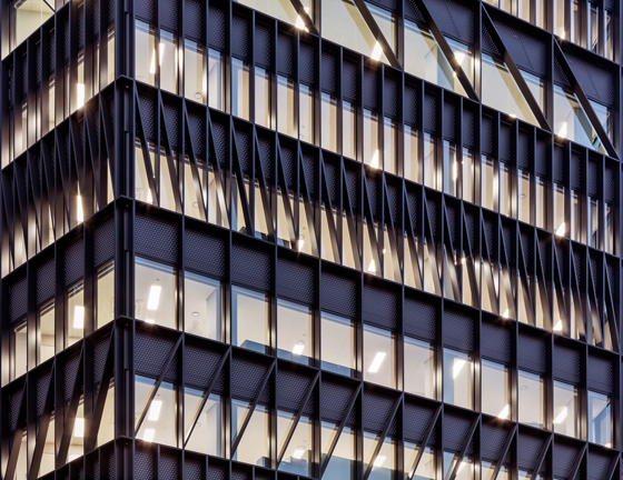
×Dutch practice Mecanoo opted for a different strategy for its Namdeamun Office Building in Seoul. To counteract the sensory overload of the Asian metropolis, the office's facade is a minimalist composition of overlapping black lattices. The effect, calm yet lively, creates a uniquely elegant exterior, framing distinctive views of the city throughout the building.
According to the architects, the patterns of fenestration of the Namdeamun Office Building are based on traditional Korean facades made of wood

According to the architects, the patterns of fenestration of the Namdeamun Office Building are based on traditional Korean facades made of wood
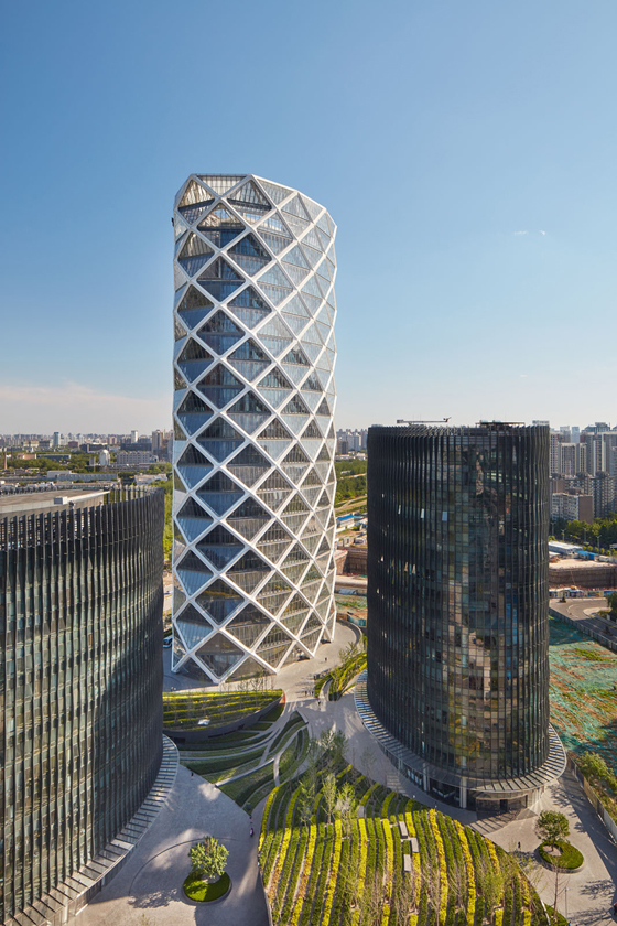
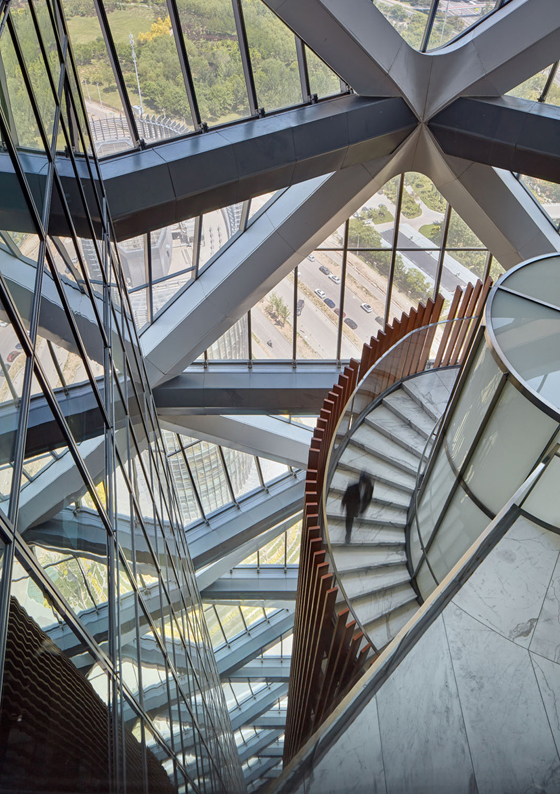
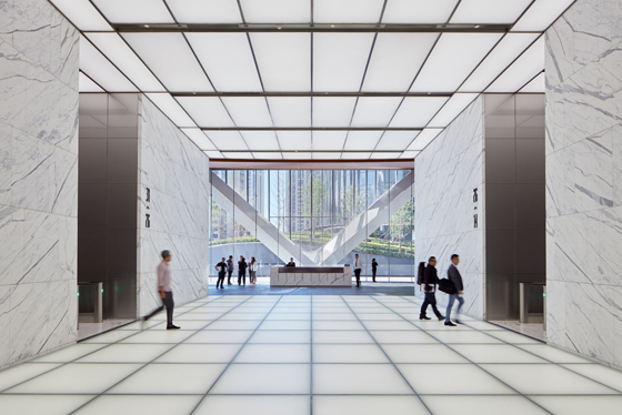
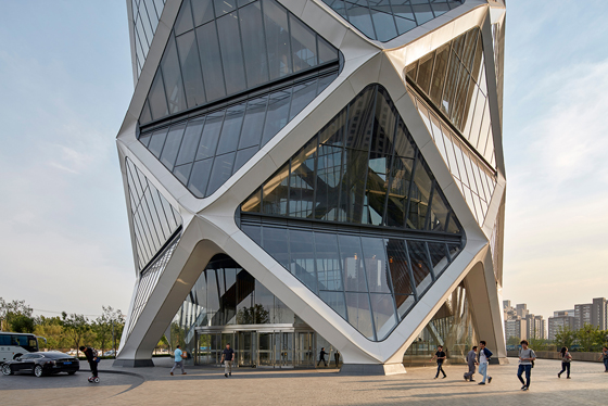
×American practice SOM has also taken inspiration from traditional forms. The central tower of Poly International Plaza, a trio of elliptical office buildings on the outskirts of Beijing, is inspired by Chinese paper lanterns. Its diagrid exoskeleton enables the creation of column-free, airy offices, while accommodating a generous internal atrium that doubles as a buffer zone to the city's famously extreme climate.
The elliptical shape of the office towers creates a flowing landscape on the ground level
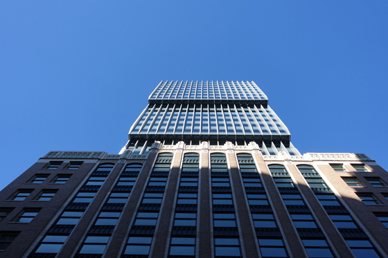
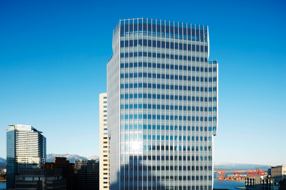
A different approach is necessary when dealing with important heritage sites. The Exchange is a successful marriage of Vancouver's Old Stock Exchange - an art deco gem restored to its former glory - and a modern, 31-storey glass tower soaring above it. Harry Gugger Studio has created a stepped, faceted profile for the new extension, ensuring it does not overpower the brick-clad structure underneath. But the architects have also ensured that the new office's aluminium mullions faithfully follow the rhythm of the original elevation, creating a balanced dialogue between the different elements.
Preserving and enhancing existing structures can be highly sustainable: The Exchange was granted a LEED Platinum certificate!

Preserving and enhancing existing structures can be highly sustainable: The Exchange was granted a LEED Platinum certificate!
ש Architonic

