Retail Reimagined: new store projects
Texte par Peter Smisek
08.05.18
Design-led store concepts are turning shopping into a resolutely aesthetic experience, with highly curated, supremely Instagrammable interiors.
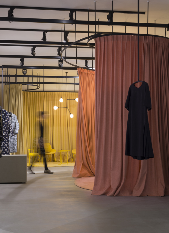
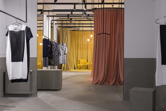
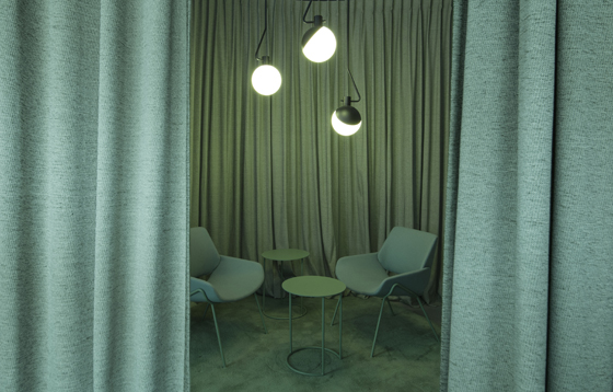
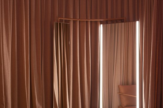
At BIRO’s Garderoba Concept Store, changing rooms in varying pastel shades and matching monochromatic furniture set a slow pace for shoppers while softening the store’s otherwise minimalist stance. Photo: Jure Živković

At BIRO’s Garderoba Concept Store, changing rooms in varying pastel shades and matching monochromatic furniture set a slow pace for shoppers while softening the store’s otherwise minimalist stance. Photo: Jure Živković
×The high street may no longer rule retail, but stores have been quick to adapt to the age of Instagram. No longer just endless stacks of shelves, bricks and mortar shopping has become experiential, colourful, and oh-so-shareable on social media.
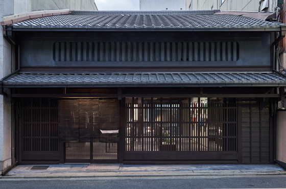
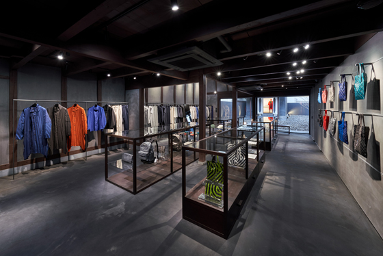
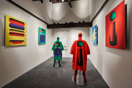
In Japan, Issey Miyake enlisted the minimalist master Naoto Fukasawa to design the brand’s Kyoto store. Housed in an historic, 132 year old machiya townhouse, Fukasawa created a clean, charcoal-grey interior with matching displays of Japanese lacquer, allowing the colourful, bold fabrics to stand out. To top it all off, the backyard of the house contains a white cube gallery for rotating exhibitions.
Naoto Fukasawa’s Issey Miyake Kyoto store combines a traditional yet pared-down retail space with an additional cultural programme. Photos: Masaya Yoshimura, Copist

Naoto Fukasawa’s Issey Miyake Kyoto store combines a traditional yet pared-down retail space with an additional cultural programme. Photos: Masaya Yoshimura, Copist
×A more experiential approach is taken by architecture bureau BIRO, who reimagined the idea of a wardrobe in their Garderoba Concept Store in Zagreb. Three distinctly coloured spaces – bright yellow, dusty pink and sea green – separated by curtains and furnished in matching shades by Grupa, create different moods and atmospheres for shoppers trying on clothes.
Flexible, colourful and eminently Instagrammable, BIRO’s Garderoba Concept Store appeals to sophisticated millennials without gimmicks. Photos: Jure Živković

Flexible, colourful and eminently Instagrammable, BIRO’s Garderoba Concept Store appeals to sophisticated millennials without gimmicks. Photos: Jure Živković
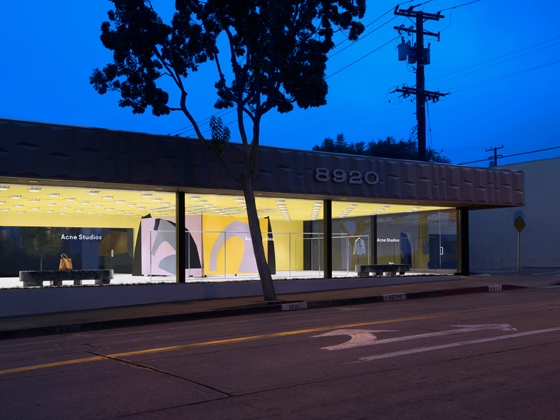
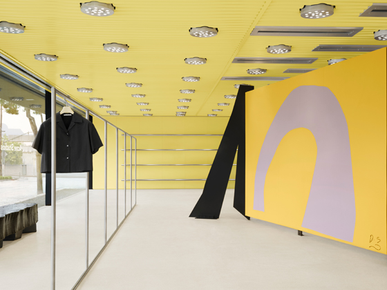
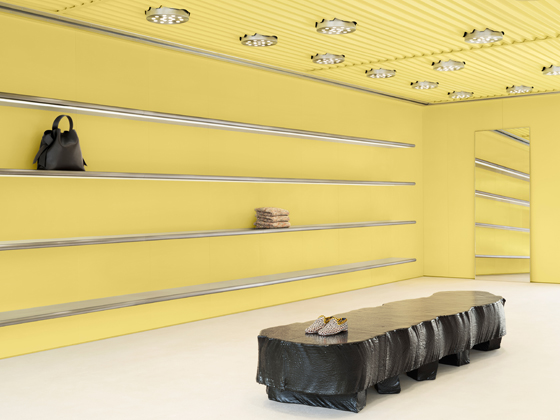
×If Garderoba Concept Store needs to be explored by wandering further in and peeling off the layers, Acne’s latest store in West Hollywood is all about instant visibility. Designed by Acne’s in-house design team and developed in collaboration with Geoff Crowther Architects, the fully glazed space features a pale acid yellow ceiling. A feature changing room, created by British artist David Silver in the form of a cashmere-panelled space divider, provides a focal point. With just a handful of clothes on display, the store contrasts with West Hollywood’s sensory overload.
Instantly visible, and sparsely furnished with carefully selected pieces of furniture, including a bench by Max Lamb, the store is designed to capture Angelenos’ famously short attention spans. Photos: Courtesy of Acne

Instantly visible, and sparsely furnished with carefully selected pieces of furniture, including a bench by Max Lamb, the store is designed to capture Angelenos’ famously short attention spans. Photos: Courtesy of Acne
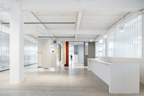
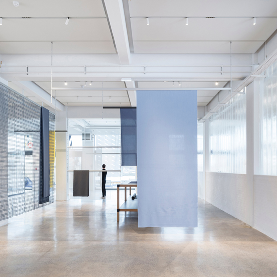
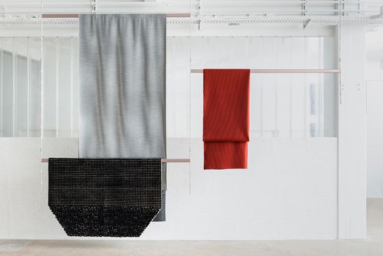
×Lastly, French design duo Ronan and Erwan Bouroullec put products centre stage at the Kvadrat store and showroom in Copenhagen’s hip Nordhavn district. The designers decided to let the famous fabrics speak for themselves, creating a white space which almost dissolves in the stark Scandinavian light. Fabric samples hang from the ceiling, while the adjacent offices are separated from the store by a translucent wall of extruded glass sections, revealing tantalising views of the activity beyond.
The Bouroullec brothers’ latest showroom for Kvadrat is an exercise in restrained minimalism, providing a clean, gallery-like space in which to display the manufacturer’s products. Photos: Michel Giesbrecht

The Bouroullec brothers’ latest showroom for Kvadrat is an exercise in restrained minimalism, providing a clean, gallery-like space in which to display the manufacturer’s products. Photos: Michel Giesbrecht
ש Architonic
