2D – Now in 3D!
Texte par Simon Keane-Cowell
Zürich, Suisse
02.03.10
Graphic designers are giving architects a run for their money as the creatives who cross disciplinary boundaries. Here, Architonic takes a look at some examples of two-dimensional specialists who've channelled their creative talent into product design and space-defining projects.
Everbody's doing it. You think you know someone and then they turn round and tell you they've written a novel or opened a restaurant. Take Tom Ford. For years renowned for his work as a fashion designer, suddenly he's a film director. (We'll let you decide whether this development is a good one or not.)
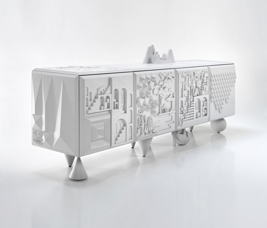
'Tout va bien' cabinet by Antoine+Manuel for Bd Barcelona, 2009
There has, traditionally, been a perceived hierarchy of cultural importance within the creative industries, with architects (according to, well, architects) occupying the highest position within the design professions, thereby giving them a natural ability to operate within other design disciplines, such as furniture, products and graphics. But there have also been a number of graphic designers who have chosen to experiment beyond the two-dimensional, using their talent to create work that functions to define space, be it through the application of graphics to pre-existing surfaces, the production of elements to sit within a space (that is, furniture and other products), or even the design of a space itself in a more architectural sense. In a world where identity politics reign, it's interesting to see designers push beyond the nominative terms ('graphic designer', 'product designer', and so on) that would seek to define them.
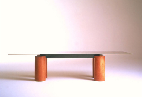
'Serenissimo' table by Lella & Massimo Vignelli for Acerbis, 1985
Design legend Massimo Vignelli, and his wife Lella, need little introduction. Their singular, consitent creative vision has been helping to transform our visual landscape for the better since the 1950s. Best known, perhaps, for their resolutely modern graphic-design work from the 1960s, such as the creation of a visual-information system for the New York subway and a memorable corporate identity for American Airlines, as well as a graphic programme for leading design manufacturer Knoll, they have also sought to lend shape to the spatial world through the design of highly considered, and, as you'd expect, very graphic furniture pieces. When you remember that the Vignellis have always favoured two particular typefaces – Helvetica and Bodoni (they redrew the latter in the 1980s) – it's no surprise to see the form of Bodoni, with its narrow horizontals and thick verticals, in the silhouette of a their 'Serenissimo' table for Acerbis from 1985. Font as furniture.
Paris-based graphic-design duo Antoine+Manuel's work is characterised by a highly illustrative, fantastical style. Their graphic parody of the Paris Metro map is, somewhat like product designer Tord Boontje's fairy-tale-like decorative language, full of flat-coloured trees, flowers and cute animals. This kind of texture is given a three-dimensional treatment in their 'Tout va bien' credenza for Spanish manufacturer Bd Barcelona (2009), which combines hieroglyphs with contemporary graphics to create a relief landscape along the façade and sides of the cabinet. Rigid, lacquered micro-textured polyurethane injection is used to produce this high-texture effect.
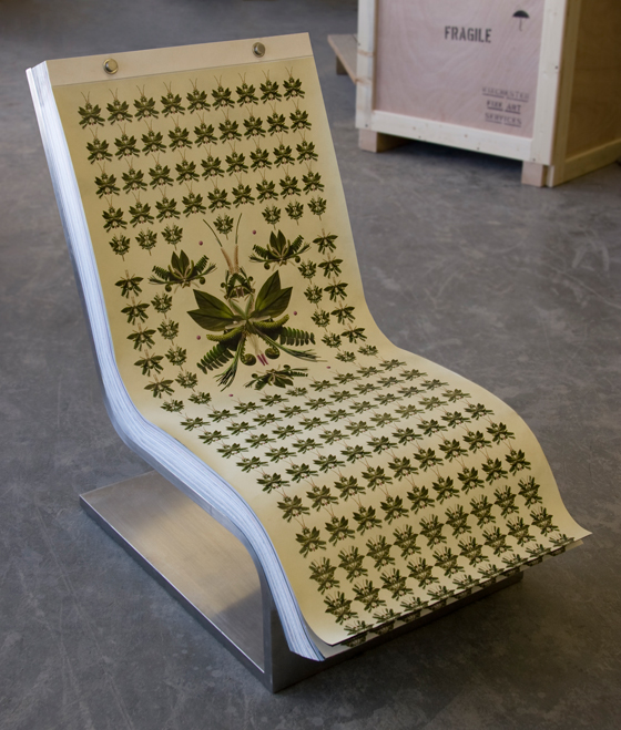
If there's one graphic designer above all others who has managed to establish his name internationally in truly stellar terms, it's Stefan Sagmeister. The Austrian-born New Yorker's concept-driven work is original, memorable and often unnerving. When he was asked to design a promotional piece for a lecture he was giving in Cranbrook, Michigan, he had the details carved onto his body with a knife and then photographed. The result: one iconic poster. This DIY approach to typography is matched by his do-it-yourself take on furniture. During the recent renovation of his studio, Sagmeister was unable to find pieces he liked and so decided to create his own furniture. His 'Darwin' lounge chair is as unconventional as you would expect. And as graphic. The cantilevered structure is 'upholstered' with a cushion made from 230 sheets of paper, each bearing a different design. Tired of the look of your chair? Simply rip away the top sheet to reveal a new pattern beneath.
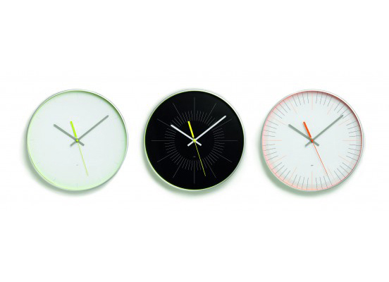
'Notime', 'Nightime' and 'Finetime' clocks by Farrow for SCP, 2010
On the other side of the Atlantic, London design studio Farrow, known in particular for their music graphics for such artists as Kylie Minogue, the Pet Shop Boys and Burt Bacharach, have tried their designerly hands at product design, creating a series of (yes, you've guessed it) very graphic clocks for British brand SCP. Given that timepiece design is (or should be) about visual communication, it's little wonder that the British design practice have chosen this particular object-type to experiment with. That said, the three clocks in the collection vary in terms of their legibility. No prizes for guessing that 'Notime' makes the user work the hardest.
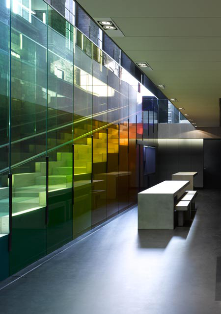
Kvadrat showroom, London, by Peter Saville and David Adjaye, 2009
Staying in the UK, renowned graphic designer Peter Saville, whose work has played a key role in British style culture since the 1970s (he has designed record covers for the likes of Suede and Pulp, and delivered identity projects for such clients as the Design Museum and the Whitechapel Gallery in London), has collaborated with architect David Adjaye on a London showroom for Danish textile manufacturer Kvadrat. Of particular note is the decidedly graphic approach taken to the space's main staircase, its coloured-glass balustrade playing on the ideas of light and perception. The steps also function as seating for film screenings, again suggesting the highly visually oriented background of the project's creative team.
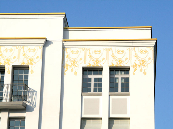
Exterior graphics at Badenerstrasse 580, Zurich, by Trix Barmettler, 2009
In addition to the creation of products and interior-architectural spaces by graphic designers, a number of visual communicators have also used their flat graphic work to affect the way that three-dimensional volumes and space are perceived and experienced, to striking effect. Based in Switzerland, Trix Barmettler has recently completed a project that involved the application of a Jugendstil-derived, repeated floral pattern frieze-like to the façade of an office and residential building in Zurich. Executed in gold and running beneath roof level across four of the structure's elevations, the transformative power of this graphic intervention on its architectural context is far greater than its relative simplicity would at first suggest.
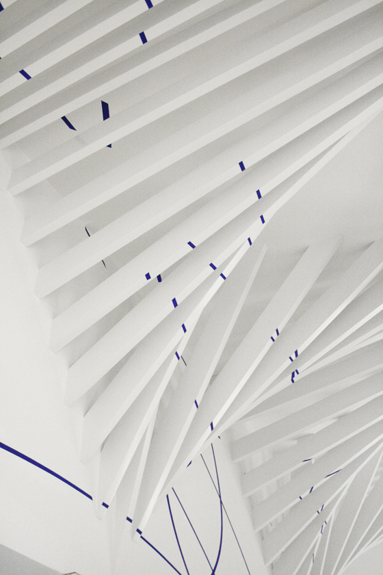
Detail of vaulting from V&A Women's Amenities project, London, by Glowacka Rennie Architects, 2009; copyright Glowacka Rennie Architects

Detail of vaulting from V&A Women's Amenities project, London, by Glowacka Rennie Architects, 2009; copyright Glowacka Rennie Architects
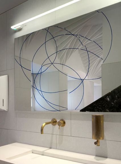
×Felice Varini graphics viewed as reflection in wash-basin mirror; Glowacka Rennie Architects' V&A Women's Amenities project, London, 2009; copyright Felice Varini

Felice Varini graphics viewed as reflection in wash-basin mirror; Glowacka Rennie Architects' V&A Women's Amenities project, London, 2009; copyright Felice Varini
×Having won a competition to redesign the women's toilets inside the V&A Museum's rather grand main entrance, London architectural practice Glowacka Rennie worked with Swiss artist Felice Varini to produce an environment that delights the visitor with its two- and three-dimensional interplay. Among other notable elements, the architects introduced some beautiful rhythmic vaulting into the space, allowed by its generous height (which, in turn, the vaulting exaggerates). Varini, who is known for his projects that play with geometry and perspective, was responsible for the creation of a graphic scheme that was applied to the vaulting and walls, made up of a series of broken blue curves. When viewed as a reflection in the mirror above the wash basin, they reveal themselves as a set of complete, overlapping circles. There is something truly magical in witnessing this visual resolution.
'Anna' graphic project by ZMIK for iart interactive, Basel, 2009
'Anna' graphic project by ZMIK for iart interactive, Basel, 2009
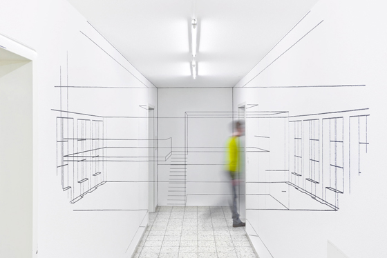
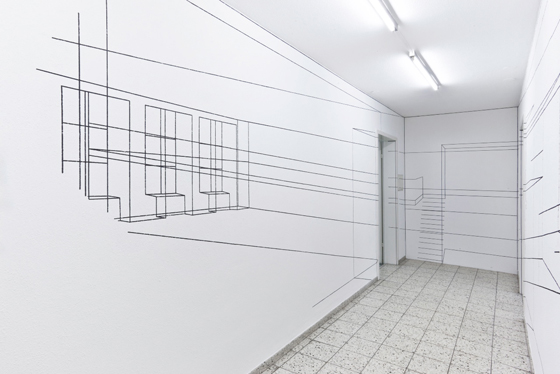
Graphic-design studio ZMIK, based in Basel, have also explored the idea of graphic legibility and its relation to space in their commission for interactive-media company iart interactive. The office's narrow, central corridor is opened up by the wireframe graphics that have been applied to the space's walls, which represent rooms (some real, some imaginary) that 'exist' beyond it. What makes the project particularly interesting is the relation between space and intelligibility: the design scheme only becomes readable, and therefore understandable, if viewed from a handful of specific positions within the corridor. Move away from this spots, and the graphics turn into a collection of abstract lines.
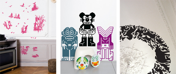
Wall graphics by Timorous Beasties, eBoy and Studio Job for Domestic's 'Wall Drawings' collection
It may have become a trend of late, but the French company Domestic were at the forefront of producing graphic wall stickers by leading graphic designers. When it comes to using two-dimensional design as a means of creating a strong spatial intervention, nothing is possibly as bold, as simple, and at times as whimsical as these vinyl applications. Their creative value is heightened by the fact that the end user determines how and where the graphics are installed. Domestic's 'Wall Drawings' collection features such leading names as Studio Job, Timorous Beasties, eBoy and the aforementioned Antoine+Manuel. But wait. Marcel Wanders, Matali Crasset, Inga Sempé, François Azambourg and Big Game also appear on the list. Furniture and product designers creating purely graphic work? This is truly a crazy, messed-up world we live in.
