Spaced: fair-stand architecture that stands out
Texte par Simon Keane-Cowell
Zürich, Suisse
22.04.14
Gone are the days when a standard-issue ‘booth’ was enough of a platform on which design manufacturers could present their latest products at trade fairs. The contemporary exhibition stand is as much a brand-marketing device as it is a product showcase. Look sharp.
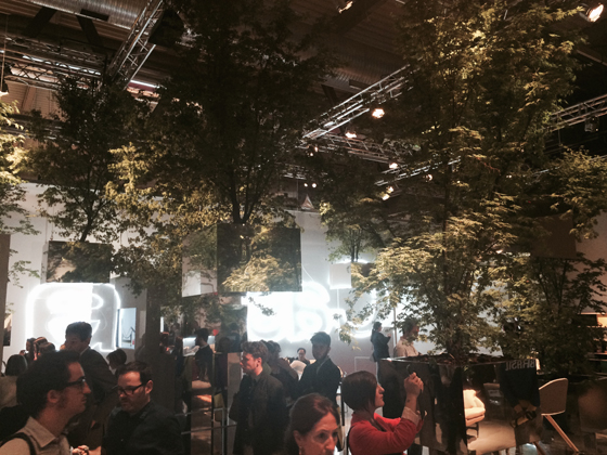
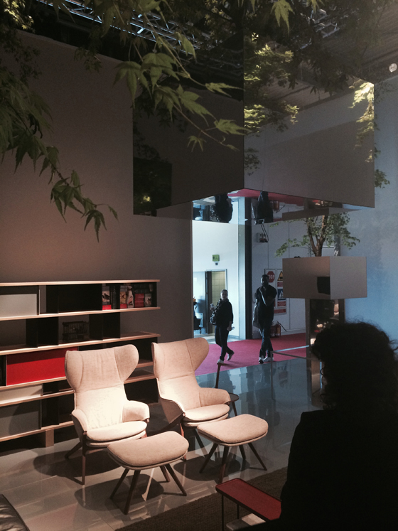
A show-stopping concept at the Cassina stand in Milan this year, in the form of Sou Fujimoto's proposition for a hybridic living environment where nature comes inside

A show-stopping concept at the Cassina stand in Milan this year, in the form of Sou Fujimoto's proposition for a hybridic living environment where nature comes inside
×Number-crunching often throws up statistics that are somewhat abstract, difficult to get one’s head round, particular when we’re talking large figures.
But anyone who’s had to navigate their way through big-top design trade fairs like the Salone del Mobile Milano and Frankfurt’s Light+Building will have no problem in testifying to the reality of the exhibitions’ super-charged stats. This year’s Milan fair, for example, with an overall show area of 340,000 square metres, saw in excess of 1,700 international exhibitors set up their stalls, as it were, all eager to engage the 300,000 or so visitors, both professional and public, who descended on the Rho fairgrounds.
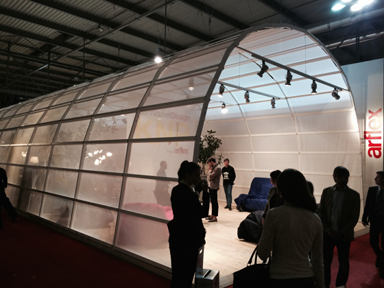
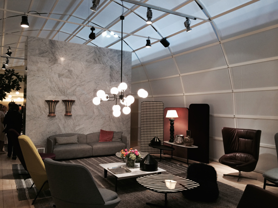
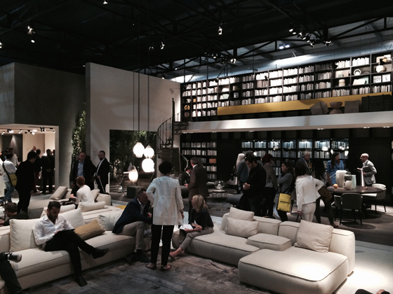
Carlo Colombo's hangar-like exhibition space for Arflex at this year's Milan Furniture Fair, internally divided with hanging screens and a marble wall

Carlo Colombo's hangar-like exhibition space for Arflex at this year's Milan Furniture Fair, internally divided with hanging screens and a marble wall
×Stand-out they call it in the FMCG business. How to differentiate your product from the competition on the crowded supermarket shelf. When it comes to the business, however, of presenting your products as a manufacturer in a visually dense and loud fair environment, there’s even more thought and effort required to place yourself centre-stage. It’s not just about unveiling new products, of course. Leading design brands have long understood that the fair stand is also a marketing device, a piece of brand positioning and communication, and, as such, needs to convey a brand’s values through an as memorable visitor experience as possible. Given that most fair-goers are time-poor, with a lot of ground to cover, the stakes are high.
Amidst the melee at this year’s Milan and Frankfurt fairs, a number of exhibitors stood out from the crowd, demonstrating that a strong concept, deftly executed, can reap reward in terms of footfall. Here’s a small selection of just some of the brands that made a real show of themselves.
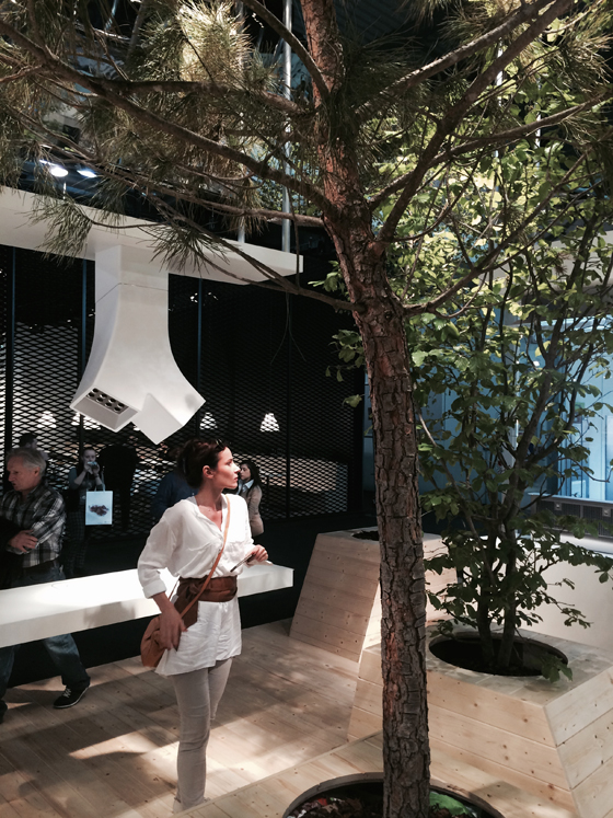
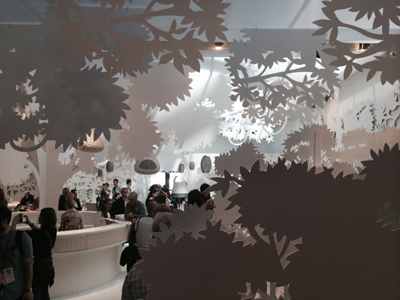
Elica elected to populate their stand at the Salone del Mobile with a small forest of different tree types

Elica elected to populate their stand at the Salone del Mobile with a small forest of different tree types
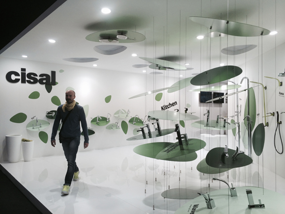
×At the Cisal stand in Milan, nature is referenced through abstracted, green leaf-like forms
Major growth
Italian brand Cassina, known for its covetable collection of design classics and its considered contemporary pieces, both underpinned by quality craftsmanship, enlisted celebrated Japanese architect Sou Fujimoto to create its fair stand for this year’s Salone del Mobile. With the idea of a collaboration first hatched over dinner last year, (so says Cassina brand director Gianluca Armento), Fujimoto developed an emphatically concept-driven stand that, manifesto-like, proposed a third-way vision of a future habitat. 40 especially grown Japanese maple trees, timed to be just the right size during fair week, were suspended at various heights within the stand space, their optical levity enhanced by the mirrored boxes in which they were planted. The outside had come indoors. But there was more to the idea than that. Fujimoto explains: ‘The future living environment is not about interior design, but about combining nature and the artificial things, to create something between nature and architecture or nature and artefacts.’ And, of course, one of the effects within such a hybridic space, where nature is deployed in a new, future-oriented way (these are not just trees, but floating ones), is that you view all the elements within the scheme with a fresh eyes – which can only be good when you’re ultimately selling furniture products.
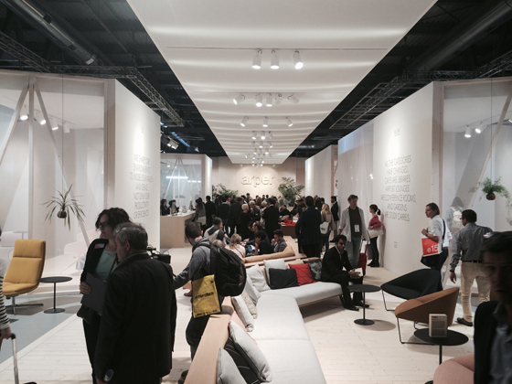
A central, boulevard-like circulatory axis at Arper's stand in Milan is attended by a number of carefully considered product stagings leading off it

A central, boulevard-like circulatory axis at Arper's stand in Milan is attended by a number of carefully considered product stagings leading off it
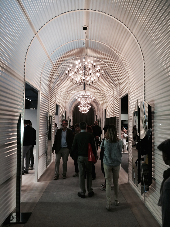
×Circulation through an arcade-like passage at the Fiam stand in Milan
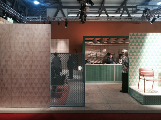
Nature also made its presence felt within the EuroCucina and Bagno parts of the Salone, at the stands of kitchen brand Elica and bathroom-fixtures manufacturer Cisal. The former featured an exhibition space populated with a small forest of trees of different types, among which the company’s latest products were arranged. This reference to the organic was underscored by the use of minimally treated timber for the stand flooring and the tree boxes. Cisal, meanwhile, embraced a more graphic vision of nature, its products suspended or wall-mounted within a field of abstracted leaf forms of various sizes.
Magis's emphatically linear presentation of its new products at the Salone del Mobile took the form of series of shop-window-like compositions

Magis's emphatically linear presentation of its new products at the Salone del Mobile took the form of series of shop-window-like compositions
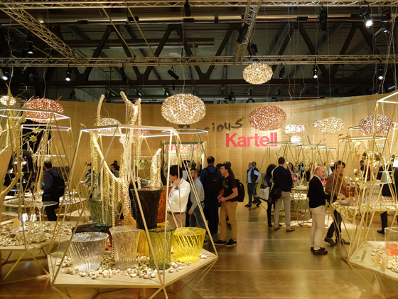
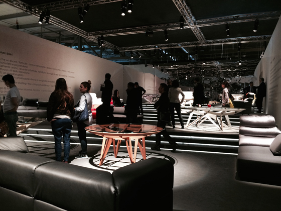
×Kartell's stand space at the Milan Furniture Fair, designed by Ferruccio Laviani, takes the form almost of a bazaar, with stall-like plinths presenting visitors with a luxurious edit of its products

Kartell's stand space at the Milan Furniture Fair, designed by Ferruccio Laviani, takes the form almost of a bazaar, with stall-like plinths presenting visitors with a luxurious edit of its products
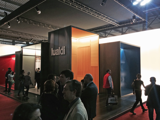
×Visitors circulate around Lualdi Porte's stand in Milan, which is articulated as a conjoined series of differently sized show cabinets

Visitors circulate around Lualdi Porte's stand in Milan, which is articulated as a conjoined series of differently sized show cabinets
×Streets ahead
Fairs involve a lot of walking. Some design brands turn this into a positive, inviting the visitor, through a carefully crafted organisation of their stand spaces, to become a kind of flaneur, encountering the products exhibited at turns. One example of this that performed particularly well at this year’s Salone del Mobile was the stand of Italian manufacturer Arper, designed by New York design consultancy 2 x 4, with creative direction by Lievore Altherr Molina. A long, central, boulevard-like axis, in which the manufacturer’s latest flexible seating programme was installed, was attended by smaller, semi-separate spaces leading off it. Here, existing collections were presented in the form of ‘vignettes or staged compositions’, as Jeannette Altherr puts it. But there’s a practical consideration in such a layout, too. ‘Last year it was the opposite,’ explains Altherr. ‘We had a big volume in the middle and the circulation went around it. The company felt that they lost control of bit of visitors. They sometimes they had to run around after them. So this time we have a kind for forum where people can meet, which is at the same time an exhibition.’
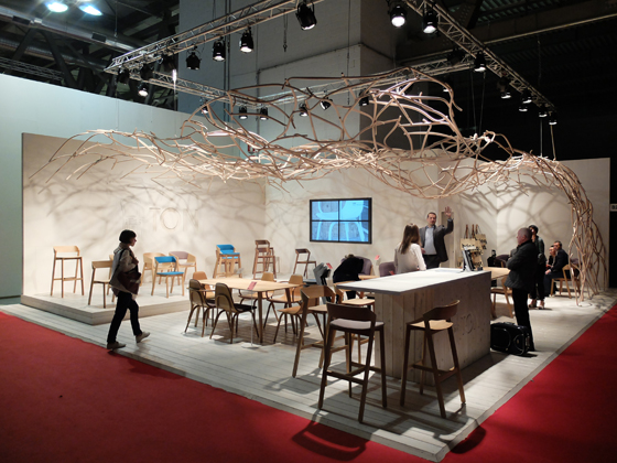
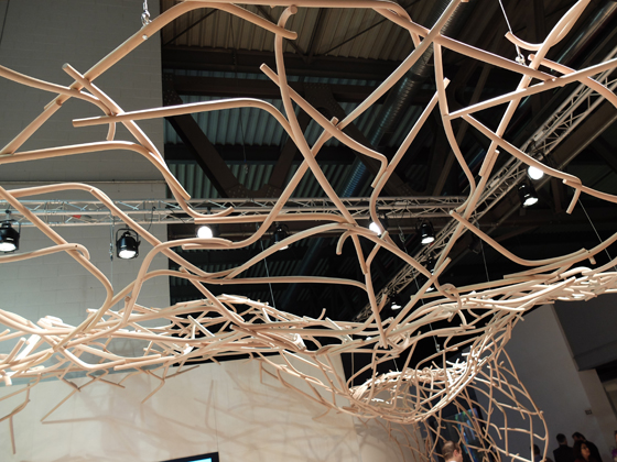
TON's expertise in steam-bending wood is elaborated into a memorable, archly sculptural fair-stand canopy in Milan

TON's expertise in steam-bending wood is elaborated into a memorable, archly sculptural fair-stand canopy in Milan
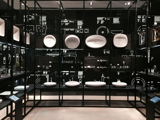
×2D and 3D combine at VitrA Bad's Salone del Mobile fair stand, which functions as living product catalogue

2D and 3D combine at VitrA Bad's Salone del Mobile fair stand, which functions as living product catalogue
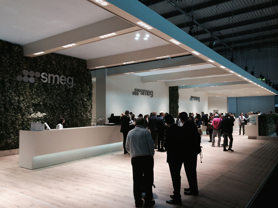
×Smeg's ultra-rational fair stand at the Salone's EuroCucina, with imposing cantilevered roof
Fiam also employed the idea of a central circulatory spine, off which products were exhibited. This time fully covered and almost tunnel-like, the effect for visitors was akin to that of a contemporary revisiting of the 19th-century shopping arcade. Magis, too, employed the idea of the linear, street-like circulation, although with more emphatically structured ‘shop windows’ off the main drag that showcased their new products. Kartell, meanwhile, opened up the idea of the street, turning it into a quasi-bazaar, replete with densely packed plinths, akin to stalls. With stand design by Ferruccio Laviani, the overall optical effect was one of metallic brilliance – golds and silvers – a concept that supported the company’s messages of preciousness and luxe.
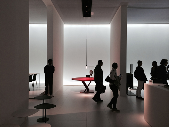
Desalto's latest products reveal themselves at turns as visitors pass through the ultra-clean stand space in Milan

Desalto's latest products reveal themselves at turns as visitors pass through the ultra-clean stand space in Milan
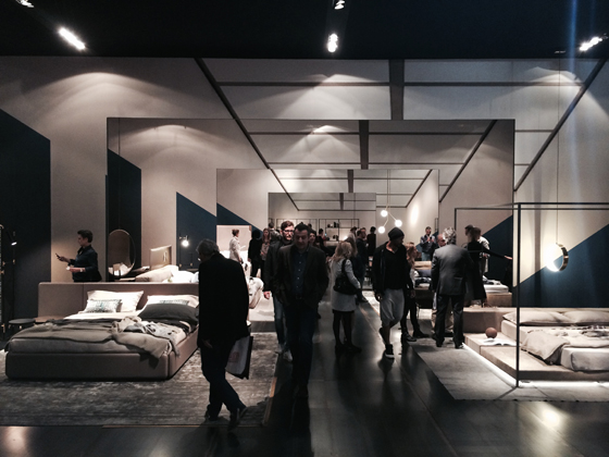
×Kettal sets up expectation on the part of visitors to its stand in Milan via a series of screens, which suggest and then reveal its new products

Kettal sets up expectation on the part of visitors to its stand in Milan via a series of screens, which suggest and then reveal its new products
×Optical trickery in Milan at the Ivano Redaelli stand, where a series of linearly linked rooms look almost like reflections

Optical trickery in Milan at the Ivano Redaelli stand, where a series of linearly linked rooms look almost like reflections
×To be precise
Several brands at Milan adopted, with striking results, a highly precise and detailed approach to the construction of their exhibition spaces. Among them were Czech furniture manufacturer Ton, who, taking a signature formal element from their classic design pieces – a steam-bent chair back – elaborated this into a compelling, super-sculptural canopy, which rose up and over the stand. Designed by Prague-based studio Mütanta, it served as both memorable architectural installation and as playful brand expression – a DNA calling card for the company. Precision was embraced at the VitrA Bad, too, in the form of a fascinating melding of the 2D with the three. The presentation of the brand’s sanitary products was supported through technical drawings and other graphic elements applied to the walls of the stand, turning the space into a living catalogue. Kitchen brand Smeg, meanwhile, showed with a stand that was as robust as its products. A strictly rectilinear build over a large footprint, it impressed crowds with its vast cantilevered roof at the front, which worked to invite visitors in.
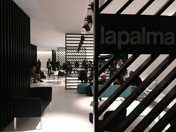
Simple but highly effective, strongly graphic screens shape the space of the Lapalma stand at the Salone del Mobile

Simple but highly effective, strongly graphic screens shape the space of the Lapalma stand at the Salone del Mobile
×Dedon's Milan stand features flat, cut-out organic shapes, reminiscent of old-fashioned stage scenery

Dedon's Milan stand features flat, cut-out organic shapes, reminiscent of old-fashioned stage scenery
×Meritalia take to the Milan stage by transforming their exhibition space into a terraced stage set. Concept by Mario Bellini

Meritalia take to the Milan stage by transforming their exhibition space into a terraced stage set. Concept by Mario Bellini
×The reveal
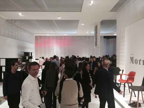
Across the Salone del Mobile, exhibitors were lending drama to their stands through clever scenography, with one recurring device in particular used to memorable effect – the translucent or opaque vertical panel deployed to interrupt space, creating a layered visual effect. This kind of staging allowed brands to create a sense of expectation on the part of their visitors, as products were revealed in turn as one moved through the stands. Successful examples of such an approach were Carlo Colombo’s stand for Arflex, with its elongated, hangar-like superstructure, divided inside into a series of discrete, staged compositions by means of hanging banners and a marble wall; Desalto’s ultra-clean, white-LED-washed, multi-panelled space; Ivano Redaelli’s mise-en-abyme-like stand, with its intriguing optical trick of a room within a room; Kettal’s multi-screened space, rich in diverse materials and textures; and Lapalma’s simple, yet highly effective, dividing panels, made of archly graphic black diagonal, horizontal and vertical slats.
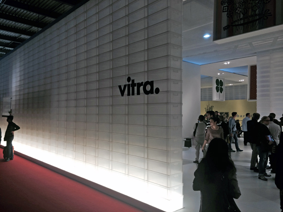
Architecture through product design: Vitra's exhibition space in Milan cleverly uses (and reuses) standard translucent storage containers to lend it shape

Architecture through product design: Vitra's exhibition space in Milan cleverly uses (and reuses) standard translucent storage containers to lend it shape
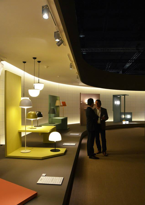
×Fontana Arte use a simple graphic device - a graph-paper-like grid - applied to the walls of its stand at Light+Building in Frankfurt to underscore the appropriateness of its products for specification in projects

Fontana Arte use a simple graphic device - a graph-paper-like grid - applied to the walls of its stand at Light+Building in Frankfurt to underscore the appropriateness of its products for specification in projects
×Yet some brands chose to take the concept of staging even further, among them Dedon and Meritalia. The former’s stand was densely populated with flat, cut-out organic shapes, reminiscent of old-fashioned stage scenery, while the latter, with concept by Mario Bellini, took to the stage by turning its stand space into an expansive, terraced stage-set, its products positioned like actors upon it.
Luxe living writ large at Lema's imposing stand space at the Salone del Mobile
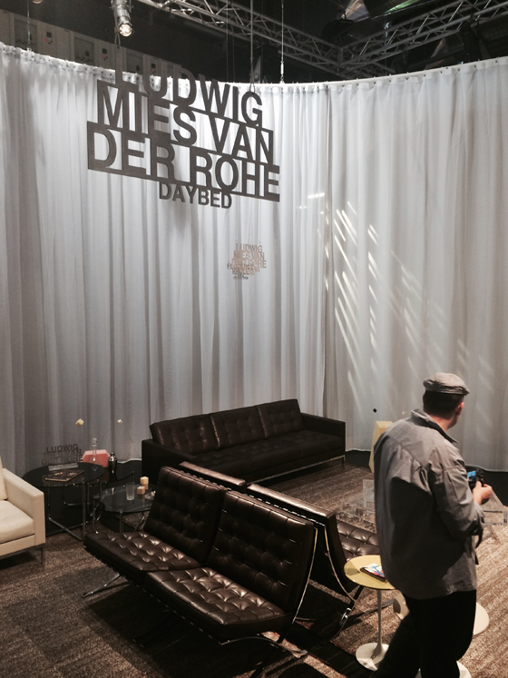
A veil-like, serpentine curtain works it way through the Knoll stand in Milan, defining discrete spaces within the overall footprint

A veil-like, serpentine curtain works it way through the Knoll stand in Milan, defining discrete spaces within the overall footprint
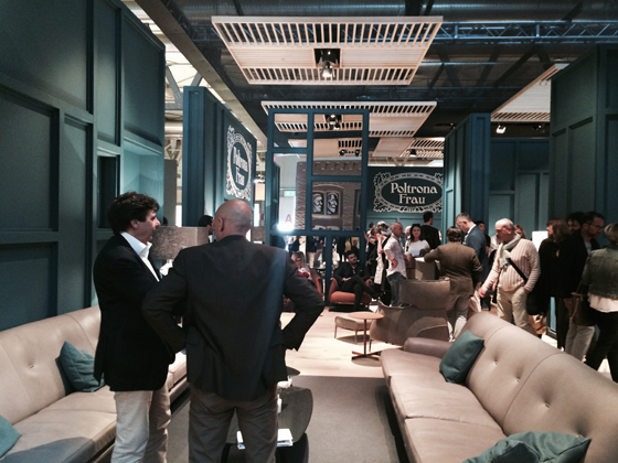
×Poltrona Frau impeccably stage the home in their expansive stand space at this year's Milan fair
Amidst the cacophony of fair stands at the world’s biggest design trade exhibitions, one thing is clear: brands who invest in innovative, concept-led design that’s well executed are guaranteed to be heard at the back.
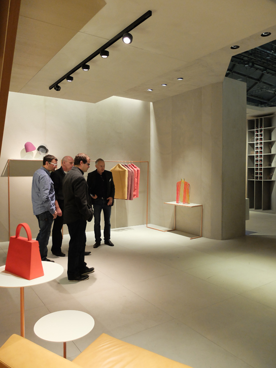
Flos emphasises the suitability of its products for project specification with a stand at Light+Building in Frankfurt that stages an elegantly lit boutique retail space

Flos emphasises the suitability of its products for project specification with a stand at Light+Building in Frankfurt that stages an elegantly lit boutique retail space
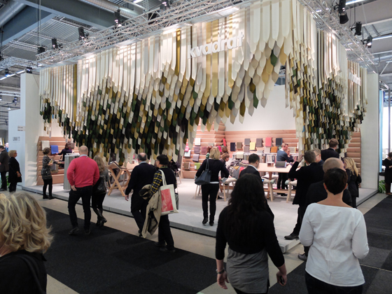
×Kvadrat's stock-in-trade – its high-end textiles – lend form to its stand at this year's Stockholm Furniture & Light Fair

Kvadrat's stock-in-trade – its high-end textiles – lend form to its stand at this year's Stockholm Furniture & Light Fair
×Dramatic architecture in Frankfurt at the epic Modular stand for Light+Building
....
