Talking Shop: Nendo on retail design
Texte par Simon Keane-Cowell
Zürich, Suisse
27.09.17
With a raft of paradigm-shifting retail-design projects to its name, prolific Japanese design studio Nendo is one smart shopper.
'We design retail spaces in the same way as we would a product or a piece of furniture,' says Nendo founder Oki Sato.

'We design retail spaces in the same way as we would a product or a piece of furniture,' says Nendo founder Oki Sato.
×Far from e-commerce proving to be the nail in the coffin for the traditional physical store, the retail industry has successfully managed to slip the bonds of binary, either/or thinking in favour of an ‘omni-channel’ business model, where brands offer customers a joined-up experience, whether they’re shopping online or in-store.
Beyond the fact that we’re physical beings – who, in spite of the digital universe we’ve created, still have a fundamental need for the analogue, the immediate, the tactile – the real-time shopping space has an important marketing role to perform for any retailer. It’s where brand awareness is consolidated, where brands come alive, generating a significant increase in traffic to their counterpart online stores.
If there’s one design studio that has bucked creative trends and consistently innovated when it comes to the shape and experience of the physical retail landscape, it’s Nendo. The Japanese office, headed up by Oki Sato, has built up an impressive list of reference projects internationally that shift the typological paradigm to memorable and commercial effect.
Sato took time out of his busy schedule to talk shop with Architonic.
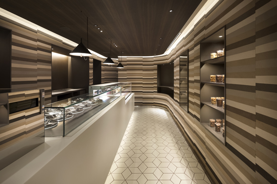
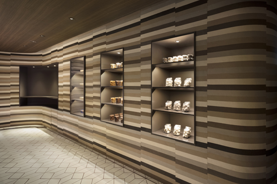
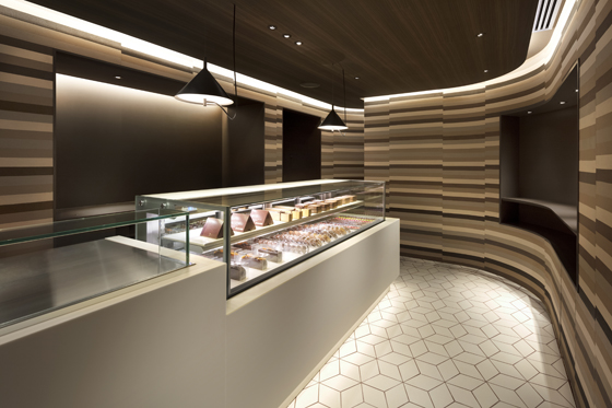
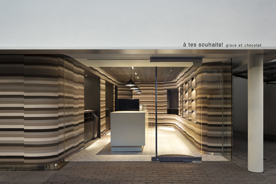
Designed after a melting ice cream cake, Nendo moulded stacks of brown, cream and beige soil into softly curving walls for the interior of the new Glace et Chocolat shop in Kichijoi, Tokyo. Photos: Takumi Ota

Designed after a melting ice cream cake, Nendo moulded stacks of brown, cream and beige soil into softly curving walls for the interior of the new Glace et Chocolat shop in Kichijoi, Tokyo. Photos: Takumi Ota
×Nendo has created some of the most inspiring retail spaces out there. Why is retail design so interesting for your studio?
For me and Nendo, the role of design is about solving things, about finding new solutions. We design retail spaces in the same way as we would a product or a piece of furniture. There isn’t, I believe, a special way or process when it comes to retail design.
When we do design retail environments, it’s as an extension of the furniture, developing from this a model for the interior-architectural plan. So, really, whether we’re creating a product or architecture, it’s all the same to me.
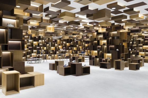
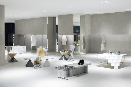
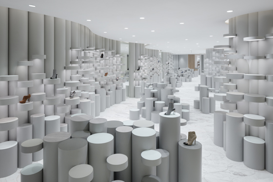
Nendo's largest retail-design commission to date, the Siam Discovery department store in Bangkok eschews a brand-based organisation of retail space in favour of Nendo's series of distinctive 'lifestyle laboratories'. Photos: Takumi Ota

Nendo's largest retail-design commission to date, the Siam Discovery department store in Bangkok eschews a brand-based organisation of retail space in favour of Nendo's series of distinctive 'lifestyle laboratories'. Photos: Takumi Ota
×How do you choose which retail brands/clients to work with?
It’s important for us to collaborate with clients who have a willingness to take on new challenges and a real passion for design – not just an interest in a project’s scale, budget or schedule.
If shopping is increasingly becoming as much about the design of experience as it is of physical space, how do you go about this?
It’s very simple. I think it’s important for the physical space to intrigue guests slowly, so that they purchase something impulsively, having found something unexpectedly while wandering around the store. If you know exactly what you want to buy, then online shopping serves this function better, I would say.
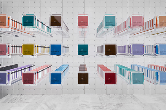
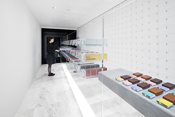
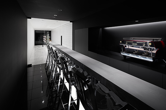
Reduction and transparency rule at Nendo's BbyB shop and café in Ginza, Japan, the Antwerp-based chocolatier's first overseas retail space. Photos: Daici Ano

Reduction and transparency rule at Nendo's BbyB shop and café in Ginza, Japan, the Antwerp-based chocolatier's first overseas retail space. Photos: Daici Ano
×How do you square your creative, experimental ideas with your clients' business needs? Do you have to dilute your initial concepts?
If I import an idea from somewhere, then I think there is potential for conflict in terms of what the client’s intentions are. However, thinking about the client’s issues as ‘ingredients’ that should be included in the mix from the start is a way to reduce these kinds of problems.
Also, I often try to simulate the finished project by using a detailed model and renderings, so that there’s a shared understanding of what the final result will be. I also place a lot of emphasis on communication.
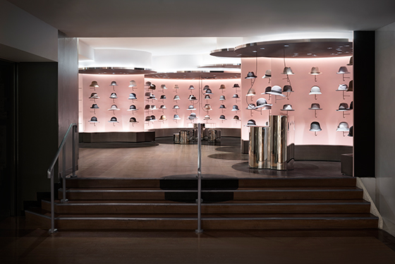
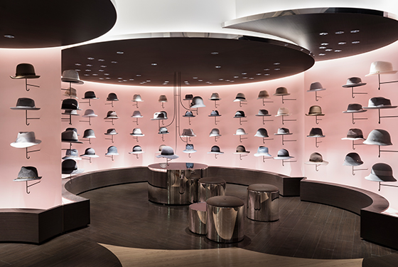
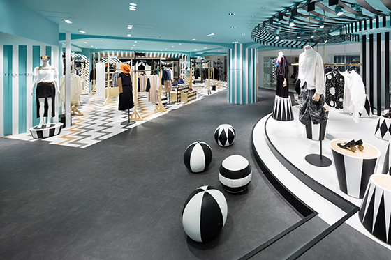
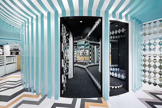
At Hat Cloud and Key to Style, both in Tokyo's Seibu Shibuya store, products become graphic elements in bold, colourful settings. Photos: Takumi Ota

At Hat Cloud and Key to Style, both in Tokyo's Seibu Shibuya store, products become graphic elements in bold, colourful settings. Photos: Takumi Ota
×How do you see retail design developing in the next few years? And how would you like it to develop?
I make a point of not really thinking about these kinds of things when I’m designing. I just focus on what I'm doing at this moment.
Big, major trends, like large rivers, split. Diversity as a trend in itself is accelerating. Think of it as the many veins of a plant or the way capillary vessels branch out. I hope that Nendo will become one of the small tributaries.
© Architonic

