How to maximise the interior design value of a kitchen
Texte par Valentina Diaz
22.04.24
These four kitchens elevate the interior design of their respective residences by taking on a central role. Featuring Markéta Bromová Architekti, Mistovia, Prior Barraclough and Ester Bruzkus Architekten.
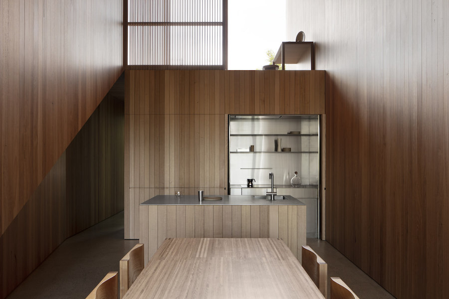
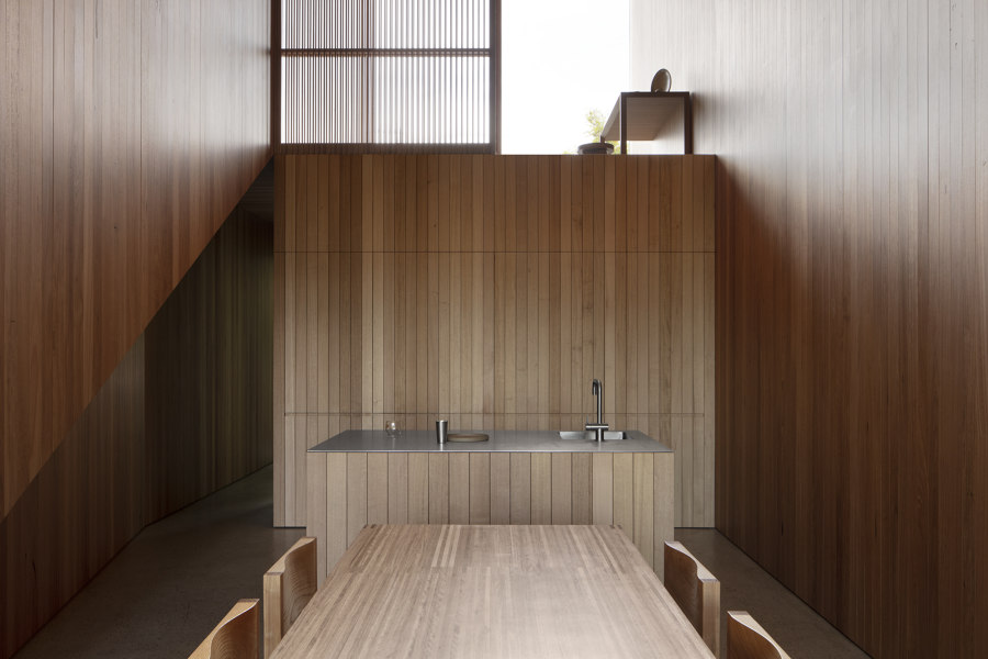
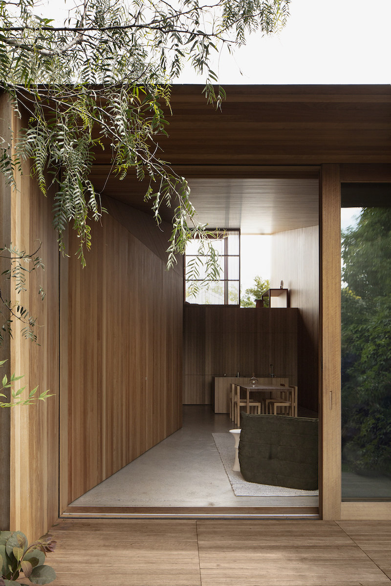
Crafting bespoke kitchen furniture tailored to fit into the overall interior design scheme is one of the key components that elevates projects like the Union Street House in Northcote, Australia, designed by Prior Barraclough. Photo: Ben Hosking

Crafting bespoke kitchen furniture tailored to fit into the overall interior design scheme is one of the key components that elevates projects like the Union Street House in Northcote, Australia, designed by Prior Barraclough. Photo: Ben Hosking
×No wonder they are the 'heart of the home': kitchens can elevate the interior design of any residential project by becoming an integral part of its composition. It is not just about connecting the kitchen with the social areas of the house; it is about its integration and contribution to the overall interior design. The kitchen space can serve as a focal point, heightening interior design quality and providing an adaptable area for activities beyond cooking.
It is not just about connecting the kitchen with the social areas of the house; it is about its integration and contribution to the overall interior design
Three key aspects play a vital part in enhancing interior value through a conscious curation of elements or finishes. Flooring is one, providing a seamless extension of finish from social areas into the kitchen to unite furniture and blur functions. Standout surfaces such as marble or steel also offer aesthetic appeal on top of durability, accommodating conversation and work, while integrated appliances maintain a sleek appearance. Lastly, lamps and decor offer ambient lighting and overall aesthetic aura, supporting diverse activities by setting different moods. These four kitchens elevate the interior design of their respective residences by taking on a central role.
Antonínská Apartment in Prague, Czech Republic, by Markéta Bromová Architekti
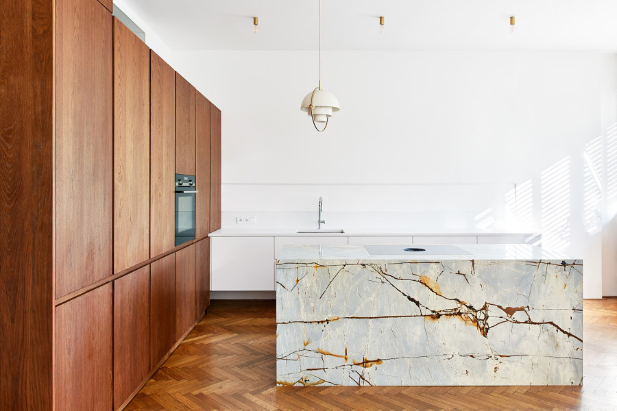
Countertop lighting is subtly tucked into a notch above the concrete slab, while the island lighting is slightly off-centre. Photos: Veronika Raffajová

Countertop lighting is subtly tucked into a notch above the concrete slab, while the island lighting is slightly off-centre. Photos: Veronika Raffajová
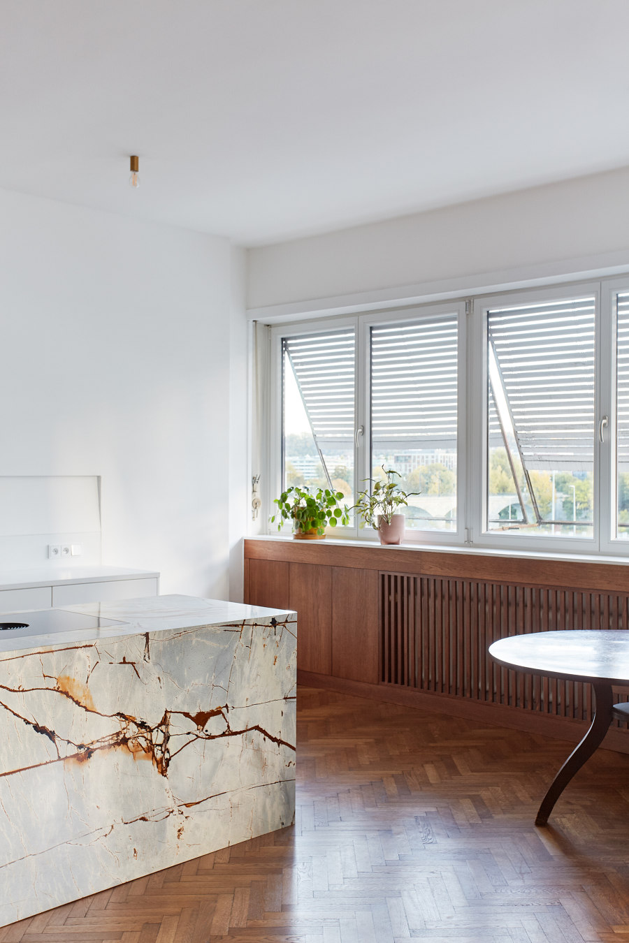
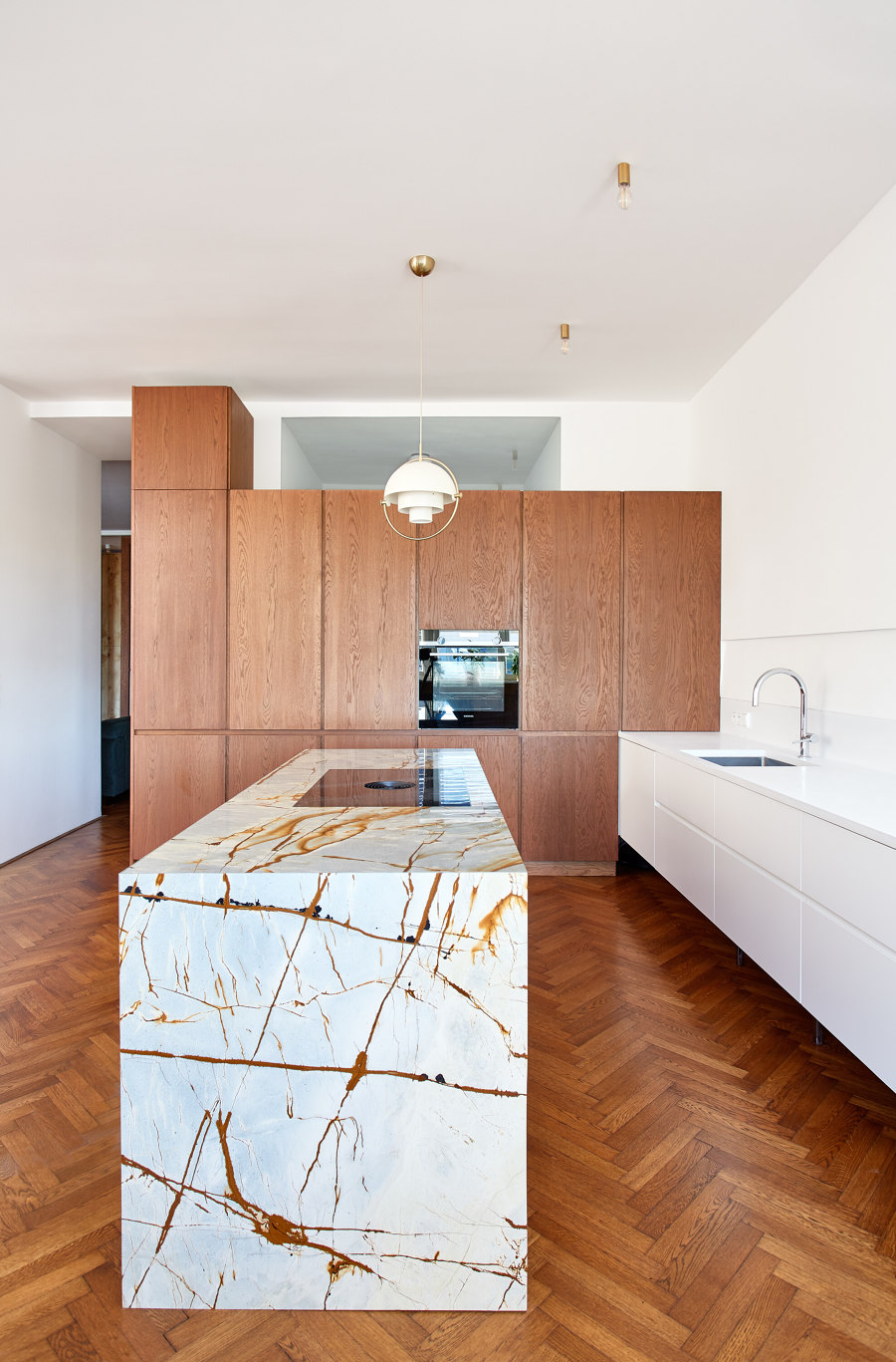
×In the Antonínská Apartment, the kitchen is positioned to face the living area, fostering an open and interconnected ambience. An island, featuring ‘space’ quartzite, occupies what Markéta Bromová Architekti calls the ‘alleyway’. Aligned with the faucet axis, the multi-small light designed by Louis Weisdorf and manufactured by GUBI, dating back to 1972, complements one side of the island. This arrangement, framed by two ceiling light points, crafts an asymmetrical kitchen front.
The uninterrupted continuation of the wooden floor and the oak veneer enveloping vertical surfaces and cabinetry unite the space, creating a cohesive envelope. Markéta Bromová Architekti notes, ‘The same veneer enters the main living space in the form of high parts of the kitchen.’ Adjacent to the horizontal window, an auxiliary dining area complements the kitchen, featuring a corner bench finished in matching oak, thereby embracing the space.
AFL Praga in Warsaw, Poland, by Mistovia
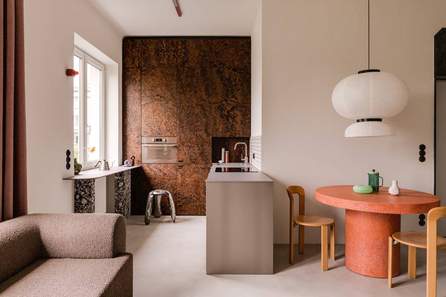
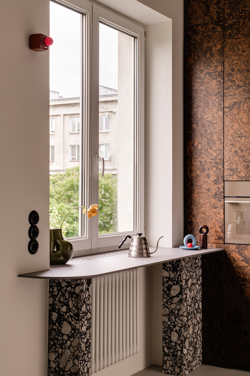
On the post-war Praga II estate, designed in the 1950s by architects Jerzy Gieysztor and Jerzy Kumelowski, the residents now enjoy green views from their kitchen window. Photos: ONI Studio

On the post-war Praga II estate, designed in the 1950s by architects Jerzy Gieysztor and Jerzy Kumelowski, the residents now enjoy green views from their kitchen window. Photos: ONI Studio
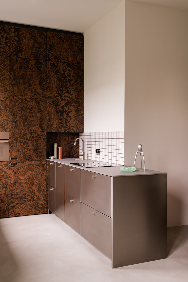
×A wooden veneer piece of furniture that spans an entire kitchen wall stands out in the AFL Praga kitchen. Martin from Mistovia highlights, ‘In the kitchen, the tall built-in furniture with a veneer made of an extremely impressive American walnut burl constitutes the main feature.’ This furniture houses integrated appliances, including an oven positioned within a tower that forms part of the furniture module, contributing to its sleek, streamlined design.
The brushed steel counter extends from the kitchen wall, merging with the surrounding social area and doubling as a backrest for the dining space
The brushed steel counter extends from the kitchen wall, merging with the surrounding social area and doubling as a backrest for the dining space. A pink terrazzo round table and vintage oblong chairs designed by Bruno Ray pay homage to the Memphis Group's bold aesthetics. A light grey micro cement floor extends throughout the apartment, ensuring visual continuity, while the absence of material breaks in the kitchen enhances its seamless integration with the living space.
Union Street House in Northcote, Australia, by Prior Barraclough
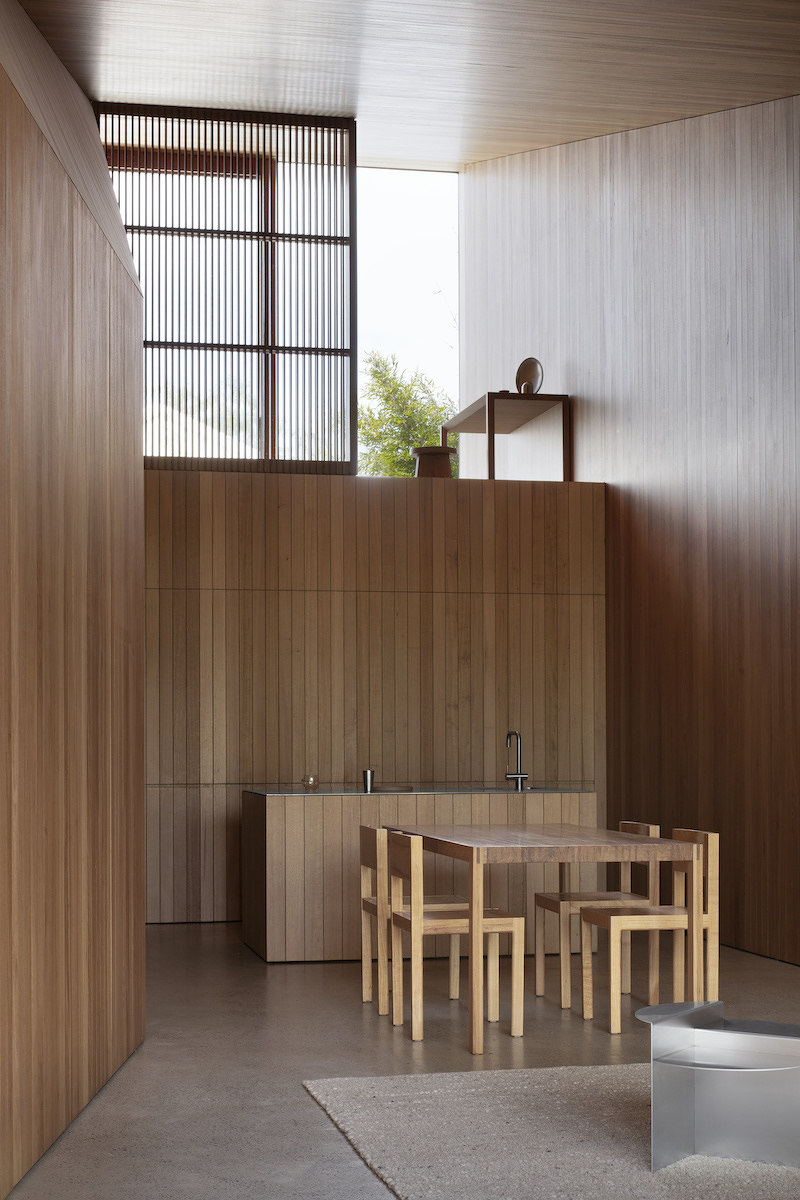
The ceiling aligns with the floor plan's width, creating intimacy. As the plan narrows, the ceiling rises, energising the dining, kitchen and study areas. Photos: Ben Hosking

The ceiling aligns with the floor plan's width, creating intimacy. As the plan narrows, the ceiling rises, energising the dining, kitchen and study areas. Photos: Ben Hosking
×In the heart of the Union Street House retirement home, the kitchen blends into the open space, concealed by Australian hardwood integration. Using a joint grid technique, it keeps its inner workings hidden. Inside, the wood extends throughout. The kitchen's furniture, fashioned from the same material, serves a dual purpose: when open, it unveils the functionality of essential appliances, such as the stove, blending form and function. Yet when closed, it melds into the continuous wooden surface.
The transformation of function is articulated through subtle material choices. As underlined by Prior Barraclough, ‘To emphasise the programmatic shift, secondary spaces are lined in materials that provide a stark counterpoint to the texture and detail of the timber, such as stainless steel in the kitchen and glazed mosaic tiles in wet areas.’ The house's interior is centered around this pivotal kitchen, integrated with the various levels and complemented by surrounding furnishings.
The Green Box in Berlin, Germany, by Ester Bruzkus Architekten
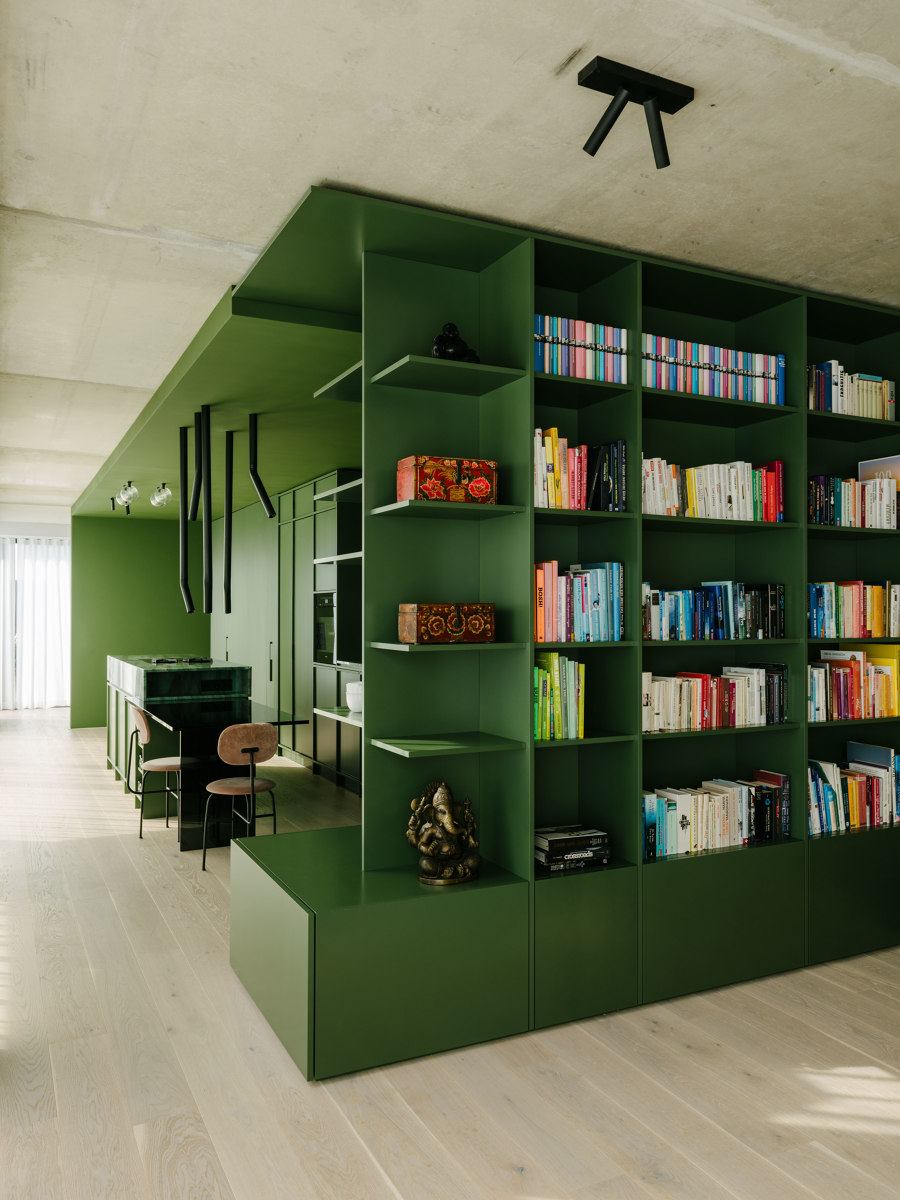
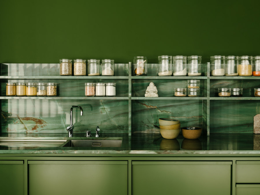
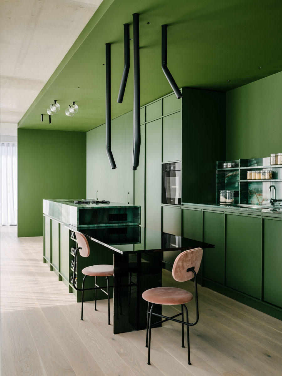
The deep green lacquered box harmonises with warm golds, violets and brown tones, creating a contrast with the cool concrete ceiling and wall through varied materials and colours. Photos: Robert Rieger

The deep green lacquered box harmonises with warm golds, violets and brown tones, creating a contrast with the cool concrete ceiling and wall through varied materials and colours. Photos: Robert Rieger
×The Green Box's centrepiece is its Ester Bruzkus Architekten-crafted green kitchen, situated to optimise open space while preserving city views and natural light in the apartment layout. ‘In the box are hidden all the kitchen and bath services; around it are public rooms that face a view of the city on two sides,’ describe the team. The faces of the green box double as functional furniture, integrating with the interior space and fostering a sense of unity throughout.
Adjacent to the kitchen, a bookcase merges with the structure housing the cabinets and appliances, blurring the boundaries between culinary and living spaces. Despite the dominant green palette, continuity reigns as the shared materiality unifies all interior elements. To enhance this integration, Ester Bruzkus Architekten selected a tubular angled pendant lamp to illuminate the island (lighting concept by PS Lab), while Afteroom Chairs from Audo Copenhagen further elevate the kitchen's Studiocoucou furniture and its bordering ambience.
© Architonic
Head to the Architonic Magazine for more insights on the latest products, trends and practices in architecture and design.
