Colour fast: Villeroy & Boch Tiles
Brand story by Mareile Morawietz
Merzig, Allemagne
21.05.21
The 12 colour sets in Villeroy & Boch Tiles’ PRO ARCHITECTURA 3.0 concept facilitate faster decision-making, saving precious time during the design process.
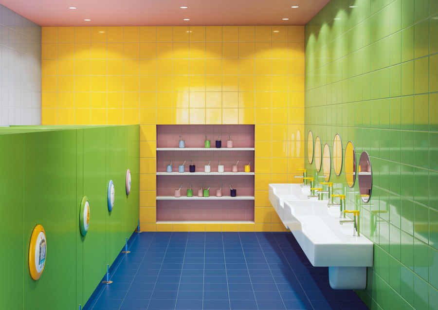
The courage to use colour: The colourful tiles stand for pure joie de vivre and easily withstand even the demands of small, boisterous kindergarten children

The courage to use colour: The colourful tiles stand for pure joie de vivre and easily withstand even the demands of small, boisterous kindergarten children
×We make an average of 20,000 decisions a day, as once calculated by Germany’s best-known brain researcher Ernst Pöppel. It starts in the morning with the alarm clock – hit the snooze button or get up – and only ends once we are fast asleep. Despite this daily training, decisions that have a lasting impact remain difficult to make, while having too many options costs valuable thinking time.
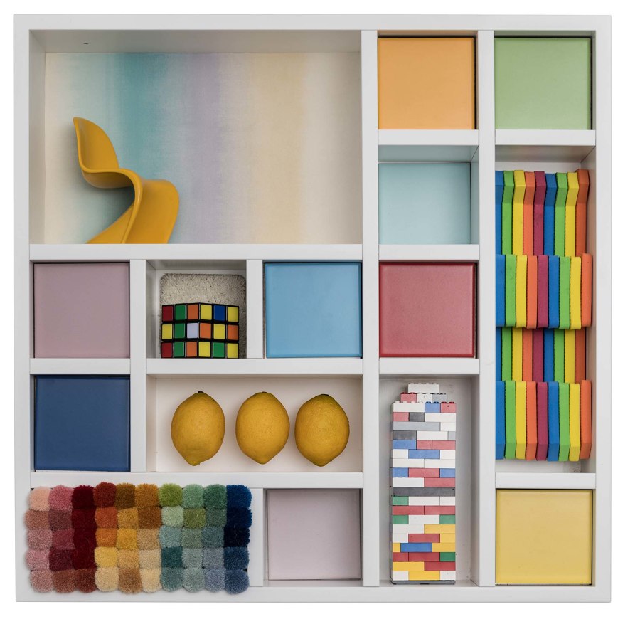
The ‘Happy’ colour set brings clear colours into play to make rooms look lively and create the right atmosphere for more creativity

The ‘Happy’ colour set brings clear colours into play to make rooms look lively and create the right atmosphere for more creativity
×Research psychologists at Saarland University have found that we prefer to go with the familiar when confronted with numerous choices. This is a huge barrier to creativity. To give architects and planners new freedom and pave the way for unconventional ideas, even when under time pressure, Villeroy & Boch Tiles has developed an innovative system: a kind of safety net for exciting concepts and revolutionary approaches.
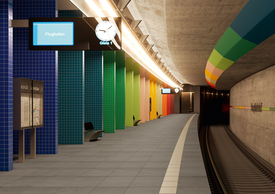
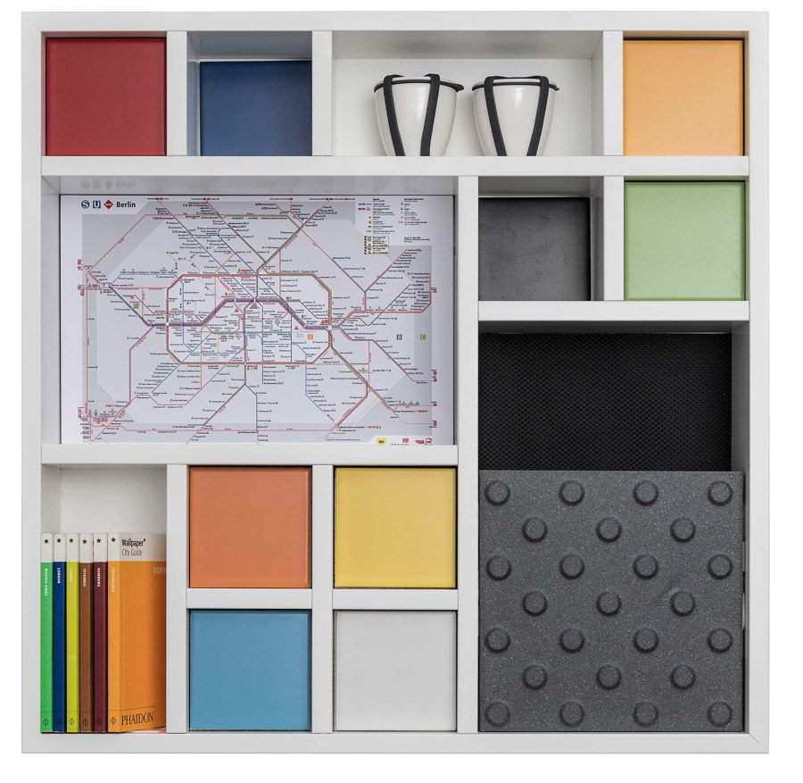
The ‘Guiding’ colour set visually simplifies orientation in buildings. By using grooves and studded tiles, a guiding system for visually impaired people can also be easily integrated on walls and floors

The ‘Guiding’ colour set visually simplifies orientation in buildings. By using grooves and studded tiles, a guiding system for visually impaired people can also be easily integrated on walls and floors
×With PRO ARCHITECTURA 3.0, the premium brand combines the advantages of the three successful systems Pro Architectura, Colorvision and Granifloor to make it easier for architects and planners to reach decisions and trust their gut feeling, which has recognised value as a memory bank of emotional experience. In doing so, PRO ARCHITECTURA 3.0 does not rely on ingrained empirical values or habits, but on opening up new dimensions.
PRO ARCHITECTURA 3.0 does not rely on ingrained empirical values or habits, but on opening up new dimensions
The fact that the complex system also works in practice is thanks to the collaboration between the experts at Villeroy & Boch and Prof. Dr Axel Buether, one of the world’s leading colour researchers. His studies on how colour affects people were key to evolving the concept for PRO ARCHITECTURA 3.0 – going beyond the visual to appeal to other sensory channels: tactile, haptic and even gustatory.
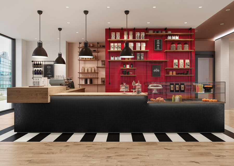
PRO ARCHITECTURA 3.0 porcelain stoneware offers the catering trade excellent advantages in terms of colour, shape and functionality, and is resistant to frost, dirt and chemicals, both indoors and outdoors

PRO ARCHITECTURA 3.0 porcelain stoneware offers the catering trade excellent advantages in terms of colour, shape and functionality, and is resistant to frost, dirt and chemicals, both indoors and outdoors
×Villeroy & Boch’s tile specialists developed twelve colour sets from the 45 hues in the new system, giving architects and planners unimagined possibilities in optimally designing the overall appearance of interiors and creating fresh perspectives.
Even with unusual variations and combinations, the system offers the certainty of achieving a cohesive overall look. Moreover, the colour matrix inspires original ideas for the combination of floor and wall tiles, not only with each other but also with other materials and surfaces, allowing for greater design freedom.
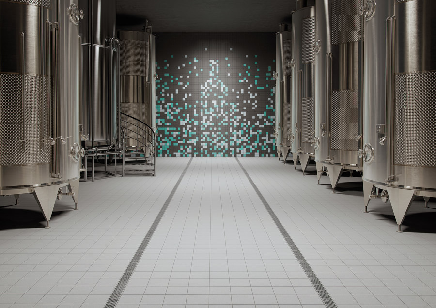
‘Clean’ stands for easy and quick cleaning. PRO ARCHITECTURA 3.0 tiles provide slip resistance on floors in work areas and eliminate the risk of tripping or slipping

‘Clean’ stands for easy and quick cleaning. PRO ARCHITECTURA 3.0 tiles provide slip resistance on floors in work areas and eliminate the risk of tripping or slipping
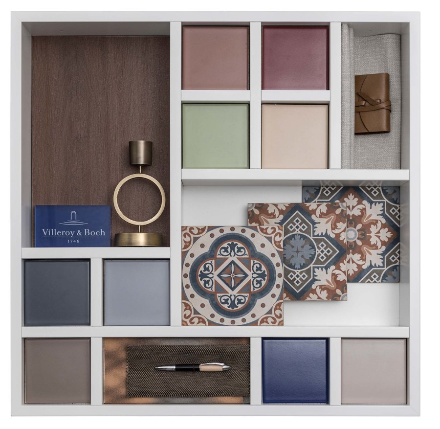
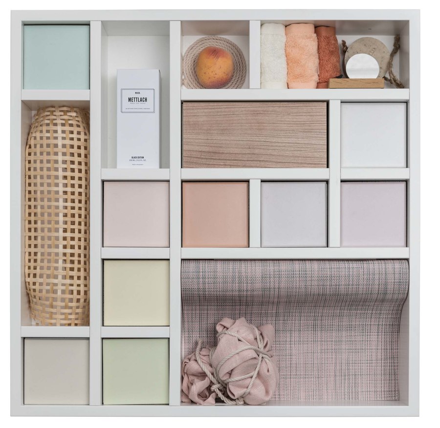
×Nine individual hues form a colour set that generates certain moods and emotions even in original combinations or when catering to situation-specific needs. While the ‘Guiding’ set, for example, leads the way with clear colours and strong contrasts, the understated pastel tones of the ‘Focussing’ set aid concentration.
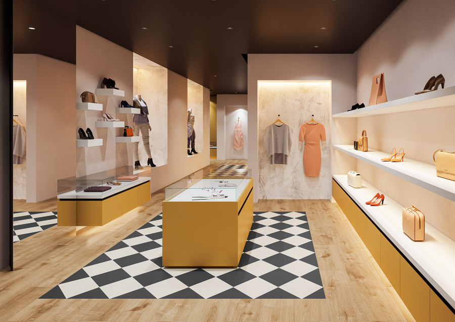
Tiles from the ‘Elegant’ colour set are recommended for designing exclusive shopping environments. They are just the right size to attract attention, convey individual style and enhance the feel-good factor

Tiles from the ‘Elegant’ colour set are recommended for designing exclusive shopping environments. They are just the right size to attract attention, convey individual style and enhance the feel-good factor
×Reflective and matt surfaces can enhance the colour effects and strongly influence the perception of an interior. The choice of surface also depends on where the tiles are to be used. The stoneware surface CeramicPlus minimises the required cleaning effort, and VilbostonePlus is resistant to stains and dirt. Of course, the surface texture can also be functionally employed to make barefoot zones in the spa slip-proof or to minimise wear with coloured porcelain stoneware.
Reflective and matt surfaces can enhance the colour effects and strongly influence the perception of an interior
The high-quality wall and floor tiles thus serve to augment the interior architecture, and its functions and effects in multiple dimensions – whether deployed selectively in certain areas or throughout the space. At the same time, they offer architects and interior designers durability as well as great scope and flexibility in implementing interior design schemes easily and sustainably with the systematic and application-oriented colour sets.
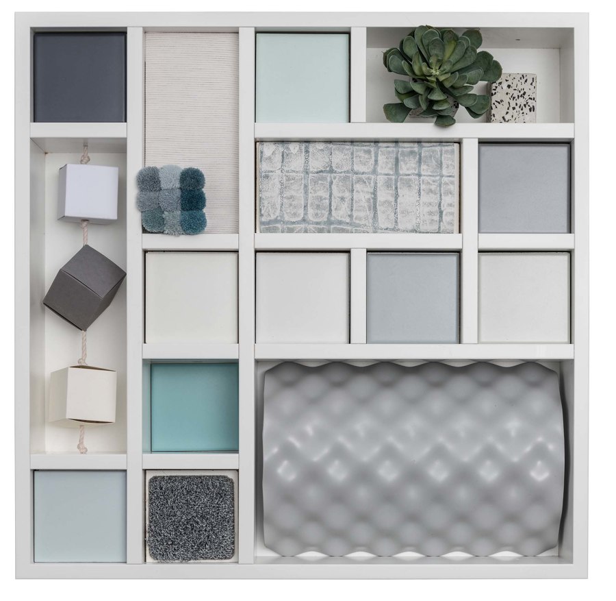
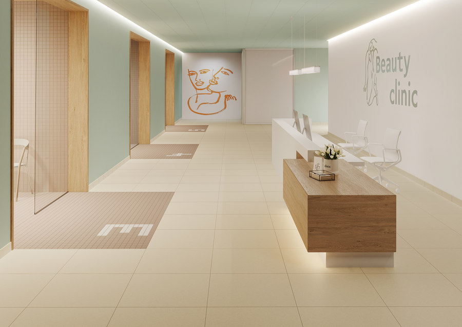
Colours have an influence on our well-being. The tiles from the ‘Regenerating’ range are deliberately restrained to create a harmonious overall impression and at the same time are convincing in terms of hygiene and safety

Colours have an influence on our well-being. The tiles from the ‘Regenerating’ range are deliberately restrained to create a harmonious overall impression and at the same time are convincing in terms of hygiene and safety
×Incidentally, according to researchers, the key to making important and definitive decisions throughout the day is to simply reduce the total number of choices. That’s why successful individuals like Barack Obama and Mark Zuckerberg always wear the same type of clothing and also limit their food choices at mealtimes to avoid banal decision-making situations and conserve thinking power.
With PRO ARCHITECTURA 3.0 from Villeroy & Boch Tiles, architects and planners do not have to sacrifice or do without, and can still achieve more quality and innovative character with fewer decisions. In addition, the experts at Villeroy & Boch Tiles are available to advise on projects and help users make the most of the three-dimensional possibilities. This enables decisions without risk and experimentation with guaranteed success. A system that would, in fact, be helpful in all areas of our lives.
© Architonic

