Workspace specialists align have completed a 20,000 sq ft suite of offices that respond to a complex technical brief, at the same time as prioritising staff’s ergonomic needs, for technology company Mendeley. The offices are located in the landmark AlphaBeta development in Finsbury Square, part of London’s burgeoning Tech City and just across the road from the Google Campus and Amazon’s new European HQ.
Mendeley is a fast-growing, global, collaborative research and knowledge-sharing platform with over 3m global users. At the core of the business offer are cloud-based tools, platforms and services, designed to help scholars all over the world discover content, organise their papers and connect with other researchers, with the overall aim of making science more open, social and accessible.
In 2013 Mendeley was acquired as a start-up – with just 40 employees - by Anglo-Dutch publishing and information giant Elsevier. Thanks to successful expansion and integration with existing Elsevier teams and resources, the company is now well on its way to being five times that number.
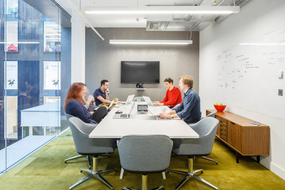
The brief revolved around enabling staff to work at their optimum level, especially when coding. This meant planning for single working, working in pairs and also in both smaller and larger groups with maximum flexibility and variety, meaning staff can work seated or standing and are able to collaborate with varying degrees of privacy in sealed-off spaces, semi-private spaces or open meeting areas. Concentration and stimulation needed to be carefully balanced in a dynamic, hard-working environment where the human and ergonomic needs of staff were to be respected at all times.
The brief also requested specific areas where consumers could come in to test new software and be observed in the process, as well as a range of break-out spaces, ranging from the relaxing to the very chilled indeed in order to off-set the intensity of the programming work. A central gathering space was also requested for the whole company to be able to come together in one place.
The AlphaBeta development by Resolution Property brings together three properties, formerly known as Triton Court, into a single scheme and was created by architects Studio RHE International. It is comprised of nine, non-uniform storeys, arranged around a full-height atrium core. The development, targeted at digital and media companies, also features a yoga room, a basketball court and a ramp that allows cyclists to enter the building directly.
Mendeley was the first tenant to occupy the building, taking just over two-thirds of level three: 20,000 sq ft of the overall 27,426 sq ft floorplate.
‘Mendeley is a young, high-growth digital business, which will sit well within the AlphaBeta community’ Jacob Loftus of Resolution Property commented, when the deal was initially signed.
align were commissioned in August 2014 to create a design scheme within the Cat A space in this iconic development, working with a base build that wasn’t yet complete and with a deadline that meant taking early possession. align worked closely with main contractor Modus to deliver the project.
Part of the brief was to navigate a clear path between end-user needs and expectations and parent company design guidelines. Elsevier were very much seeking a showcase for their new technology flagship business, whilst Mendeley was seeking to push boundaries as a forward-thinking, fast-growing concern.
Arrival & Reception
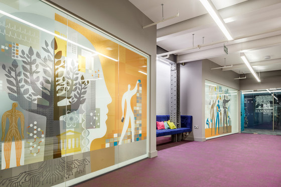
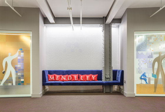
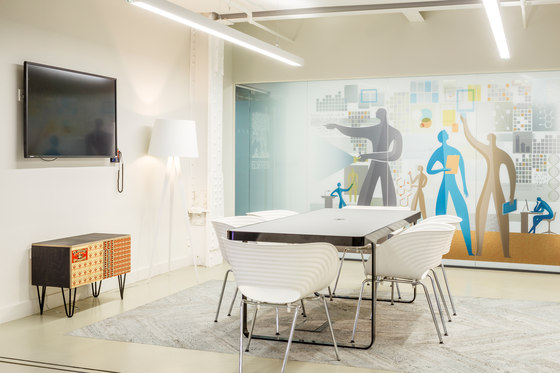
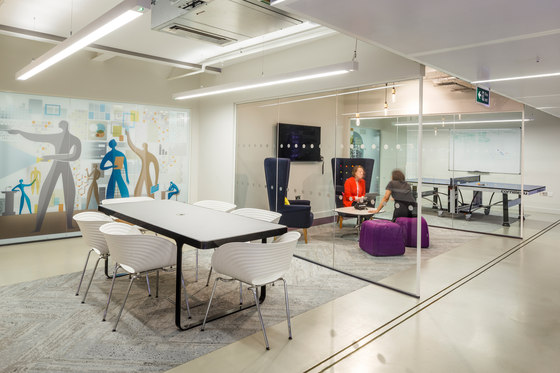
Visitors first arrive at the third floor level into a lift lobby area, which is bordered to the right and the left by two sets of glass doors, decorated with the Elsevier white tree logo. Two glass walls opposite feature eye-catching, full-height graphic illustrations, which are transparent enough to show the movement of figures the other side, but which also create a degree of privacy for the meeting spaces beyond. These came from Elsevier’s existing image library, but were selected by align to work specifically with the space and the overall colour scheme.
Located between the two glass meeting room walls is a nook with a seemingly floating sofa in a bold royal blue velvet, decorated with small M-for-Mendeley cushions, which announce the colourful, fun treatment to come and can be found, in red and green, throughout the scheme. The flooring here is a bold, purple Simulo from Bolon, with a variegated texture, which plays off the light. Above the sofa is the first iteration of the Mendeley logo on the back wall, with a thin LED profile light behind an overhead beam to wash light down over the logo and wall.
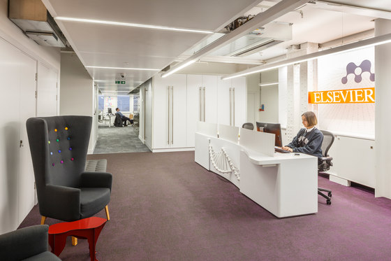
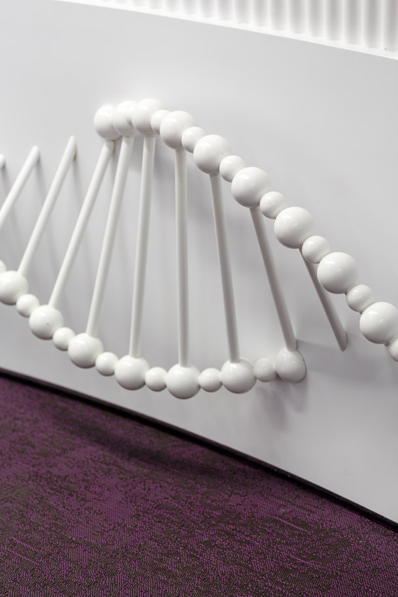
The main reception space is located through the doors to the left and is centred around a bespoke, 3.2m-long desk, created by align in white Corian and inspired by the ever-evolving nature of DNA as a motif for the activity taking place in the office.
‘We came up with the integrated DNA idea because DNA is at the core of everything within life sciences, Mendeley’s key area of focus and also because its constant spinning and evolutionary nature suggest a company very much on the move’, Gurvinder Khurana explained.
The DNA takes the form of a lacquered, timber-spun strand at the front of the desk, lit by pulsing LED light, with a panel to each side, with the DNA pattern etched into them. Three low modesty screens in white-sprayed corrugated ply protect the receptionist’s privacy at the front of the desk.
The wall behind the desk displays the identities of Mendeley and, directly below, Elsevier. As in the lobby, an LED profile light washes light downwards and over the two identities.
Opposite reception is a waiting area, with two dark grey Loved Up high-backed chairs from Dead Good, with multi-coloured buttoning and the first of three small Dog tables by Imbibe, in red, setting the tone for a quirky, human and fun domestic-scale furniture found throughout the scheme in linking spaces or around the main work areas.
Main Work Zones
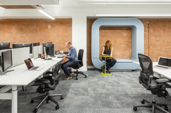
Behind reception is the first of the three main open-plan work zones. These feature large-format 1800mm-long workstations, so that two people can easily work at each if needed, divided by classic privacy and acoustic screens, clad in a grey Blazer fabric by Camira. Desking and chairs throughout the main zones are by Dutch manufacturer Gispen, who work with Reed Elsevier globally, whilst carpets here and in most meeting spaces are a dark grey: Composure by Interface, with an additional lighter grey used in the Board Room and Customer Experience Room.
‘Each bank of 6-8 workstations has one station that can be adjusted to standing height’ commented align Director and Co-founder Nigel Tresise. ‘This has great positive benefits for posture for those working all day on screens. It’s a workstation design that’s becoming ever more standard in continental Europe, though the trend is at a much earlier stage currently here in the UK. We think it’s definitely something to be encouraged!’
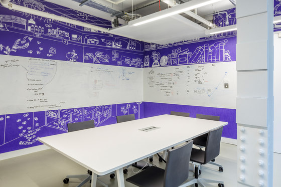
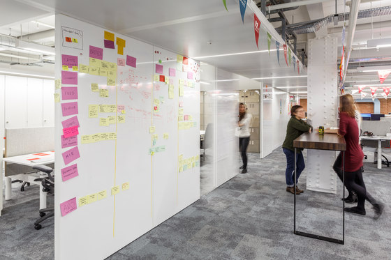
The most unique aspect of the zones comes in the use of wallcoverings with both sliding screens and write-on walls that enable Mendeley’s staff to work on coding and scheduling, whilst constantly benefitting from interaction with and input from other staff.
‘There are three types of write-on walls’, Nigel Tresise explained. ‘First, a magnetic write-on, wipe-off wall covering by Tektura, which we’ve also used in a lot of the meeting spaces. Secondly, Ideas Paint, which is floor-to-ceiling and non-magnetic and which we used on many of the core walls. Thirdly, in two work zones, there are whole walls made up of magnetic sliding panels, accompanied by standing talk-point tables, so that large groups of staff can be involved in creative and coding brainstorms.’
To ensure flexibility throughout these zones, staff use laptops work on whichever desk space is the most convenient for their task. There are no pedestals alongside desks and personal items and changes of clothes are kept in lockers. Each staff member has his or her own personal locker, located in banks around the office. Supplied by Maine, the lockers came in raw natural steel and were lacquered to be eye-catchingly reflective.
‘Generally’, Nigel Tresise added, ‘the need for storage is very different from more traditional businesses. The only major storage request in the brief, beyond the post-room and copy areas, was for ten floor-to-ceiling cupboards in the third open work zone’.
The lighting for the work zones is Cat A architectural lighting and takes the form of LED-source linear suspended lights.
The Social
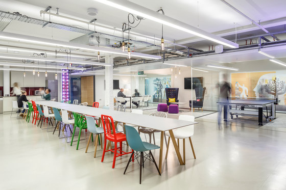
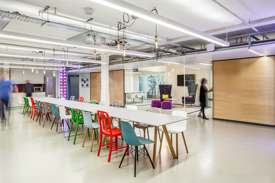
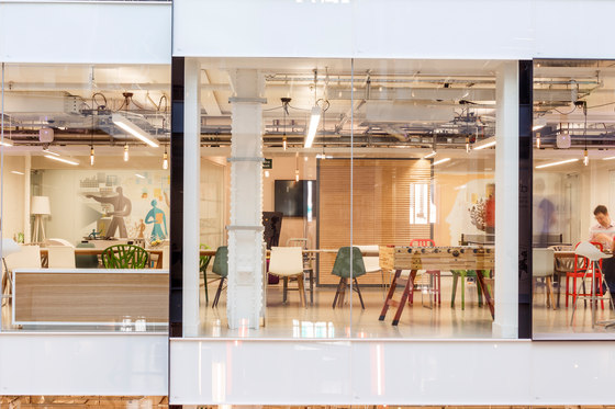
The Social is the longest single space within the scheme and serves as a ‘Town Hall’ meeting space, as well as a general space for eating, drinking and relaxation. It overlooks the atrium directly via a full-height glass wall and is announced by two fun, bespoke installations by Argent and Sable, made of hand-painted reclaimed timber, edged with fairground-style lighting, which book-end the space with the mantra ‘Eat, Drink, Code’.
A series of Copenhague tables from Hay sits down the centre of the space, with five different types of chair - and two repeated in different colour-ways. The seeming randomness of this very much forms part of the non-standard, individual and ‘human’ aspects of the scheme. Over by the glass atrium wall, a number of taller bar chairs and lamps are interspersed with two very domestic-scale units – cupboards from Mint Leaf with front doors made of original matchbox covers.
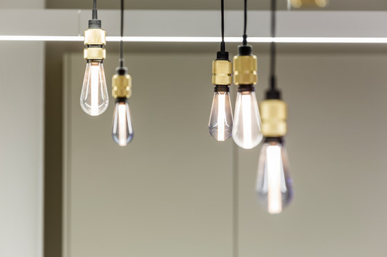
Feature lighting above the tables is from the Hooked range by Buster + Punch, featuring a series of LED lights set within traditional-style bulbs and hung on long black cables, which are hooked and wound so that they can be customised to hang at different lengths.
Flooring in this area is a green-tinged putty-coloured rubber by Chroma.
The units in the kitchen are a Polyrey-laminate Masic, topped with a super-thin Silestone composite worktop. These are very sleep and, when combined with the smoothness of the flooring, contrast well with the slightly rough feel of the imposing timber signage.
The units are interrupted by the building’s huge structural iron columns, which the designers decided not to box off.
‘We very much believe in respecting and celebrating the original structure of the building in all our schemes’, Gurvinder explained. ‘The kitchen surfaces are considered and contemporary and much finer than the imposing building structure, but we think the contemporary and traditional side by side work really well.’
Running alongside the opposite side of the space are three additional areas which can be used for meetings, relaxation or overspill at lunch-time. The first has a ping-pong table, but also chairs so that staff can use the space to meet in if they wish. The middle space is more of a lounge area and contains two further Loved Up high-backed armchairs, as in reception except in navy this time, whilst the third is more formal with a meeting table and room for more chairs. Carpeting runs down the centre of all three, allowing access for cabling and data and future-proofing the scheme which otherwise features sealed floors. All three spaces have a completely open side, facing onto The Social and are used in this mode for all-company events, such as Friday beers, but can be screened-off when needed via three metal-framed screens on rolling tracks, made of corrugated ply.
‘The timber for these corrugated ply screens, which we’re really pleased with, comes from Vancouver’ Gurvinder Khurana added, ‘with the screens made up to our precise spec by a manufacturer in Leeds, who also made the front reception desk.’
Meeting and break-out spaces
Further work zones lie beyond The Social, as do a range of meeting and break-out spaces, offering as much variety as possible.
‘It was very much part of the brief that each of these spaces, or series of spaces, was non-uniform and had a strong and distinct personality’, Gurvinder Khurana commented.
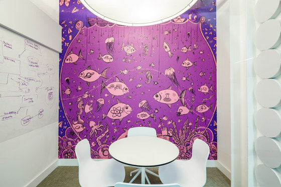
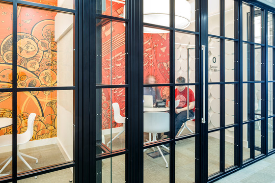
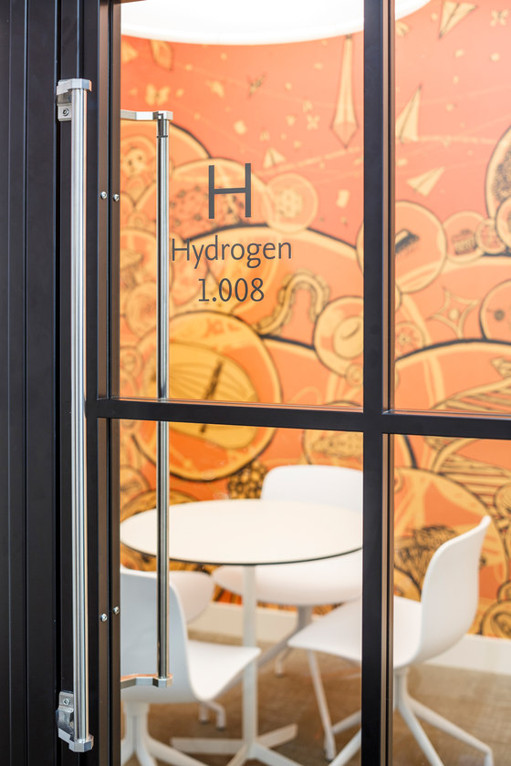
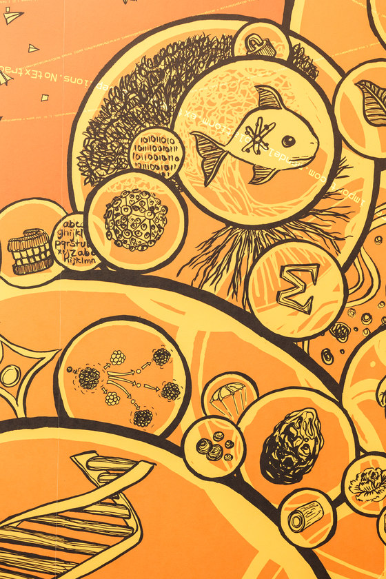
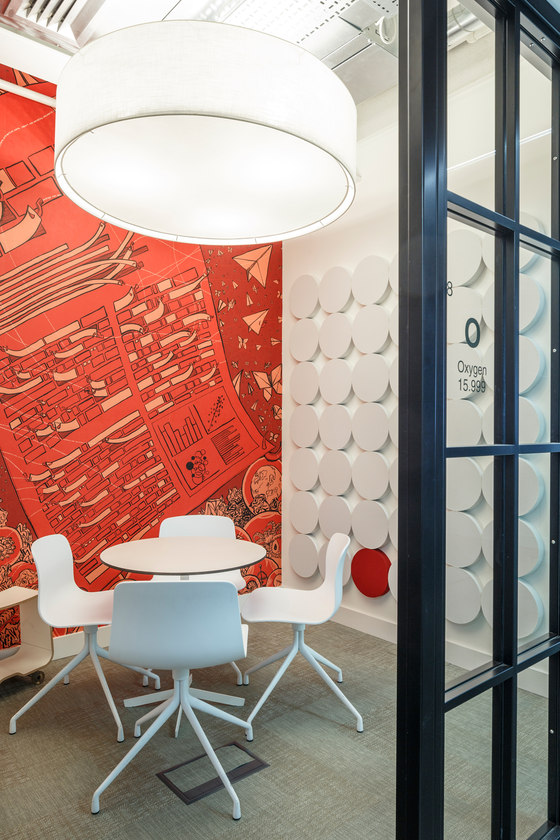
For example, on the opposite side of the atrium is a series of three closed meeting rooms, which accommodate just two people at one time, called Oxygen, Hydrogen and Nitrogen. The rooms were named and branded by align and each features a gigantic, 1200mm-diameter bespoke lampshade (commissioned from Albion Lighting) and an individual wall-graphic in bright colours, on a science theme, especially commissioned by artist Claudia Stocker. Flooring is a grey version of the Bolon floorcovering, both within the rooms and for the linking corridor outside.
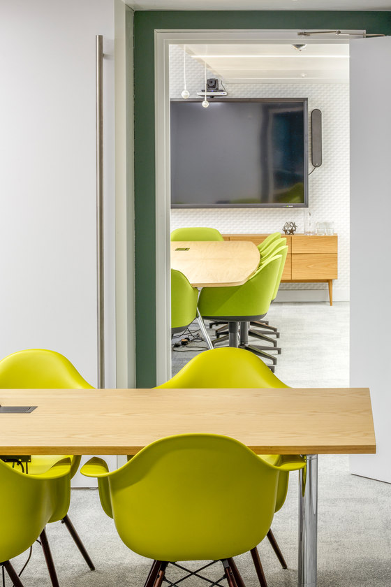
A fourth room in the series, Carbon, is larger and is specially set-up for video-conferencing. The screen in the room is set against an almost-black wall (Metalline by Tektura Vinyl), so that the screen effectively seems to disappear when switched off. Furniture in this space includes a Joyn conference table and chairs from Vitra. To make the room extra-lively, a mossy, mottled green carpet called Dylab by Shaw Carpets has been used, whilst at credenza at the back, from Blue Sun Tree, has a subtle green detail and is a perfect match for the carpet.
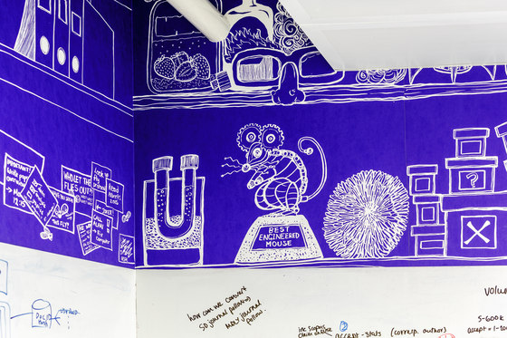
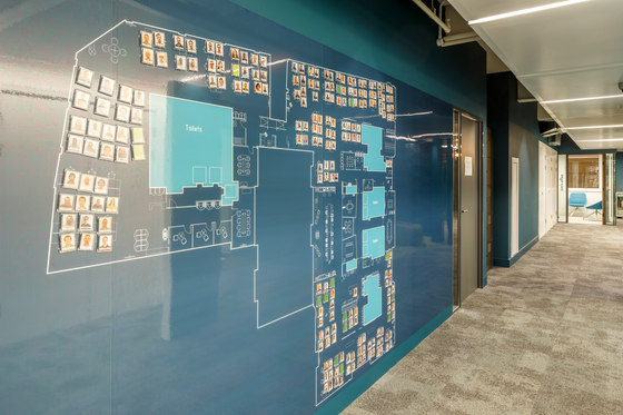
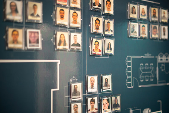
Also in this cluster of rooms is a further meeting room called The Lab. Here, the client requested a room deliberately styled on a laboratory theme. Chairs in The Lab are the .04 chair by Vitra; flooring is the same Chroma putty-coloured rubber as used in The Social and the room also has a special feature wallpaper, created by artist Claudia Stocker, which tells the story of a lab-rat. The wallpaper has been created in a blueprint style, echoing a further giant blueprint graphic of the whole office located just around the corner from The Social, which is illustrated with small magnets showing the face of each member of staff and showing where everybody is sitting.
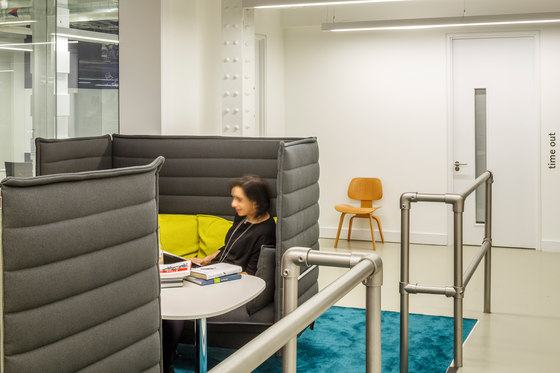
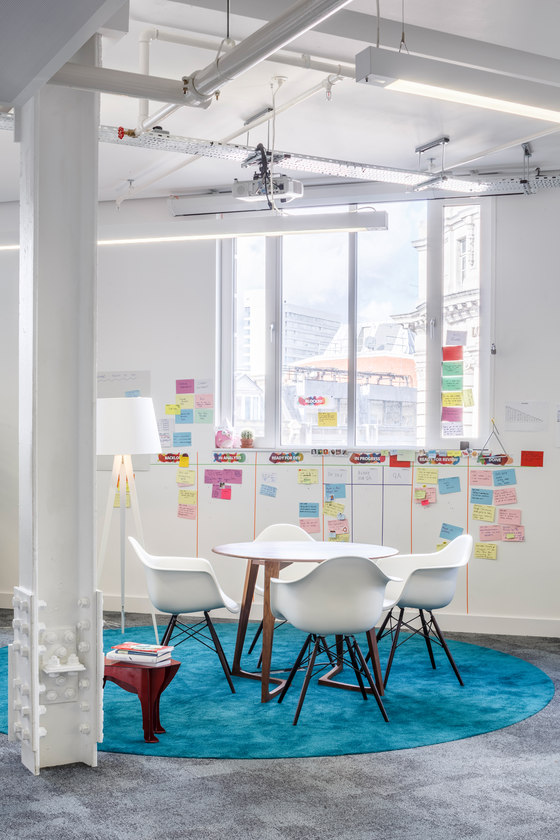
Within the open-plan offices themselves there are also alternative spaces, such as The Snug at the end of work zone 2, which has upholstered seats and a quilted surround; plus an open area in work zone 3, featuring a walnut table by Zeitraum and Eames armchairs from Vitra. Another break-out/work space is located between work zones 2 and 3: The Collaboration Point, which has a bar-feel and is furnished with two high-backed Alcove sofas and an Alcove table by Vitra, plus Jasper Morrison NES tables for laptops, along with and a striking green carpet.
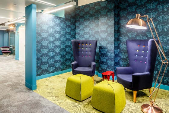
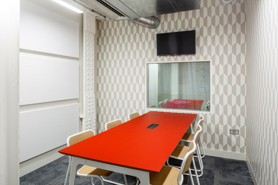
The other main cluster of rooms is found along a corridor leading off from The Social. Here we have the customer suite, including The Observation Room and The User Testing Room, where software is tested by consumers, with a two-way mirror for observation, which can be semi-obscured by a red voile drape if preferred. Further along are Tim’s Office (the only named office - for a leading Reed Elsevier Director); The Customer Experience Room (for post-testing meetings) and The Board Room. The corridor linking the rooms has the most eye-catching treatment of all perhaps, with a red voile at the end drawing your eye through; silver Anglepoise wall-lights and an open meeting space - The Butterfly Pod – with a strong residential feel, including striking wallpaper (Camberwell Beauty by Rockett St George); Web Art Volcano carpeting by Chroma in lemon grass, Knoll chairs and a further ‘Dog’ table by Imbibe.
‘The move to Alphabeta is enabling us to continue to attract top talent and work collaboratively in a fast-paced, fun environment’, said Fernando Fanton, SP Global Product and Technology at Elsevier.
align Director Gurvinder Khurana commented, ‘This is very much a grown-up scheme, which has been designed to be extremely functional and flexible in order to enable a work culture that is highly collaborative and where togetherness and sociability are both encouraged and celebrated. It’s been an absolute pleasure to work on, especially within such an exciting new building envelope.’
align
