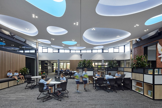
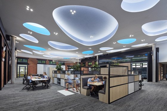
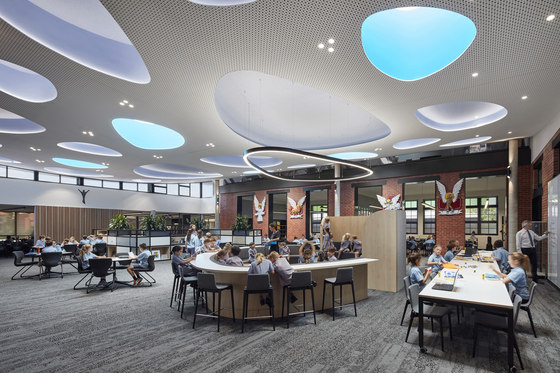
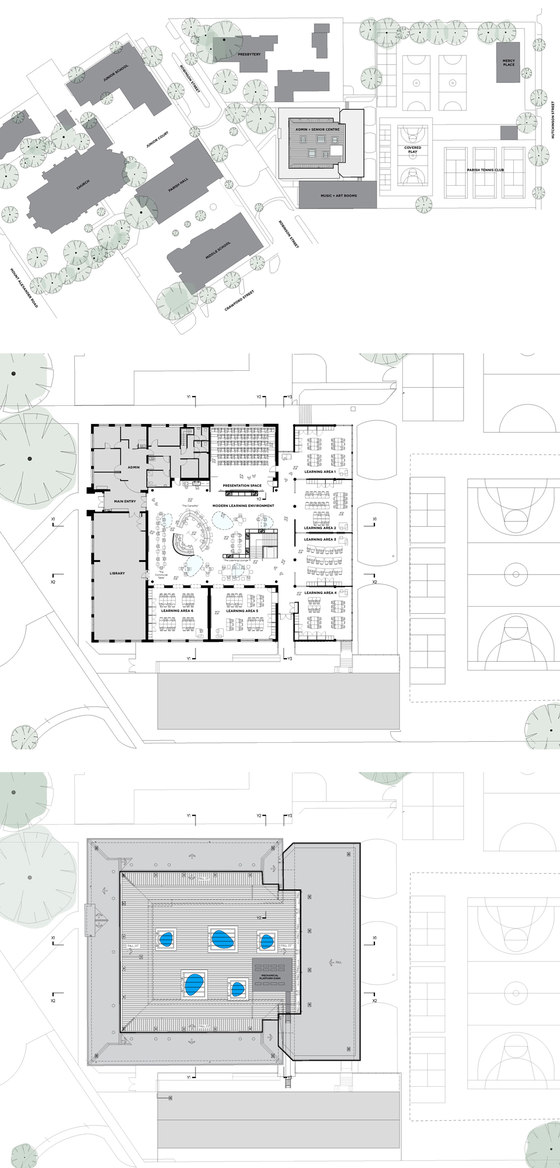
St Monica’s Senior Centre saw the modernisation of a 1917 heritage building. Our contextually driven design reconceptualised an underutilised courtyard into a central Modern Learning Environment which unifies six learning areas and a presentation space catering for over 150 Year 5 and 6 students. Our brief was to create a sophisticated and mature space for senior students transitioning to high school, while respecting and working within the heritage framework.
This was implemented through a restricted material palette, custom joinery and diverse learning opportunities. Critical to our thought process was maintaining the feeling of light and sky designing the ceiling to be a sculptural interpretation of this. Our ‘sky’ set as a gentle curve, linking two sides of the previous courtyard terminating in a mirrored horizon edge and eroded by repeating organic forms – the “pebbles.” This development ensures future growth and promotes a mature learning philosophy amongst its senior students.
Who are the clients and what's interesting about them?
The Catholic school has a rich cultural heritage dating back to 1853. Over the last 30 years, the school has undergone extensive renovations from the amalgamation of the girls’ and boys’ schools, to the construction of the Junior School, refurbishment of the tuckshop and Year 3 and 4 Middle School, to the construction of the Senior Centre in late 2015. Baldasso Cortese’s long term relationship with the client, has facilitated these major works bringing brought St Monica’s into the 21st Century while still respecting the school’s profound heritage.
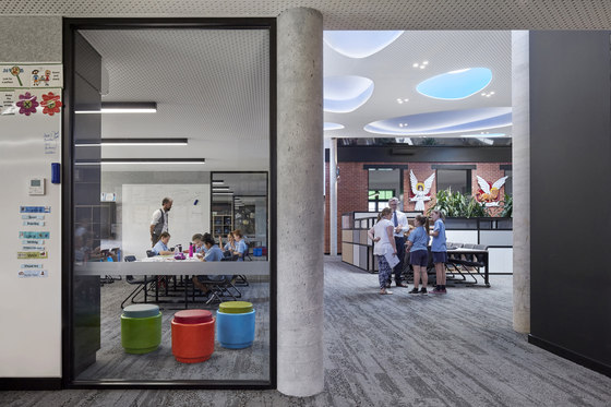
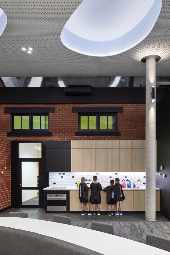
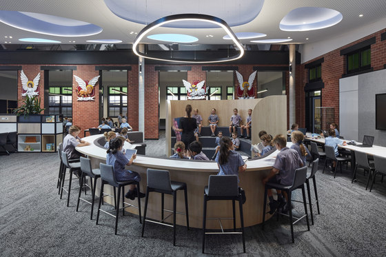
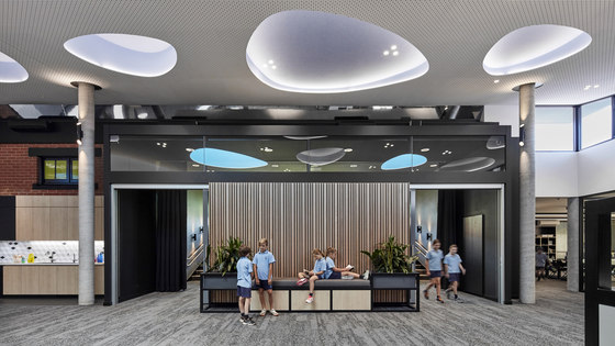
From the beginning the project was influenced by existing conditions, a strong respect and consideration was given to the one hundred year old building, as we created a positive tension between existing and modern materials. For instance, retaining the external heritage brickwork and using it as an internal material. By converting the existing highlight window lintels to openings all the way to the ground - we created large traversable archways or “portals” which we framed in black steel. These “portals” are pivotal to enable the free flow of students between the learning spaces, promoting flexibility, a core theme of our design.
What was the brief?
Our brief was to create a sophisticated and mature space for senior students transitioning to high school. This was implemented through a neutral and restricted material palette, furniture selection and the types of learning opportunities we created for students. Typically bright colours are used to add life and excitement in primary schools, at St Monica’s we played on the inherent colour of the diverse range of materiality that existed within the heritage framework and our modern additions –the raw materials like red brick, concrete and timber counterpointed with the modern finishes like painted steel, perforated plasterboard, felt panels and carpet.
What are the sustainability features?
We concentrated on excellence in passive sustainable design principals. In terms of light, it was crucial for us to obtain a level of natural light that was not direct, nor overwhelming and therefore tempt usage of blinds, but nonetheless provide a generous wash of light through the space. The modern learning environment has five “pebble” skylights, and we went to considerable efforts to realise the correct specification for the glass.
Additionally the facility can be naturally ventilated by the use of louvers set at high level, and in classrooms that generates a cross ventilation through the space. These are operated with a single open/shut button maximising the simplicity of usage for the school. Our philosophy was to simplify the user interfaces with all the technology and we worked closely with service engineers to archive this. We worked with a landscape architect to specify resilient plants in self-watering contraptions to bring some natural foliage relief to a highly constructed environment.
How does the building cater for the community?
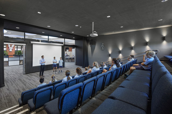
The 75 seat tiered presentation space, can allow for over 100 people with the inclusion of flexible seating. It is a space that facilitates a connection between the Senior Centre students and the rest of the school. The space allows for big or small group presentations, and has been acoustically treated as to not disrupt the activities in the adjacent areas and classrooms. Not only intended as a space for students but as well as the wider community, it has been designed to cater for after school community events and for a senior citizen program on the weekends.
How is the project unique?
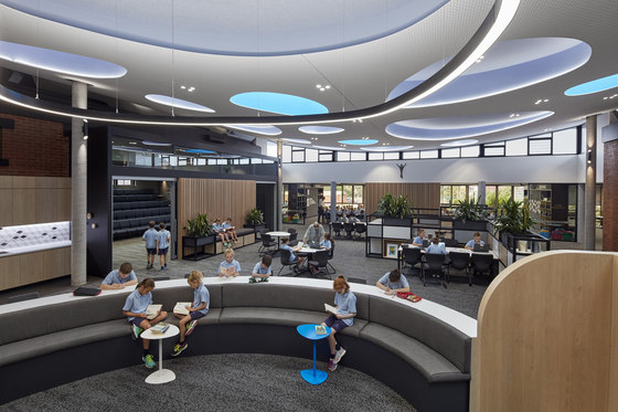
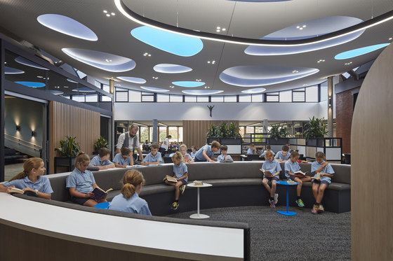
Critical to our thought process was maintaining the feeling of light and sky in our architectural expression of the ceiling. We designed the ceiling to be a sculptural interpretation of this, highlighting the transformation of an exterior courtyard to an interior space. We considered that this expression would help alleviate the feeling of enclosure. Our ‘sky’ was set as a gentle curved ceiling that linked the two sides of the previous courtyard terminating in a mirrored horizon edge. The new sky is eroded by repeating organic forms – the “pebbles,” some of which are skylights.
In line with the programmatic goal of opening up the classrooms to the central space, the elimination of doors was used to promote fluid and constant movement between the spaces. However, this meant acoustic considerations were critical to the building’s success. We worked carefully with an acoustic engineer to ensure the facility could absorb the weight of sound, liaising also with the manufacturer Knauf, to achieve the curved perforated plasterboard ceiling. The Stratopanel by Knauf allowed excellent acoustic performance while also allowing the architectural feature of the curved ceiling to be achieved due to the flexibility in the material.
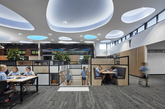
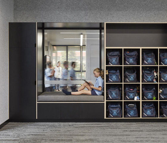
Other key endeavours in the scheme include high levels of transparency and custom joinery, helping to enhance teaching and learning opportunities within the space. The transparency across the scheme works to promote the sense of connectivity, visibility and supervision. The transparency also worked to satisfy contemporary requirements for safety for students in schools. Three key pieces of joinery occupy the new facility; “The Learning Lounge”, “The Campfire” and “The Communal Table”. Each of these were important in addressing the requirements of the client to have multiple opportunities which encourage group learning as well as private study.
“The Campfire” allows for an entire class group to gather within it, with its tiers capable of holding small presentations or performances, while its upholstered seating and work bench are able to be used for study or group activity. “The Learning Lounge” creates various spaces around the basement stair- while fulfilling safety requirements to enclose the stair, the booth and moveable tables allow for small group activities and breakout spaces from the neighbouring classrooms as well as lots of storage. “The Communal Table” is an initiative allowing whole class teaching to occur using the adjacent teaching wall but also encouraging breakout space from classrooms. The interaction between the classrooms and the custom joinery creates a learning community that enables diverse learning possibilities and options for the teachers and students.
Baldasso Cortese
