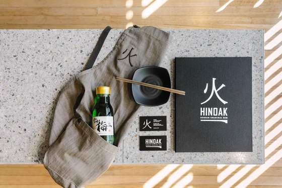
Craft, harmony and a delicate balance between built form and natural material underpin our design for Hinoak, a modern but authentic interpretation of the traditional Korean barbecue in Melbourne’s south-east. Our studio was commissioned for the project’s interiors and branding, inspired by traditional Chinese iconography.
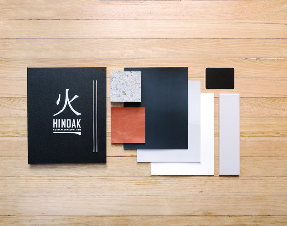
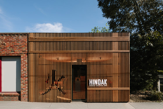
Our concept for the project took design cues from the elegant work of Japanese architect Kengo Kuma, exploring the relationship between humanity, nature and design. The result is an interior that is warm, cosy and intimate, filled with the intriguing play of light that filters through the slatted exterior. Our branding for the restaurant focused on the Chinese symbol for ‘fire’ – commonly used in Korean culture, this character has been cut into the external battening, recalling Korea’s fine craft traditions.
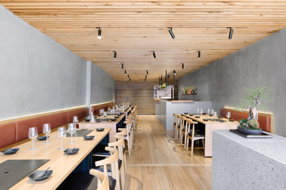
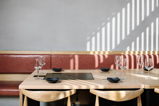
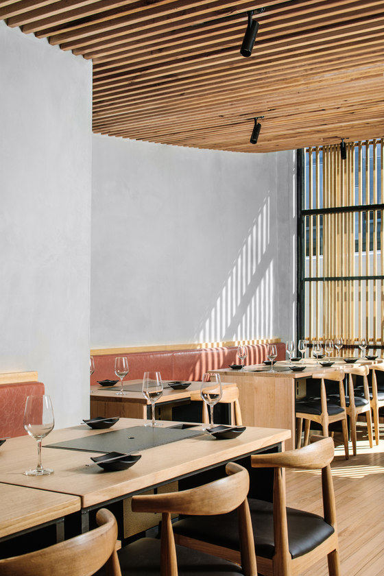
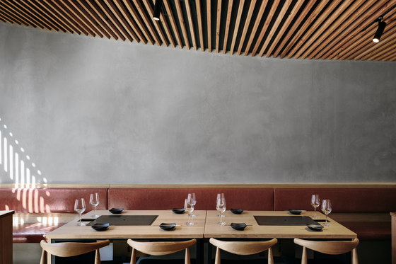
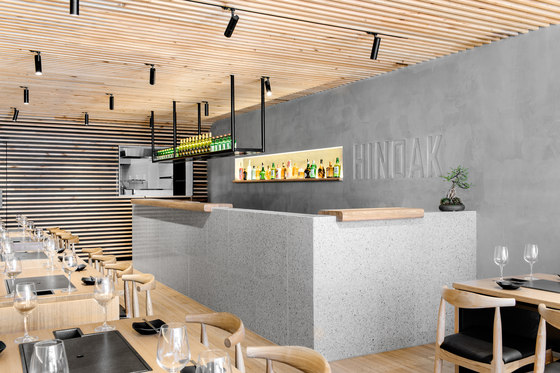
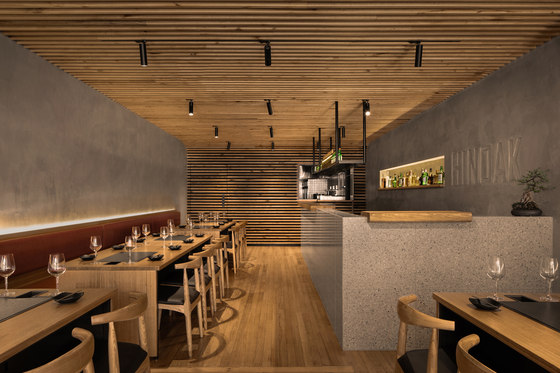
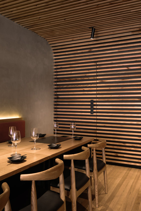
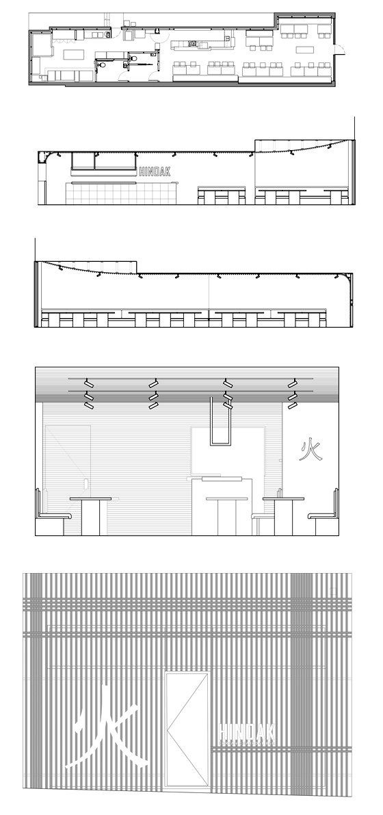
The lightweight timber structure of the exterior sets the scene for the restaurant’s refined interior. The space is structured by two banks of timber tables with integrated charcoal barbecues and flues that run the length of the interior, with a bar nestled at the rear. To ensure the lightness and openness of the space, we specified LED backlighting rather than pendants, which removed any visual obstruction from the ceiling.
Inspired by the finely crafted eaves of traditional Korean houses, the striking timber-battened ceiling descends gently as it extends through the space, curving into the rear wall. This design gesture subtly enhances the sense of intimacy around the bar, allowing a seamless transition from the light and bright tables at the front – perfect for lunchtime trade – to the cosy tables at the rear, suited to nighttime dining with friends and family.
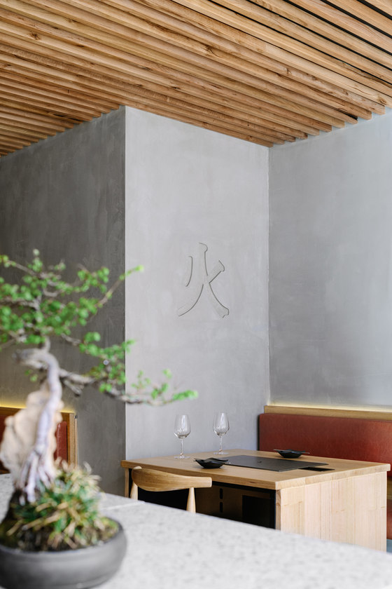
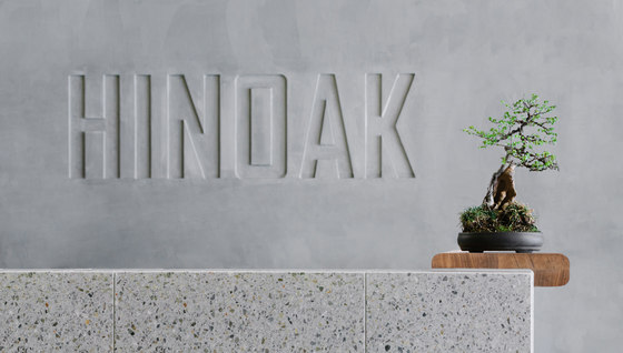
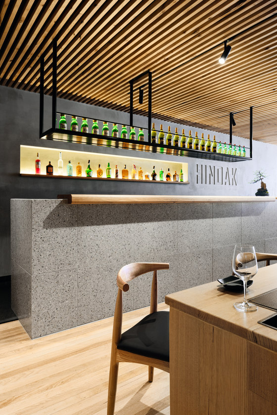
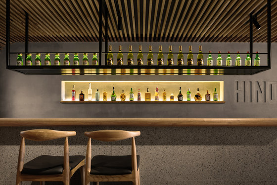
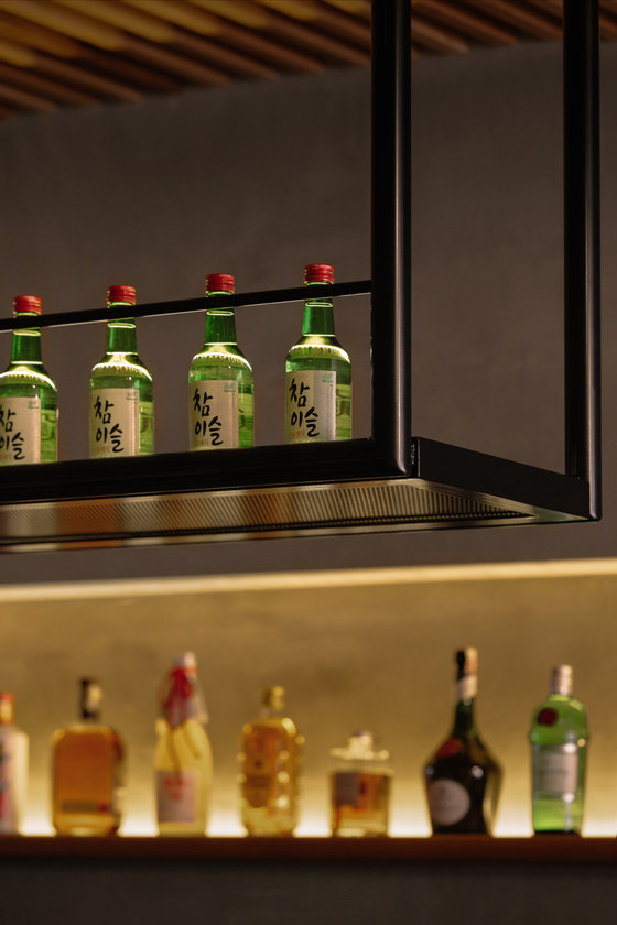
Materially, the space contrasts timber with terrazzo and soft grey walls. The bar at the rear is encased in terrazzo tiles and topped with sculpted timber benchtops that sit atop the bar in sections. Above, suspended black display shelving descends from the ceiling. Behind, a niche cut into the wall displays fine spirits. Debossed into the concrete-like wall surface, the restaurant’s brandmark is subtle but memorable. Curved elements – the banquette seating, the timber benchtops, and the transition from the ceiling to the back wall – soften the hard surfaces.
Combining Korean craft with new technology, this is a playful and carefully detailed experience modernised and evolving the much-loved dining tradition.
Biasol
Builder: Rcon
Engineer: DPC (Mechnical Engineer)
Other: Tract (Town Planner), Check Point (Building Surveyor)
