The project is a total reconstruction of an old motorcycle repair shop into an advertising agency in downtown Madrid, in the heart of Malasaña district, reknowned since the decade of the 1980s for its street art and its fringe cultural scene.
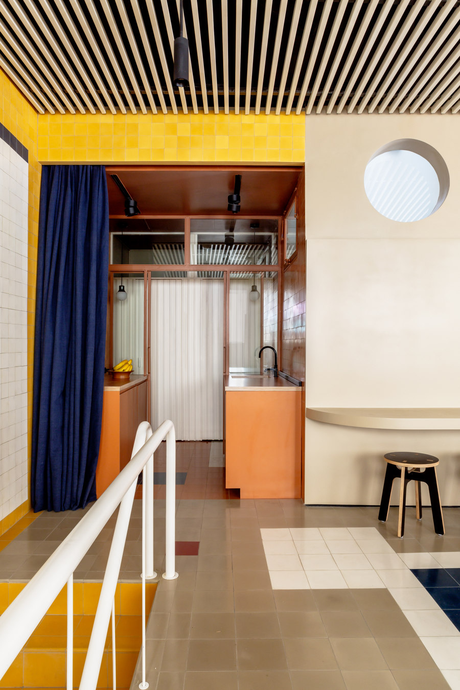
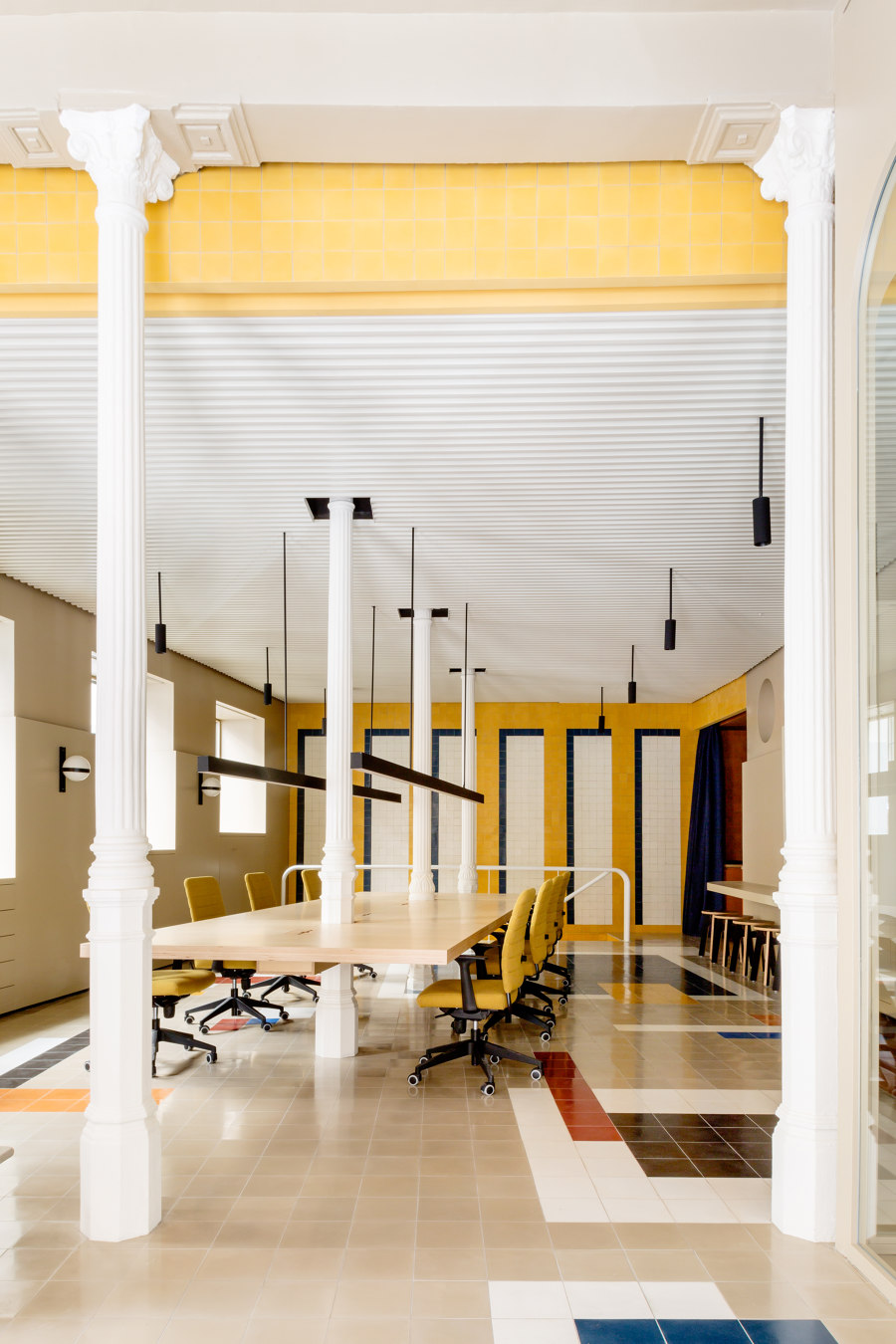
The demands of the clients (a Spanish duo of marketing professionals in their forties) were very specific and exacting: a meeting room for the agency directors, a large table for group work and discussions that would allow interchange of ideas and easy communication, a built-in-kitchen, cupboards and lockers for workers, a multi-purpose space for presentations, and two bathrooms.
One last condition had to be met: the spatial design should be flexible enough to allow for a potential redefinition of the use of the different sections of the agency according to their use.
The total surface is 146 square meters: 100 on the ground floor, roughly rectangular-shaped with three entrance doors on its short side and five windows on its long one; and 46 square meters on the basement, long and narrow in shape, with one small opening on its short side for natural light from above.
The design project included architecture (redefinition of spaces and uses on the two floors) and design of the following: pattern design for tiled floors and walls, design of custom-made furniture (lamps, large central table), textile combinations, modular cupboards and other pieces of made-to-measure carpentry work.
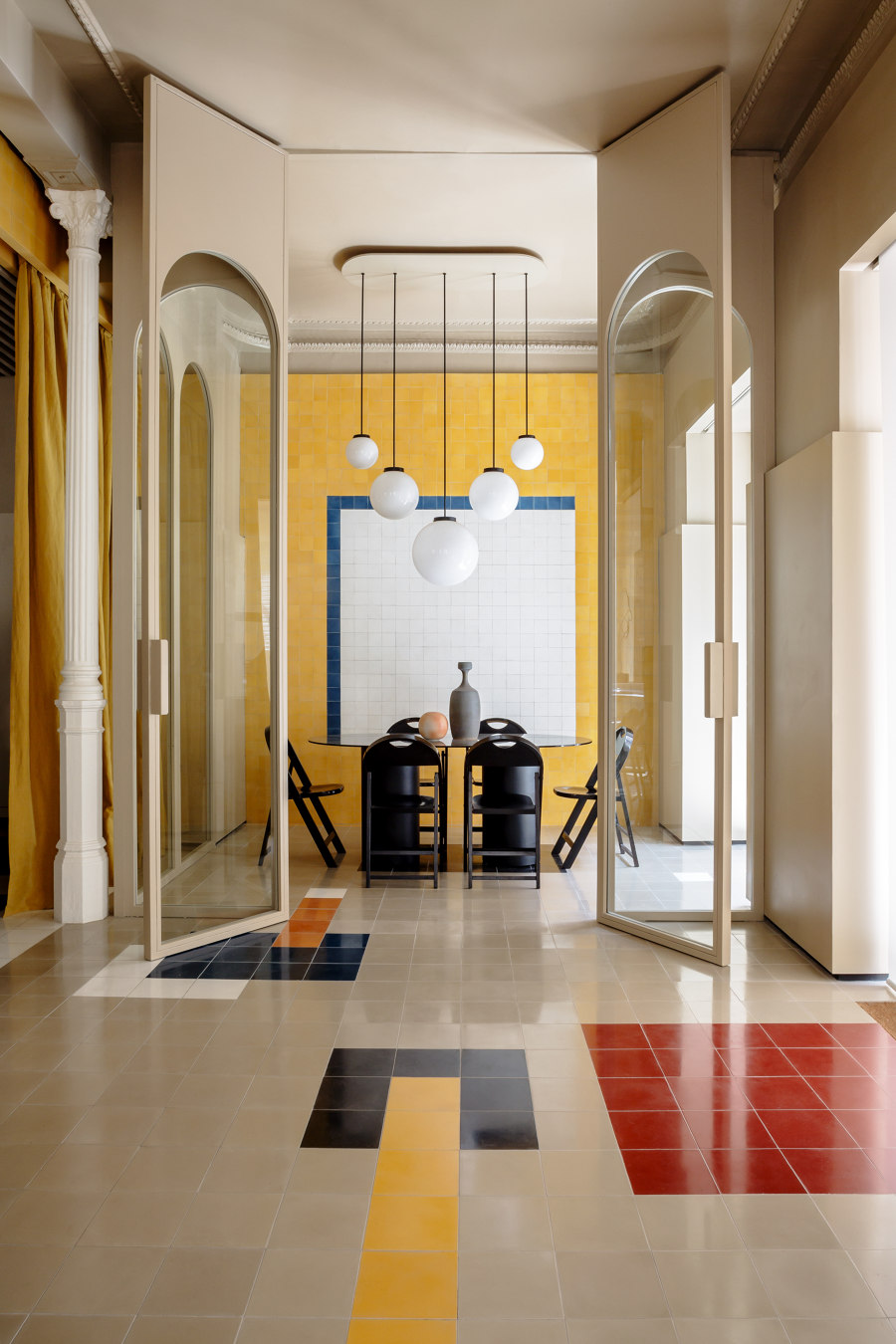
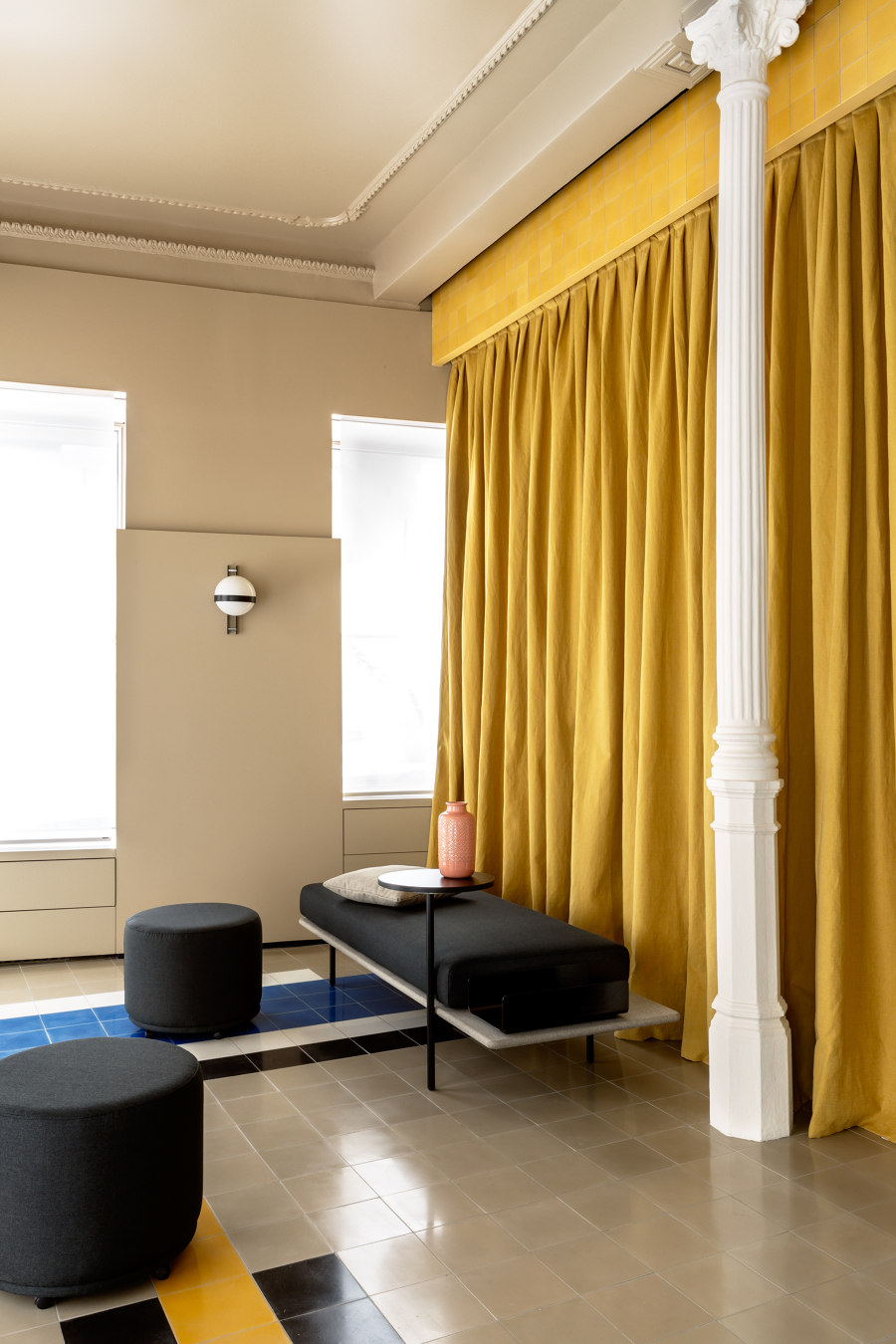
As for the style and the spirit of the project, Casa Josephine Studio defined two general lines: strong clear geometry on floors and walls to suggest changing perspectives, and light partition walls (glass or textile) for a sub-division of the space, which should at all times and from all angles be “read” with clarity.
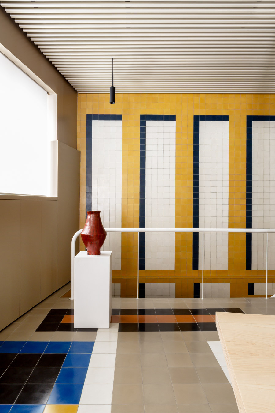
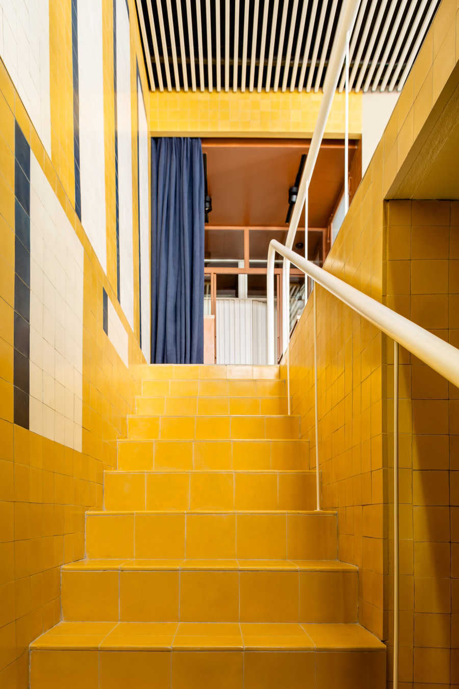
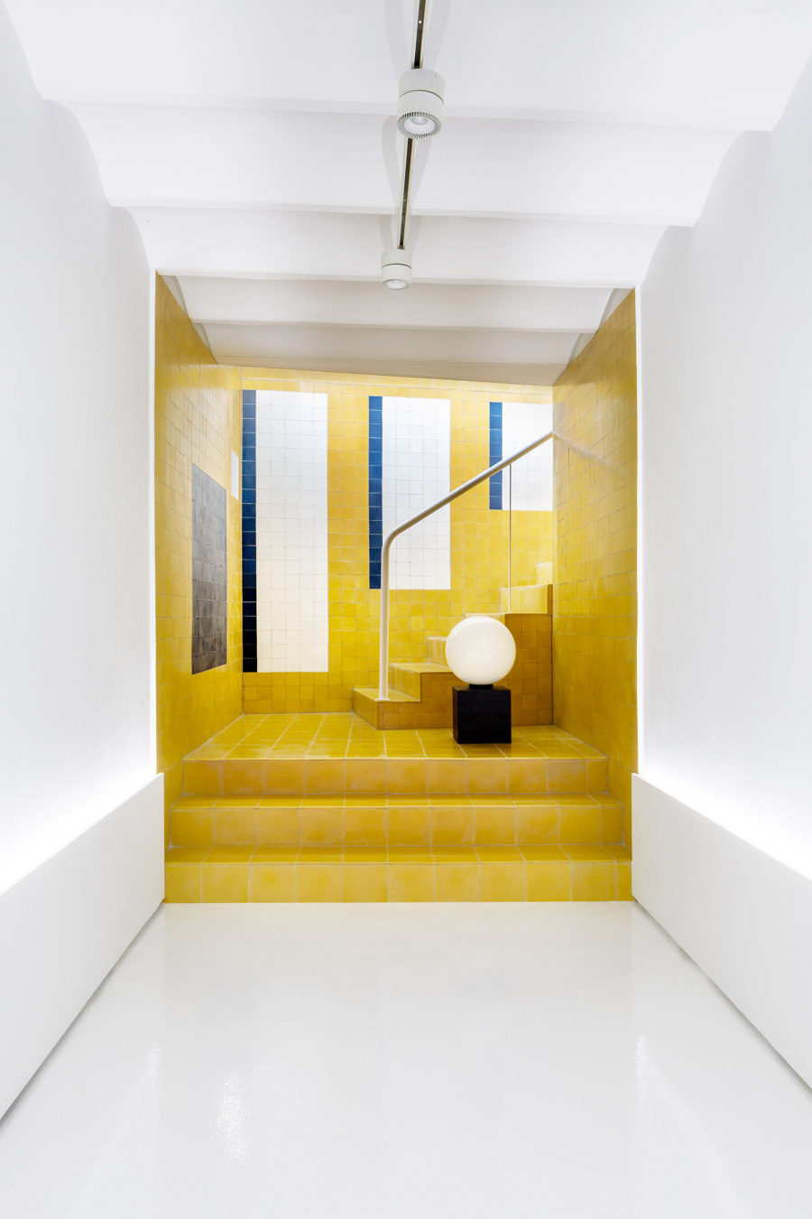
The studio designed the geometry patterns of floors and walls with locally made bright cement tiles measuring 10 x 10 cm for walls and 20 x 20 cm for floors, combined in both symmetrical and asymmetrical layouts. Bright yellow and bright blue form the color chord on walls, with the addition of neutral grey, two shades of dark-terracotta and maroon, and touches of black and dark blue on the floor. Floors, walls and textiles are emphatically geometrical, whereas the pieces of furniture were designed with a more subdued personality for contrast.
For a more rational and less invasive use of space, the central large table was designed to be mounted hanging from the pre-existing iron columns. The structure that separates the directors’ office from the rest of the space is made of iron and glass, and the different textile walls can be rearranged as screens when a division in smaller sub-sections is needed, or a redefinition of perspectives is wanted.
As for the symbolic significance of the design, geometry works in two different ways on the main floor: for the directors´ office, a strong sense of symmetry was achieved by the design of the hanging lamp, which emphasized the centrality of the table below. For the main space around the long meeting table used for creation and brainstorming, a non-symmetrical, freer-flowing layout was preferred.
The basement, long and narrow, required simplicity in its design because of the mixed nature of its use (mainly presentations of advertising projects). The visual connection of the two spaces was achieved by the design of the main wall and staircase.
Casa Josephine Studio is formed by Iñigo Aragon and Pablo Lopez Navarro. For this project, the studio counted on the technical counselling of Rodrigo Aragón.
Design Team:
Casa Josephine: Iñigo Aragon and Pablo Lopez Navarro
Technical counselling: Rodrigo Aragón
