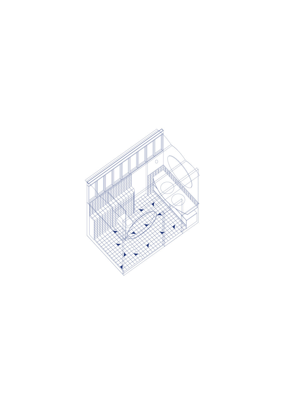
Cal Totxo is a modernist house located at the foot of the Collserola Natural Park, which enjoys fantastic views and good solar orientation on its main facade. The original state of the apartment had three bedrooms, two bathrooms, a small isolated kitchen, an interior space without ventilation or natural light, and a couple of very narrow and less interesting corridors.
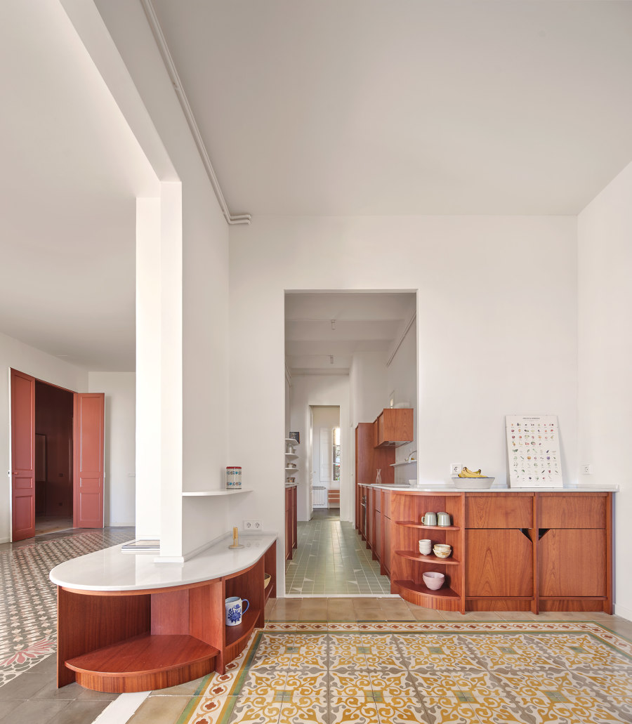
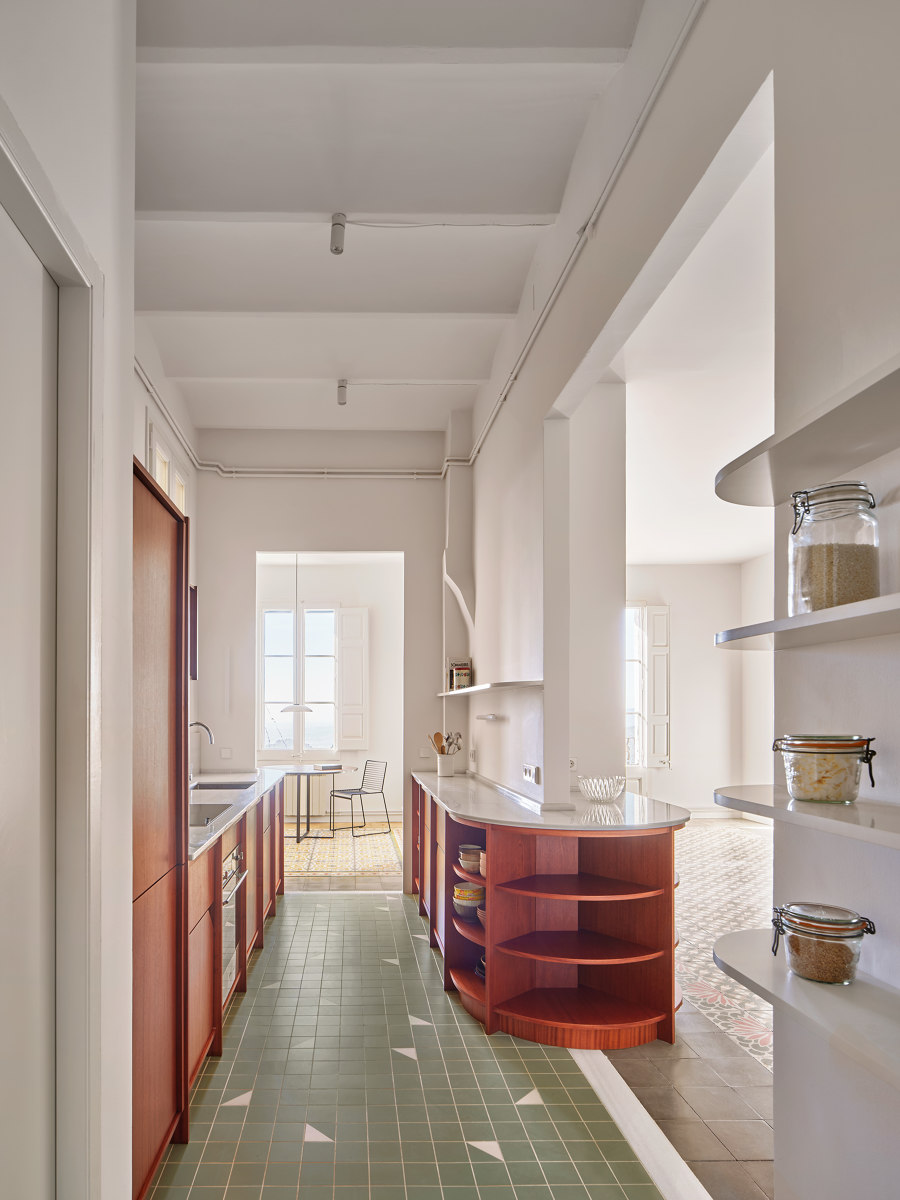
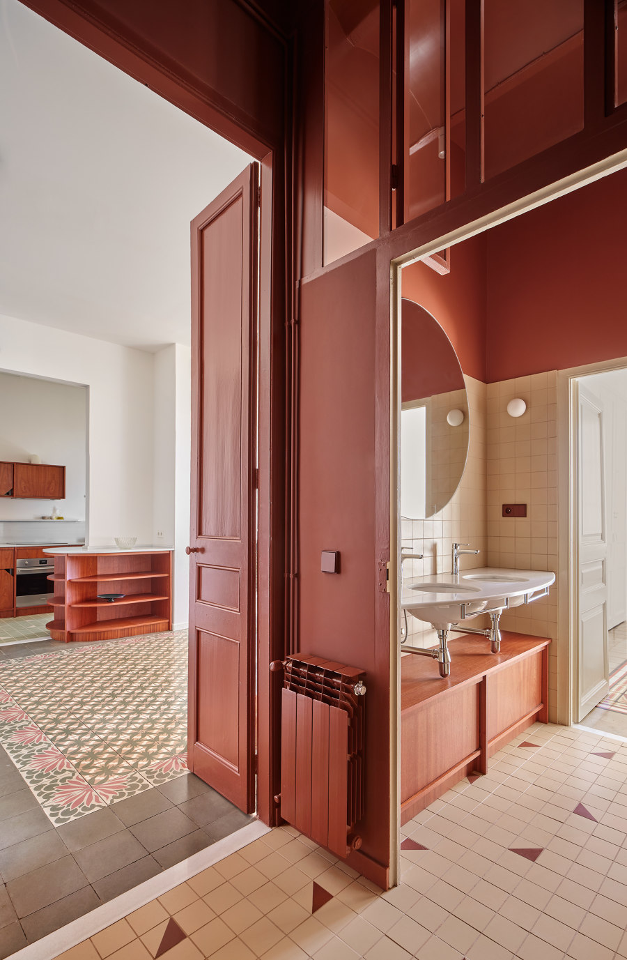
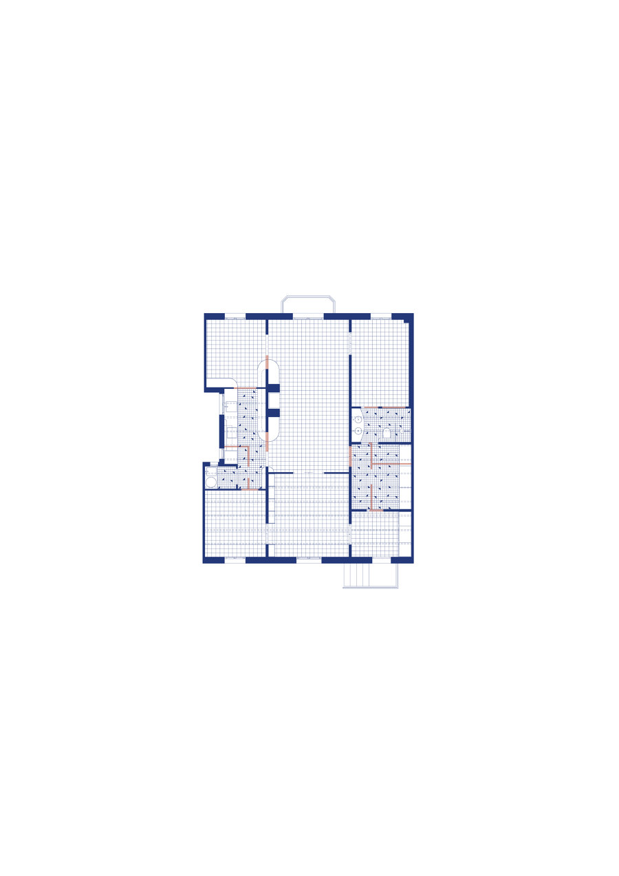
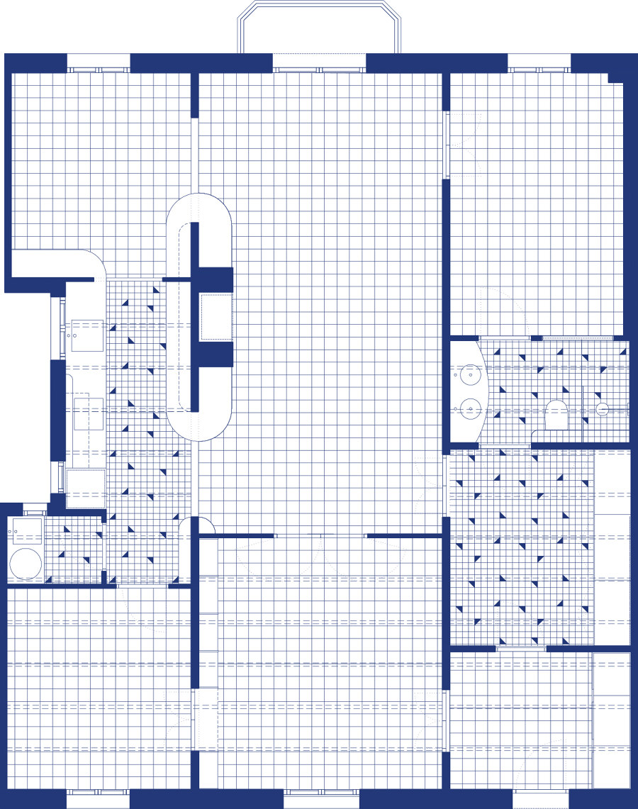
The project reorganizes the distribution of the house by proposing an uneven grid through which one can circulate between spaces, avoiding the presence of corridors. Each of the rooms has at least two possible accesses. In this way, the routes and the visuals are multiplied, allowing to illuminate rooms that were previously completely dark and expanding the perception of space. At the request of the clients and against the usual trends, only two of the three bedrooms are preserved in order to maximize the shared spaces of the house. It will be inhabited by a family of four members. The decision is made to redesign a single bathroom and convert the other one into a laundry room, giving a good part to the open kitchen.
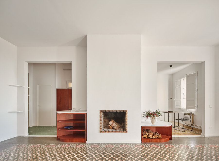
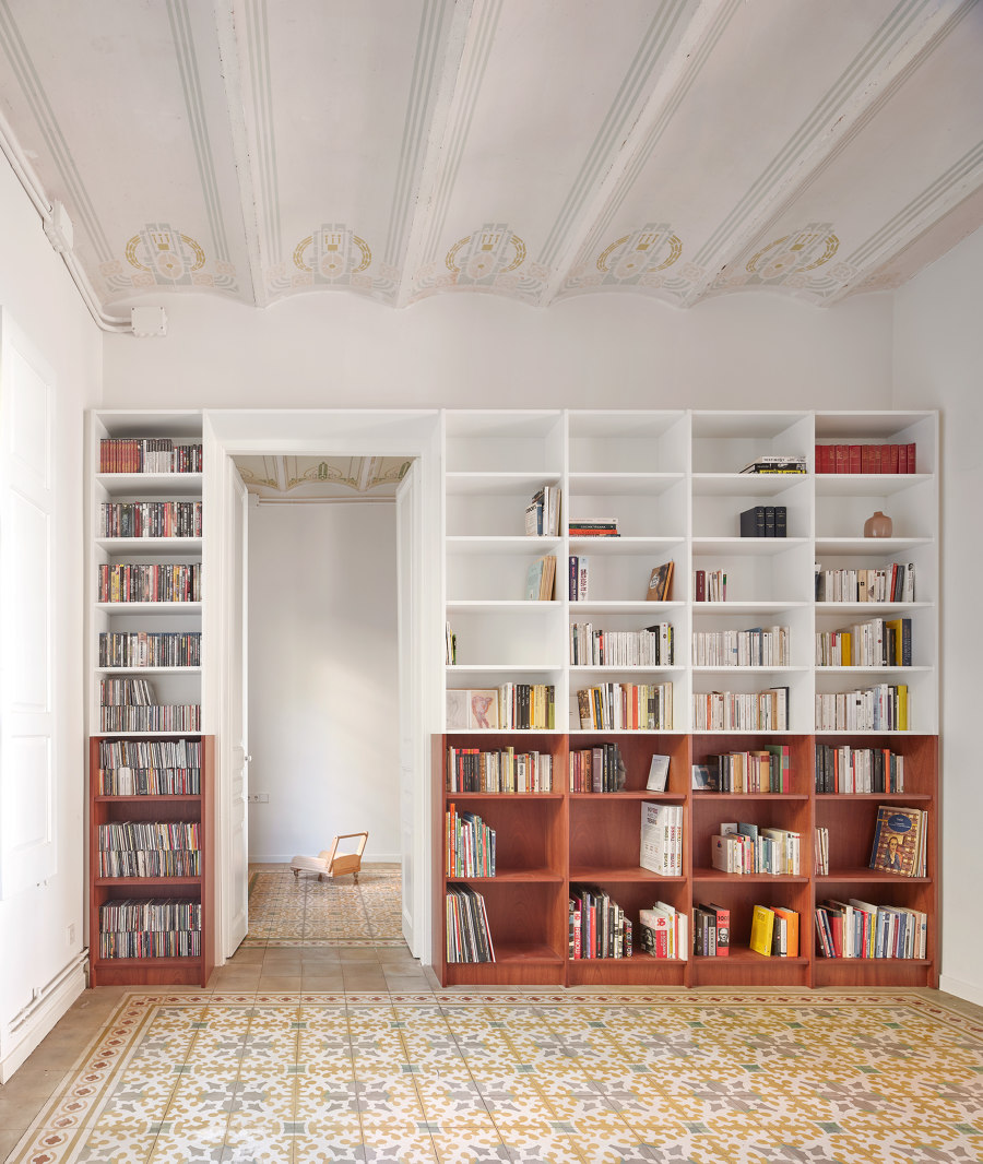
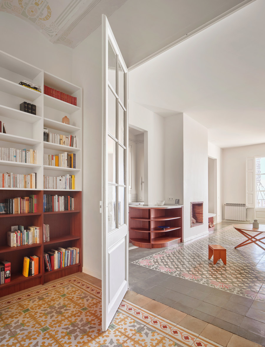
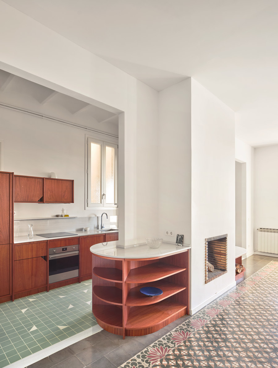
The house is accessed directly from the outside through the entrance hall, which allows you to enter the library or the communal dressing room. From both rooms, you can continue towards the living room, where the fireplace is located in the center of the space. Some existing steps are enlarged, and others are opened to generate circular routes around the fire. Finally, the kitchen is extended towards the future dining room, separated from the living room.
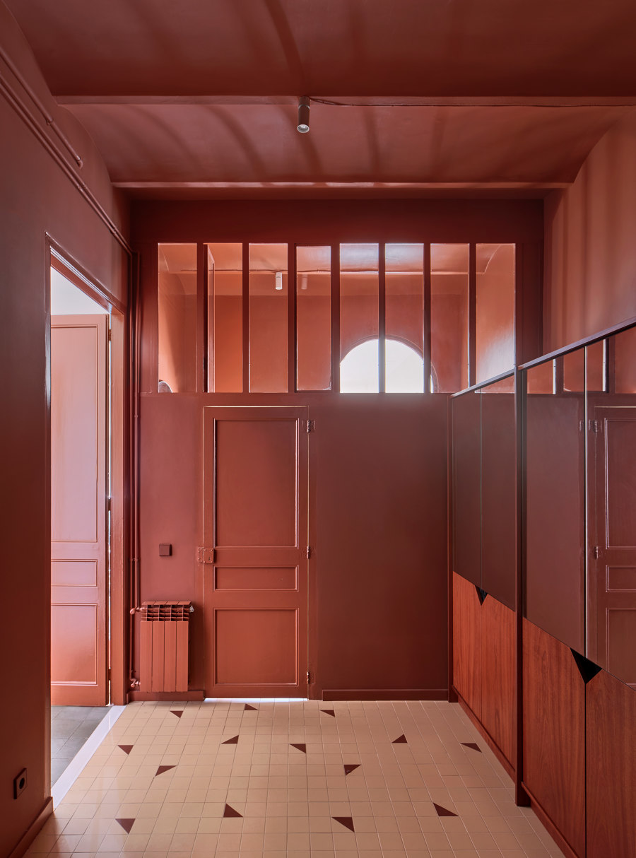
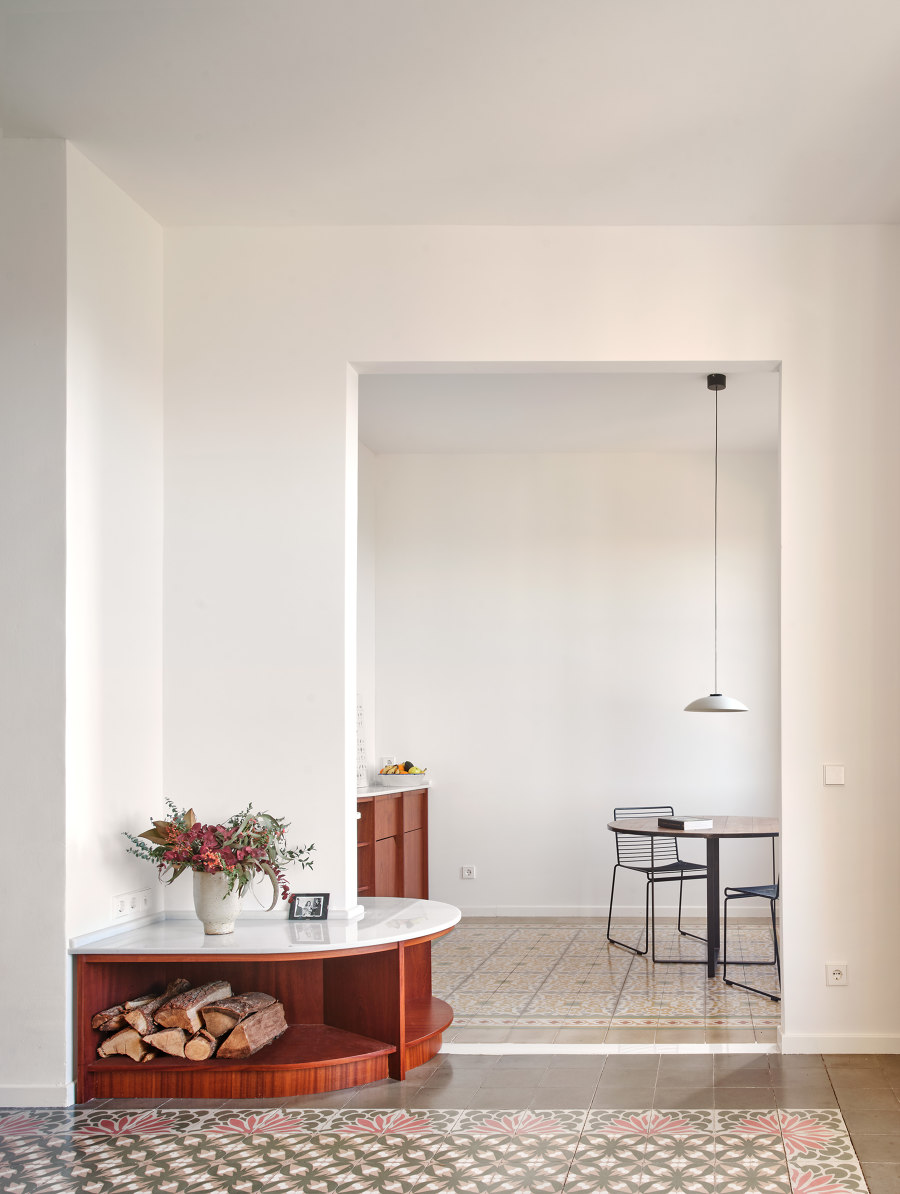
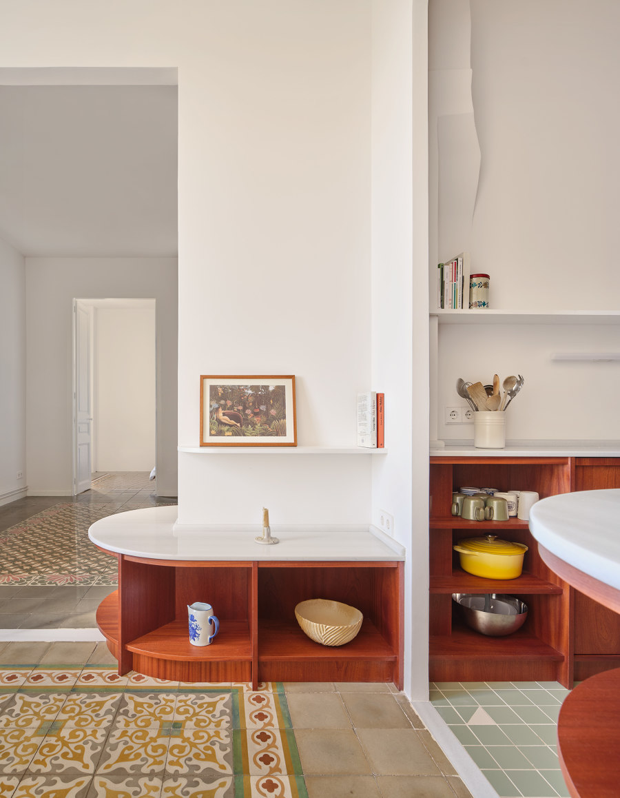
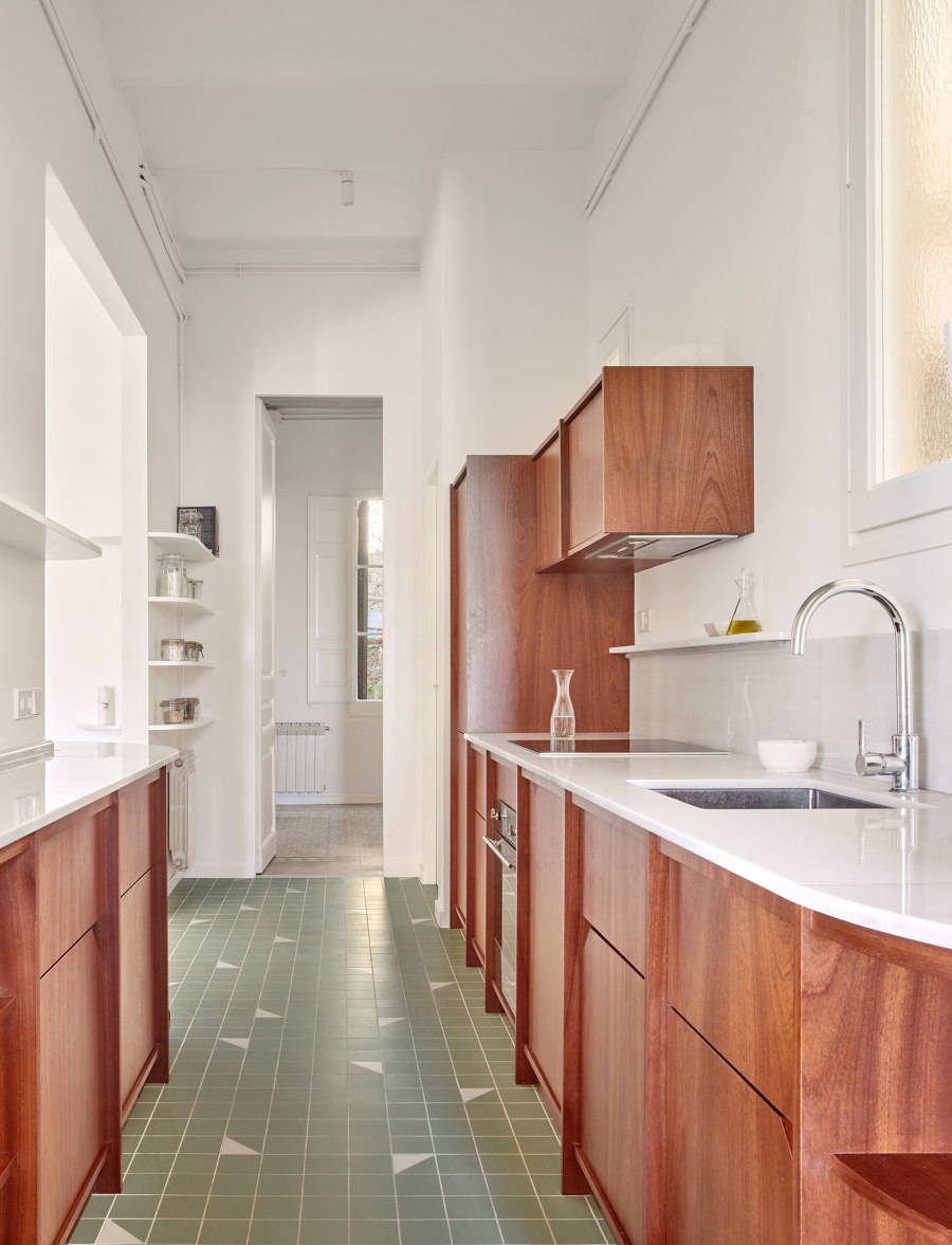
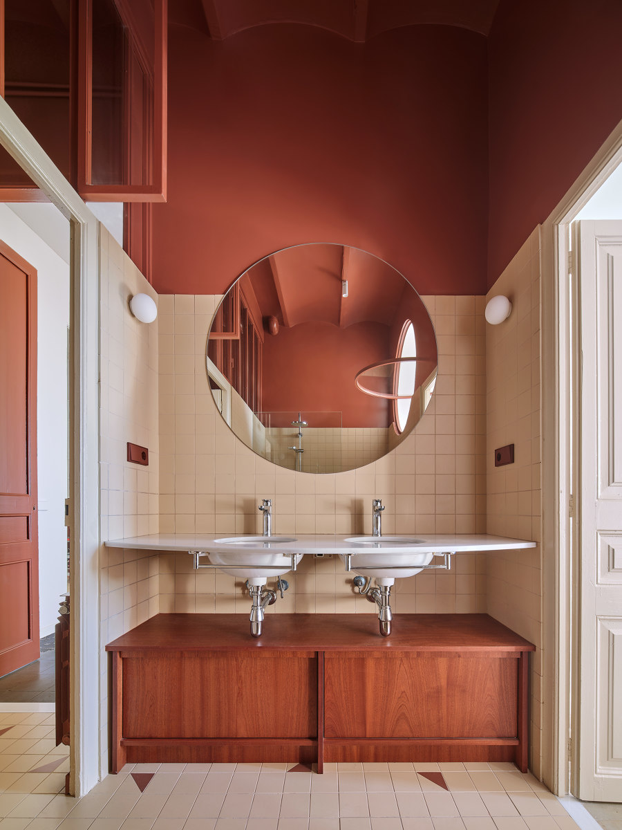
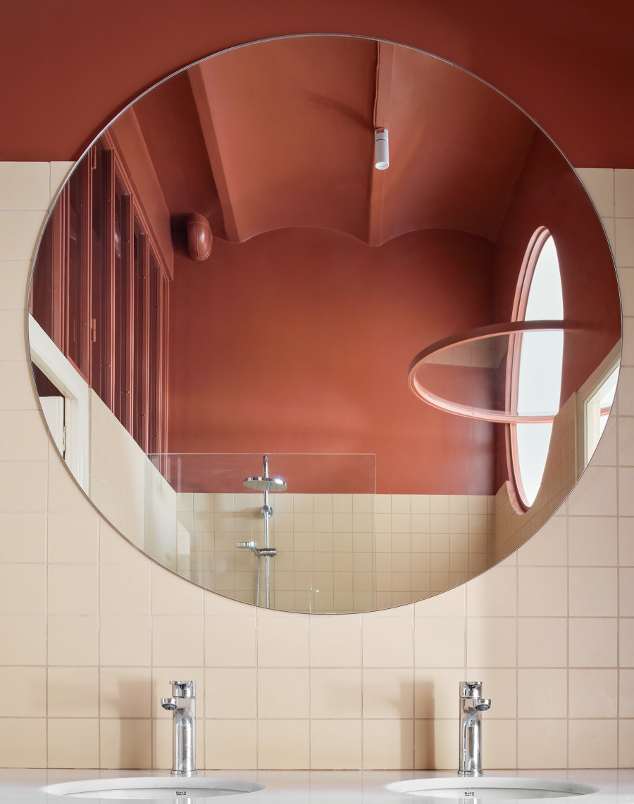
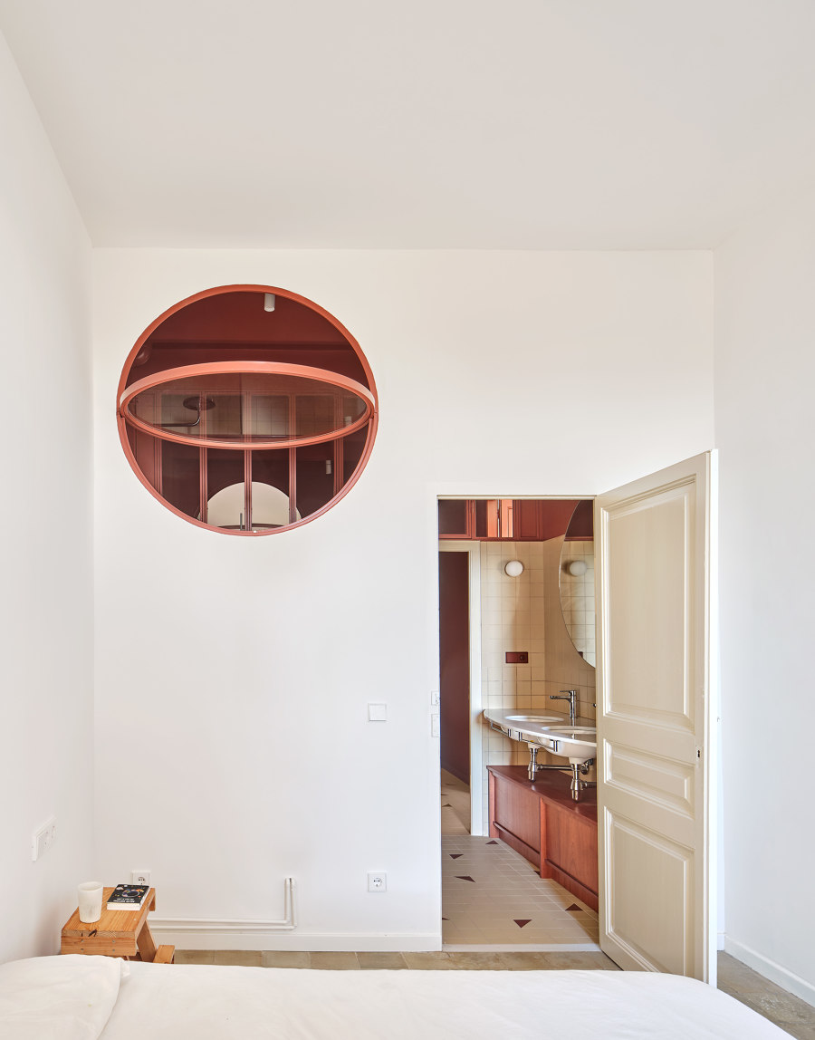
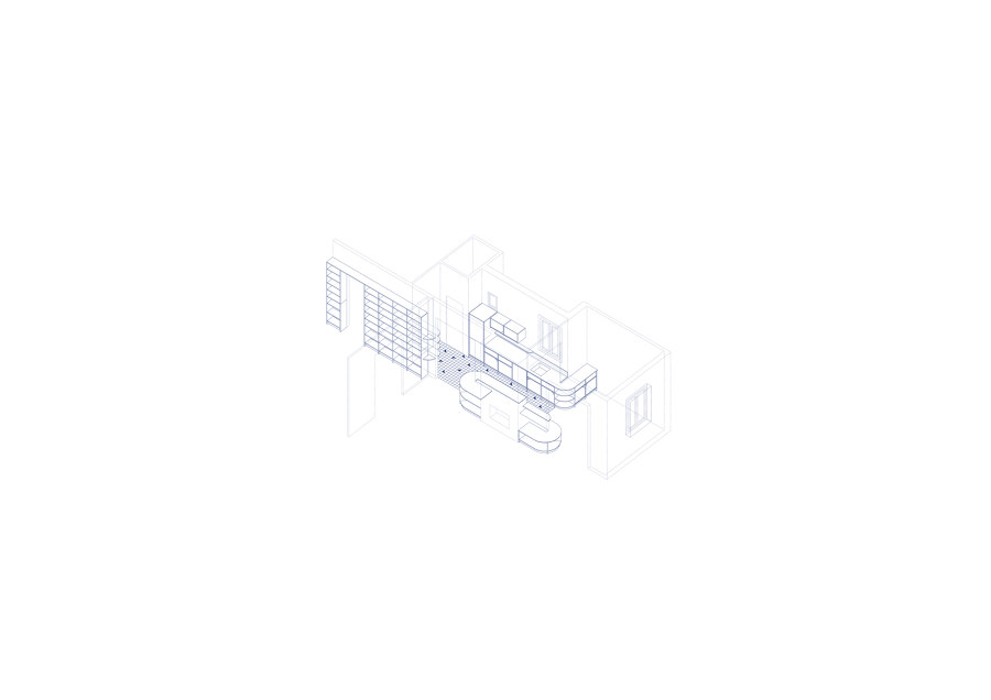
The custom-designed furniture, finished in natural wood and combined with the original hydraulic tile flooring, brings warmth and sophistication to the interior design of the house. Sinuous geometries appropriate all the elements: rounded edges, circular mirrors, and windows, and rotating countertops. The reddish tone of Sapelli contrasts and, in turn, fits in with the rest of the palette to the point of dyeing everything in the monochromatic space of the dressing room. A darker room, naturally illuminated through the bathroom and the entrance hall, generates an atmosphere of more seclusion and intimacy.
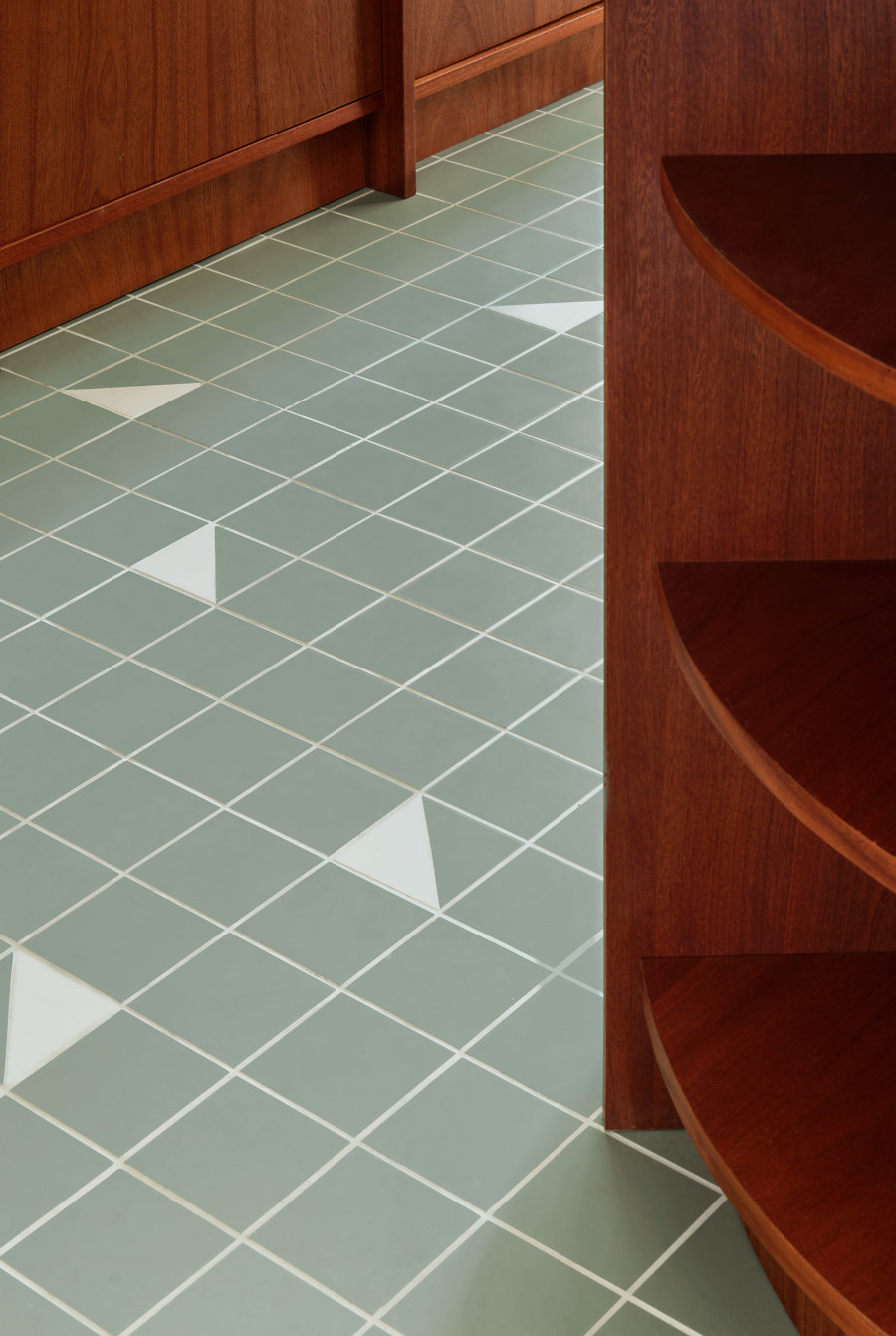
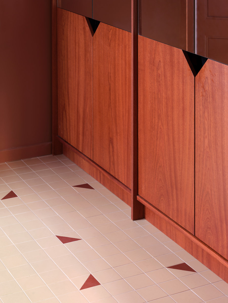
To renovate the kitchen, bathroom, and dressing room floors, the existing range of adjacent rooms is played with, and a two-tone combination is chosen, creating an apparently random pattern that modernizes the concept of mosaic. The 10x10cm format of the hydraulic tile is chosen, resulting in triangular geometric figures by diagonally cutting the pieces in two. The same size and shape are replicated in the door handles. The two-tone strategy is also applied to the furniture itself, placing the change of material at different heights depending on the use, combining wood with Macael marble and white melamine shelves, and blending in with the walls.
The proposal has significantly changed the spatiality of the house and has taken care of each detail with care and attention.
Design Team:
Cierto Estudio
