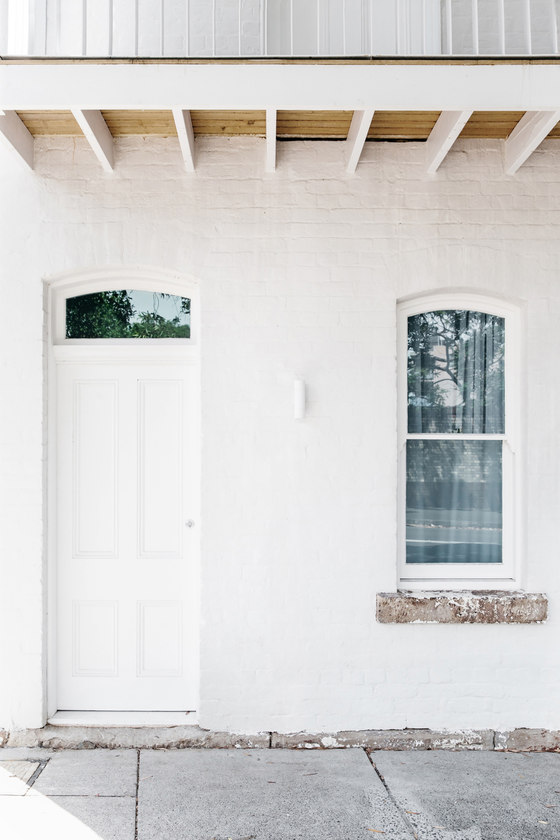
The Paddington Project was a resdesign of a quintessential Sydney workers cottage from the 1880’s. The original cottage had very simple features, reflective of the purpose it was built for which housed support staff from the Paddington barracks. The heritage aspect of the property was the single most important element that informed the redesign, ensuring a sympathetic approach to the heritage elements was maintained throughout the renovation.
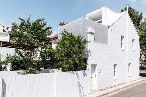
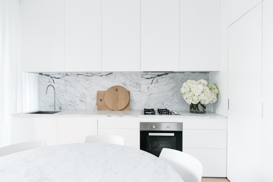
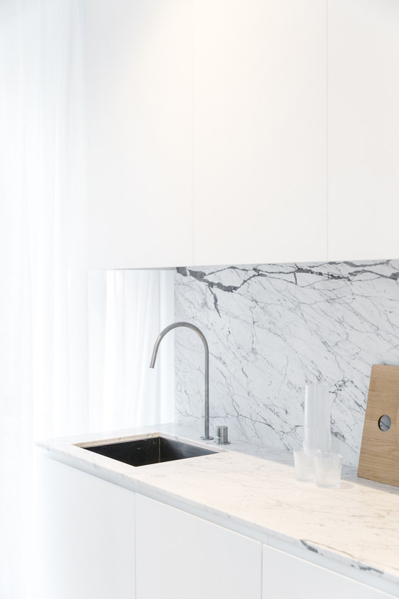
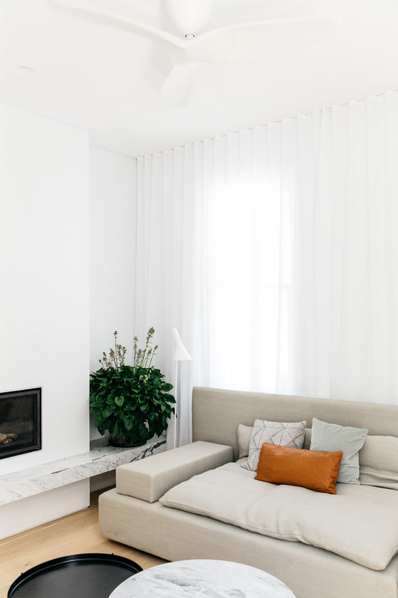
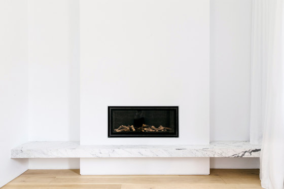
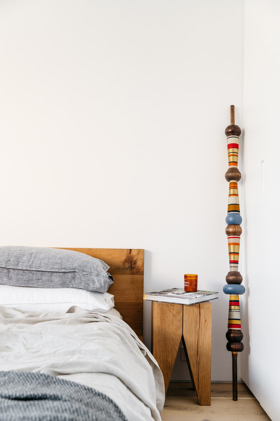
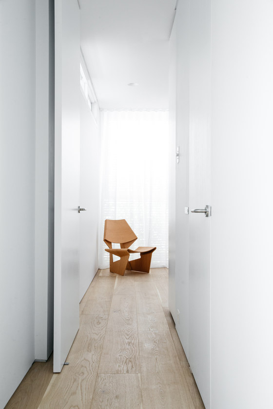
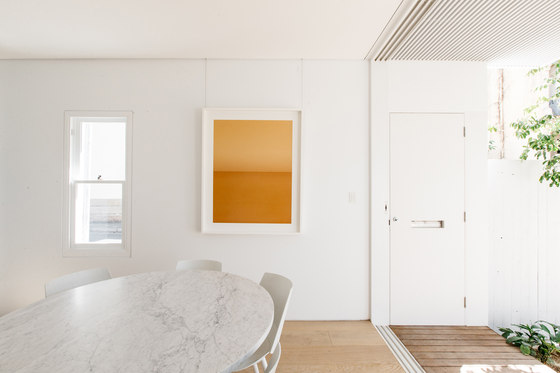
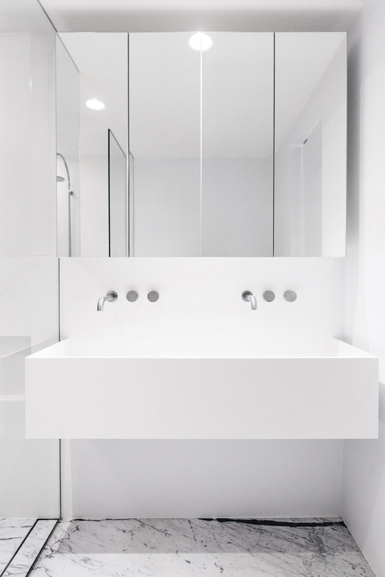
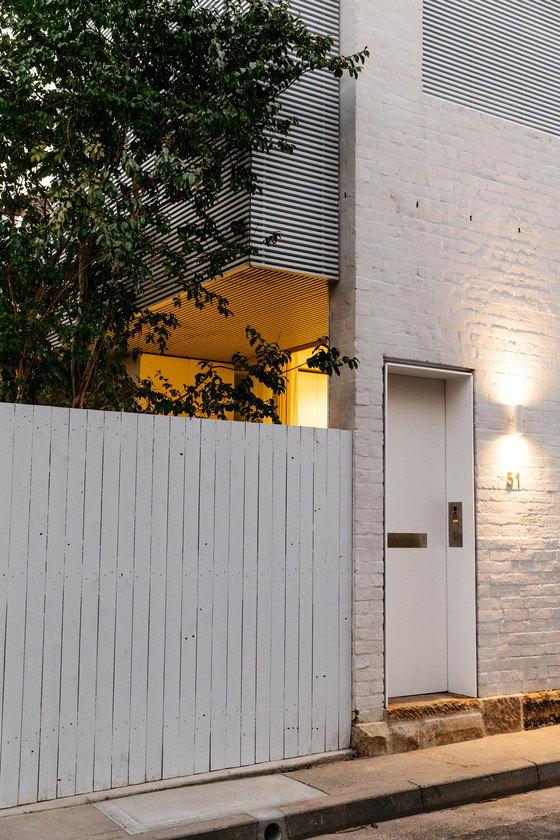
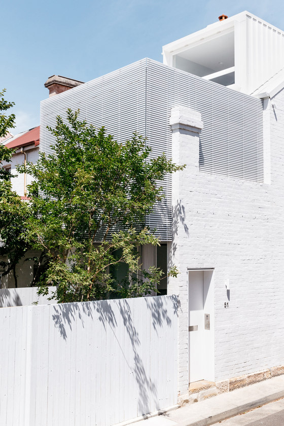
The house had fallen in to disrepair. As a result the property required substantial alterations and additions to maintain the its functionality as a contemporary dwelling. Located on a narrow urban block of only 63 sqm, it was the aim of cm studio to craft a flexible modern dwelling, maximising potential floor space, whilst maintaining, and championing the existing heritage form. Located on a corner block the key form of heritage expression was the profile of the existing street facade, which acted to establish the form of the connected row of terraces.To maintain the expression of this pitched silhouette it was important that proposed rear addition was clean, simple, and submissive to the existing form whilst being clearly delineated through materiality. This lead to the design of timber batten clad box, which is became the focus of the rear elevation, its form being balanced by the steel framed dormer. Internally the simplicity of the worker cottage was maintained through the use of a paired back palette of three materials. The project displays the way in which a minimalist pallet can be executed, without becoming clinical. The assemblage of the spaces, and careful curation of pieces, along with the precise use of materiality ensure an inviting warmth is created.
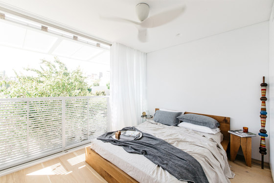
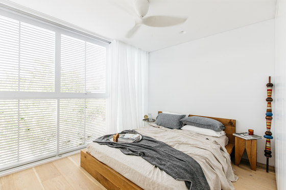
The tight site meant we had to created liveable spaces for the family by maximising every available space. The new addition pushed the boundaries of functionality of facades and impact on the spaces within. The operable screen creates an adaptive, engaging bedroom. While a rooftop terrace was not permitted, the functionality of the dormer window allowed the space to feel like a balcony.
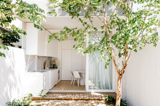
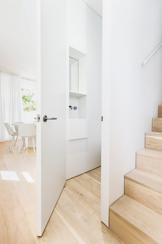
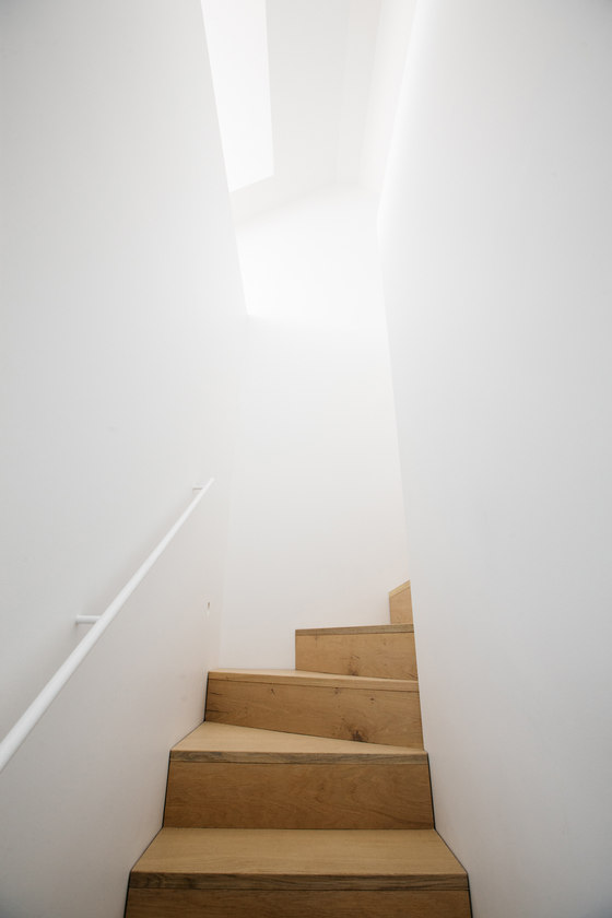
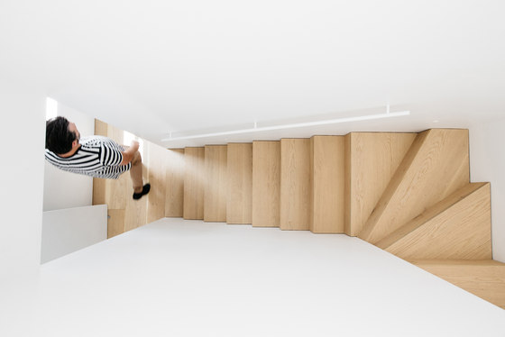
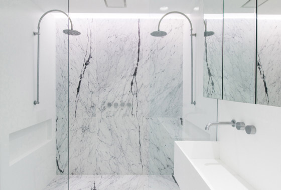
The house was to be light filled and reflect the simplicity of the original terrace, sympathetic to the heritage neighbourhood. It was to have all the modern amenities, walk in pantry, laundry, GF water closet, open plan kitchen, indoor outdoor living, double bathroom, and storage, all in a bite size package. This was achieved by creating highly flexible spaces, and maximising the functionality of every square mm of space. This required us to think smart about how we used the space under stairs, and in cupboard, hiding essential rooms behind joinery, and sinks in services cores.
The build was a truly collaborative process, the builder and subcontractors, especially the window and door fabricator who took on the role of fabricating the rear batten operable facade knew the importance of simple detailing to achieve the form created.
The project displays a unique collaboration between Living Edge, curator Sebastian Goldspink and CM Studio. Operating as an open house the project displayed the ability of architects, artists, and furniture houses to work together to engage, and inform the public further about their respective fields.
cm studio
Interior Styling and Furnishing: Living Edge
Art curation: Sebastian Goldspink
Builder: Baugroup
