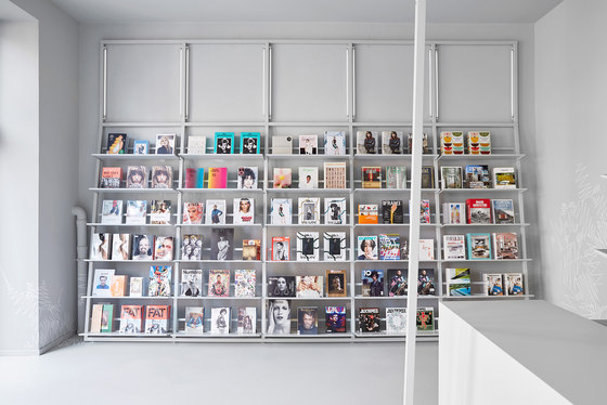
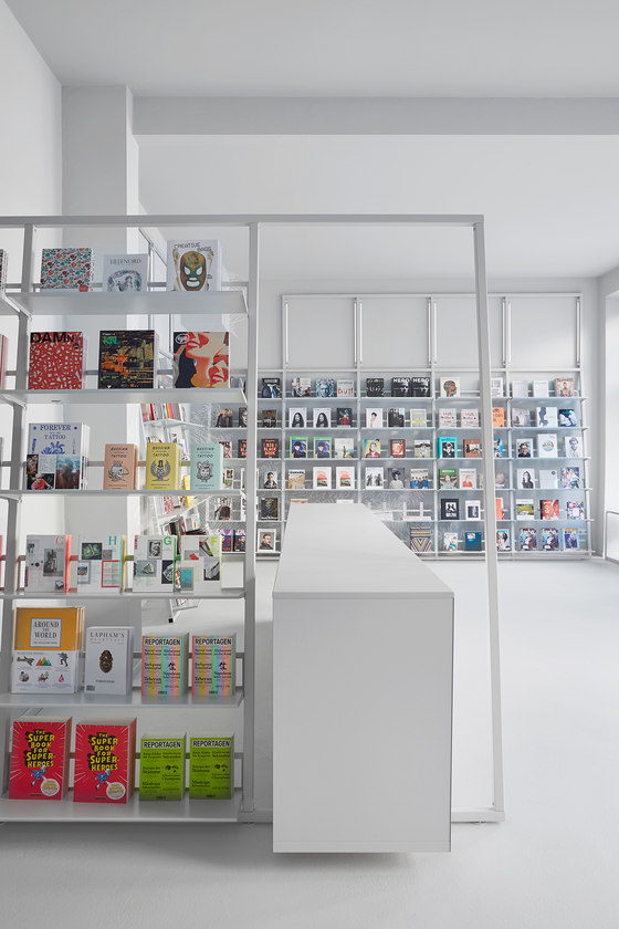
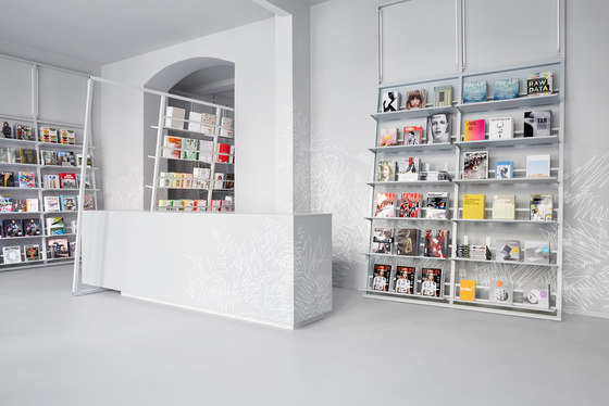
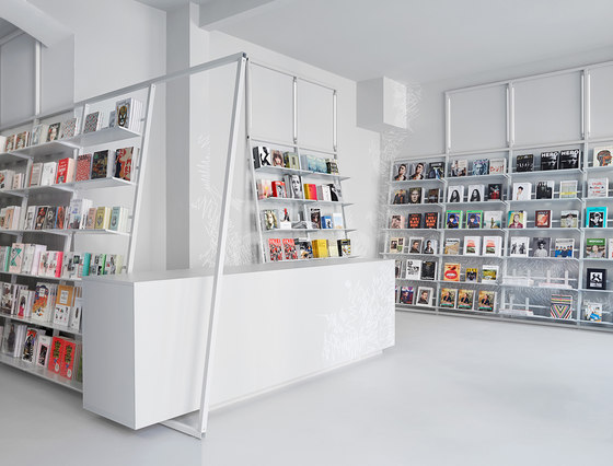
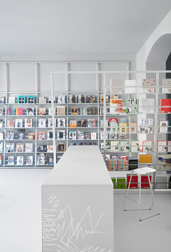
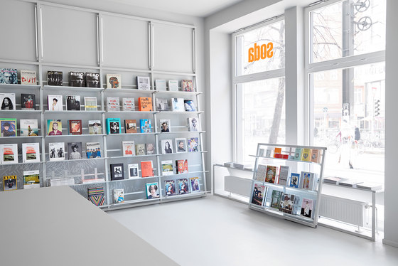
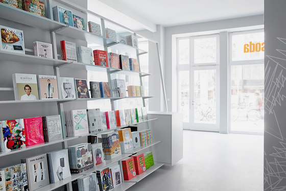
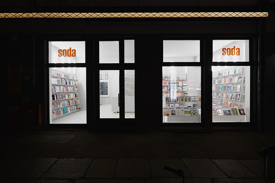
The interior of soda.BERLIN, a bookshop for visual culture in the heart of Berlin, was the brainchild of Designliga, the Munich-based bureau for visual communication and interior design. After soda.MÜNCHEN, Sebastian Steinacker opened the second branch of soda at Berlin’s Rosenthaler Platz in early January 2015, offering a range of books and magazines from all areas of fashion, photography, architecture and design.
Passionate about visual culture
Sebastian Steinacker studied fashion design at the prestigious Central Saint Martins in London. Inspired by that environment so rich in bookshops and libraries, he discovered a deep-rooted passion for print media. For Sebastian, the materials of a publication, its printing and binding play as important a role as the content itself.
Returning to Munich, Sebastian opened his first bookstore in Baaderstrasse in 2004 in cooperation with the fashion journalist Anna Schäffel – a project very close to his heart: “We’d felt that Munich lacked a bookstore like that – so we opened one.” The tiny store rapidly became an insider’s tip, moving to more spacious premises in Rumfordstrasse three years later.
Tool for designers
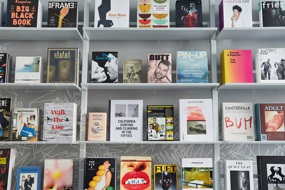
soda embodies visual culture and freedom of inspiration. The majority of its customers work in design-related professions, and are always seeking the shock of unfamiliar impressions and new impetus. soda’s bookshelves display covers, not spines, arranged like artworks in a gallery. Sebastian Steinacker understands his customers and the prominence they give to visual perception; he regards his bookstore and himself as a tool for designers, as a resource for creation.
Defying the trend of ordering print media online, Sebastian Steinacker’s customers appreciate the sensuous, tactile experience of books and magazines in an open, comfortable atmosphere. They have confidence in Sebastian’s credibility and curatorial abilities. His careful selection of international publications focuses on their aesthetic and visual quality, so that the shelves also contain lesser-known, but opulently produced and exceptional works.
After 11 years in Munich, during which soda’s fame has spread far beyond the city’s boundaries, Sebastian Steinacker has sought new challenges by opening a second store in Berlin. As a bookstore for independent print media, soda.BERLIN’s design and high-traffic location are unique and ensure its status as a pioneer for the entire industry.
Maximizing the minimalism of design
soda.Berlin opened at Rosenthaler Platz in Berlin in early January 2015. Designliga, a design bureau with close professional and personal ties to Sebastian Steinacker, was responsible for the interior of the 80qm store. The goal was to establish a common DNA between soda.München and soda.Berlin while creating a wholly original concept, with reduction as its primary design reference. The bureau faced the task of designing a space that had to be completely self-effacing, directing all attention to the objects within it. The space and its furnishings would merely be a stage for the books and magazines, which – produced as they are by graphic designers – are themselves works of art.
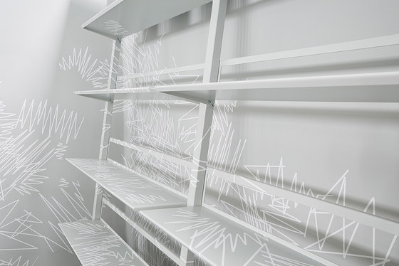
Foreground and background, space and interior design blend into one as the dominant design principle. The core idea is to streamline the variety of elements in the store by blanketing them in a neutral colour palette, then add graphic texture to further smooth out the distinctions between the furnishings and their surrounding structures. This approach created a space with a minimalist, clear atmosphere, despite the quantity of objects and the extensive display areas necessary for them.
The store as a stage for the products
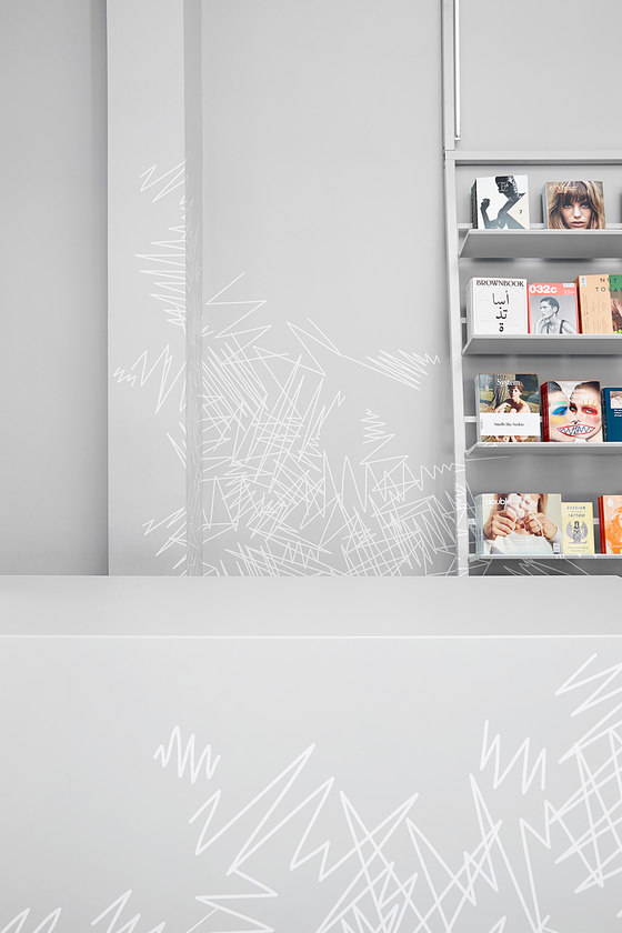
The interior design echoes the ‘exhibition’ style that is so effective at soda in Munich, and translates the style into an individual design principle. To enable the 800 or so printed works to be presented by their covers, Designliga developed its own shelving system. The shelves seem to lean almost casually against the walls, spanning 135 metres of display space for the books and magazines they hold; constructed along the lines of a stage set, they create a feeling of transparency and permeability despite their enormous capacity. They also integrate the entire interior lighting system. A large counter in the entrance area provides additional space for sales equipment and serves as a reception.
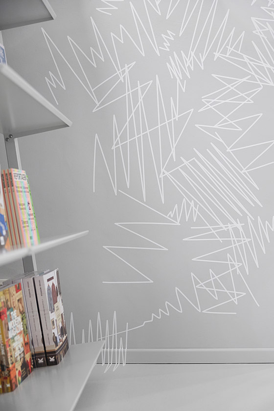
The interior and fittings are bathed in a uniform shade of RAL 7035 Light Grey, which is echoed in all materials used in the store – from floor and ceiling coverings to walls. The space and the objects it contains thus blend into a single whole, an effect which is heightened by the abstract pattern which extends over parts of the walls, shelves, ceiling and floor. These “scribbles” have a random, incidental air despite their clearly graphic origins, releasing the areas they cover from their usual significance. The pattern flows and overlaps from fixed to variable elements, eliminating the distinction between the space and its furnishings and blurring the various levels into a diffuse whole. The glowing publication covers form the focus of attention, a vivid contrast to the minimalist background.
The interior by Designliga thus creates a stage for Sebastian Steinacker’s main players – his carefully curated range of magazines and books.
Designliga
