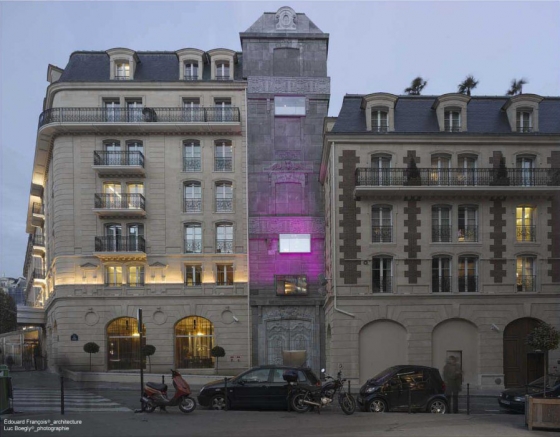
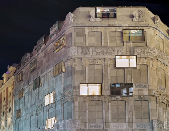
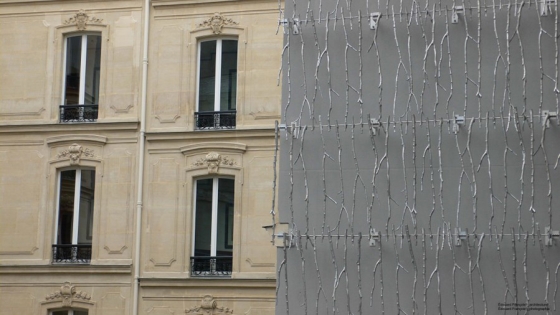
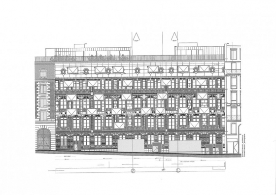
Edouard François has copied the façade of a block of houses on the Champs-Elysées, flattened it out, dyed it grey and reproduced it in concrete around the corner.
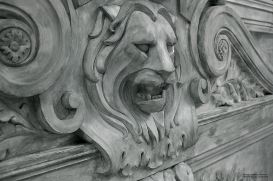
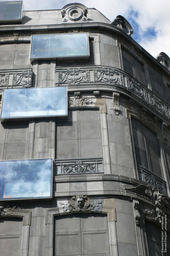
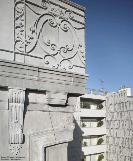
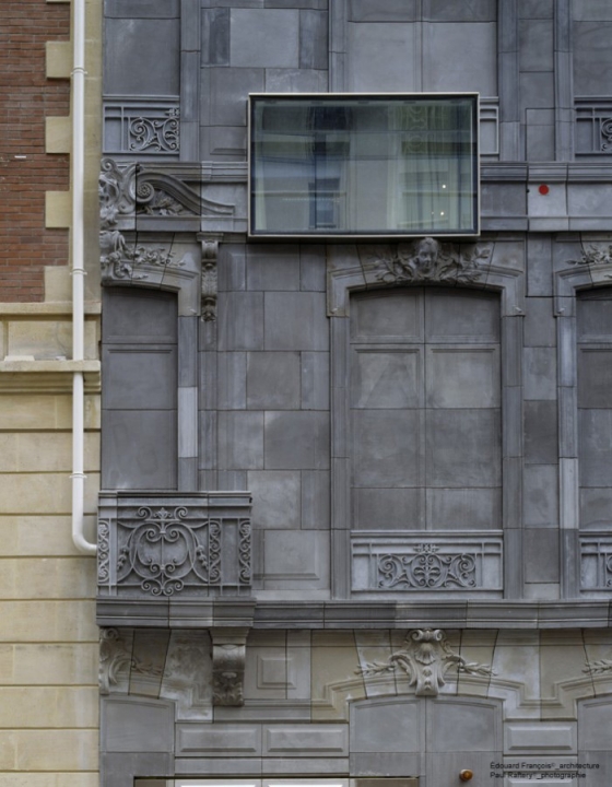
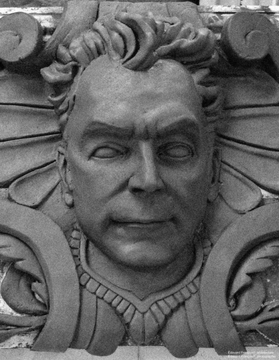
It is one the oddest buildings in Paris, but it’s only once you’re right next to it that you notice that something’s not right. The Haussmann-style façades are entirely made of lead-grey concrete. The windows and doors look cemented up. The façades lack depth: the carved reliefs, lion’s heads and columns are, as it were, flattened out. It’s reminiscent of the Reichstag wrapped by Christo, it looks more like contemporary art then architecture. The only openings in this grey all-over surface look like glass aquariums forming a random pattern in the façades, deviating significantly from the formal idiom of the classical façade, based on symmetry and regularity. What goes on behind the façades is invisible from the street. The deep aquarium windows are framed in mirrors, so that during the day they only show the sky, while at night only glimpses of the carpeting in the interior are visible at the façade.
Is Edouard François, in using this so oft- criticized neo-Haussmann style for this project- the Fouquet’s Barrière hotel on the exclusive Champs-Elysées- a bold architect, or just one more designer bowing to the heritage- obsessed French public with this historicizing style? His answer is a short ‘if doing something has meaning, you should do it’. This begs the question of what the meaning of the spectacular strategy François has applied here-making a perfect copy of a section of old façade and then cutting random openings out of it- exactly is.
In 1999 the Groupe Lucien Barrière, whose business include hotels and casinos, took over the famed Fouquet’s restaurant. But the group wanted more; it wanted a luxury hotel on this side. It therefore bought an entire city block above and next to the restaurant, consisting of seven buildings with facades on the Champs-Elysées, on the Avenue George V and two sides streets.
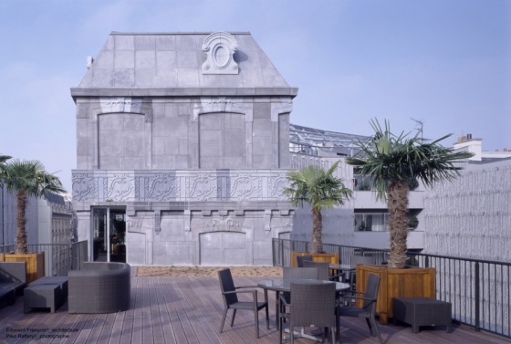
Edouard François’s commission was for a’ shell & core: transforming the façades of the seven buildings into a single whole, to turn them into a recognizable ‘monument’. The inner courtyards were to be merged into a garden, a terrace would look out over the roofs. The general functioning of the palace hotel-the organization and division of the spaces- was to be devised by Edouard François, whereupon designer Jacques Garcia was to take charge of the interior.
If you’re going to build in the digital age with forms out of the past, you have to use a scanner and a casting mould.
François tore out walls and sometimes floors in the various buildings in order to create one gigantic hotel with connecting rooms and broad corridors. To enable the 350 members of staff to circulate, a’ service architecture’ was incorporated, consisting of a ‘street’ in the basement level and a lift tower, making it possible to rush lobster and champagne to the 107 rooms and suites in record time. A large spa was also built on the site of the old shopping gallery that once ran through the block. On the garden side, the architect wanted to create a’ clearing in forest’ and so 8,000 aluminium branches were affixed to the blank walls and moss was grown on metal grids.
There remained the issue of the different façades. The buildings on the Champs-Elysées are authentic Haussmann buildings – and therefore enjoy a protected status. The two buildings on Avenue George V and rue Vernet were built in 1980, in two nineteenth-century styles ( neo-Haussmann and neo Louis- Philippe). Another building on Rue Vernet was a bank building from 1970 with a skin of brown glass. While the client had given François carte blanche to refurbish all the façades in a contemporary style if necessary, it soon became clear that the heritage commission that watches over Paris would never grant a building permit for such a project. It was therefore an impossible task to create a single recognizable whole out of seven disparate buildings, unless…the Haussmann style was selected.
A dilemma. The architect was fully aware of the risks of this strategy. How could he avoid the predictable criticism such a pastiche would attract? The answer proved simple: by showing that he didn’t care about the style, that he was only copying it- like a décor, like wallpaper –and pasting it, but not building in it. Out of necessity, therefore, the architect tore down the only thing that was modern: the glass façades of the bank building. The 90-m façades of the Fouquet’s restaurant was digitally scanned, then cast in grey concrete elements and pasted onto the other side of the block. François was keen to reproduce an exact copy of the façades
in concrete; he changed only the depth of the reliefs and the colour. Finally the room windows were cut out of the concrete skin, the only criterion as optimal a placement in the hotel room as possible. The result is the irregular pattern of glass rectangles in the facades, which simultaneously expresses that the building and the façades – read: the architect and the style – bear no relation to each other.
Edouard François avoided criticism by showing that he didn’t care about the style.
If you’re going to build in the digital age with forms out of the past, says Edouard François with this building, you have to do it perfectly, using a scanner and casting mould. And if you’re then going to concern yourself with its function, you owe it to your client to create openings in a decorated building like this that are optimally adapted to its functions. In this hotel, the like between the façade décor and the windows has been severed. It is a synthesis of classical decorative architecture and the modern demand for light and space. The two are not placed alongside one another, but juxtaposed one over the other; they engage in different role divisions, at different levels.
François sees this as a constant in his work: there is a décor on the outside that may or may not imitate its context, and separate from that there are windows, balconies, corridors and other functions. Clients can choose the placement of the façade openings themselves, precisely because these are not intrinsic to the experience of the decorated façade. This may be planted with vegetation ( the Sprouting Buildings in Montpellier), filled with bamboo ( the Flower Tower in Paris), with strips of wood ( the Closeraie in Louviers) or covered in Haussmann –style concrete. In doing so François shows that you can use even this threadbare cliché of French architecture, the ubiquitous suburb after monotonous suburb is being built today, as a reference to a certain ‘idea of Paris’, in an innovative way, as long as you do it honestly.
The façade of Fouquet’s Barrière has no colour; it is grey, and thus becomes, like black-and-white photography, an interpretation, a transposition, that creates distance only to arouse greater emotion-an atmosphere, if you will. The grey façades produced through a technique (‘moulé-troué’ or ‘pierced mould’) for which the architect has obtained a patent, are not superficial allusions to the past. They are in fact a triple critique: of the shameless copying of heritage, of the excessively strict relationship between interior and exterior and of an artificial conflict between modern and classical, which does a disservice to our two most significant architectural legacies. Bruno Zevi laid the foundation for this dialectic approach in the Modern language of Architecture in 1973: you were either symmetrically classical or functionalistically modern, never both at once.
The grey façades are a triple critique: of the shameless copying of heritage, of the excessively strict relationship between interior and exterior and of an artificial conflict between modern and classical.
Edouard François’s building shows that Zevi’s rigid contradistinction was limiting and artificial: it is in fact possible to give expression to modernist functions within a classical façade decorated with proportion and regularity, if the façade is no longer dependent on its openings. Outside and inside have been uncoupled, the façade does not hinder the interior, and the functional interior does not intrude excessively upon the city.
Extract of Mark, 6/2007
Groupe LUCIEN BARRIERE
Groupe ACCOR
Maîtrise d’oeuvre d’exécution:
COTEBA ingénierie.
Décoration : Jacques GARCIA
Entreprise: BOUYGUES BATIMENT Ile de France – Rénovation Privée
procédure design & build
