REFORM of a building of housing for HOTEL project
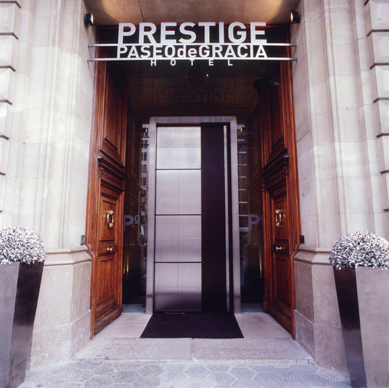
It is the rehabilitation of a building of housing between medians, located in the Paseo de Gracia, 62 of Barcelona, to make this 4 star Hotel.
Reception
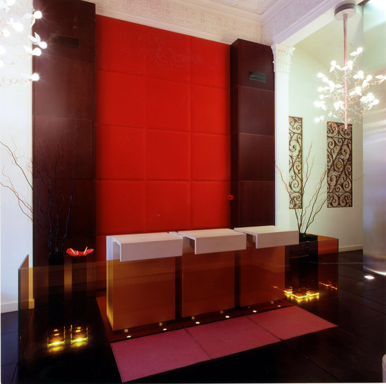
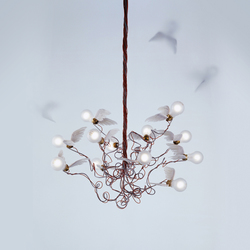
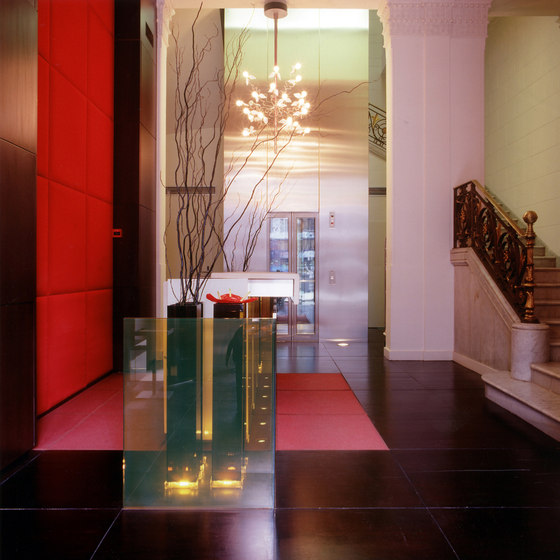
The limitations of space on ground floor caused a conception of the reception as a zone of passage area. In this way, with few elements are power, on the one hand the great height of the local, upholstery and furniture of disproportionate ratio and on other care individualized customer through elements of small scale, such as the counter that is divided into three modules. The atmosphere ends with two large sculptural character hanging lamps. This space is different from the rest by the use of spots of colour that overlapping and counteract the austere nature of the rest of materials.
Common areas
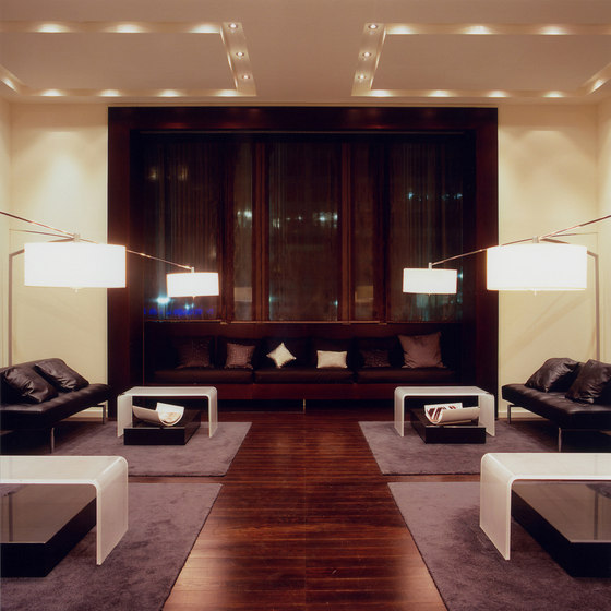
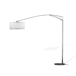
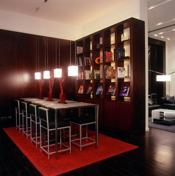
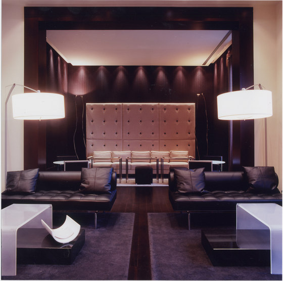
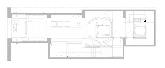
This area had to be versatile and comply with various uses of the hotel. Breakfast, reading, being, queries of internet, drinks, coffees, all linked in an intimate and personalized atmosphere. Trying to customize the different spaces: the area of reading with two large libraries, backlit and soft light, the side halls with a point of sophistication combined dark cloth upholstery on walls, in the Center Gallery is supported by the large sofa and the four floor lamps. A factor that helps greatly to these changes of use is lighting which also incorporates a system of management, according to the time of the day and the use of the time. Most of the furniture is design of GCA Arquitectes associats, such as libraries, reading of granite and steel tables, support in matte acrylic, sofas of the aisles with Fund capitoné salons, or the large sofa that presides over the rostrum. All this is complemented with lamps and props of market.
Rooms
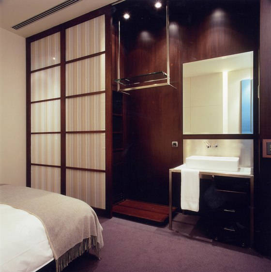
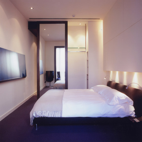
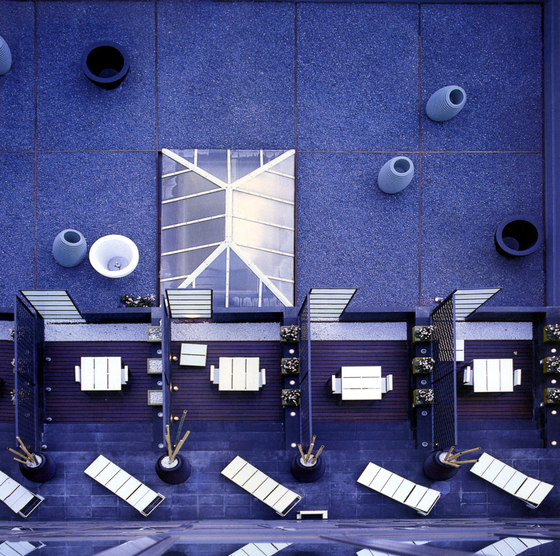
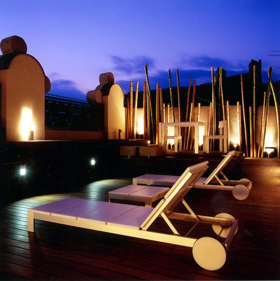
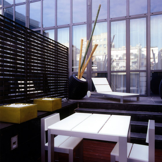
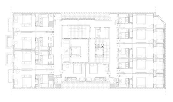
The hotel has 45 rooms over four floors, attic, and penthouse. Its sober but current aesthetic play with materials of neutral but contrasting tones. Dark wood, clear textures applied to the headboards, textile-based assistance and silks. Some conventional elements are reinterpreted. The wardrobe becomes a formal fold of the vertical plane. Its boundary with the exterior becomes a great sliding panel of mirror that through their reflections distorted the spatial perception of the carrier. The desktop disappears becoming an auxiliary element of work for flexible use. In the bathroom she highlights the stone lining colour ash, as continuous plane glides through the wall, pick up the bathtub and soars beyond its limits, covering also the space in the entrance hall. The rest is combined with steel sink and glass of special textures and one point of freshness in the Green pistachio of the niches for towels. One of the major concerns of the project is the lighting. Looking for a differential value in its contribution to the perception of the environment, has introduced a management system that allows to work with scheduled lighting scenes. Some of the rooms have balconies. They are designed as a continuation of the image inside to enhance its visual extension. Wanted the dynamics of the space through a stony platforms combining with ribbons of floating wood and furniture in strict line blank.
Courtyard
This articulator space of the tubular form and high-rise hotel thought treated as a point of attention. Walls are rehabilitated and tapiaron hollow incorporating textures in them on the same tone. On four sides, was painted a geometric version of the map of the city of Barcelona in lines of aged silver bread that stands out on the stone bottom. And you can see from the glass elevator.
Manufacturas Balmes Vives
Partner Architect responsible of the project: Josep Juanpere
Architect director of the Project: Maria Vives.
Architect: Olga Saro
Structure: BIS architectes
Construction: CODECSA, S.A
