The current project is based on the 1999 competition. At that point the brief represented an urban design vision for the gradual renovation of the museum complex with its various buildings exhibiting the different means of transport, as well as a new building for the Road Transport Hall.
At the beginning of 2005 the project was resumed. In the first construction phase a new entrance building (Futurcom) was also to be provided in addition to the replacement building for the Road Transport Hall. This urban design strategy enables the generation of a central open courtyard (Arena), which in the new scheme should remain undeveloped and creates space for temporary, themed exhibitions.
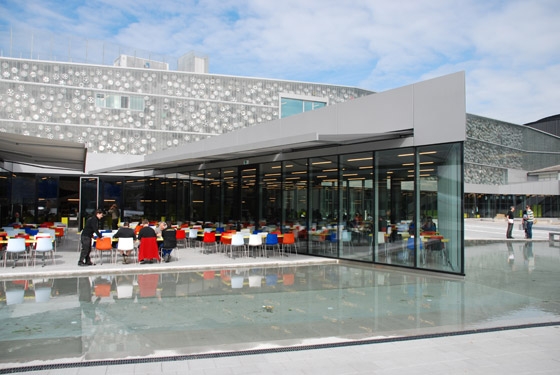
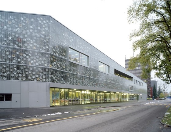
The new entrance building forms a bridge-like link between the existing buildings on Lidostrasse (the IMAX, the Rail Transport Hall and the high-rise building). It contains on the ground floor the ticket office, shop area and both restaurants – one offers table service and opens towards the lake, the other is conceived as a self-service restaurant that stretches out like fingers into the arena. On the first floor are accommodated the exhibition areas for communications, the new entrance to the Planetarium and also the services area. On the second floor is the conference area with a conference hall that seats 500 guests and three smaller meeting rooms.
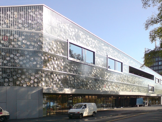
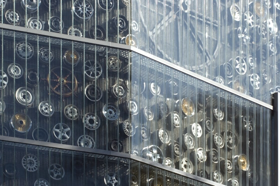
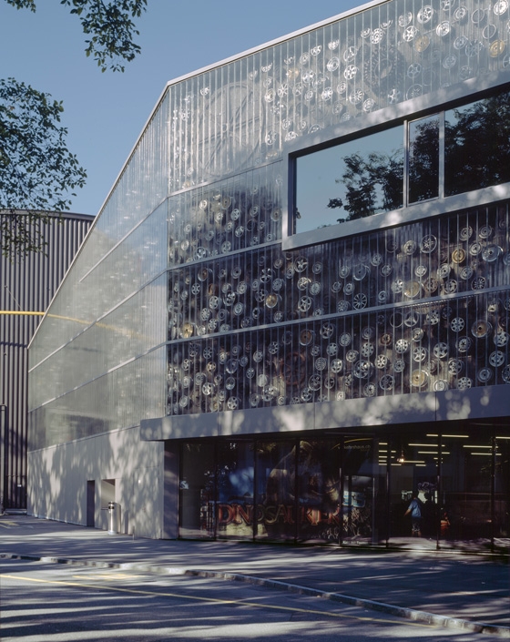
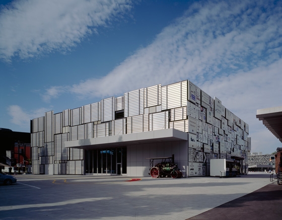
The façades form roughly transparent ‘vitrines’ for all kinds of wheels, propellers, wheel rims, turbines, cogs, steering wheels, etc. The mechanical parts hang densely in front of the building insulation and are behind the façade panes, forming a shimmering, shiny and in parts revolving façade ‘undergarment’. The omnium-gatherum of the various manifestations of the wheel pays homage to this basic element of mechanical movement.
The concept for the new Road Transport Hall differs considerably from the first design during the 1999 competition. Where originally a three-storey building was conceived with concrete shear walls, a load-bearing, glazed façade construction and bridge-like ramps on the exterior, the new building should be two-storied, like a black box, more flexible and in particular more economical. It should be a structure that is reminiscent of those buildings countrywide that are designed for the storage and housing of cars, i.e. multi-storey car parks. Instead of negotiating the floors via ramps, an automated parking system is employed; a shelf-like structure operated by a mechanical lift displays the collection of classic cars (or even new models) densely positioned one above the other and out of reach. At the touch of a button visitors can bring one of the cars closer to them and look at it up close. The connection to the open areas on the ground and first floors enables the possibility of running different themed exhibitions parallel to this. A workshop shows the visitors how the vehicles are maintained and repaired.
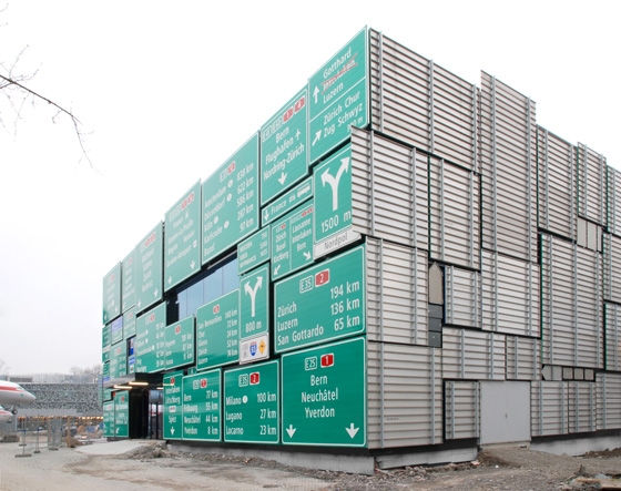
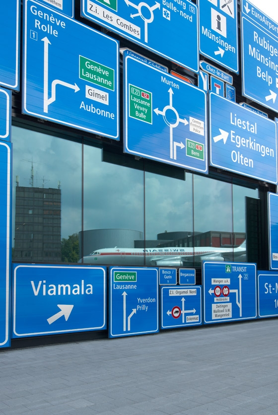
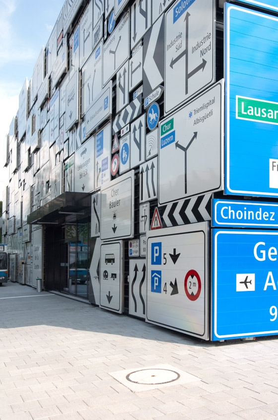
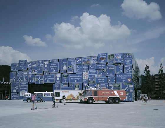
The facade cladding of the mainly closed building volume is composed of sheet metal in differing formats and colours. However, standard facade sheeting will not be employed, nor metal from car bodies (as envisaged during the preliminary project), but rather they will be clad from the sheet metal boards that direct traffic – we are referring to traffic signboards: destination and orientation boards, instruction signs, manditory signs, prohibition signs, placename signs. The signboard walls, which spatially delimit the Road Transport Hall, indirectly refer to the great latitude of private transport, which is directed and regulated with the help of such boards. The signs also refer to numerous localities that are connected via different road networks. Amongst them might be the home towns and cities of the visitors, who arrived at the Swiss Museum of Transport via diverse traffic routes and with different means of transport and here can discover more about (their) mobility.
On the rear facade, towards the neighbouring buildings, the signs are reverse mounted, meaning that the printed side faces into the building while the untreated, metal side faces outwards. Thus the neighbours see these boards just as road users would see those signs meant for the oncoming traffic - from the rear side.
Verkehrshaus der Schweiz, Luzern
Architektur: Annette Gigon / Mike Guyer, Architekten, Zürich
Mitarbeit: Caspar Bresch (Projektleiter), Mark Ziörjen, Damien Andenmatten, Gaby Kägi, Gilbert Isermann
Totalunternehmer: Karl Steiner AG, Luzern
Landschaftsarchitektur: Schweingruber Zulauf Landschaftsarchitekten, Zürich
Fachplaner Statik: Henauer Gugler AG, Luzern
Fachplaner Haustechnik: Wirthensohn AG, Luzern
Fachplaner Bauphysik: Ragonesi Strobel & Partner, Luzern
