Fotografo: Thomas Meyer / Ostkreuz

Fotografo: Thomas Meyer / Ostkreuz

Fotografo: Thomas Meyer / Ostkreuz
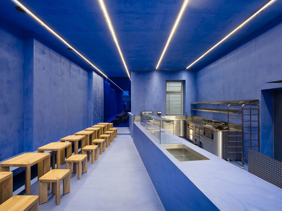
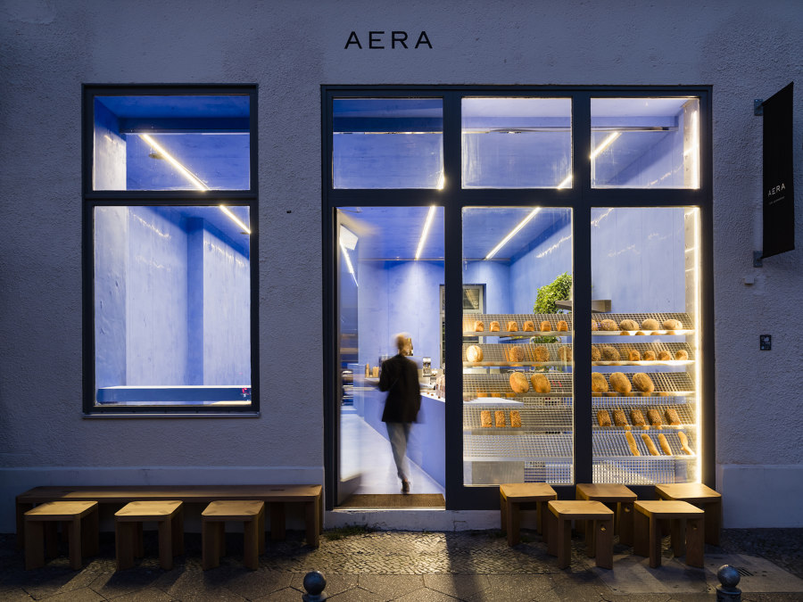
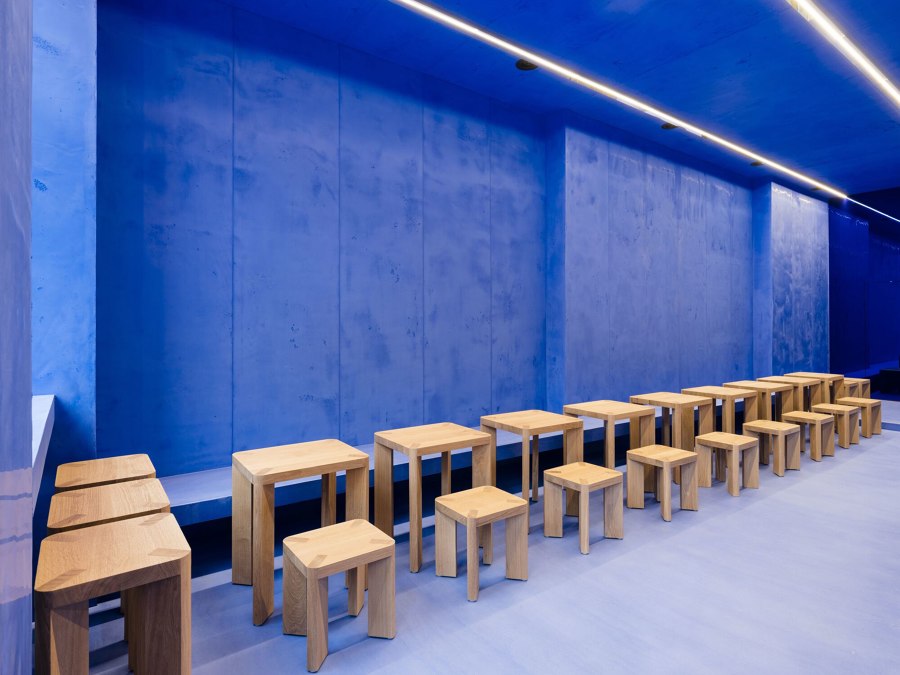
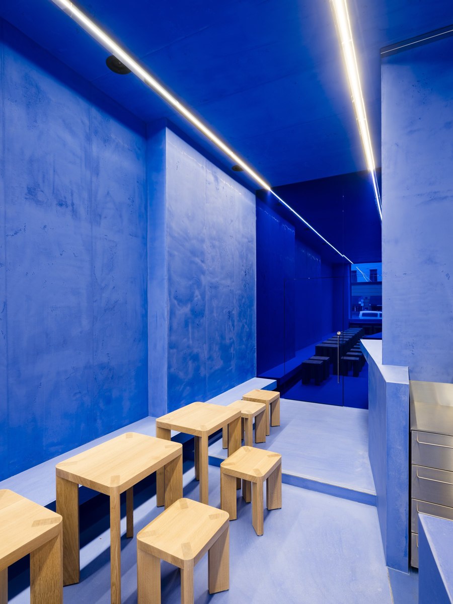
For the second Berlin branch of Aera – a gluten-free bread manufacturer and café located at Rosenthaler Platz – the architecture duo Gonzalez Haase AAS designed a space that takes full advantage of its prominent location by being impossible to overlook. The entire depth of the new store is made visible through a large storefront window, allowing its rich Lapis Lazuli blue interior to take centre stage.
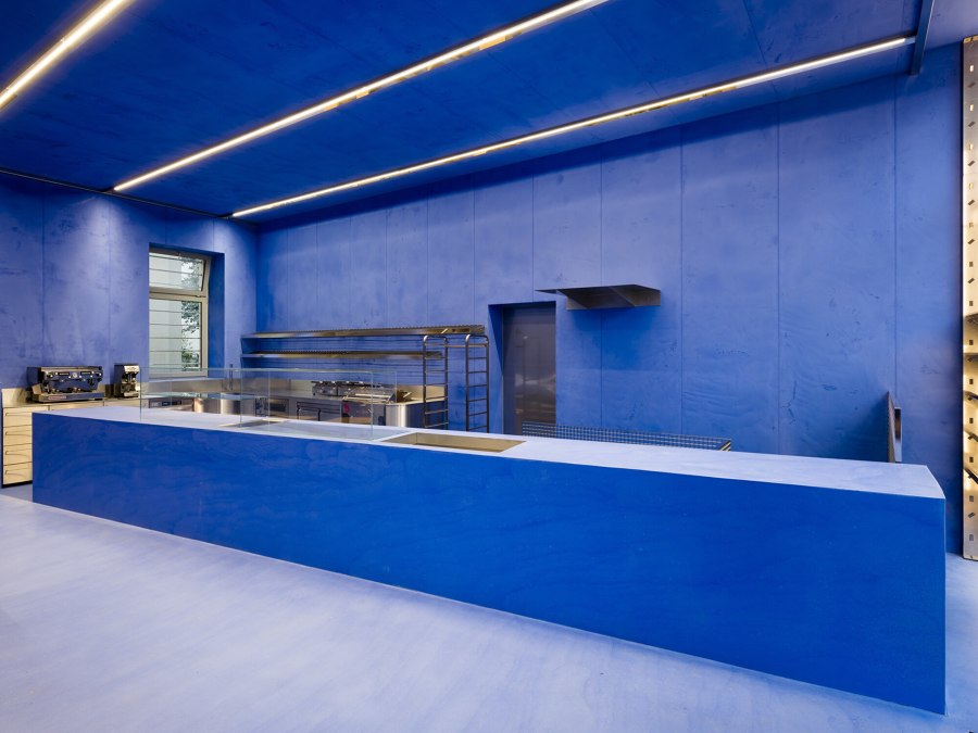
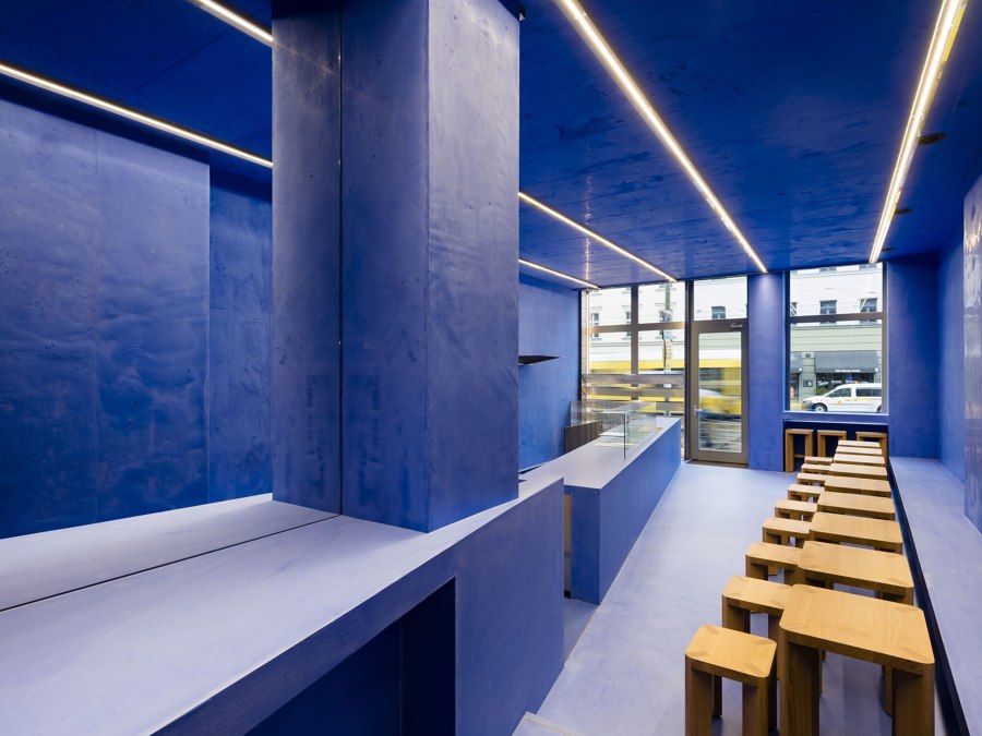
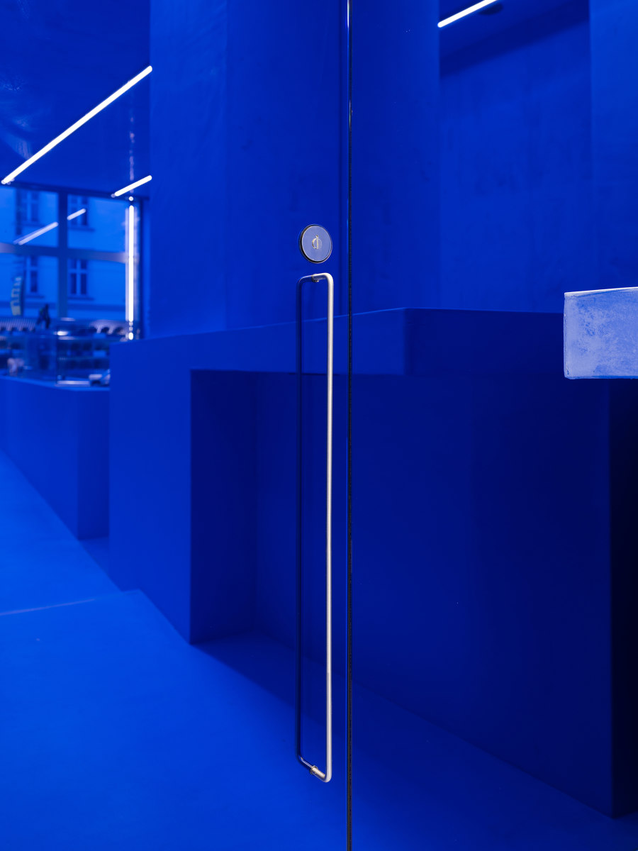
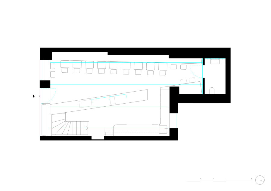
Freeing the 70m2 space from the layers of the past revealed a ceiling of 3.8m in height and allowed the length of the space to be viewed in its entirety from the front of the 13m long wall. No inlaid walls or edges were used. A diagonal counter, which runs from the entrance to the end of the shop, divides the space into two functional areas and guides the visitor along the length of the store from entering to placing and then receiving their order. Uniform in texture and colour, this long concrete counter visually merges with both floor and wall surfaces, becoming an organic part of the room due to its proportions and size.
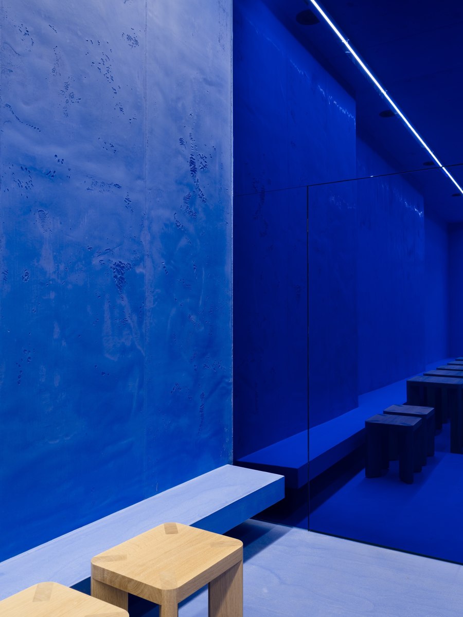
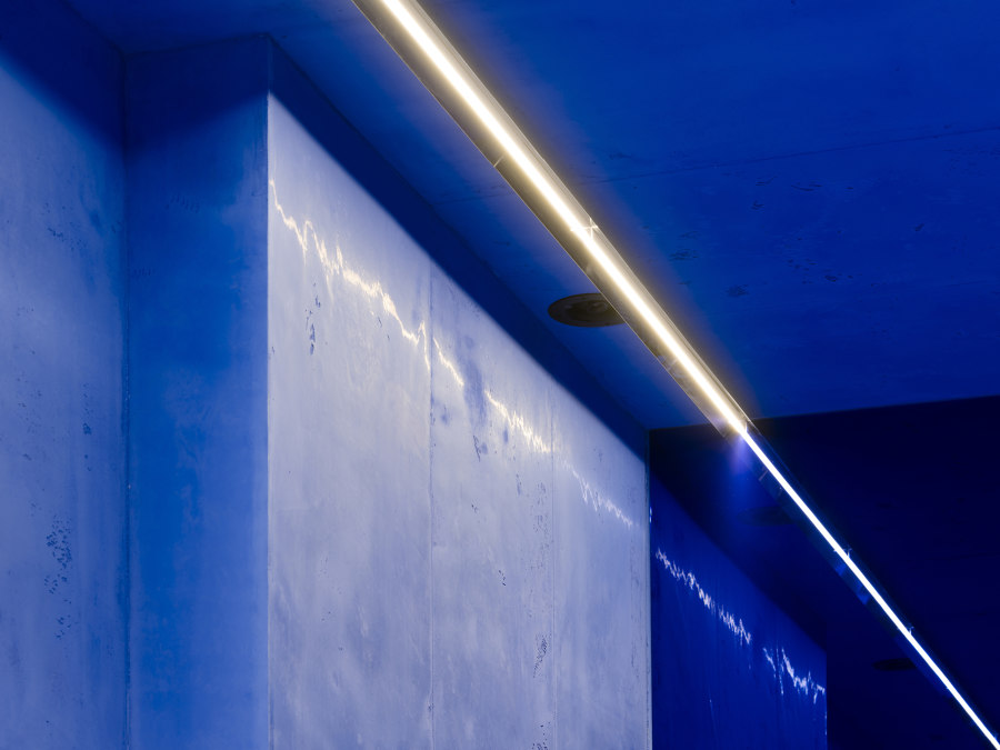
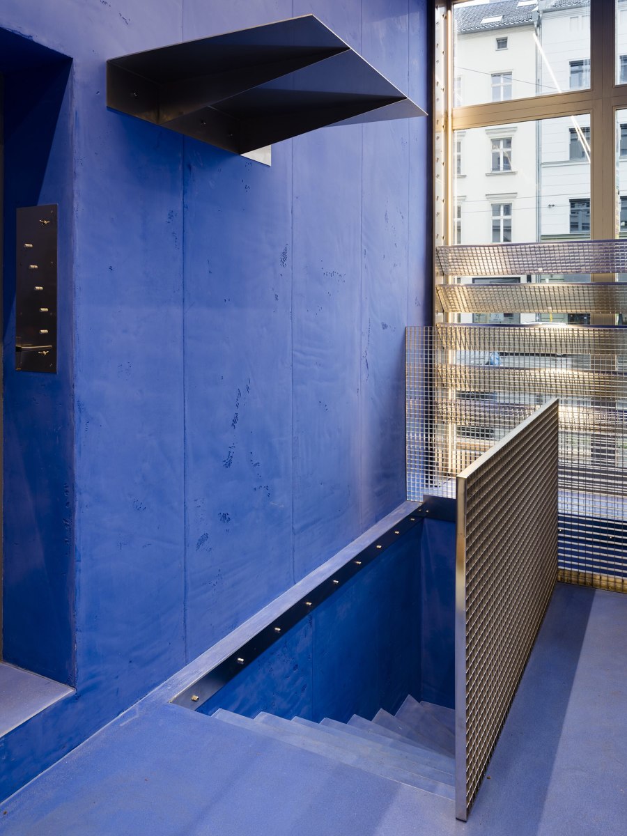
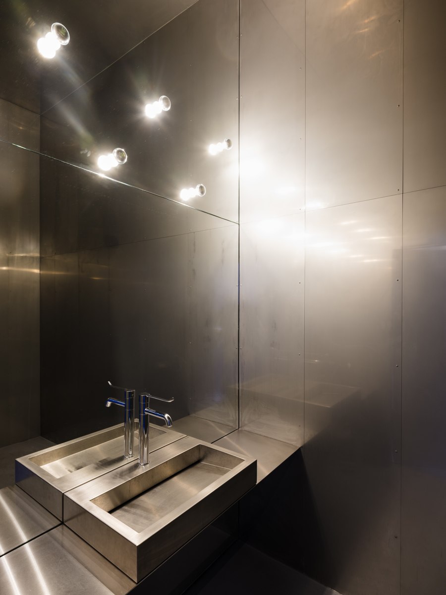
Monotone concrete was applied evenly in 80cm strips in an intense Lapis Lazuli blue colour embedded so consistently throughout the space that the room as a whole becomes a spatial sculpture, inseparable from its bold colour. The furniture designed by Gonzalez Haase AAS for the space is of solid oak while the shelving for baked goods is made of electropolished stainless steel. The incoming natural light alters the intensity of the blue and the surfaces from glossy to matt depending on the time of day, the weather and the position of the observer. Sometimes more light than dark and others rather brilliant and intense.
The colour itself is inspired by paintings from the 17th century, most notably those of Jan Vermeer and his interest in the reproduction of light and material structures. Vermeer was particularly impressed by the painting of light and shadow, as was Gonzalez Haase by the space, completely transformed by light and shadow over the course of the day and light’s progression. Like many painters of his time, Vermeer used a very limited palette. The only significant difference between his palette and those of his contemporary artists was the extensive use of natural ultramarine (pure lapis lazuli) instead of the more affordable azurite. Natural ultramarine is made from the powder of the crushed semi-precious stone lapis lazuli. The blue was applied extensively by Vermeer and is extremely rich in colour, dominating the palette of any painting it is applied to.
"The powerful, uniform colour scheme works as the background of a painting, allowing the true subject to really come into its own. Coupled with the LED lighting strips mounted right onto the ceiling and the natural light that filters in through the window front, we created a vibrant, light-filled space that brings the fine bread and baked goods into focus. Their warm-gold colour appears as a complementary, punctuated element in a space that clearly stands out." - Judith Haase
The architects deliberately play with expectations to create a surprising and at the same time harmonious space through unusual material and a bold colour scheme.
Design team:
Gonzalez Haase Architects

Fotografo: Thomas Meyer / Ostkreuz

Fotografo: Thomas Meyer / Ostkreuz

Fotografo: Thomas Meyer / Ostkreuz

Fotografo: Thomas Meyer / Ostkreuz

Fotografo: Thomas Meyer / Ostkreuz

Fotografo: Thomas Meyer / Ostkreuz

Fotografo: Thomas Meyer / Ostkreuz

Fotografo: Thomas Meyer / Ostkreuz
