Fotografo: Mark Humphrey’s

Fotografo: Mark Humphrey’s

Fotografo: Mark Humphrey’s
“This building, which houses the new UCL Cancer Institute, does something exciting by opening up an often opaque and private area of study. The transparency and accessibility of the building reflect a desire to enhance UCL’s national and international profile in cancer research”
Professor Chris Boshoff – Director, UCL Cancer Institute
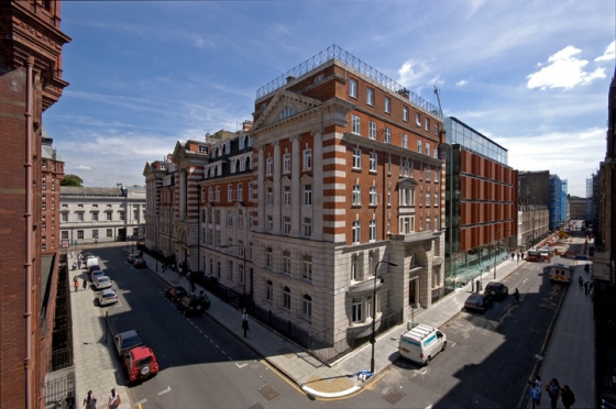
Grimshaw was appointed to design a post-graduate medical school and new UCL Cancer Institute following a competitive interview in 2000. The site lies at the edge of the 1998 Bloomsbury Conservation Area and is bounded by Huntley Street to the west, University Street to the north and Chenies Mews to the east. The medical school is accommodated in a refurbished Grade II listed building built by Paul Waterhouse at the beginning of the 20th Century. The new UCL Cancer Institute is built adjacent to the medical school in place of a 1930’s extension, which has been demolished to make way for the new facility. The gap between the existing building and the new Institute creates a lightwell covered with a steel and ETFE cushion roof.
The UCL Cancer Institute brings hundreds of cancer specialists together under one roof, to create one of the largest biomedical facilities in Europe. It accommodates 350 scientists in 4,500 sq m of state-of-the-art laboratory space set, over five floors with close proximity to key hospitals and UCL research centres. The Institute is an acknowledgement of all that UCL scientists have contributed to cancer research thus far and confirms UCL as one of the best centres in this field; it is a signature building for the university intended to attract first-rate minds. The laboratories have been specified to achieve the highest standards of environmental conditions and service in accordance with JIF Guidelines.
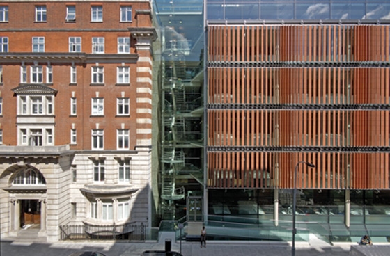
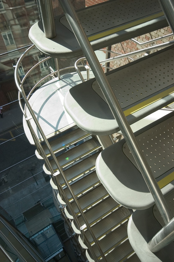
The main entrance is located at the juncture between the reinstated wall flank of the Grade II listed building and the new Institute. This gap is glazed with a single glass sheet spanning from the new structure to the old. It reveals a highly engineered staircase that provides the main circulation core and an architectural focal point. The transparency of this circulation area articulates it as an open, shared space that is visually accessible from the street. This emphasises the Institute as a live and active building. The staircase itself consists of cast stainless steel treads cantilevered from a structural spine of pre-cast concrete to create a dramatic feature.
The internal layout follows a new approach to the design of research laboratories. It separates the practical laboratory from the write-up area, to create a distinct space for analysing and sharing information. The laboratories occupy the central core of the building and a bank of ‘bookend’ offices, located on the south elevation, spans Chenie Mews. On the fifth floor, the dedicated office space is replaced by a balcony area, offering a breakout space which provides spectacular views across the roof tops of central London. From a servicing perspective this creates a vertical stack of laboratories; each stack is serviced by its own high grade air-handling unit on the sixth floor.
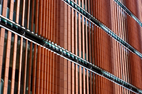
Conceptually, the building design was influenced by its role as a cancer institute and the relationship between science and the study of cancer. In particular there was an interest in the images that have been generated by the processes used in modern medical research and which have now become part of our culture. Images of cells, wave patterns and the chromosome permeate the forms of the building. For example, the terracotta louvre-bank suspended across the main façade has a rhythm that can be read as a vertical ‘bar code’ configuration or genetic sequence image; but also reflect the waveform that is so significant to modern science. Likewise, concrete soffits are left exposed, retaining the details of their own construction and revealing points of reinforcement reflective of the mechanisms and cellular structures of biology: they are literally scooped out where the material serves no structural purpose.
The idea of cancer as a mutation led to this being viewed as imperfection. These flaws are also seen in the texture of the natural world, in objects of beauty and character, such as wood grain, fossils in stone and colour variation effects of erosion and growth. This study permeated the choice of finishes and materials within the building and the subtle juxtaposition of more perfect materials, such as glass and stainless steel, with those that have natural defects.
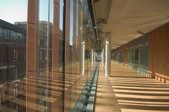
The concept of scientific and natural patterns is also reflected in the stunning wave-like façade treatment, comprising of vertical terracotta blades set at varying angles to the street in front of a glazed envelope. The positioning of the individual terracotta blades is determined by sunlight studies, with the intention of mitigating the negative impact of solar rays maximising the use of natural lighting, whilst allowing views in and out of the building. The slender terracotta blades of the façade have holes through the body to accommodate a stainless steel tube which holds them together. As terracotta is a brittle material, it is threaded over the rods and then separated from its neighbour by a softer rubber lining. The weight of the terracotta segments hold the assembly together, but the steel rod acts as the stiff spine. The rubber joints allow the blade to flex under load without damage. Each blade is made of seven extruded segments of terracotta.
These louvres resonate with the adjoining 19th century Cruciform building by Alfred Waterhouse who considered terracotta a ‘new and exciting modern material’ and utilised its mass production benefits in his buildings. He used terracotta in what was considered an adventurous way during this period. The finely detailed stainless steel suspension system that supports the louvres of the new build continues this tradition of pushing the boundaries of terracotta’s use in architecture.
Directly behind this façade on the first to fourth floors are strips of write-up space which run the length of the Huntley Street elevation. These are the architectural focus of each floor and are divided from the laboratories by a combination of American cherry veneered acoustic panelling and glazed panels and doors. The glazed elements have sand-blasted fritting to provide a degree of privacy between the two areas, while still allowing natural light to penetrate into the heart of the laboratories.
There is an attention to detail in the articulation of the façade and write-up spaces. The first to fourth floors push out past the structural grid line, almost like a sliding drawer. The cast stainless-steel components of the suspension system, largely internal on the upper floors, become fully external on the ground floor as the façade recedes back towards the grid line. The articulation permits the gain of additional floor space in the write up areas and also provides the appropriate setback to minimise the massing of the building at street level.
University College London
8th floor Estates and Facilities Division Gower Street London WC1E 7HB
Pauline Williams
pauline.williams@ucl.ac.uk
Partner in Charge
Neven Sidor
Project Architect
Simon Moore
Team
Kristina Ehlert, Jane Garrett, Christian Hönigschmid-Grossich, Nigel Raynor, Wenke Reitz, Jerry Tate, Karen Summers, Karen Turner, Malgorzata Haley, Andrew Perez, Shoaib Rawat
Structural Engineer
Buro Happold
Services Engineer
Faber Maunsell
Quantity Surveyor
Gleeds
Project Manager
Turner and Townsend / MACE
Contractor
Shepherd Construction Limited

Fotografo: Mark Humphrey’s

Fotografo: Mark Humphrey’s
