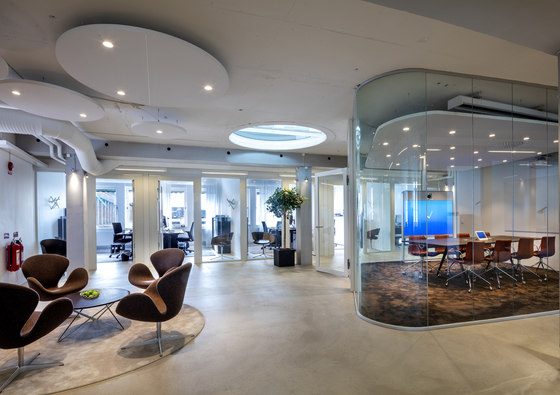
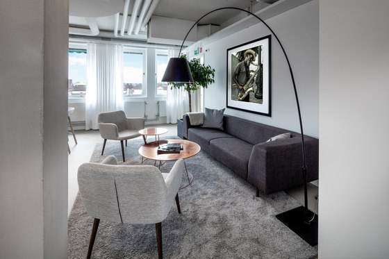
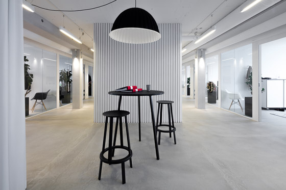
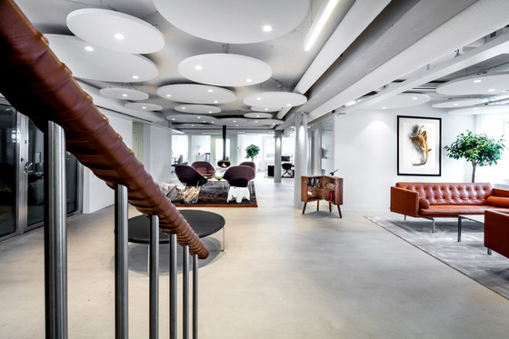
Ideas creates workspaces one can look forward to spending time in, and Heimstaden’s new headquarters is a perfect example of such a space. Interior design blogs applaude the new design concept, a Mad Men inspired design with an ultramodern vision. Influences from the 50s and 60s are incorporated with clean, modern lines and thoughtfully placed lighting. The elegant and sophisticated furniture combined with subtle details make this office extraordinary.
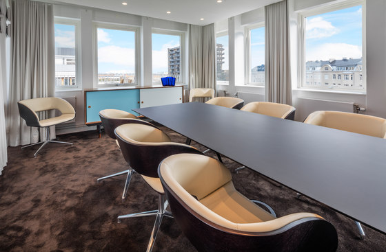
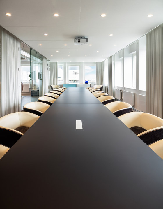
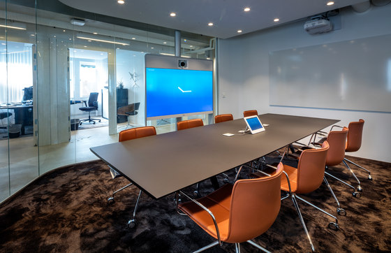
Colors and expressions are muted and carefully chosen to reflect Heimstadens identity. Experiencing the space remains in focus and thus heightens the creativity for both designers and clients. The materials chosen are sustainable and the design is ageless. The many high-tech solutions in the space offer an exciting contrast to the retro design. The office is approximately 1,000 square meters divided over two floors. It houses 32 work spaces, 5 conference rooms (the largest with a capacity of 24 chairs), and project spaces. The retro feel is present throughout and suits the building from the1960s.
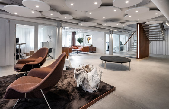
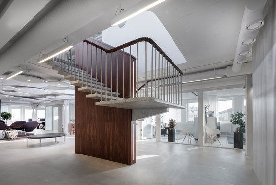
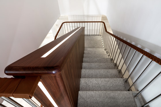
The atmosphere is accentuated through details such as the original staircase being refurbished with the railing wrapped in darkened leather, and the terrazzo stone being polished and coated with walnut. The space holds several walnut pieces along with leather and textiles in various shades of brown that juxtapose the white foundation, which reflects the light in the space.
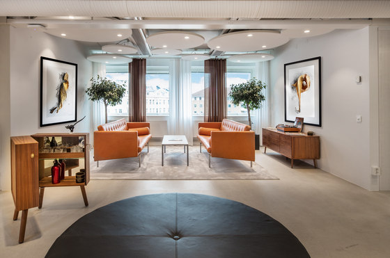
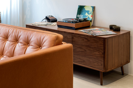
Concrete floors were chosen throughout and flow seamlessly with the walls. The material reflects a sense of permanence and an ageless beauty. Visitors are welcomed by the open space, the ergonomically designed ottoman and a couch area. The retro details fit in any Mad Men episode, including the record player, liquor cabinet and the polaroid camera. Instead of a standard reception desk visitors are met by a lounge, where a fireplace extends down from the ceiling.
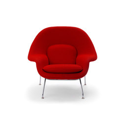
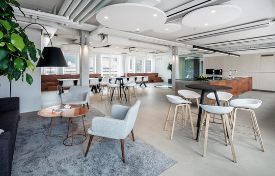
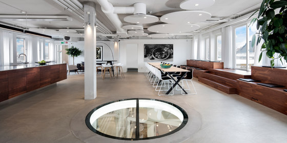
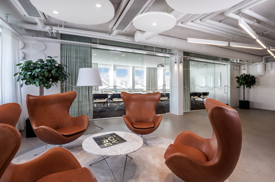
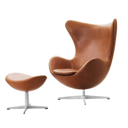
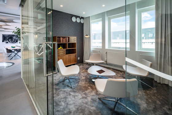
In the office you will find design classics like Arne Jacobsen’s ”Ägget” and ”Svanen”. The open spaces have areas with soft rugs that are carefully chosen to tie in with the concrete floors. Where there once was a spiral staircase there is now a round glass floor in its place creating a skylight for the floor below. The conference rooms and the kitchen on the second floor are inspired by the retro look trough details such as the side tables, book cases and leather-bound furniture accentuated with dark wood.
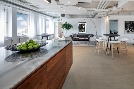
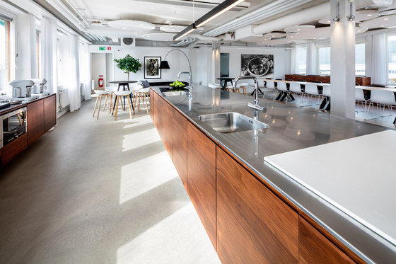
Towards the terrace is a custom staircase built to provide seating along the whole interior side of the building. It was constructed in the space and made of walnut, just like the five meter long kitchen island, the centerpiece of the space. The kitchen is minimalistic and thoughtfully laid out with plenty of concealed storage solutions. The kitchen appliances and recycling are thoughtfully hidden behind a white ash wall. The dining table acts as the centerpiece of the kitchen and creates a gathering point in the room. Adjoined to the kitchen is a spacious terrace with expansive views of central Malmö.
Ideas
Tony Rydberg (creative director), Oscar Rydberg (project manager), Oilyde Martinez (3D rendering)
