When leading supply chain management firm, Allport Cargo Services South Africa, sought to redesign the interiors of its Cape Town offices, it looked no further than award-winning design studio, Inhouse. Allport Cargo Services South Africa offers logistics solutions for the storage, clearance and movement of goods both by air and over sea. The company required a solution that would reflect its brand identity and business offering in a modernised work environment.
Allport Cargo Services South Africa occupies the 2nd and 7th floors of a building on Loop Street in Cape Town. The Inhouse team needed to integrate the aesthetics of the two separate areas in a seamless manner regardless of the spatial divide. In response to the design challenge, Inhouse made use of several key elements that generate an immediate impression of the brand identity as soon as guests enter either floor and allow visitors to instantaneously distinguish the offices from others in the building. Because Inhouse’s design concept was inspired by the shipping industry, decidedly maritime notes are reflected in both the colour palette and interior décor elements.
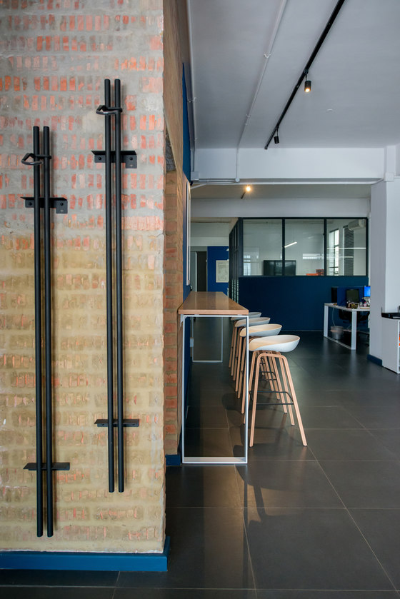
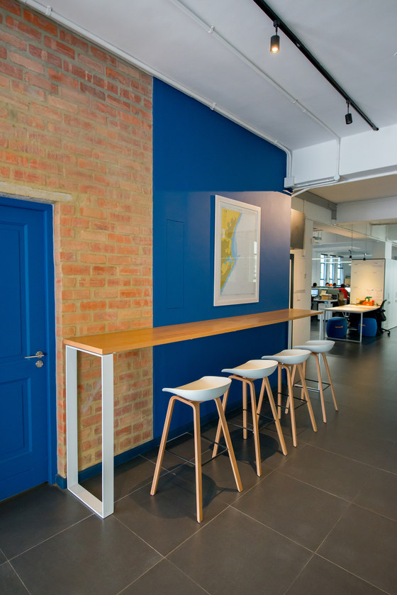
These elements include a colour scheme of blue, white and black, which correlates to Allport Cargo Services South Africa’s corporate colours. Timber, exposed brickwork and the use of nautical-inspired elements are evident throughout. Even the elevator landings serve to extend the design scheme, featuring white metro tiles, bare brickwork and splashes of blue.
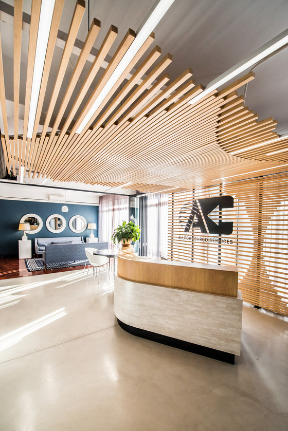
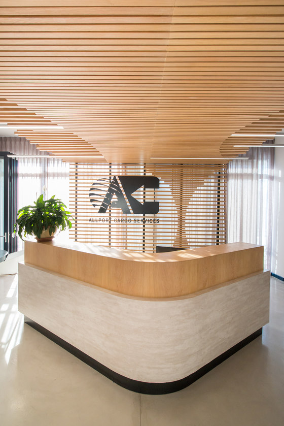
Upon entering the 7th floor offices, guests are greeted by a warm and welcoming reception area.
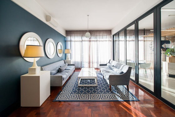
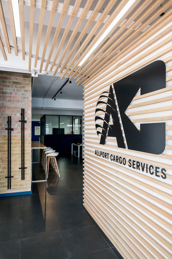
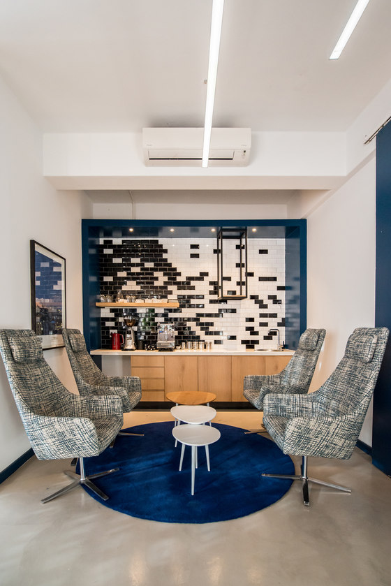
An impressive floor-to-ceiling timber installation, which bears the company logo in crisp black steel, along with a concave timber reception desk, are the first points of contact for visitors. The timber installation is crafted out of irregular timber slats of varying lengths that are interspersed with LED lighting strips. To the left of reception is a waiting room, which is decorated in the brand’s corporate colours. Asymmetrically placed black and white metro tiles make for a striking feature wall. Finishing off the space is a circular dark blue rug, chairs covered in streaks of blue, black, grey and white, and white and timber nested coffee tables.
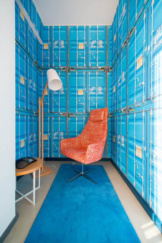
The 7th floor features other striking spaces that extend the nautical theme. The first is a private room in which employees can make phone calls without any disruptions or noise. It is a small, narrow space that features vibrant wallpaper that was made to look like stacks of shipping containers – emulating a freight ship. Minimal furnishings include a small table with a timber top, rug, armchair and timber standing lamp.
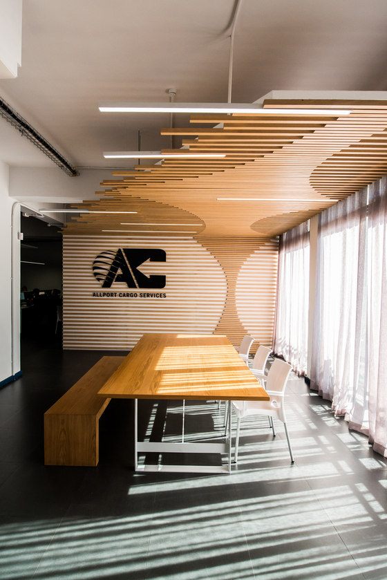
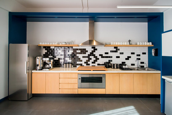
Elements from the interior design of the 7th floor re-appear on the 2nd floor. When entering the 2nd floor offices, visitors will once again be met with a striking timber installation featuring the firm’s logo in dark steel. In addition, the asymmetrical black and white metro tiles and vivid blue wall-paint featured in the 7th floor waiting room are repeated in the 2nd floor kitchen.
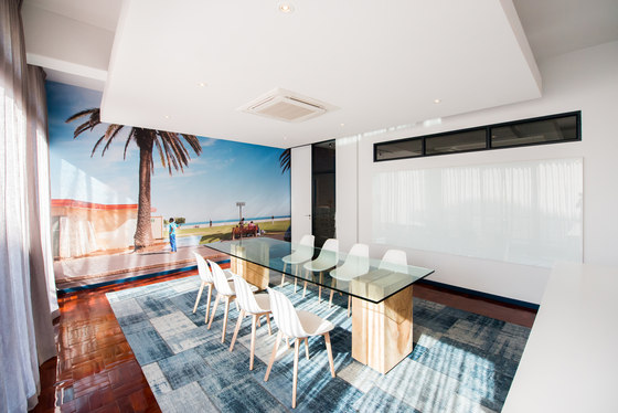
Though most of the 2nd floor is open-plan, there is a closed-off meeting room. Like the lounge area on the 7th floor, it features a combination of the corporate colours, with white walls, and a large, modern, square-patterned rug in various shades of blue. The use of timber is also evident in this room – there are timber chairs and the glass-topped conference table is supported by timber blocks. A photographic mural adds depth to the room. In keeping with the maritime theme, it depicts a seaside vista.
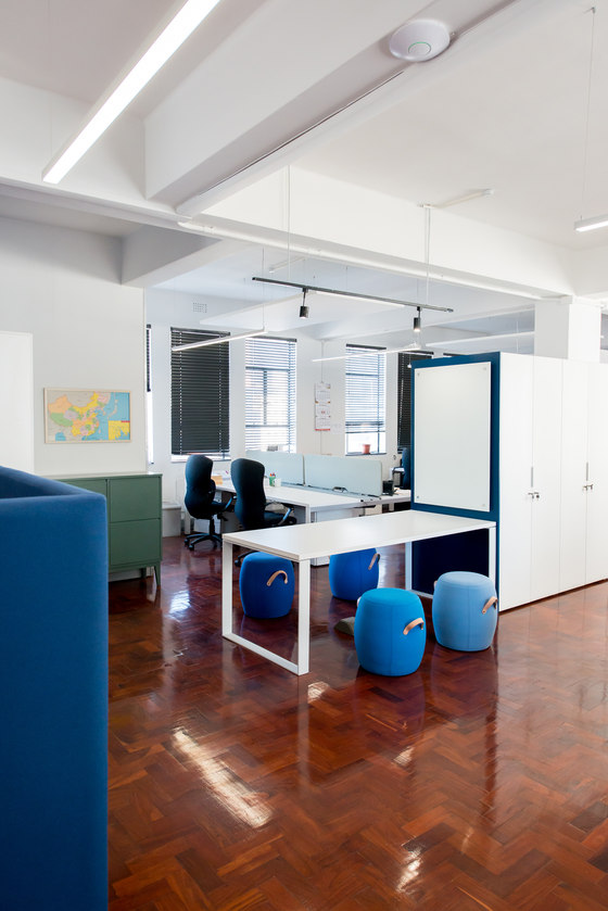
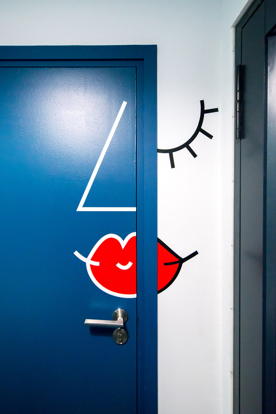
The remainder of the 2nd floor office space is dominated by white walls that are softened by the inclusion of bare brickwork, polished parquet flooring, sections of grey tiling and various shades of blue. Nautical maps are scattered throughout, paying homage to the industry in which the firm operates. The bathroom area is a particularly creative: the women’s restroom door features a Picasso-esque depiction of a feminine face and on the right is a shower room, indicated by a simple shower illustration. Other elements include a wall that is covered in a light blue-and-white leaf pattern adorned with yet another “porthole” mirror.
Phillip Wyatt, Director at Inhouse, discusses the success of these renovations: “Moving between several spaces, and working in a series of stages, made this a particularly challenging project,” he says. “The result, however, is sleek, modern, world-class, beautiful and undeniably fun. The team at Allport Cargo Services South Africa is thrilled!”
Inhouse
