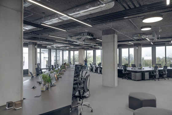
Scholz & Friends Warsaw wanted to evolve their collaborative approach to working. They imagined their traditional creative team clusters, typically designated in discrete groups, evolve to a more flexible organization wherein team members could move freely between open ended and unassigned seats, allowing them to gather in groups as needed. This approach was made possible by the simple fact that most of the employees worked on laptops, stationary workstations are now a rarity in their office.
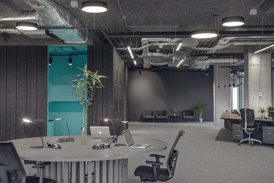
KOS architects reasoned that in order for a fluid and collaborative work environment to function all spatial cues suggesting division and vertical hierarchy be removed and replaced with a horizontal egalitarian spatial configuration; one where all members of the creative team, from the receptionists, executive assistants, designers, graphic designers, client services personnel, copywriters, and creative directors, sat at one table.
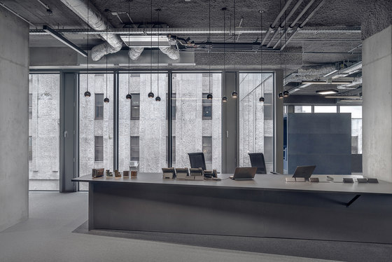
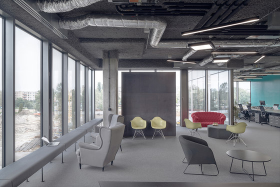
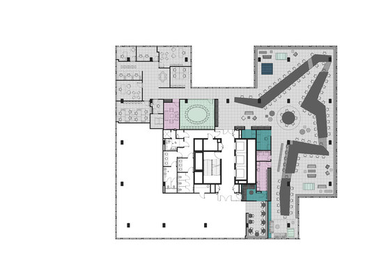
The intended outcome was to encourage senior personnel to interact with juniors, while simultaneously forcing juniors to confront seniors more frequently than they would have in a traditional open and closed office layout, one wherein executives sit in closed offices around a perimeter of support staff in open cubicles. In fact, in the case of the new Scholz & Friends offices, the perimeter of the office was replaced with a long bench that encouraged communal or solo work with a view on to city beyond, ultimately dissolving the traditional perimeter office and opening it for all to use. The intended effect of course was to break workplace barriers as quickly as possible allowing the entire workforce to move on to the important business of developing creative content for their clients.
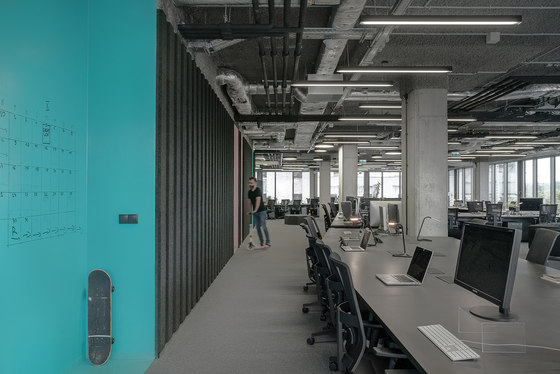
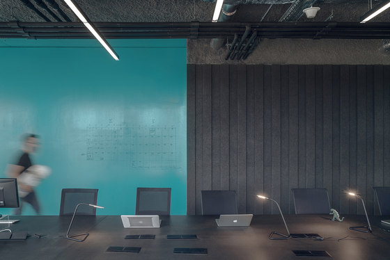
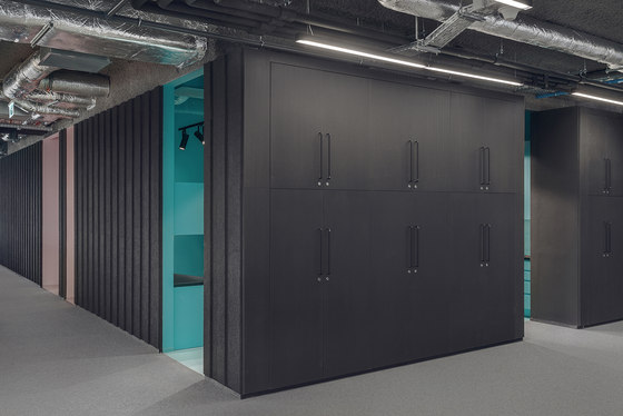
Architecturally, a long communal table wound its way through the space where teams could gather and work at a ‘desk’. The shape of the table created informal open lounge-like communal areas for larger group meeting and brain storming sessions. Large wood-crate-like pods, with comfortable acoustically treated interiors, provided quieter and more private conditions for teams of 2 to 6 people to work in a more concentrated manner.
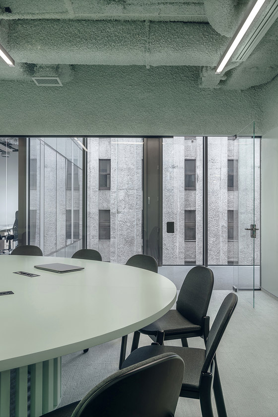
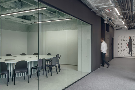
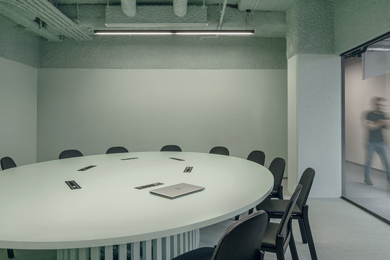
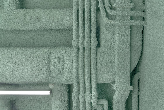
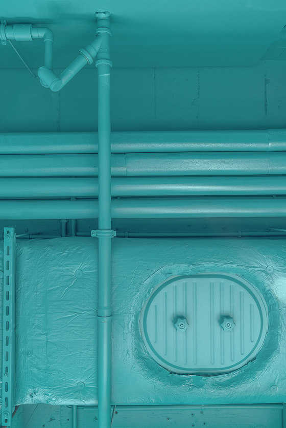
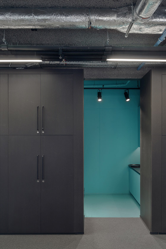
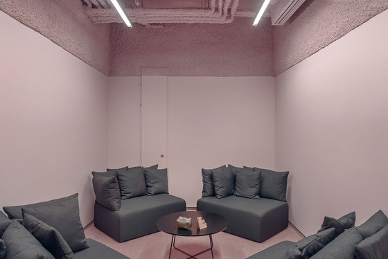
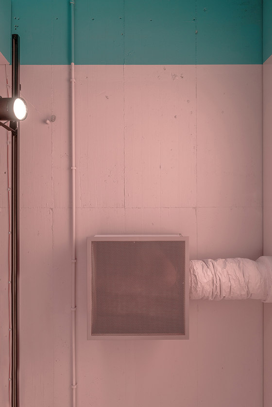
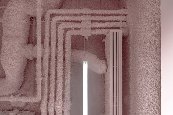
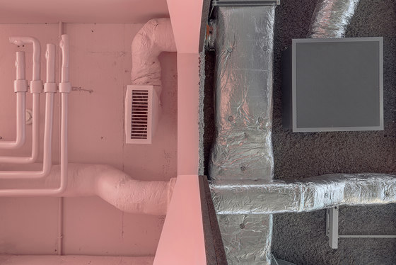
Acoustics is a major issue in open space planning. In the case of the Scholz & Friends offices spray foam ceilings and acoustic panel walls were used to mitigate sound transmission and maintain acoustic comfort. Instead of resolving this with generic acoustic ceiling tiles or baffles, the acoustic treatment was integrated as part of the interior architecture of the space. Acoustic wall panels were arranged in a striped relief pattern to provide a sense of scale and rhythm to the interior wall finishes, while the acoustic spray ceiling was applied in a monolithic manner, in some cases covering all of the mechanical equipment, turning them into suspended abstract objects that would have typically been concealed by a generic dropped ceiling system. The acoustic spray ceiling was itself inspired by the building next door, a remnant of early 1990’s ad hoc architecture, typical of the post 1989 laissez faire building boom in Poland.
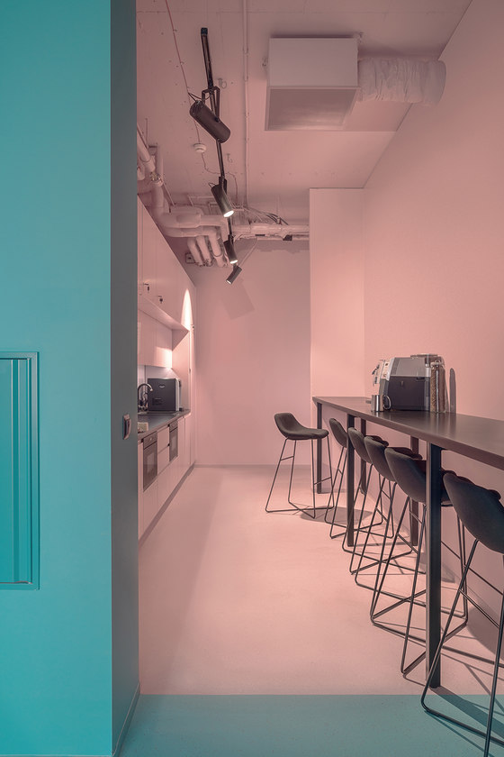
Finally, punches of color were added to the support spaces, such as printer rooms, conference rooms, kitchen, etc. Doors were removed to these spaces to provide a greater sense of contrast and compositional unity.
KOS Architects
Lukasz Kos, Edyta Krawczyk, Magdalena Gorecka, Joanna Otrebska
