HERE is a company that is co-owned by three German car manufacturers: Audi, BMW and Daimler. HERE is a leader in navigation, mapping and location experiences to the automotive industry, consumer market and business.
The technology of HERE is based on a 'cloud model’, in which the location information and services are stored on remote servers so that users can access them, regardless of which device they are using. In may 2016 moved HERE to the new location in the Centre of Eindhoven; the Kennedy Tower.
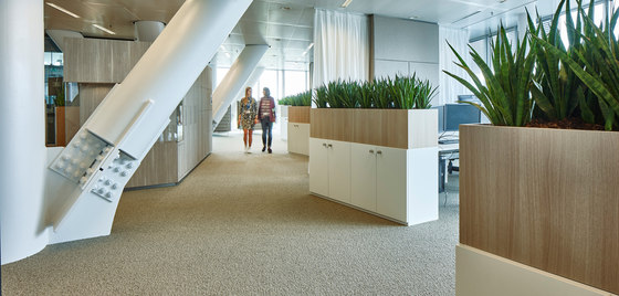
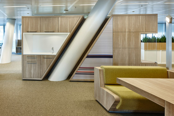
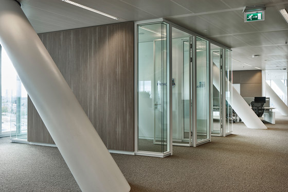
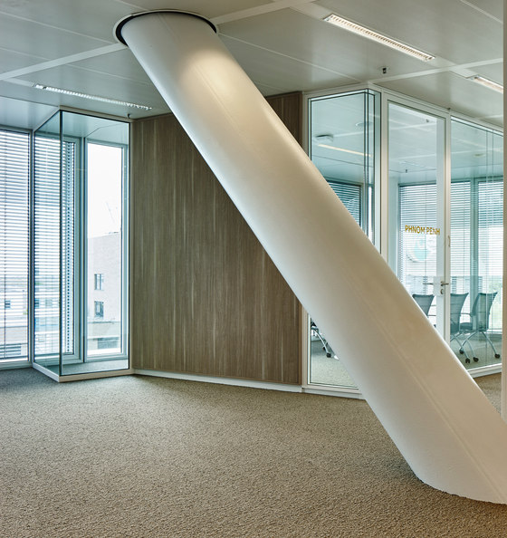
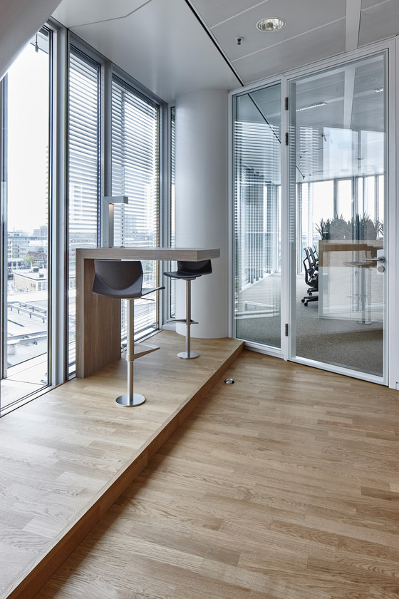
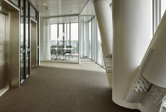
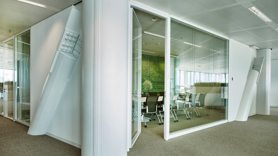
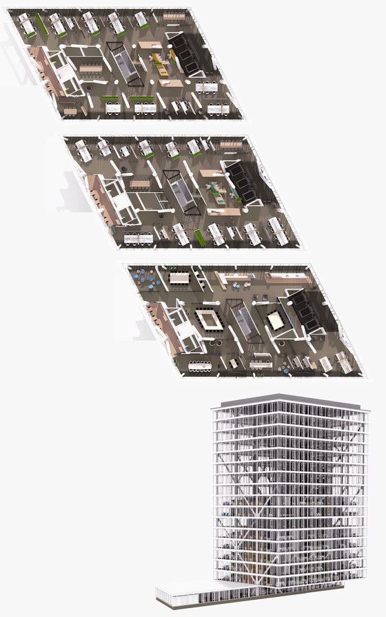
M+R interior architecture designed this new innovative work environment. The head quarter of the international HERE Company occupies the 5th to the 13th floor of the 22-story high tech glass building. Each floor has a different format as a result of the dominant steel columns structure in the building so each floor has another layout.
The Kennedy Tower is located in the center of Eindhoven next to the railway station and is a multi tenant building. Because of the central position of the building in the heart of the center of Eindhoven, with a lot of lunch and dinning facilities, the building isn’t occupied with a restaurant. Each floor is about 750 m2.
The challenge for our office was to integrate the amount of workstations for over 350 employees and also take care of implementing spaces where the HERE employee could meet their colleagues, sharing knowledge, brainstorming etc.
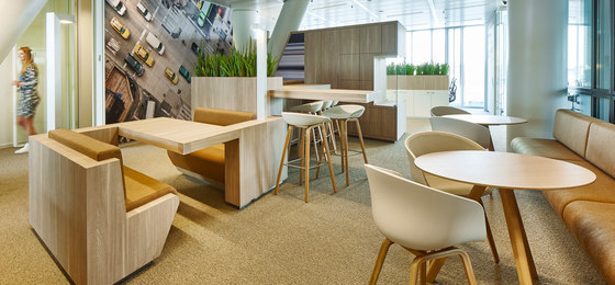
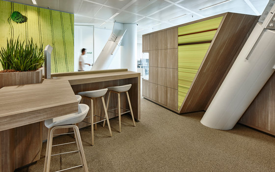
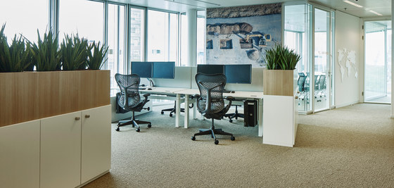
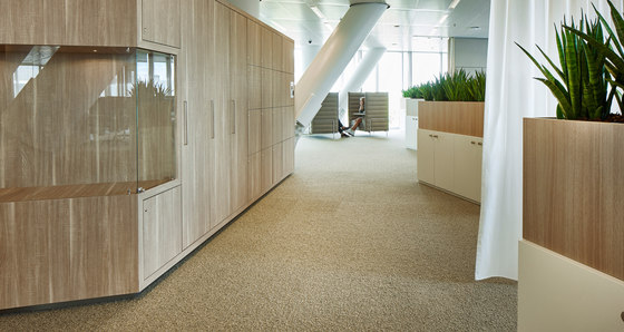
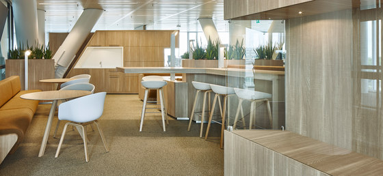
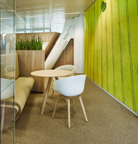
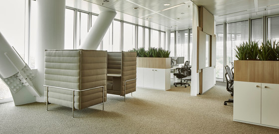
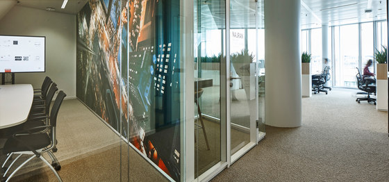
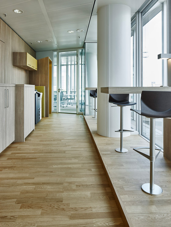
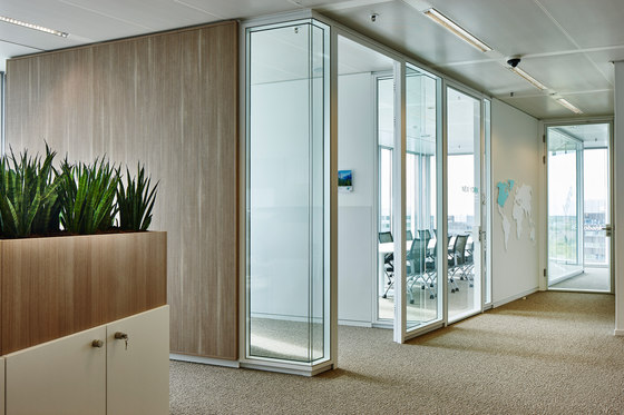
For the office we designed a floor plan concept that provides meeting spaces in the central; a communal area, a break out space with warm drinks and a small lunch facility and the meeting rooms. The workstations are positioned at the external façade so that every employee can enjoy the unobstructed view and has the maximum benefit of daylight.
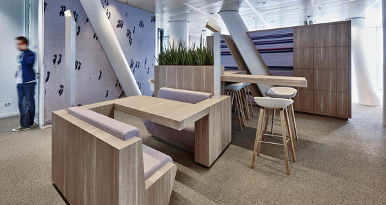
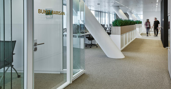
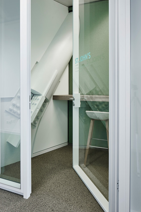
Between the workplaces are quiet room and consultation places situated in such a way that there is a maximum of 8 working places combined in an open space. This creates a meandering landscape that also provides peace and privacy for the employees. Extra attention is given to the sound quality; acoustic walls are part of the concept.
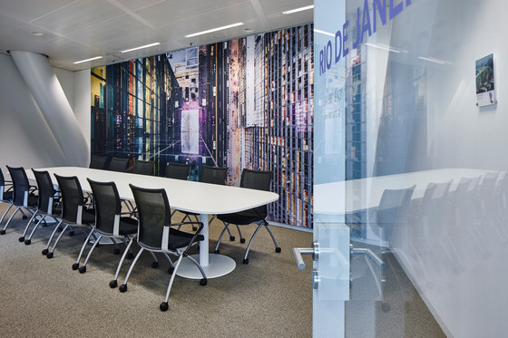
A number of acoustic partition walls have sliding doors with integrated white boards. The design of the M+R is per floor with a thematic design and color concept on the basis of the core task of HERE: navigation. For this we named every floor after a region and used the countries and landmarks for naming the different area’s and meeting rooms. The developed color pallet of our office is now part of the new branding and corporate identity of HERE Global.
M+R interior architecture
