Opolska
Katowice, 2022
Progetto di
MistoviaThis small flat measuring 45m2 is located in a recently renovated vintage town house in the city centre. It was created by merging together two tiny flats. The investor purchased them for herself, but over time, life altered the initial plans and the flat eventually ended up functioning as a short-term rental. This didn’t harm the project, although a part of the concept had to be adjusted to the new function. The owner invited the designers from the Mistovia studio, already experienced in designing effective rental spaces, as her collaborators. This time, the plan was very clear from the start – the owner loves vintage and she knew straight away that she was going to want the design to include numerous elements connected to this style. What’s more, she became involved in searching for them online and in stationary shops herself. As usual when it comes to investment flats, the budget was a bit limited. The second-hand furnishings allowed us not only to save a considerable sum, but also to give the old furniture a new life. On the other hand, buying vintage objects comes with quick decision-making and requires a lot of patience. Good deals disappear very quickly, narrate the designers.
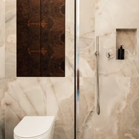
Before we could proceed to selecting the furniture, the interior needed to undergo a few major changes. The original design placed the bathroom in the current living room. Moving it somewhere else in order to create more living space was the designers’ first step. It allowed us to create a lot of living space connected to the spacious kitchenette and the dining room, explain the architects. The designers separated the bathroom from the bedroom using a light construction made of pink steel profiles. The frosted glass filling them provides the necessary privacy. Ensuring there is enough storage space was another crucial element of the project. In short-term rental spaces, it is incredibly important to find space for a closet. In this design, it was smartly hidden behind a wall of coloured mirrors, which at a first sight seem to serve no other purpose than the aesthetical, when, in fact, it hides a very creative solution. Storage space in the bedroom was also achieved in an unordinary way – through white shelves originally meant for the wardrobe, which here have been mounted on one of the walls, creating a gallery of unique objects. A classy, oak hardwood floor made by the investor’s father fit perfectly into the town house’s interior. In order to soften the relatively dark floor, the designers decided to go with light pastel colours – blue can we found – atypically – on the ceiling (its height accommodated this unique solution), among the coloured mirrors, on the bathroom walls, and, in a slightly different version, also on the fronts of the kitchen cupboards. Pink rules in the kitchen, on the powder-coated bathroom furniture, and an adept eye will also spot it on the windowsills and on the top of the old linen closet functioning as a cupboard under the bathroom sink. Only the bold, intense navy of the front door breaks out from among the pastel colours. The door has been additionally made taller thanks to the painted archway topping it. Dark Negro Macondo navy welcomes the guest in the threshold (literally).
The antique credenza constitutes the focal point of the kitchen – or, more precisely, only its top half, which has replaced the classic kitchen cupboards. It is truly surprising, how this vintage piece of furniture, a must-have in every traditional Silesian kitchen, “gets along'' with the Italian furniture – a set of modernist chairs by the Milan-based ZEUS brand (the turn of 80’s/90’s) and the table made of chrome steel and black glass, which brings to mind the 70’s designs of Giotta Stoppino. The lighting, also vintage, consists fully of foundlings from popular websites, and the leather couch comes from one of IKEA’s older collections. In this design, we had the possibility to experiment and a lot of freedom in terms of using elements of different characters. After all, vintage isn’t one specific style, and a low budget doesn’t have to necessarily come with buying equipment of low quality. All we need to do is skilfully connect the existing furniture – which, by the way, doesn’t even always require renovation, only a bit of freshening-up – with simple, minimalistic forms of new furniture. The suggested colour palette was supposed to constitute a delicate background for the older elements, and creating a cozy interior was our main goal, say the designers.
Design Team:
MistoviaGalleria del progetto


