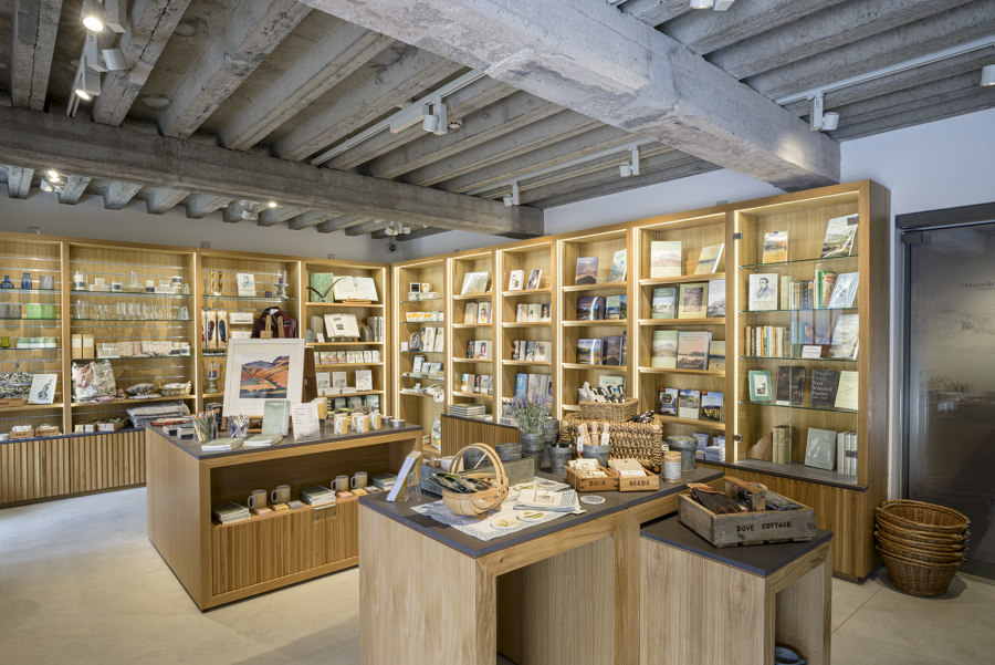
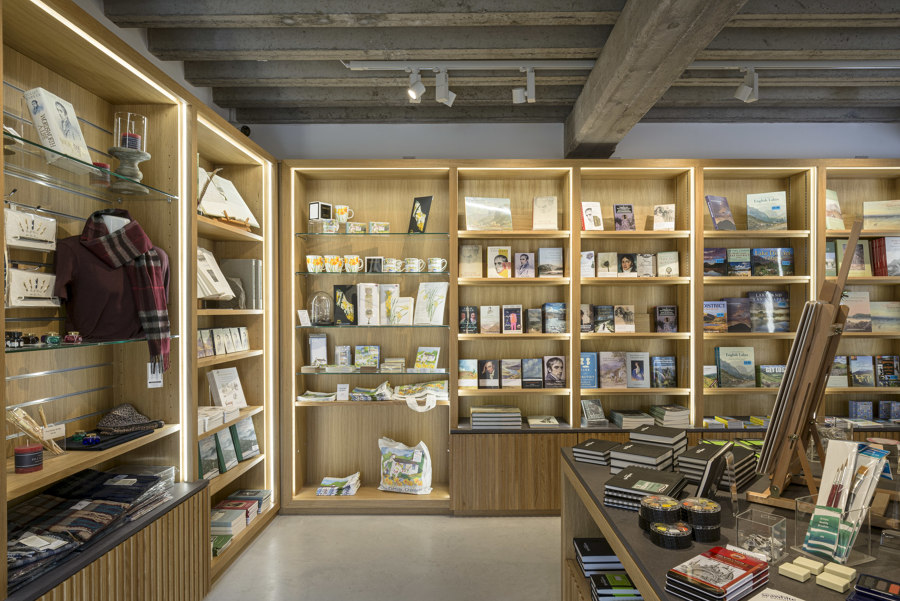
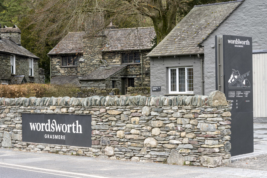
The Museum at Wordsworth Grasmere, the second phase of work at the former Lake District home of the great English Romantic poet William Wordsworth and his sister Dorothy, is now complete and will open to the public on 17 May 2021, with all gallery, exhibition design and interpretative overviews by Nissen Richards Studio and the building’s remodelling and extension by Purcell.
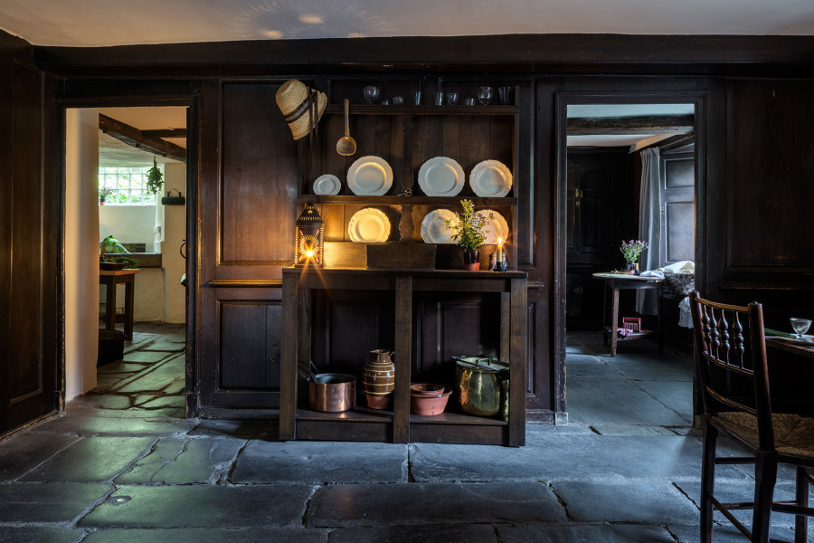
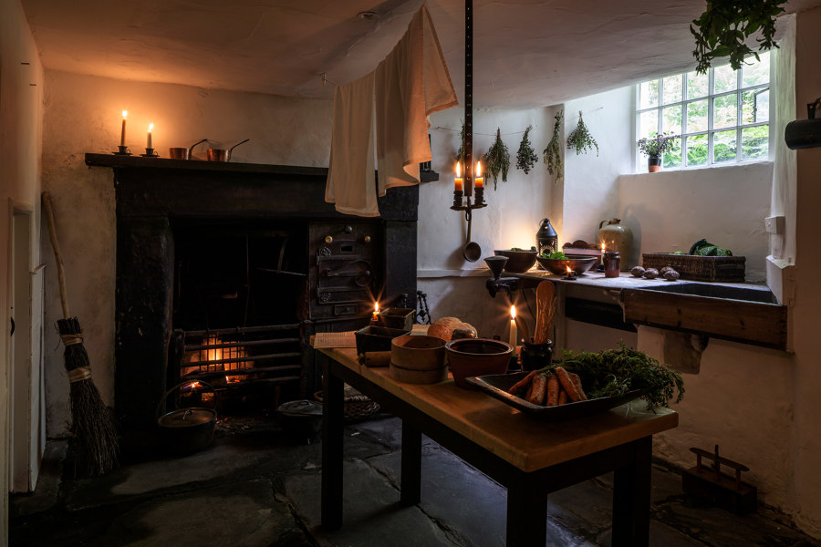
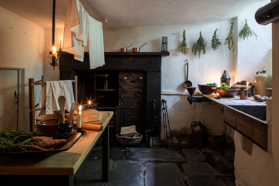
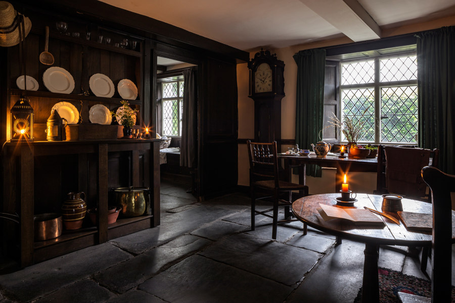
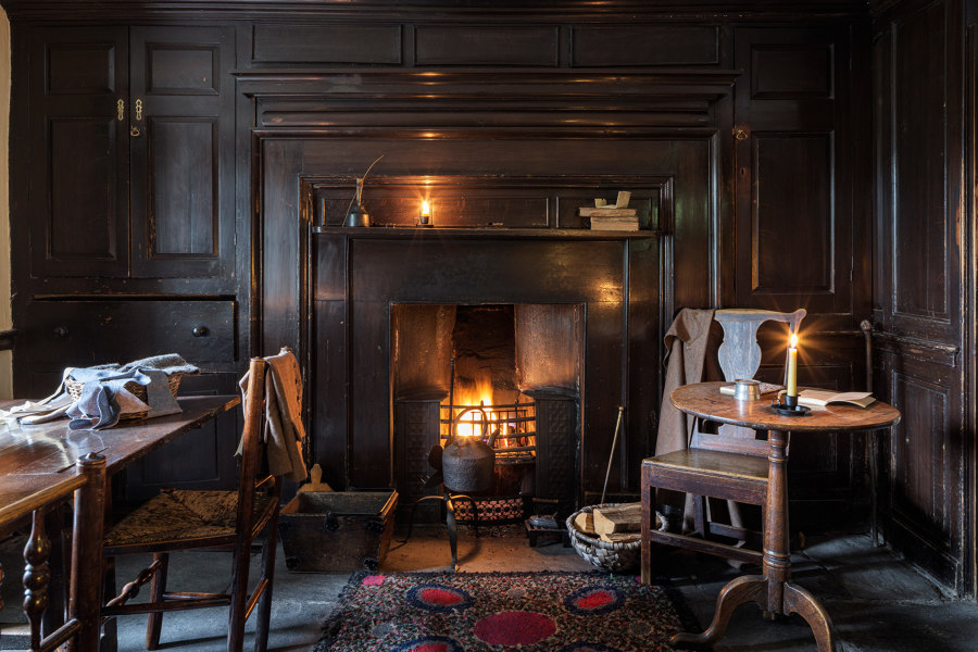
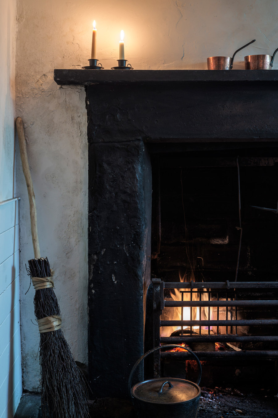
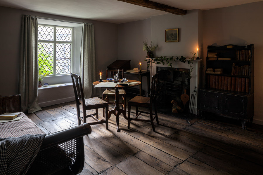
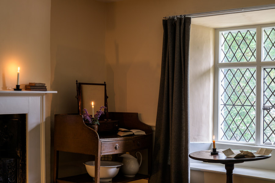
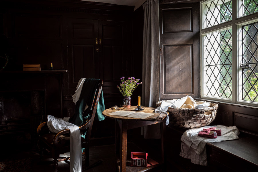
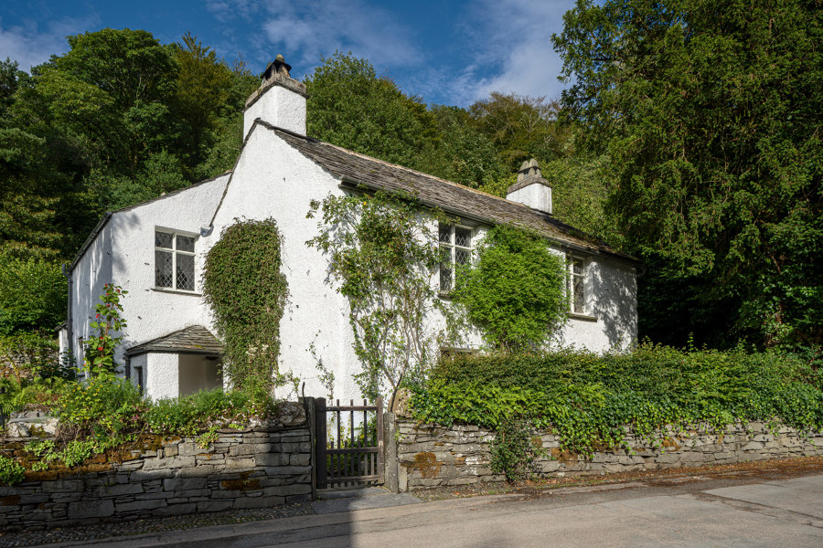
The first phase of re-design work by Nissen Richards Studio at Wordsworth Grasmere opened in summer 2020 and encompassed the conservation and reinterpretation of Dove Cottage itself, where William and Dorothy once lived, plus the design of a new identity for Wordsworth Grasmere and all signage and wayfinding for the scheme, which makes use of locally-sourced Lakeland slate, fulfilling the client’s request to work with local materials and tradespeople wherever possible to underscore the Museum’s connection to the local area.
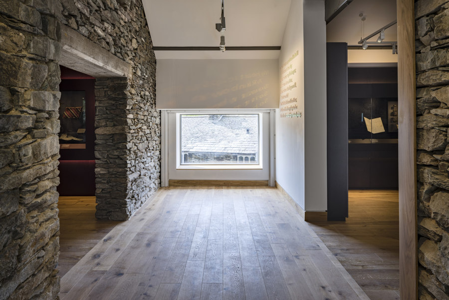
‘We enjoyed how the landscape could melt into this project by using sympathetic materials colours and tones’ Pippa Nissen, Director of Nissen Richards Studio commented, adding that ‘Wordsworth’s poetry is full of local detail and so we wanted the project to be something he himself might have enjoyed. His poetry is present in the visitor experience in the form of quotations, sounds and original manuscripts, leading visitors through the different spaces, including the new viewing station giving extraordinary views across the landscape Wordsworth loved.’
Background to the Museum Design:
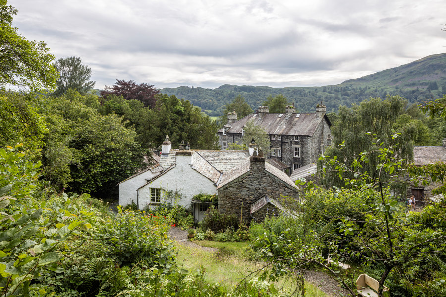
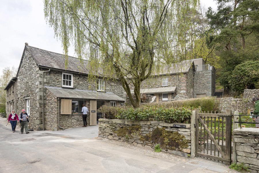
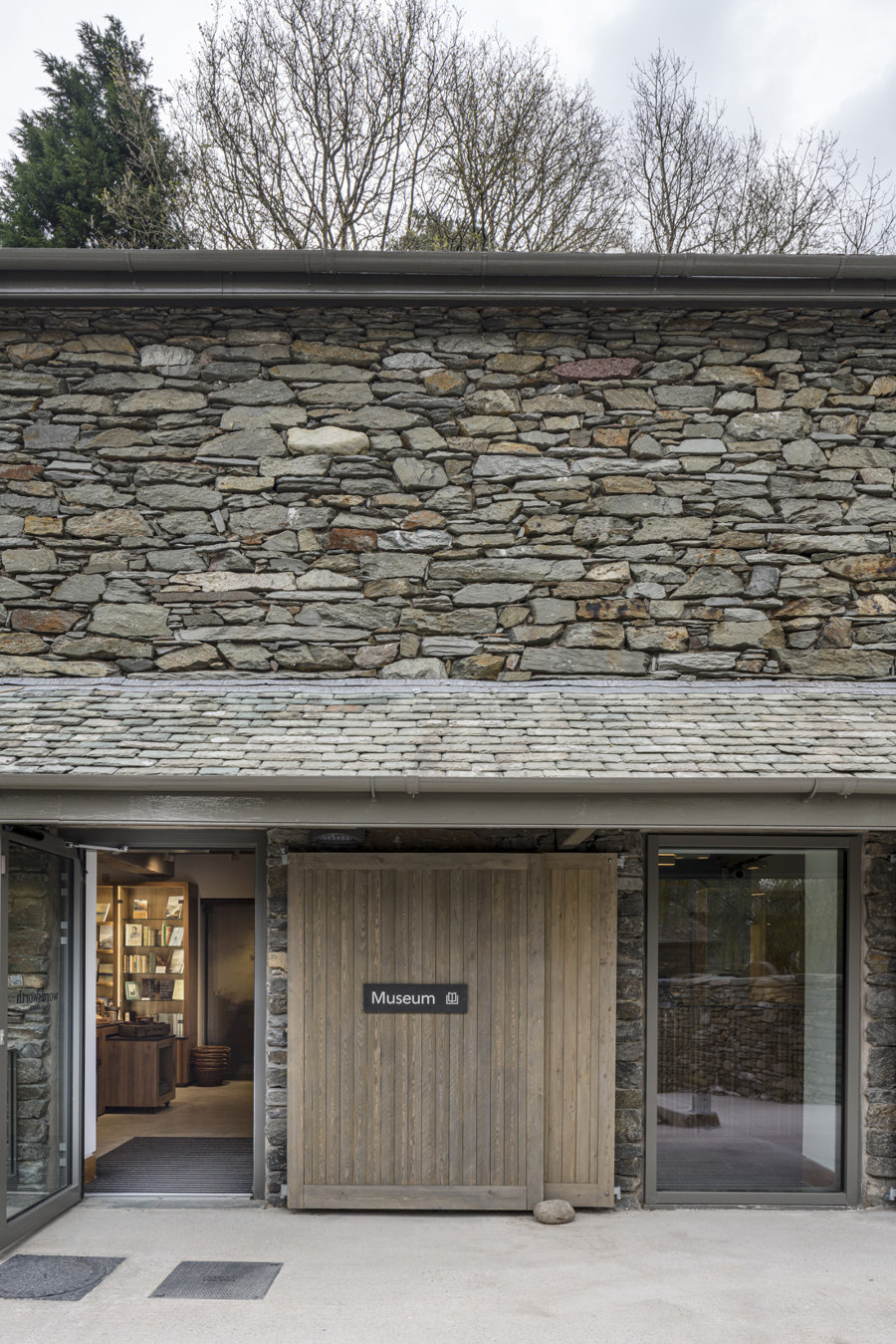
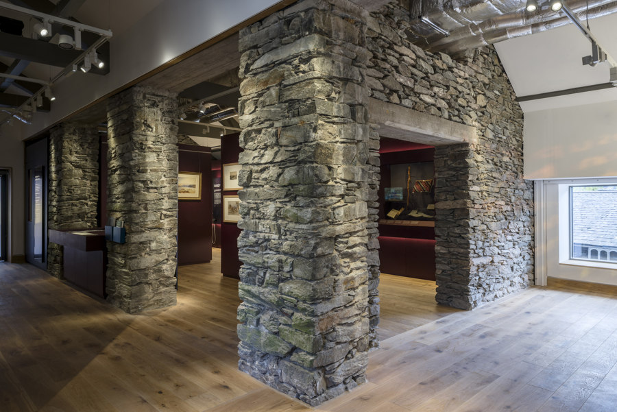
When Dove Cottage opened to visitors in 1891, the museum was located within a single room of the cottage. More land and buildings were subsequently acquired and the site now encompasses Dove Cottage, the Museum and the stand-alone Jerwood Centre - created at the turn of the millennium to house a world-class collection of Wordsworth manuscripts, first editions and paintings - together with a number of supporting buildings, gardens and a car park. The Museum is located in a former coach house and has been remodelled and extended by Purcell in this new phase of work, including the creation of a rooftop viewing station. The interpretive moves of the journey formed part of the collaborative thinking between Nissen Richards Studio and Purcell, whilst the architecture and new galleries display a careful choreography of the visitor route through these spaces.
The New Visitor Journey:
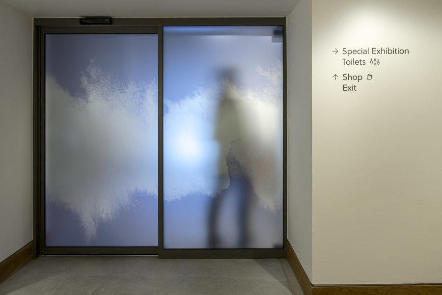
The new visitor journey, designed by Nissen Richards Studio in close collaboration with the Wordsworth Grasmere team, includes a series of threshold moments, such as a totem sign and the setting of words into the walkways, featuring fragments of poems going off in two directions, so that visitors see them clearly on arrival and departure. From stepping into the past in Dove Cottage to reflecting on Wordsworth’s poetry and immersing the visitor in the landscape and its emotional impact, the route encompasses a total experience.
‘The journey also takes its inspiration from Wordsworth’s own processes, Pippa Nissen added, ‘as he would first experience the landscape and then reflect back on that experience in terms of ‘spots of time’, by pacing and walking, referring to his poetry as ‘emotion recalled in tranquility’. We have reflected this by creating more intense moments, followed by a pause space for reflection and further connection to the landscape.’
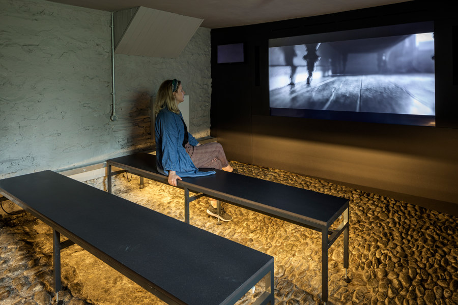
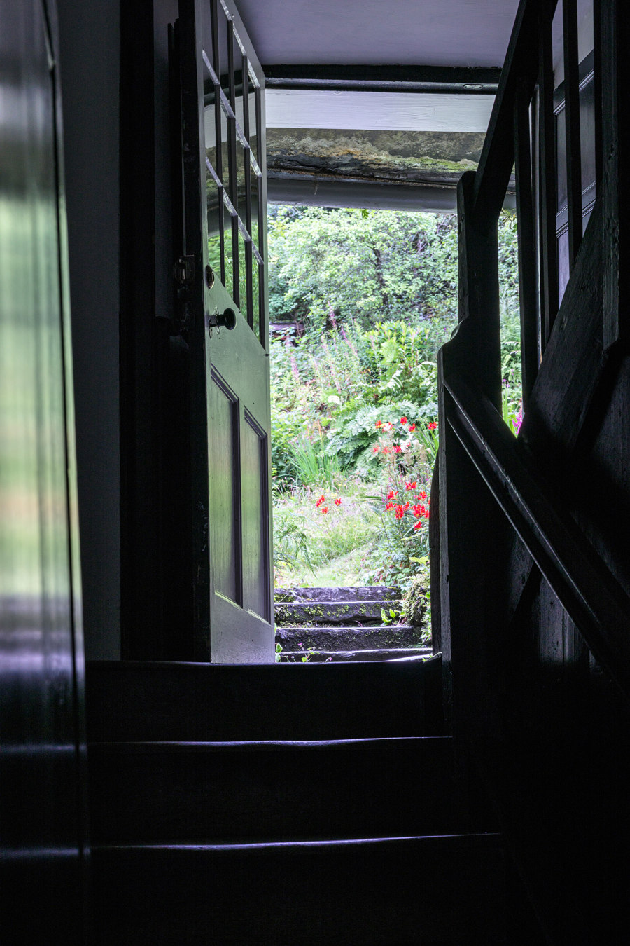
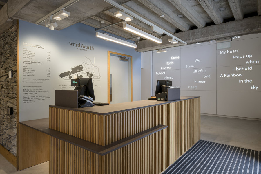
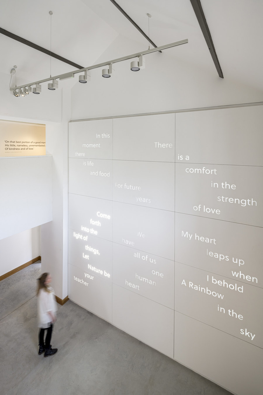
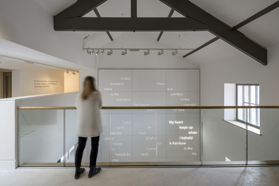
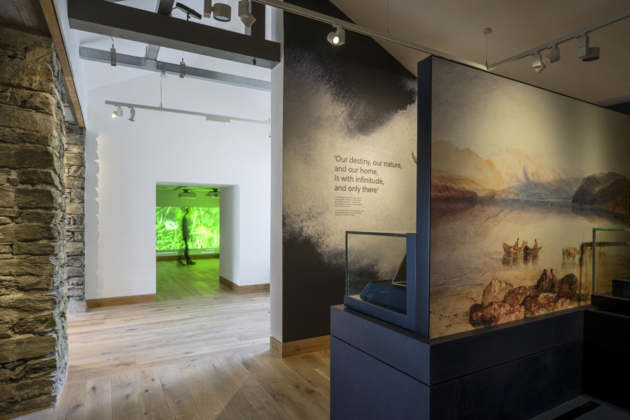
The main entrance to Wordsworth Grasmere leads visitors to a shop and ticketing area, before entering the new, double-height Museum orientation space. Here, quotations by Wordsworth are set within a dramatic, full-height light wall. Visitors then make their way to a former stable space that houses an immersive introductory film, before stepping over the threshold into Dove Cottage. Visitors return to The Museum via Dove Cottage’s Garden-Orchard, entering an expanded first floor space, which has been loosely arranged into four new galleries. Galleries One and Four are set to one side and Galleries Two and Three to the other, whilst a pause space in between offers views onto the gardens and surrounding landscape.
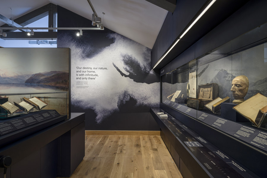
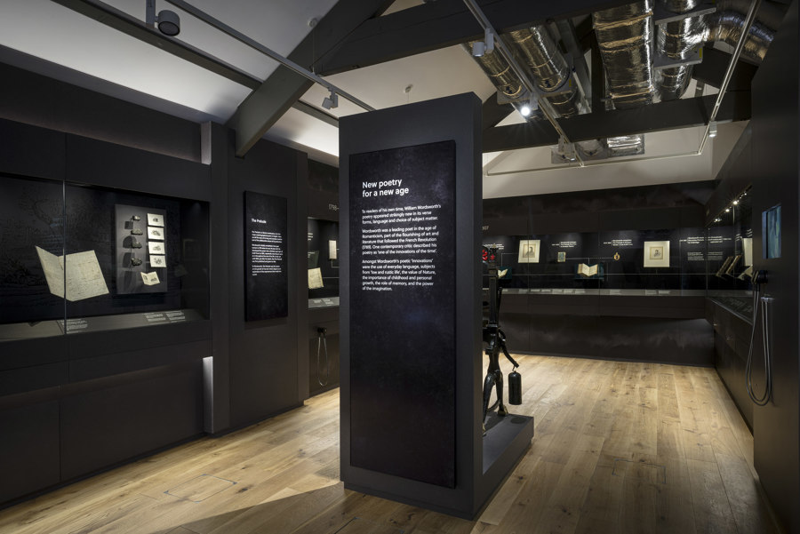
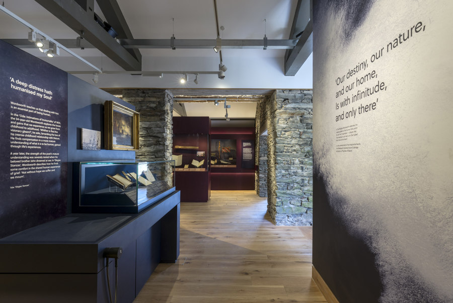
Gallery One centres on nature and a historic timeline and allows visitors to get to know Wordsworth better and understand the impact nature made on him.
‘The display here had to speak to a wide range of visitors, from those that are new to Wordsworth’s work to those with specialist knowledge and interest’, Elin Simonsson, Head of Interpretation at Nissen Richards Studio explained. ‘Strands of the biographical story include influential moments from childhood and adulthood and the death of William and Dorothy’s dear brother, whilst objects include a Wordsworth life-mask and his shoe buckles, as well as the Poet Laureate’s Royal Warrant, to bring visitors close to Wordsworth as a person.’
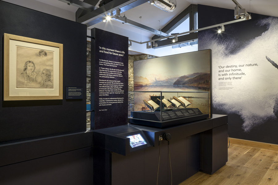
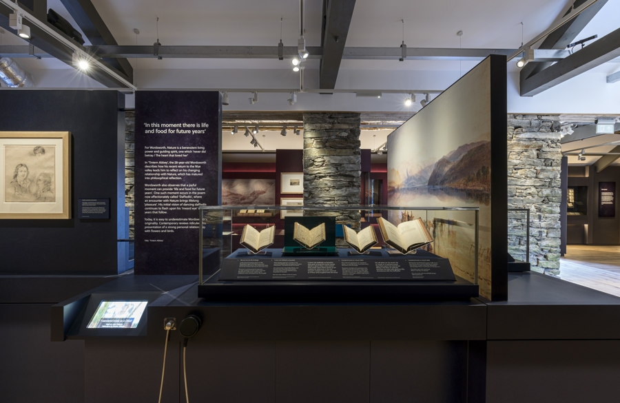
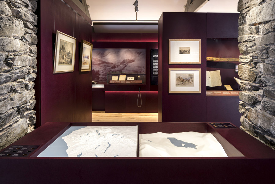
Gallery One features a nature-inspired soundscape by sound artist Carolyn Downing, who also created the sound design for Dove Cottage. A number of stand-out literary pieces are highlighted in this gallery, including ‘I Wandered Lonely as a Cloud’. Objects are integrated alongside the manuscripts, such as Wordsworth’s own ice-skates, which link an actual incident in Wordsworth’s life to the manuscript nearby. The display here is mostly contained within a central low island to allow views around the room, whilst a low-level ledge, 300mm deep, in front of the central display case, features embedded moments, as well as a bench with a book for visitors to sit and read. This is only one of a series of visitor activities interspersed throughout the galleries, allowing visitors to become more involved in the exhibits. One such ‘embedded moment’ takes the form of a tactile 3D model of the Lake District, for example. The gallery’s main decorative colour is blue, inspired by the slate from the quarry on Loughrigg Fell, with blues also used for a bespoke, large-print wallpaper.
Gallery Two is an AV space, serving to immerse visitors in Wordsworth’s poetry. The gallery features two screens giving a 50-minute-long looped recitation of poetry, so that visitors can listen to a single poem, several or the entire run. The poems have been recorded by a carefully-selected range of voices, ranging from well-known actors to local people and academics. The gallery design has a simple, monochrome feel to allow the AV to dominate.
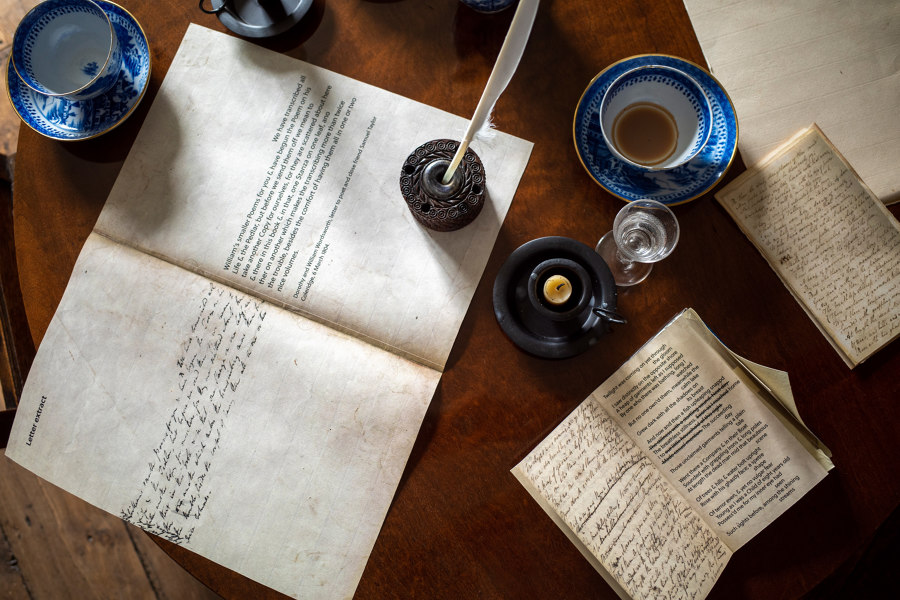
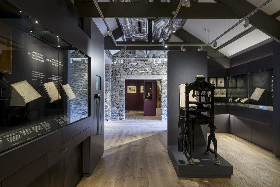
Gallery Three ramps up the literary intensity and tells the story of how The Prelude came about over a 50-year period. The Prelude was Wordsworth’s major life work and the gallery tells the story of the creation of one of the greatest works in English literature through its manuscripts, with 23 of the 24 in the possession of Wordsworth Grasmere and highlights on display here, allowing visitors to see how the poem develops and the collaboration of the people involved. Being able to see the very moments of creation and alteration and the emotion of those involved through the handwriting on the pages is a dramatic experience and represents an innovative approach to interpretation.
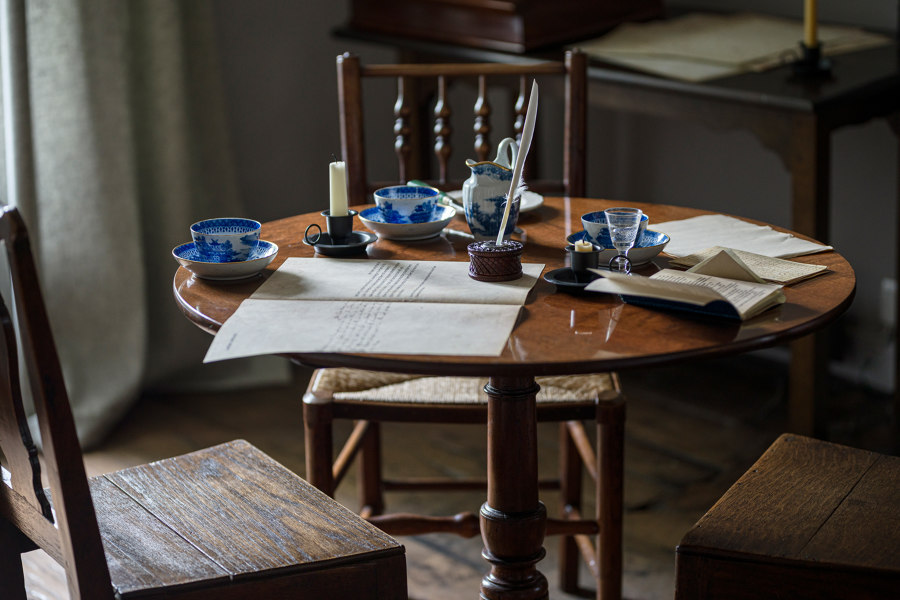
In terms of look and feel, ink stains are used within the gallery decoration to accompany the manuscripts, referencing the Wordsworth Grasmere branding language devised by Nissen Richards Studio. Gallery Three also features a quill-writing table, with four drawers integrated below the showcases containing activities relating to the display.
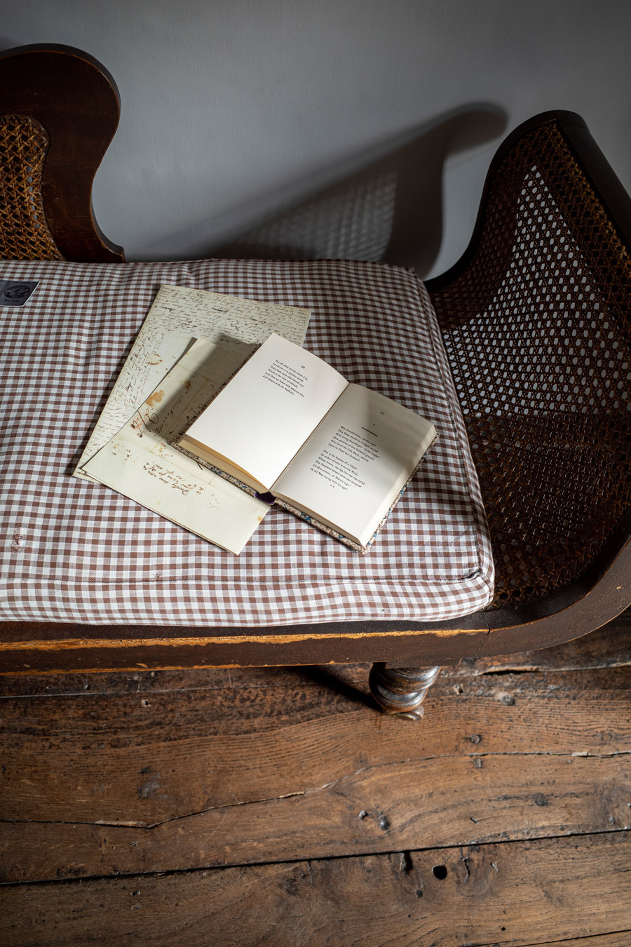
Gallery Four takes the form of a homage to the Lake District and in particular to Grasmere, showing how Wordsworth was very much a poet of the Lake District and how he and his family were rooted here – whether walking, writing or reading. The gallery narrates the highs and lows of family life, from love letters and children to grief and loss. Full-height cases create mini roomsets to emulate a domestic feel, whilst the gallery’s colour treatment ranges from slate to rust, inspired by the ironstone of nearby Easedale.
The pause area between the galleries is in white, left blank for thought, with a creative writing table and integrated dichroic quotes coming alive through colour.
‘It has been a privilege to work with Nissen Richards Studio and the wider creation team on this project’ Wordsworth Grasmere’s Curator & Head of Learning Jeff Cowton commented. ‘We are overwhelmed by the way in which the interpretation and design makes Wordsworth’s words live – you see them in stone and in lights as you arrive and leave; they are at the heart of the introductory film and within the home itself – and they are everywhere in the museum. As Curator and Head of Learning, I take special pleasure in seeing the manuscripts on which they are written come alive in the beautiful displays. The displays spark our imaginations into the lives of real people living 200 years ago and lead us to think of the relevance of their words for us today.’
Design Team:
Exhibition, interpretation & wayfinding: Nissen Richards Studio
Branding: Nissen Richards Studio
Introductory film: Nick Street
Sound designer: Carolyn Downing
Basebuild architect: Purcell
