Gina Tricot is a familiar face in the Swedish fashion landscape, its affordable on trend collections of base garments being a go-to label for girls and young women across the country.
Recent years have seen established Swedish fashion label, Gina Tricot begin to shed its skin and emerge as a forward-thinking, progressive retailer. Taking new directions in its advertising campaigns, brokering collaborations with the likes of Icona Pop and earlier this year embarking on a journey to revitalise the aesthetics of its boutiques.
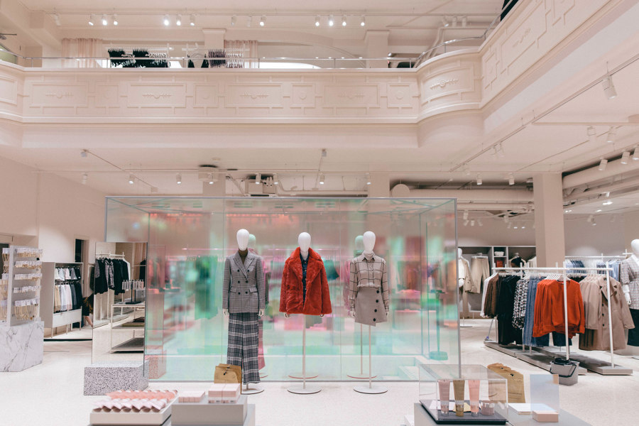
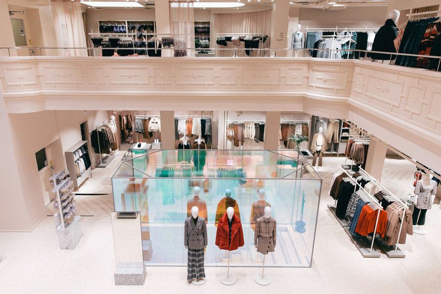
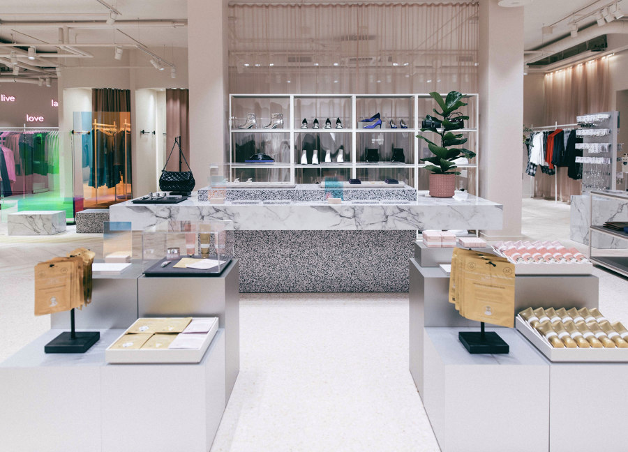
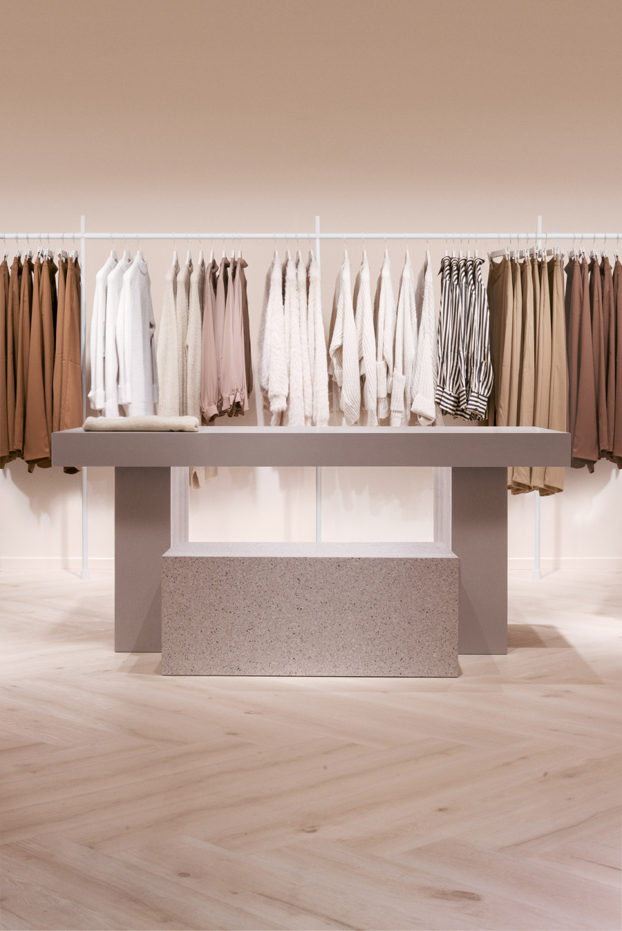
Beginning with its flagship store on the hip Stockholm island of Södermalm, it approached Note and Open Studio for a fresh look that raises the garments on display to a new level and empowers the shopper in the process.
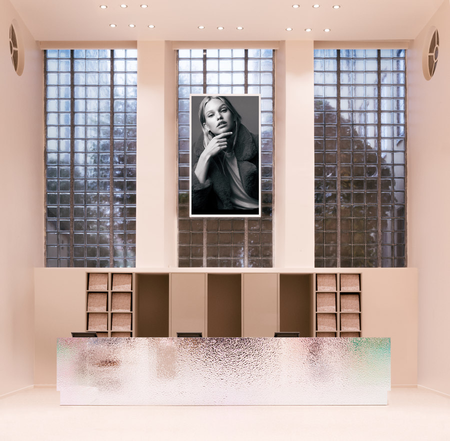
The boutique is situated on one of Stockholm’s busiest shopping streets, with a challenging period space and features to be preserved. Another challenge is that, once completed, this space would be the seed for Gina Tricot’s other stores across Sweden—so every design decision and attribute needs to be transferable and scalable without loosing its brand consistency.
During planning Note and Open Studio encountered an anomaly which would leave an impression on the end design. Gina Tricot’s overall customer demographic is one which differs in the physical space to that of its online marketplace. And the label’s physical retail spaces play a significant role in the lives of its shoppers—acting as social destinations where genuine human-to-human interactions are currency.
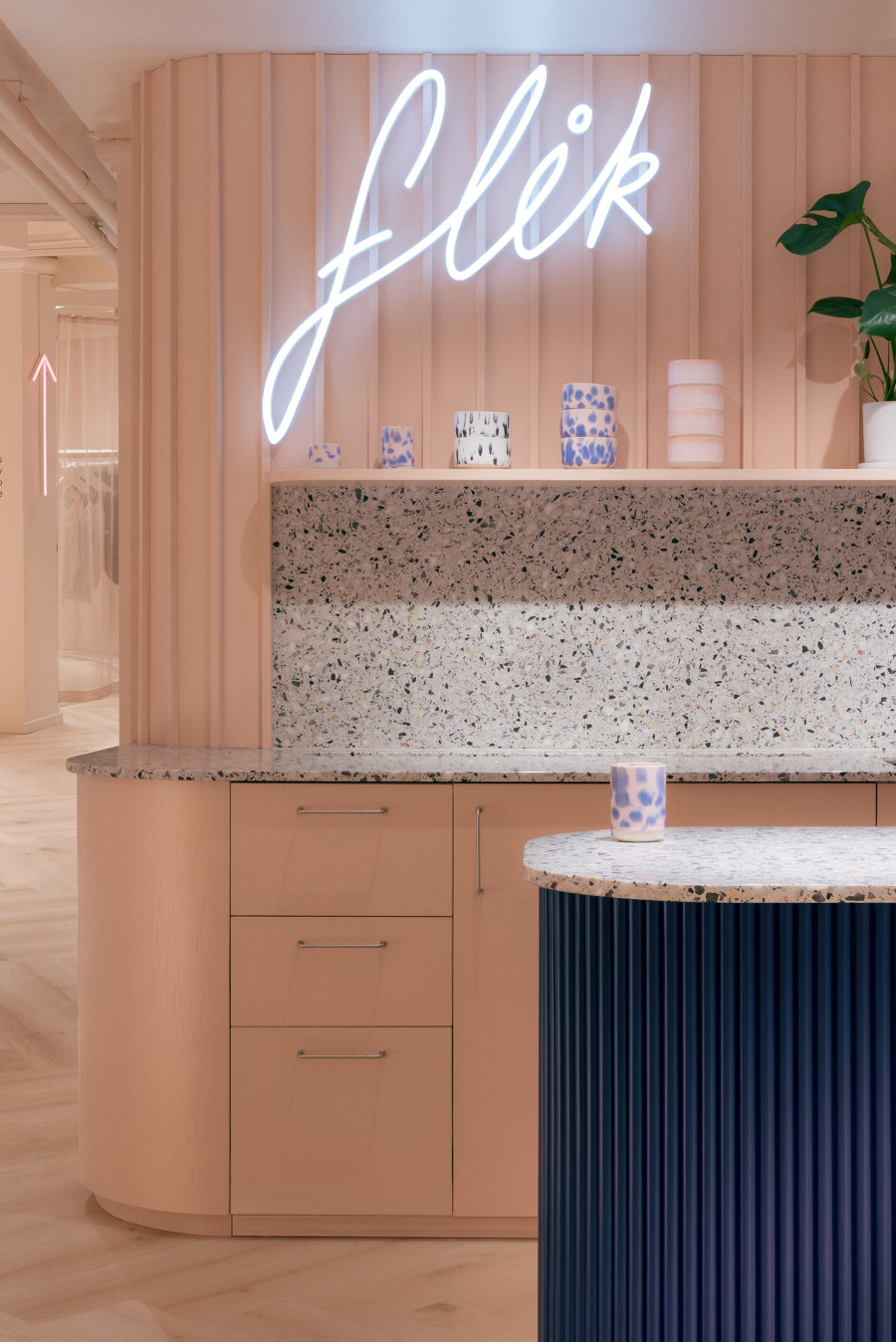
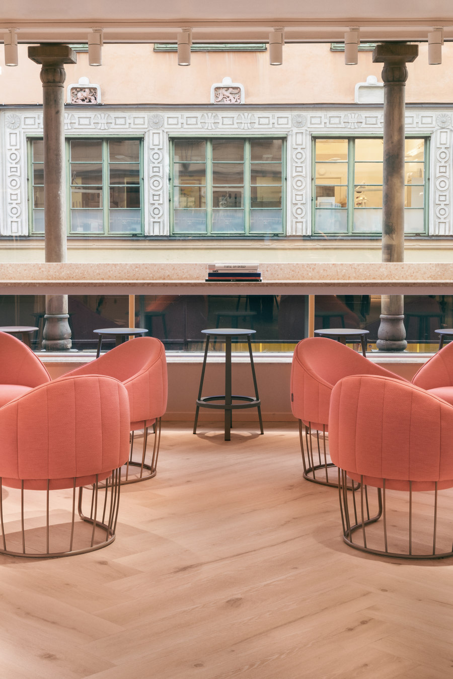
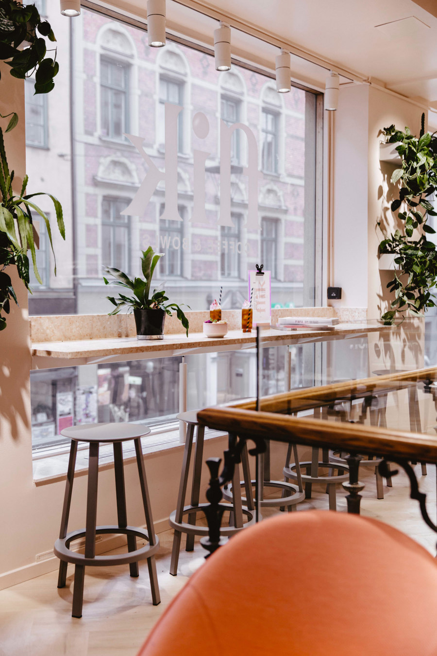
As a result, the final design needed to reflect the rituals of the shopping experience and be a hangout for friends sharing time together. A juice and snack bar emerged in the design to allow for relaxed gatherings while enjoying the collections. The contrasts in shopper demographics also allowed for a broader palette of materials and colour for a vision of future retail that caters for the younger customer now, but also the way they’ll grow and develop as they get older.
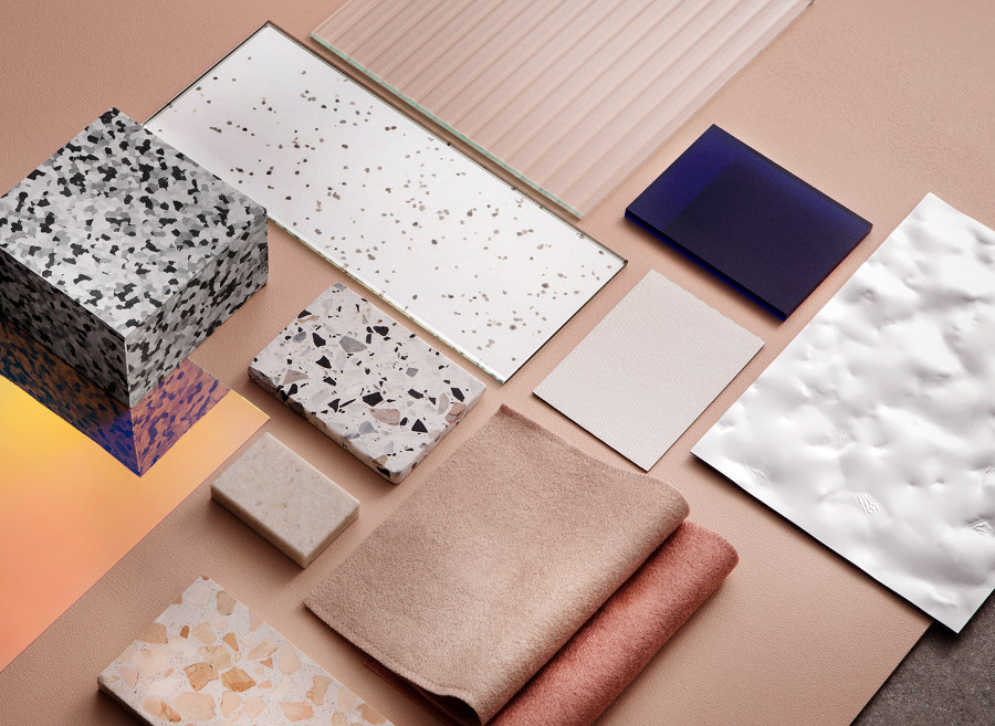
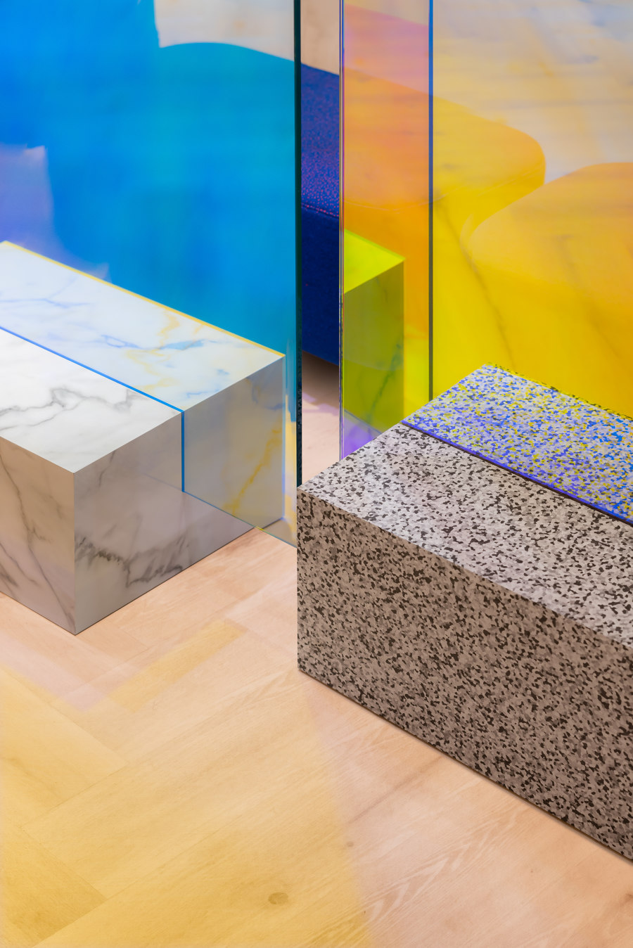
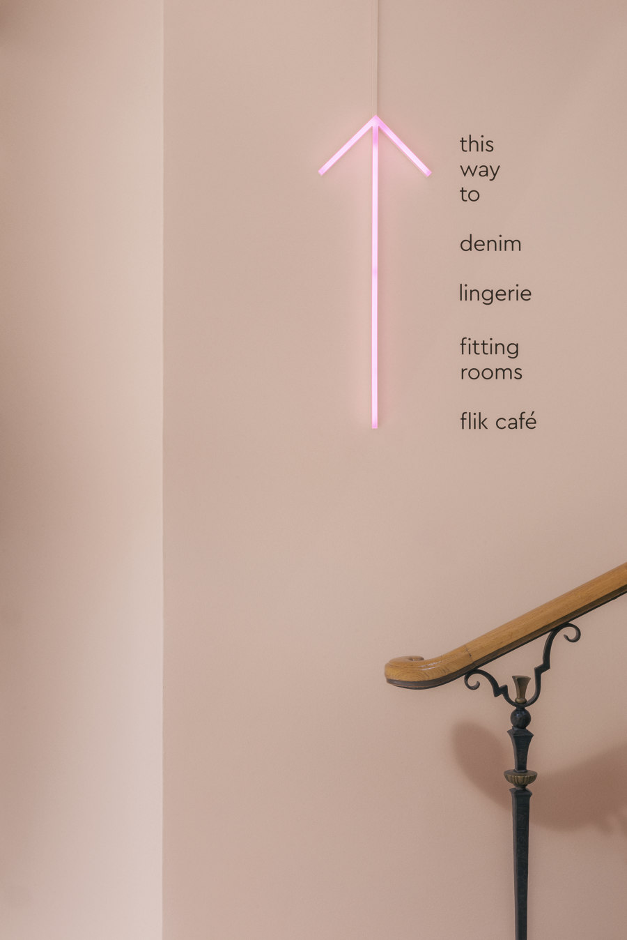
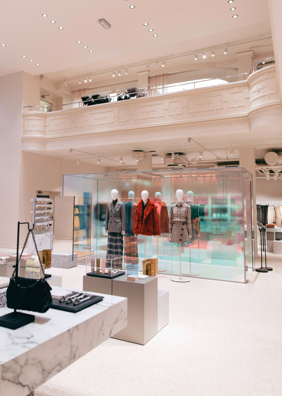
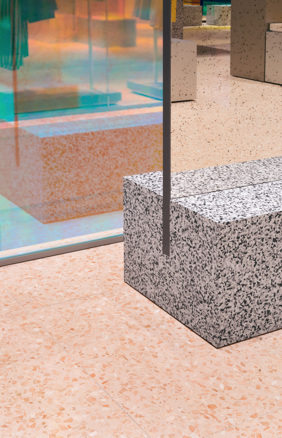
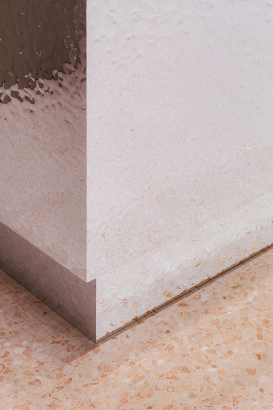
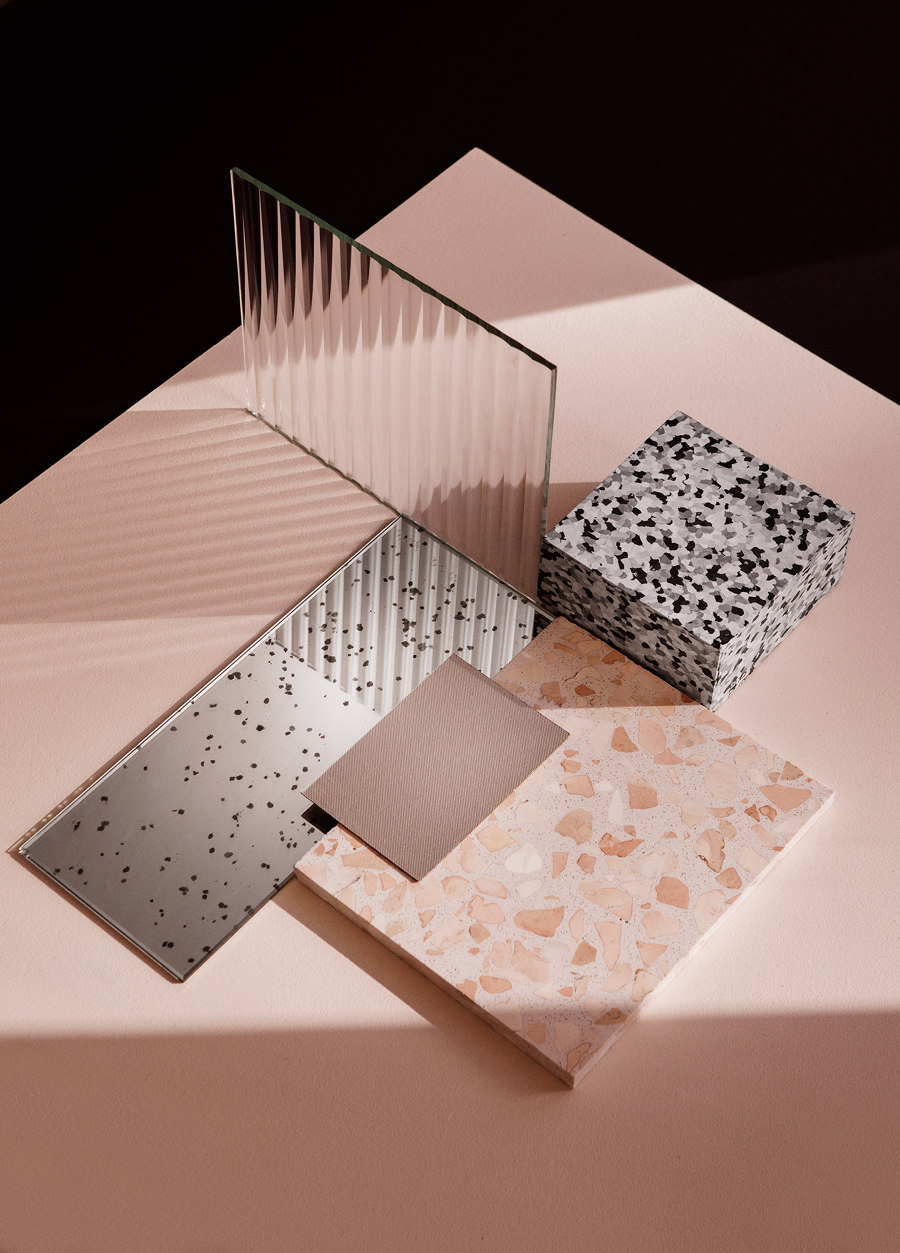
A key feature of the new space is streamlining the flow of shoppers through the aisles, of which there are relatively few. Instead of funnelling the visitor through a pre-set customer journey, the new store leaves the customer to make decisions. By using tints, transparency, mirrors and textures the interior invites exploration and generates surprise encounters with key pieces and styles. If it was felt that a material wasn’t contributing to the experience it was left out.
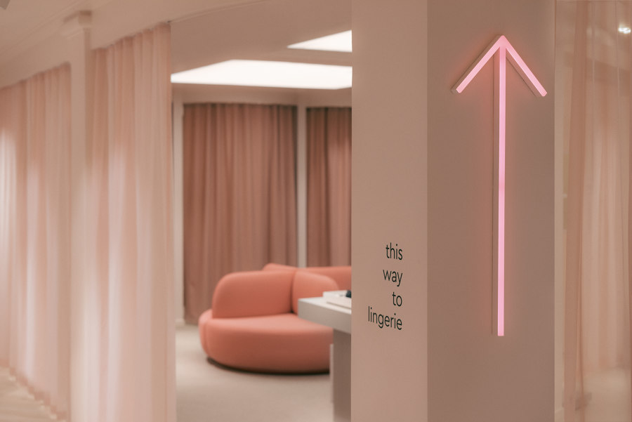
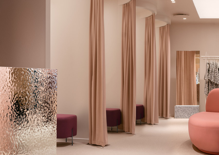
Arguably the most relevant iteration in the new Gina Tricot experience space is the treatment of the changing rooms. Gone are the claustrophobic cubicles and unflattering lighting, in its place is an area that brings a sense of togetherness and camaraderie. More space for changing into the clothes but then the shopper is encouraged to throw open the curtain and leave the confines to an open, uncluttered, energetic communal point.
Defined, focused and empathic to today’s shopper now and in the future, the new concept is will roll out across the fashion brand’s 180 stores and locations, scalable to fit each space. “We’ve used a lot of tints, mirrors and textures in the interior, and wanted to really influence the areas of a fashion store which detract from a positive shopping experience. Namely, the changing room areas.” says My Degerth, Note.
“The space reflects the sense that life is really about the people you meet. And that shopping is made better and more memorable with friends. We wanted to bring life to Gina Tricot in a way that is natural and unforced.” says My Degerth, Note.
“This has been a pretty exciting retail project. Gina Tricot needed a new Gina and chose to roll it out first at its flagship store on Södermalm. A pretty bold, provocative step for such an established retail chain—you’d perhaps do a small concept store, then test it and then roll it out across other locations. But Gina wanted a really big change, and to do it somewhere that would have a real impact,” says My Degerth, Note.
Design Team:
Note Design Studio
