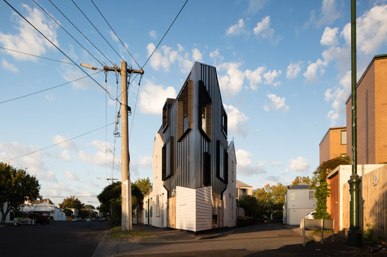
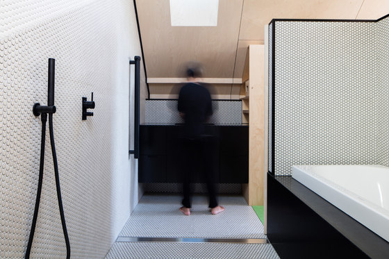
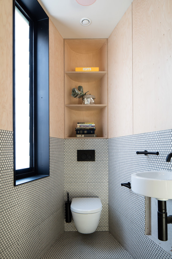
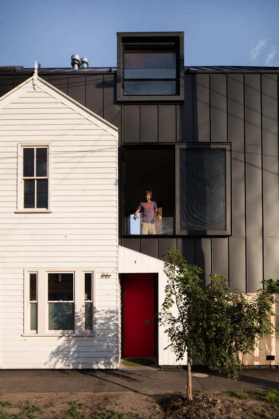
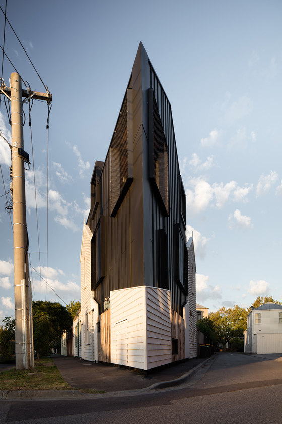
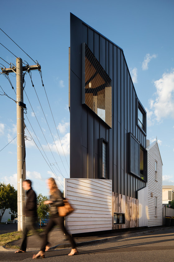
Acute House is the transformation of a 'renovator's nightmare' into a compact 21st century family home. The severe limitations of a tiny, very triangular site and the demanding heritage context have resulted in a pointy new wedge of house that is designed to exploit its problems.
The original, and extremely decrepit, Victorian weatherboard cottage had become impossible to inhabit but was well loved by the neighbourhood as well as its new owners.
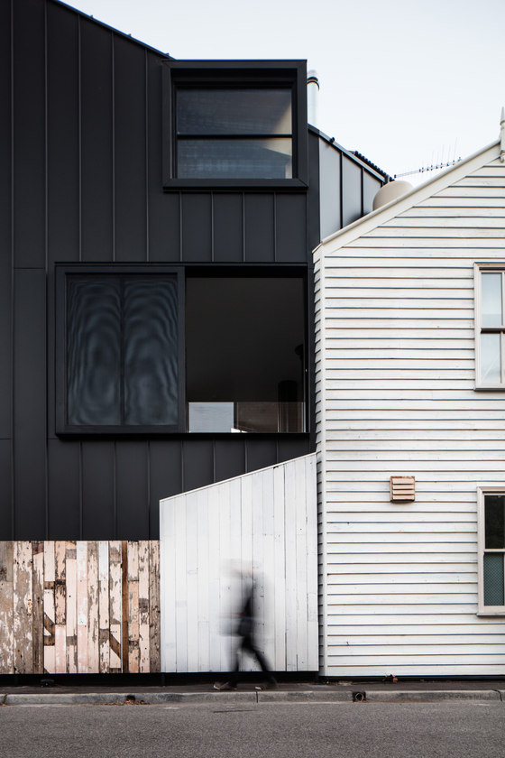
We tried to retain its weathered character by re-using as much original fabric as possible from warped weatherboards and fence palings to random accumulations such as door knobs, vents and street numbers. Like fragile museum artefacts, these were carefully removed, labelled, stored and re-installed in their original location on a new mount that not only highlights their charms by contrast but allows the house to live again in a new way.
Tight
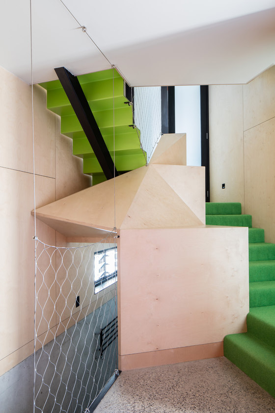
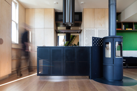
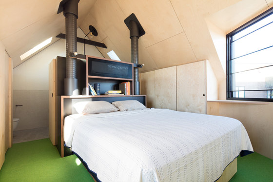
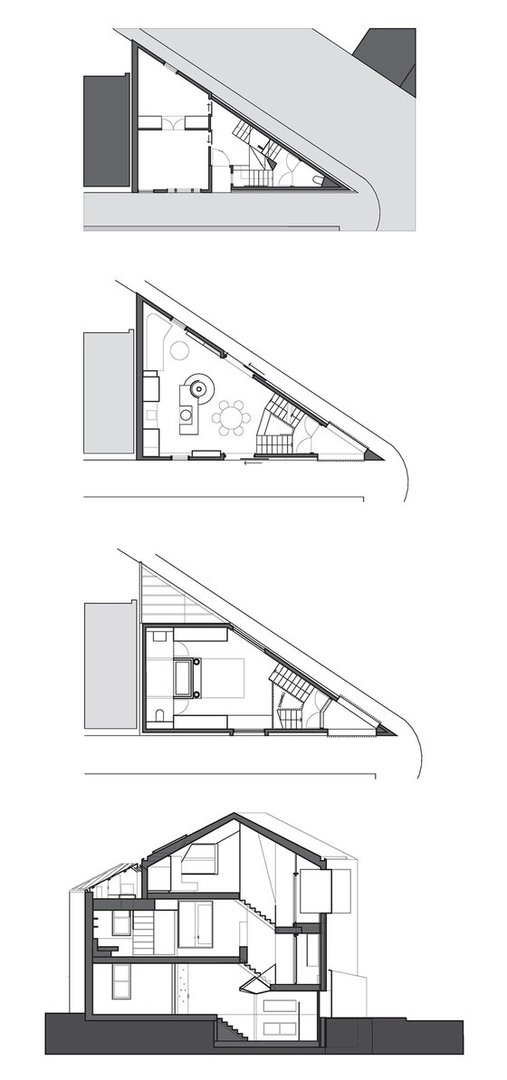
To take advantage of the opportunities of such an unusual site, the geometry required an adjustment to the layout and lifestyle expectations of a conventional family house. Multiple levels were required to accommodate the basic space needs of a family home and these were accommodated where site geometry best suited them. These spaces are distributed over split levels with the vertical space of the stairwell providing visual privacy and a sense of definition without wasting precious space on internal walls, corridors or doors. Continuous circulation is provided through each floor with no dead-ends, allowing spaces to be kept lean yet feeling spacious and un clogged – visually or physically.
Virtual Gardening
While site area limitations and geometry allowed the council to permit building over 100% of the site this advantage came with the counterbalancing disadvantage of 0% outdoor space. As a result, the house interiors had to accommodate the needs of a family as well as providing them with the enjoyments of the great outdoors. This total lack of garden is offset by the artificial internal landscape of the stairwell with lawn green carpets, hanging plants, a central aquarium of aquatic plants and fish and a sunny outlook to every room. Full height sliding doors and screens open up the main living level as a virtual verandah and the pointy, but surprisingly generous, balcony provides the ambience of a yacht in the street.
Heritage-ous-ness + Context
The resulting new wedge of house is designed as an unusual but highly responsive approach to the character of the surrounding neighbourhood, and to the challenges and opportunities for responsive architecture presented by the site and its immediate context. It takes on the challenge of preserving an important but almost unsalvageable local landmark by working within the general typology of the surrounding neighbourhood, "rhyming" with its housing stock while remaining resolutely contemporary in its expression and articulation.
OOF! architecture
Fooi-Ling Khoo
Planning + Heritage: David Brand
Interior Design: OOF in collaboration with JPILD
Engineer: Mark Hodkinson Consulting Structural Engineers
Building Surveyor: Anthony Middling & Associates
